Black and white photography strips an image down to its essentials: light, shadow, shape, and texture. Without color to lean on, every tonal decision matters more. Lightroom gives you excellent tools for black and white conversion, but the defaults are just a starting point.
The Conversion
Click “B&W” in the Basic panel or press V. Lightroom converts the image to monochrome using its default mix of color channels. This default is decent but rarely optimal.
The real control lives in the B&W mix panel, which appears after conversion. Here you’ll see sliders for eight color ranges: Red, Orange, Yellow, Green, Aqua, Blue, Purple, and Magenta. Each slider controls how bright or dark that original color appears in the black and white conversion.
Understanding the Mix Panel
This is the most important tool in black and white editing, and it’s the one most people skip.
Each slider controls the luminosity of one color range. Moving Red to +50 means everything that was red in the original image becomes brighter in the black and white version. Moving it to -50 makes reds darker.
Practical effects:
- Red and Orange primarily affect skin tones. Higher values produce smoother, brighter skin. Lower values create more texture and drama on faces.
- Blue controls sky brightness. Pull it down for dramatic, dark skies that make clouds pop. Push it up for a brighter, airier sky.
- Green and Yellow affect vegetation and warm tones. Adjust these to control how bright or dark grass, trees, and foliage appear.
The Tone Curve for B&W
After your mix is set, the Tone Curve becomes your primary creative tool.
For dramatic, contrasty black and white: Create a steep S-curve. Pull the shadow point down, push the highlight point up. This produces punchy, high-contrast images with deep blacks and bright whites.
For soft, film-like black and white: Lift the shadow point (don’t let blacks reach zero). Gently compress highlights. This creates the classic film look with rich shadow detail and smooth transitions.
For high-key: Lift everything — blacks, shadows, midtones. Create a bright, ethereal image with minimal dark tones.
For low-key: Pull everything down and let highlights be the only bright elements. Moody, dramatic, and atmospheric.
Texture, Clarity, and Structure
These three sliders behave differently in black and white than in color:
Texture enhances fine detail without affecting broader tones. In B&W, it’s excellent for bringing out skin pores, fabric weave, stone texture, and wood grain. +20 to +40 for texture-forward images.
Clarity enhances midtone contrast — it makes edges more defined and gives the image a sense of punch. For gritty street photography and dramatic landscapes, +20 to +40. For soft portraits, -10 to -20.
Dehaze works well in B&W for cutting through atmospheric softness, just as in color work. It tends to increase drama significantly in monochrome.
Adding Grain
Black and white images often benefit from intentional grain. It adds an organic, film-like quality that smooth digital files lack.
In the Effects panel:
- Amount: Controls how visible the grain is. 15-30 for subtle, 40-60 for prominent.
- Size: How large the grain particles appear. 25-35 for fine grain (like ISO 100 film), 40-60 for coarser grain (like Tri-X).
- Roughness: How uniform the grain is. Higher values create more organic, irregular grain.
A good starting point for a classic film look: Amount 25, Size 30, Roughness 50.
Toning for Mood
The Color Grading panel adds color tints to your black and white image — a technique called toning.
Warm tone (sepia): Highlights hue 40-50, saturation 10-15. Creates a classic, warm, vintage feeling.
Cool tone: Shadows hue 200-220, saturation 8-12. Creates a modern, cold, melancholic mood.
Split tone: Warm highlights + cool shadows. This adds depth and dimension, mimicking the toned print look of traditional darkroom work.
Keep toning saturation very low (under 15). Heavily toned black and white images look gimmicky rather than intentional.
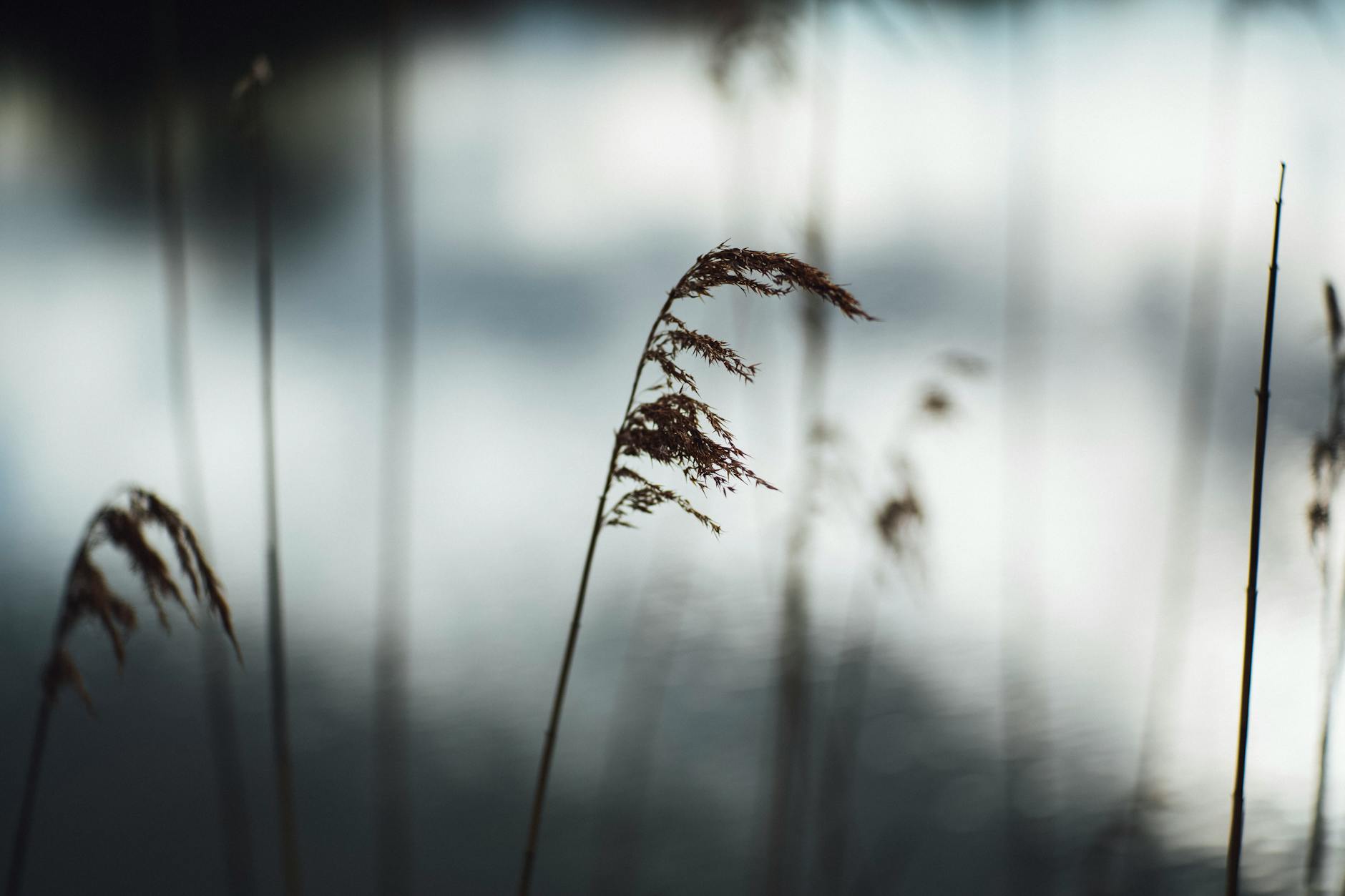
Which Images Work Best in B&W
Not every photo improves in black and white. The best candidates have:
- Strong contrast between light and dark areas
- Interesting textures — rough surfaces, detailed patterns, expressive faces
- Clear shapes and lines — geometric compositions, strong silhouettes
- Compelling light — dramatic shadows, rim lighting, strong directional light
- Distracting or ugly color — sometimes removing color improves an image by eliminating the weakest element
If an image relies on color for its impact (a sunset, autumn foliage, a colorful market), it’s probably not a strong B&W candidate.
Comments (5)
This should be required reading for anyone getting into photography.
Finally someone explains this without making it overly complicated.
Would love to see a video walkthrough of this process. Any plans for that?
Is there a Lightroom equivalent for this or is it strictly a Photoshop technique?
Great point, Priya Sharma. I might cover that in a future post.
Leave a Comment