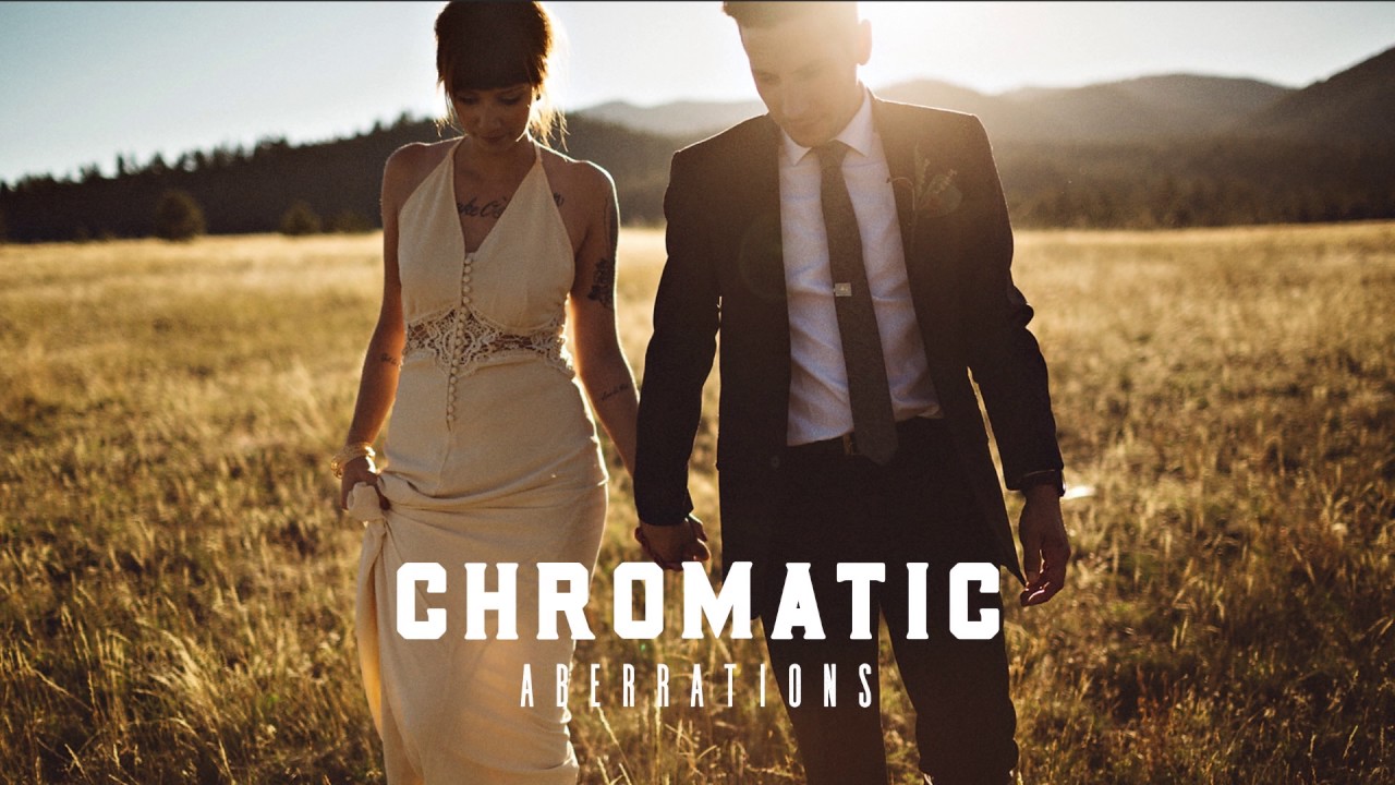
I used to make the mistake most beginners make: I’d apply a preset, think the edit was done, and export. Then I’d look at the photo two days later and wonder why the skin looked like someone had applied a Instagram filter from 2012. The problem wasn’t the preset itself. It was that I didn’t know how to dial it back in when something went wrong. That gap between “I applied a preset” and “I know what I’m doing” is exactly what this Mango Street tutorial covers, and it does it in under five minutes.
Watch the full tutorial on YouTube
What I like about this particular breakdown is that it doesn’t waste time on philosophy. It shows you three specific problems that show up in real photos, and walks you through fixing each one inside Lightroom’s Develop module. If you’re newer to Lightroom, consider this the tutorial that fills in the gaps your first YouTube rabbit hole left open.
Step 1: Get Into the Develop Module and Open the HSL Panel
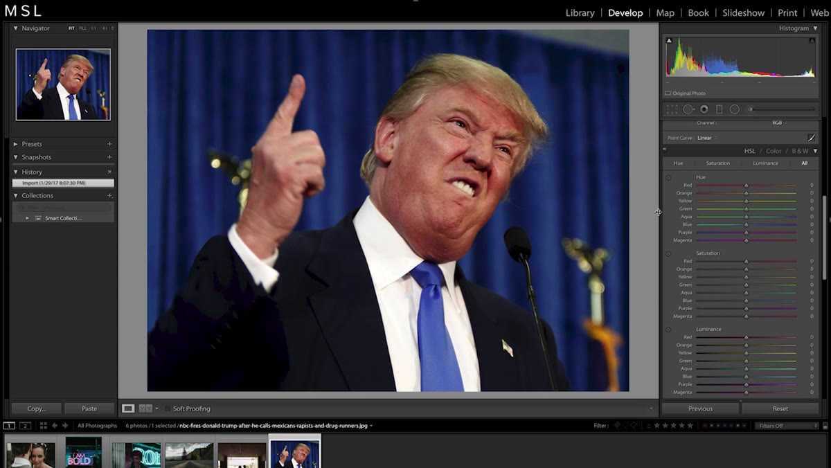 Develop module open with HSL panel visible
Everything in this tutorial happens inside the Develop module. If you’re still living in the Library module, hit “D” to jump over. Once you’re in, scroll down the right panel until you find the HSL / Color section. Click to expand it. You’ll see three tabs: Hue, Saturation, and Luminance. Each one controls a different quality of a specific color range in your photo. This is where a lot of intermediate edits actually happen, and most beginners scroll right past it.
Develop module open with HSL panel visible
Everything in this tutorial happens inside the Develop module. If you’re still living in the Library module, hit “D” to jump over. Once you’re in, scroll down the right panel until you find the HSL / Color section. Click to expand it. You’ll see three tabs: Hue, Saturation, and Luminance. Each one controls a different quality of a specific color range in your photo. This is where a lot of intermediate edits actually happen, and most beginners scroll right past it.
Step 2: Fix Skin Tones Using the Target Adjustment Tool in Hue
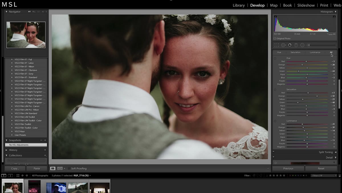 Target adjustment circle selected next to Hue tab
Instead of dragging individual sliders and guessing which color range your subject’s skin falls into, use the target adjustment tool. It’s the small circle icon sitting to the left of the Hue sliders. Click it, then move your cursor directly over the skin in your photo and click and drag. Dragging upward shifts the affected color sliders to the right. Dragging down pulls them left. If the skin looks too red and ruddy, drag up. If it’s gone too yellow or orange from a preset, drag down. You’re nudging the actual hue of that specific tone, not the whole image. Work slowly here. The difference between “natural” and “uncanny” is smaller than you think.
Target adjustment circle selected next to Hue tab
Instead of dragging individual sliders and guessing which color range your subject’s skin falls into, use the target adjustment tool. It’s the small circle icon sitting to the left of the Hue sliders. Click it, then move your cursor directly over the skin in your photo and click and drag. Dragging upward shifts the affected color sliders to the right. Dragging down pulls them left. If the skin looks too red and ruddy, drag up. If it’s gone too yellow or orange from a preset, drag down. You’re nudging the actual hue of that specific tone, not the whole image. Work slowly here. The difference between “natural” and “uncanny” is smaller than you think.
Step 3: Brighten Skin With the Luminance Target Tool
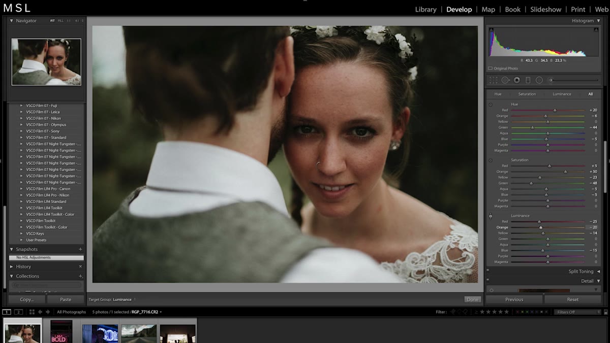 Luminance tab active, cursor hovering over subject’s skin
After correcting the hue, switch to the Luminance tab and grab its target adjustment tool the same way. Click over the skin and drag upward gently. This lifts the brightness of that specific tone, which can make skin look cleaner and more even lit, especially if the original shot was a little flat. The warning here is real: push this too far and you get a washed-out, overexposed look that reads more like a retouching mistake than an intentional edit. I’d stay conservative. A nudge of 10 to 15 is usually plenty. Think of it as giving the skin a little room to breathe, not blasting it with light.
Luminance tab active, cursor hovering over subject’s skin
After correcting the hue, switch to the Luminance tab and grab its target adjustment tool the same way. Click over the skin and drag upward gently. This lifts the brightness of that specific tone, which can make skin look cleaner and more even lit, especially if the original shot was a little flat. The warning here is real: push this too far and you get a washed-out, overexposed look that reads more like a retouching mistake than an intentional edit. I’d stay conservative. A nudge of 10 to 15 is usually plenty. Think of it as giving the skin a little room to breathe, not blasting it with light.
Step 4: Reduce Saturation to Clean Up Muddy or Oversaturated Skin
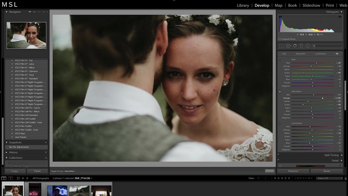 Saturation tab active, mouse dragging downward over skin
Last stop in the HSL panel: Saturation. Same process. Click the target circle, click and drag down over the skin. Most presets pump saturation across the board, and skin almost always gets collateral damage. Pulling the saturation of the orange and red ranges down a touch removes that artificial warmth and makes tones sit more naturally. This step pairs especially well with step two. Lifting luminance while reducing saturation is a classic combination for making skin look healthy without looking fake.
Saturation tab active, mouse dragging downward over skin
Last stop in the HSL panel: Saturation. Same process. Click the target circle, click and drag down over the skin. Most presets pump saturation across the board, and skin almost always gets collateral damage. Pulling the saturation of the orange and red ranges down a touch removes that artificial warmth and makes tones sit more naturally. This step pairs especially well with step two. Lifting luminance while reducing saturation is a classic combination for making skin look healthy without looking fake.
Step 5: Remove Chromatic Aberration With the Lens Corrections Panel
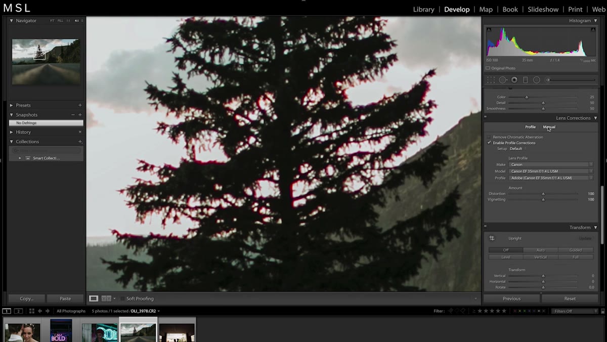 Manual tab open in Lens Corrections with Fringe sliders visible
Chromatic aberration shows up as a colored fringe, usually magenta, green, or purple, along high-contrast edges in your photo. Tree branches against a bright sky are a classic culprit. The Mango Street tutorial recommends heading to the Lens Corrections panel and switching to the Manual tab. Set the Fringe Amount to around 5 as your starting point, then use the Hue sliders to select the specific color range of your fringing. In a photo with both pink and purple fringing, you’d need to cover both ranges. The sliders let you narrow or widen that selection. The key caveat: if you drag the selection range too wide, you’ll start desaturating colors in your image that were never affected by fringing. Zoom in to 100% and keep an eye on the broader image while you work.
Manual tab open in Lens Corrections with Fringe sliders visible
Chromatic aberration shows up as a colored fringe, usually magenta, green, or purple, along high-contrast edges in your photo. Tree branches against a bright sky are a classic culprit. The Mango Street tutorial recommends heading to the Lens Corrections panel and switching to the Manual tab. Set the Fringe Amount to around 5 as your starting point, then use the Hue sliders to select the specific color range of your fringing. In a photo with both pink and purple fringing, you’d need to cover both ranges. The sliders let you narrow or widen that selection. The key caveat: if you drag the selection range too wide, you’ll start desaturating colors in your image that were never affected by fringing. Zoom in to 100% and keep an eye on the broader image while you work.
Step 6: Apply Lens Profile Corrections and Fix Perspective
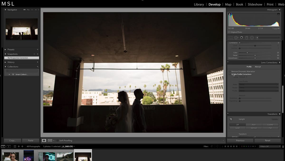 Profile tab in Lens Corrections with Enable Profile Corrections checked
Switch from the Manual tab to the Profile tab in the Lens Corrections panel and check the “Enable Profile Corrections” box. Lightroom will detect your lens automatically and apply a profile that corrects for the natural vignetting and distortion that specific lens introduces. This is a one-checkbox fix that most beginners skip, and it makes a visible difference on wide-angle shots especially.
Profile tab in Lens Corrections with Enable Profile Corrections checked
Switch from the Manual tab to the Profile tab in the Lens Corrections panel and check the “Enable Profile Corrections” box. Lightroom will detect your lens automatically and apply a profile that corrects for the natural vignetting and distortion that specific lens introduces. This is a one-checkbox fix that most beginners skip, and it makes a visible difference on wide-angle shots especially.
Directly below Lens Corrections is the Transform panel. Check “Constrain Crop” first, then hit the Auto button. This attempts to level your photo and straighten any perspective warping. It doesn’t always produce something you want to keep, so treat it as a suggestion rather than a rule. If it looks wrong, undo and straighten manually instead. A level horizon goes a long way, even when nothing else changes.
Step 7: Use the Adjustment Brush to Lift Shadows Under the Eyes
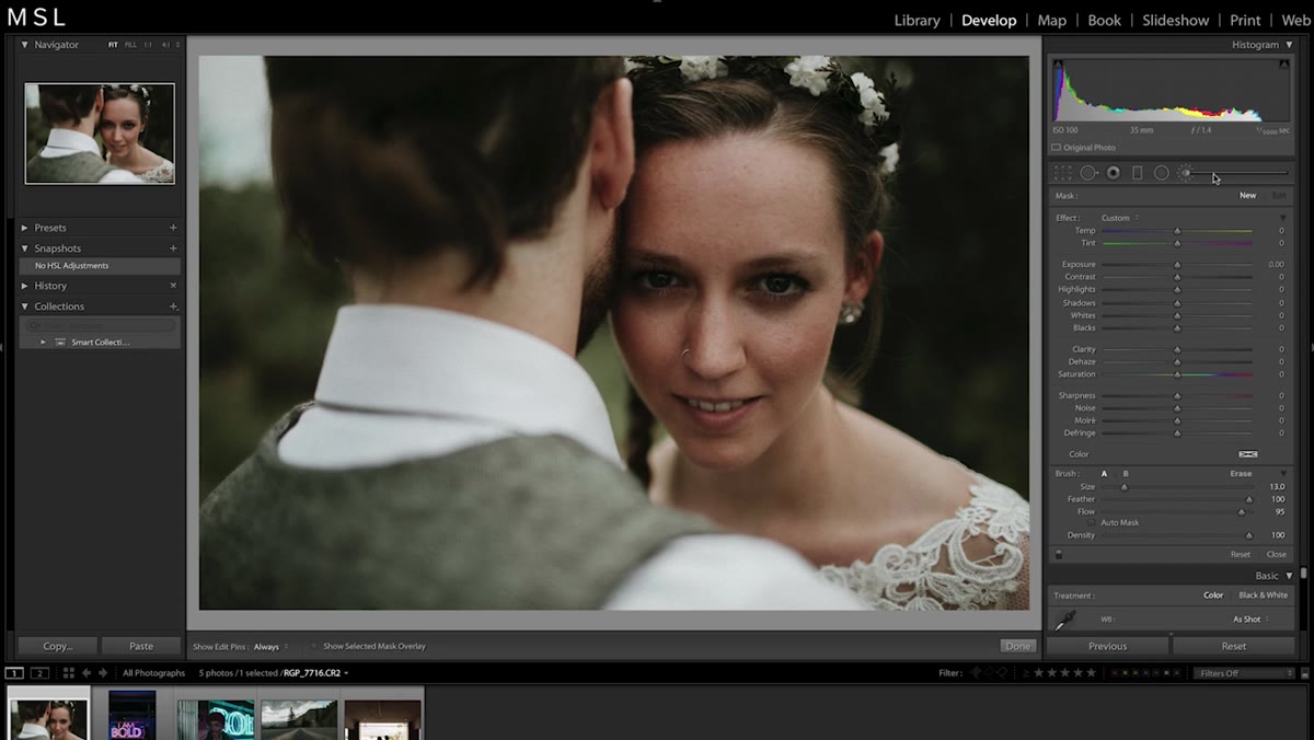 Adjustment brush active, painted over eye region with overlay visible
This is the bonus tip from the tutorial and it earns its place. Select the Adjustment Brush from the toolbar above the histogram. Before painting, set Highlights to around +30 and Shadows to a small positive value. Make sure your brush Feather is high (soft edges) and your Flow is moderate so you’re building the effect gradually. Paint over the entire eye socket region, including the under-eye area. Hit the “O” key to see a red overlay showing exactly where you’ve painted. If you’ve gone outside the lines, hold Option on Mac (Alt on PC) and paint to erase those areas. The result is a subtle brightening that looks like better light rather than a retouching job.
Adjustment brush active, painted over eye region with overlay visible
This is the bonus tip from the tutorial and it earns its place. Select the Adjustment Brush from the toolbar above the histogram. Before painting, set Highlights to around +30 and Shadows to a small positive value. Make sure your brush Feather is high (soft edges) and your Flow is moderate so you’re building the effect gradually. Paint over the entire eye socket region, including the under-eye area. Hit the “O” key to see a red overlay showing exactly where you’ve painted. If you’ve gone outside the lines, hold Option on Mac (Alt on PC) and paint to erase those areas. The result is a subtle brightening that looks like better light rather than a retouching job.
A Note on Preset Dependency
The reason these three techniques matter so much in my workflow is that I use presets constantly. I’ve built dozens of them over the years, named after songs like most of my other bad habits. But a preset is a starting point, not a finish line. HSL corrections, chromatic aberration removal, and lens profile fixes are the difference between a photo that “has a preset on it” and a photo that actually looks intentional. Presets can drift on skin tones depending on the light source, the camera body, and even how the file was exposed. Knowing how to bring a preset’s color work back into line without tearing the whole edit down is a skill that saves real time on client work.
The single most useful thing you can take from this tutorial is the target adjustment tool inside the HSL panel. It removes the guesswork from color correction and lets you work directly from the image itself instead of hunting through sliders. Once you start using it, manual slider dragging starts to feel like reading a map when you have GPS.
Watch the full tutorial on YouTube to see Mango Street walk through each of these corrections on real photos. Seeing the before and after in motion makes the subtlety of each adjustment a lot easier to calibrate when you’re working on your own.
Comments (2)
This is going in my reference folder. Incredibly useful.
This saved me so much time on my last edit. Wish I'd found this sooner.
Leave a Comment