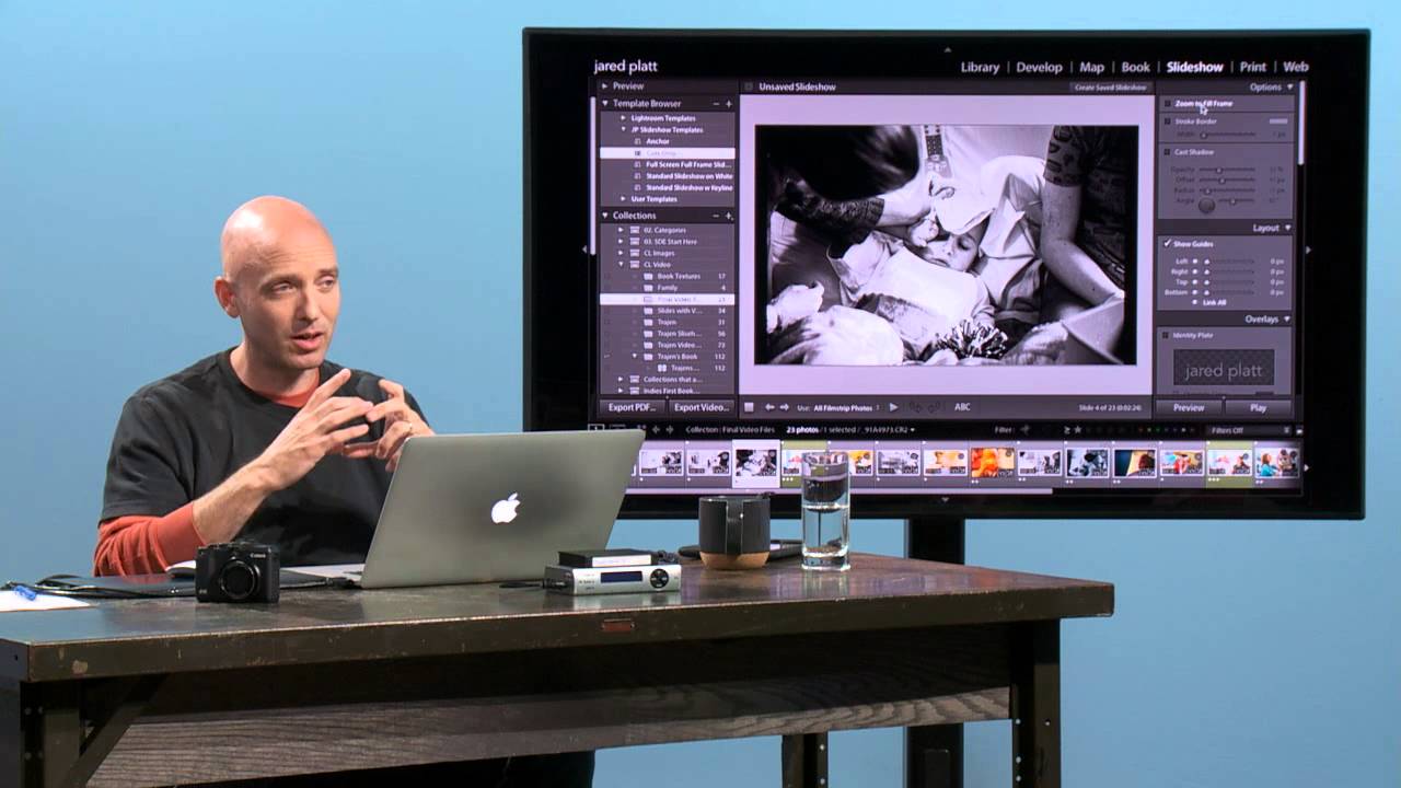
There’s a specific kind of frustration that comes from having great footage and great photos but no clean way to combine them. For a long time, my answer was to drag everything into a timeline editor and spend three hours doing something that should have taken thirty minutes. What I didn’t fully appreciate was that Lightroom’s Slideshow module can do this job surprisingly well, especially when you want a clean cuts-only sequence that feels more like a short film than a wedding photo gallery. Watch the full tutorial on YouTube
In this CreativeLive tutorial, the instructor walks through exactly how to build that kind of sequence inside Lightroom, using a mix of video clips and interspersed still photos. The technique is more intentional than most people realize. Dropping a photo between two video clips isn’t a workaround, it’s actually a legitimate editorial tool for smoothing over jump cuts and giving your audience a visual breath between scenes. I’ve started using this approach for client delivery packages where they want a short highlight reel but don’t need a fully produced video.
The whole thing is more approachable than it sounds, and once you build a saved template for it, the next project takes about a quarter of the time. Here’s how it works.
Step 1: Collect Your Files in the Library Module
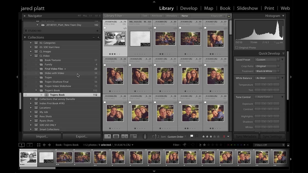 Library panel open with video files and photos visible
Start in the Library module with your video clips and photos organized into a single collection or folder. The tutorial uses a folder called “Final Video Files” that mixes video clips with a handful of still photographs. The key here isn’t just dumping everything in together, it’s being intentional about which stills you’re including and why. Each photograph in the sequence should serve a purpose, whether that’s bridging two clips that don’t cut cleanly together or giving the viewer a moment to land before the next scene.
If you’re pulling from a shoot with both a camera and a phone, get everything into one place in Lightroom before you move forward. Trying to manage files from multiple sources mid-workflow is where things get messy fast.
Step 2: Switch to the Slideshow Module and Select Your Sequence
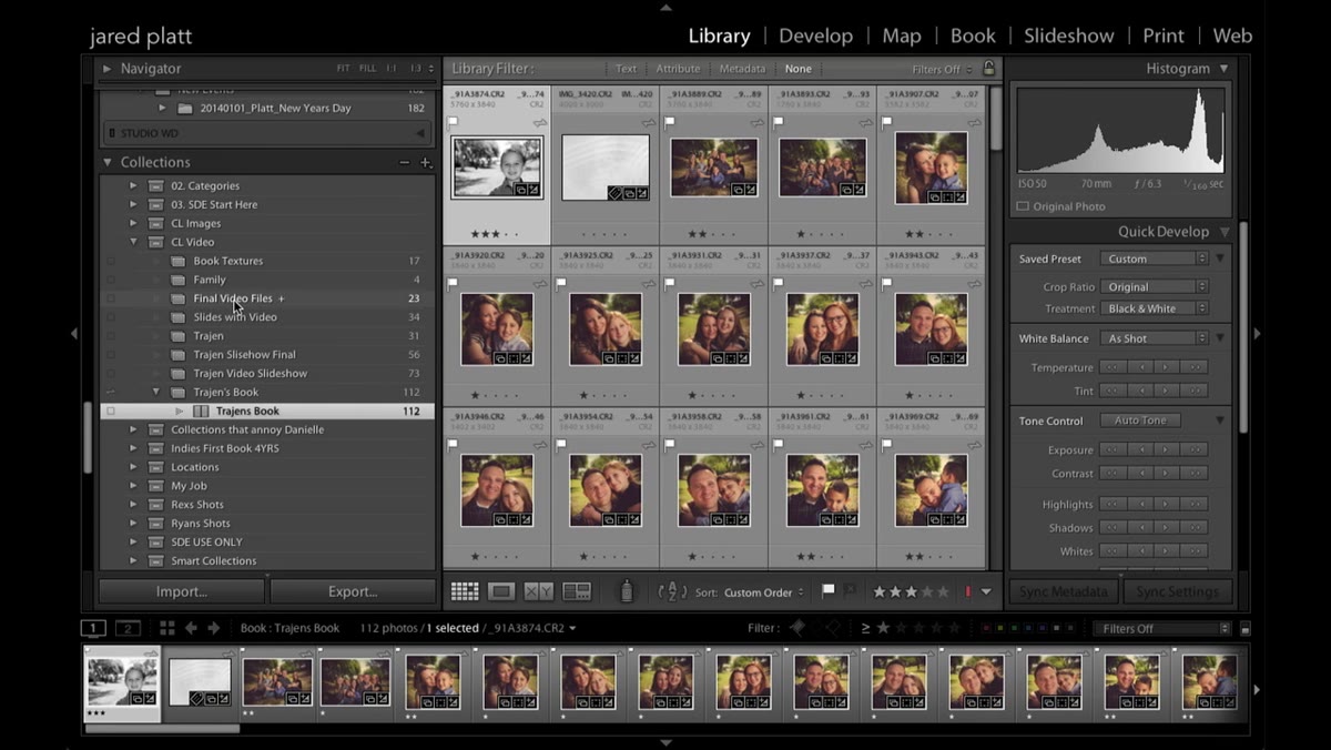 Slideshow module selected in Lightroom’s top navigation
Once your files are organized, navigate to the Slideshow module from the top menu. Lightroom will work from whatever collection or folder you have selected in the Library, so make sure you’ve got the right set of files active before you make the switch. The order of your images and clips in the filmstrip matters here because the slideshow will play them in that sequence.
This is also a good moment to think about pacing. A short video clip followed by a still photo followed by another clip creates a rhythm that feels deliberate rather than accidental. If you’re building something for a client, that rhythm is what separates a polished deliverable from a rough cut.
Step 3: Set Up a “Cuts Only” Template
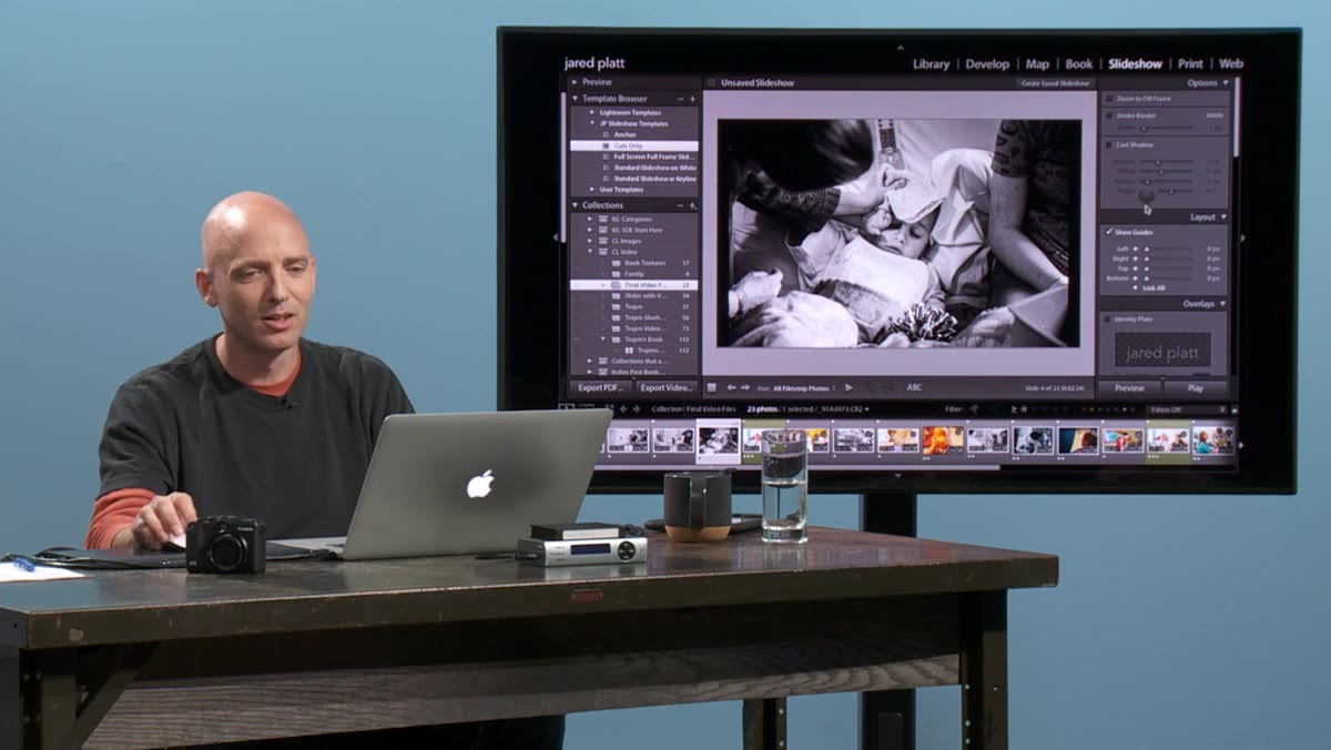 Template browser showing custom “Cuts Only” template selected
The instructor mentions creating a saved template called “Cuts Only” specifically for this kind of sequence. The idea is to strip away everything that makes a slideshow feel like a slideshow: no music, no crossfades, no Ken Burns pans. Just clean cuts from one clip or image to the next, the way an actual edited video would behave.
You can build this template once and save it for future projects. Inside the template settings, turn off any transition effects and leave the audio section empty. The goal is a sequence that plays straight through with no visual decoration getting in the way. Save it with a name you’ll actually recognize later, because nothing wastes time like hunting through a template list.
Step 4: Use “Zoom to Fill Frame” for Your Still Photos
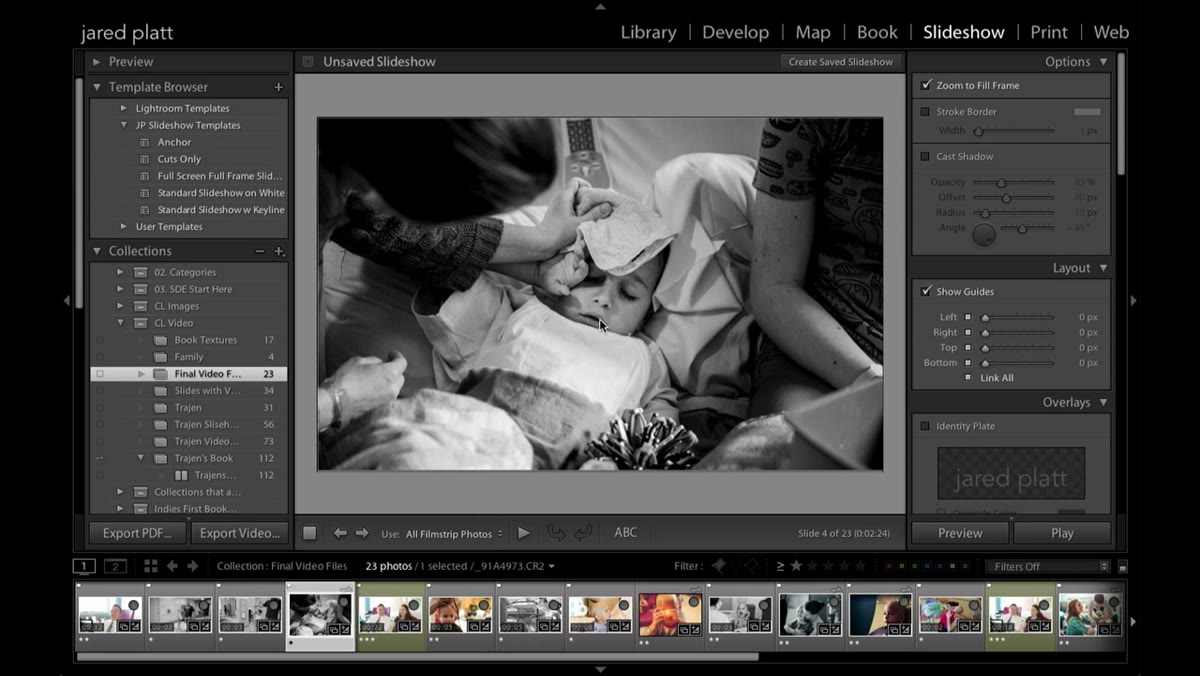 Photo filling the 16x9 frame after Zoom to Fill is applied
This is the step most people skip, and it’s the one that makes the biggest difference. When you mix still photos into a video sequence, Lightroom will display them at their native aspect ratio by default. A standard 4x6 photo sitting inside a 16x9 video frame will have black bars on the left and right sides. That immediately signals to the viewer that they’re looking at a slideshow insert, not a film frame.
The fix is straightforward. In the Slideshow module’s layout options, enable “Zoom to Fill Frame.” This crops the photo to fill the 16x9 frame, and suddenly that still image reads like a frame from the video itself rather than a photograph that wandered in from a different project. You can also do this upstream by cropping your photos to a 16x9 ratio in the Develop module before you get to the Slideshow step, which gives you more control over exactly what part of the image stays in frame.
Step 5: Create Title Cards Using the Print Module
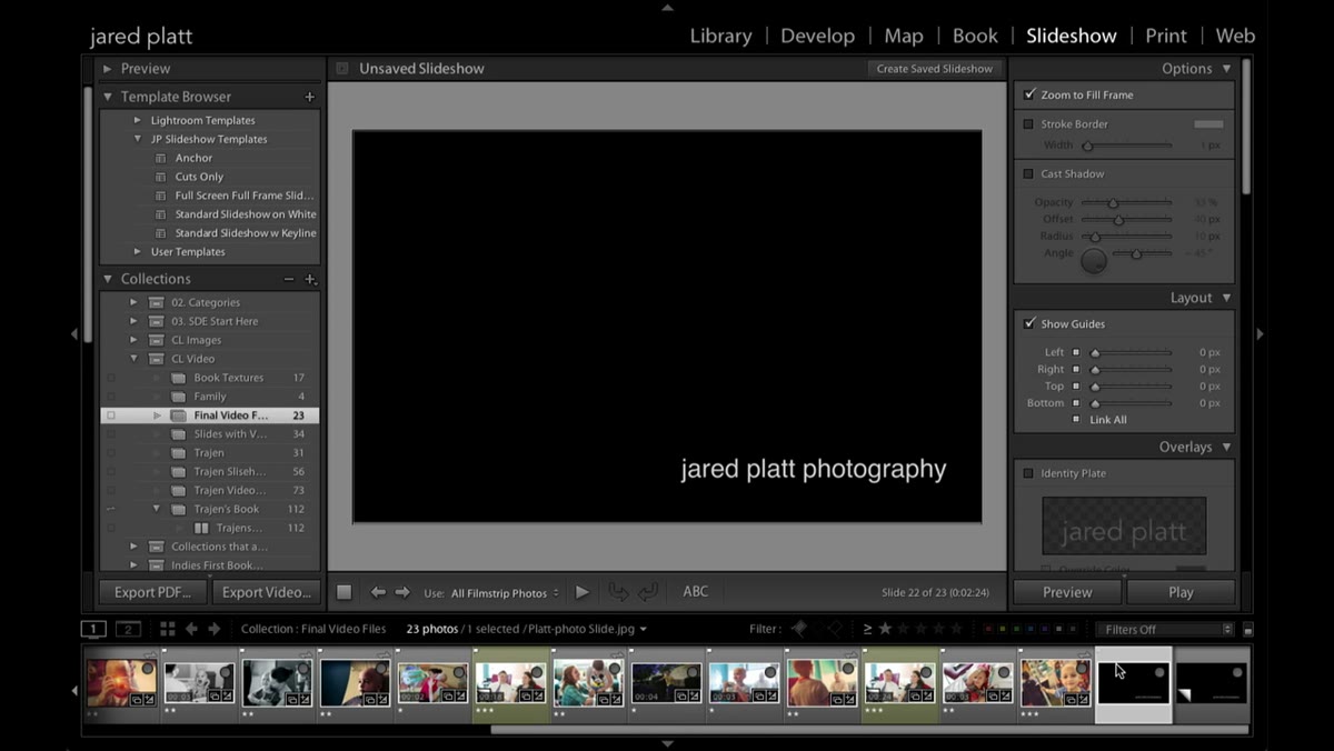 Black title card with text created from the Print module
Here’s something genuinely clever from this tutorial that I hadn’t tried before. If you need a title card, an intro frame, or any kind of text overlay, you don’t need Photoshop. Build it inside Lightroom’s Print module instead. Create a new layout, set the background to black, add your text using the Print module’s text tools, and then export it as a JPEG. Import that JPEG back into Lightroom and drop it into your sequence like any other still photo.
It’s a closed-loop workflow that keeps everything inside one application. For simple title sequences, this is genuinely good enough, and it saves the back-and-forth of opening a second app just to type some white text on a black background.
What I’d Add: Sequence Order Is a Creative Decision, Not an Afterthought
The tutorial focuses on the technical mechanics, which it does well. But the part that took me longer to internalize is that where you place your still photos in the sequence is an editorial choice with real consequences for the viewer’s experience. A photo dropped right before an emotionally significant video clip creates anticipation. The same photo placed after the clip functions more like a punctuation mark.
I’ve started treating the stills in these hybrid sequences the way a film editor treats a cutaway shot, not as filler, but as a deliberate tool for controlling pace and emphasis. If you’re building these for clients, it’s worth having a conversation about that upfront rather than making those choices invisibly.
The single most important thing this tutorial taught me is that aspect ratio mismatch is the detail that most obviously exposes the seams in a mixed photo-video sequence. Fix that first, with either the “Zoom to Fill Frame” setting or pre-cropping your stills to 16x9, and the rest of the sequence will immediately feel more cohesive.
Watch the full tutorial on YouTube to see the complete walkthrough, including how the instructor handles audio settings when video clips are mixed with music in a more complex sequence.
Comments
Leave a Comment