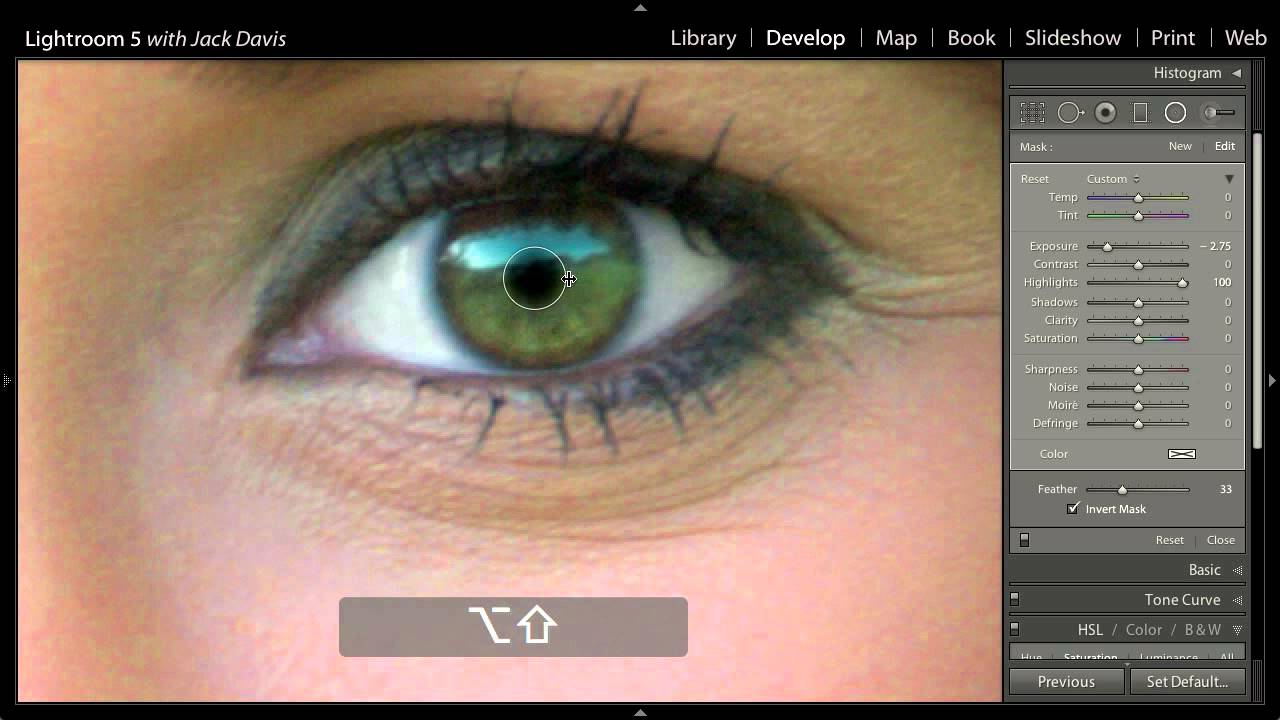
Portrait retouching has a reputation for being either too subtle to matter or so heavy-handed it looks like a video game cutscene. Eye work lives right in that danger zone. I’ve been editing press shots and portrait commissions in Lightroom long enough to know that most people either skip eye enhancement entirely or blow it out with a slider they didn’t fully understand. Both outcomes are a waste of a good image. When I came across this CreativeLive tutorial on changing eye color in Lightroom 5 — Watch the full tutorial on YouTube — it laid out a workflow I now use on almost every portrait session I deliver.
What makes this particular technique worth writing about is that it solves two separate problems at once: changing the perceived color of the iris, and enhancing the depth of the pupil to give eyes that quality photographers sometimes call “open.” These are usually treated as two different editing tasks. The approach in this tutorial folds them into one efficient, non-destructive workflow using tools that are already sitting in your Lightroom local adjustments panel.
The technique works on eyes, but the underlying logic applies to any product or object where you need to shift hue without rebuilding the color from scratch. Sneakers, car paint, product labels. Keep that in mind as you work through this.
Step 1: Desaturate to Remove the Existing Color
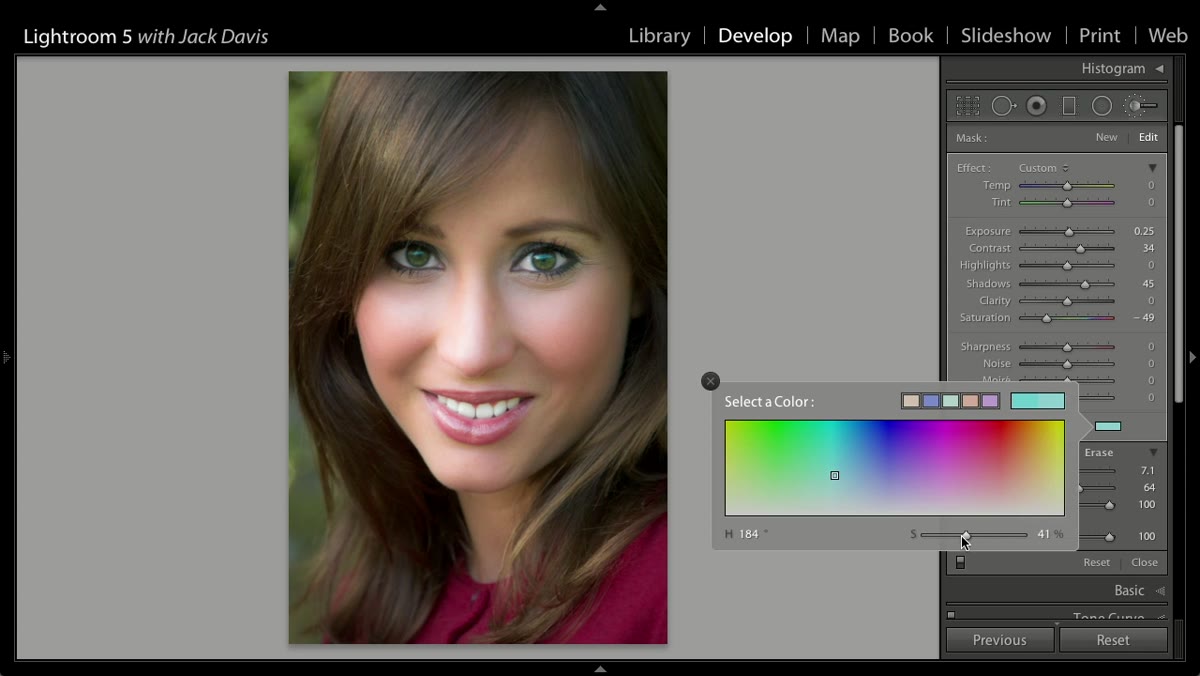 Saturation slider being pulled down inside a local adjustment
The first move is counterintuitive but important. Before you can push a new color into the iris, you need to strip out what’s already there. Inside your local adjustment (brush or radial filter over the eye), pull the Saturation slider down toward zero. You’re not going for a completely gray look necessarily, but you want enough of the original color removed that the tint you add in the next step reads cleanly. Think of it as priming a wall before you paint. Skipping this step is why so many eye color changes look muddy or fake.
Saturation slider being pulled down inside a local adjustment
The first move is counterintuitive but important. Before you can push a new color into the iris, you need to strip out what’s already there. Inside your local adjustment (brush or radial filter over the eye), pull the Saturation slider down toward zero. You’re not going for a completely gray look necessarily, but you want enough of the original color removed that the tint you add in the next step reads cleanly. Think of it as priming a wall before you paint. Skipping this step is why so many eye color changes look muddy or fake.
Step 2: Apply the Tint to Set Your New Color
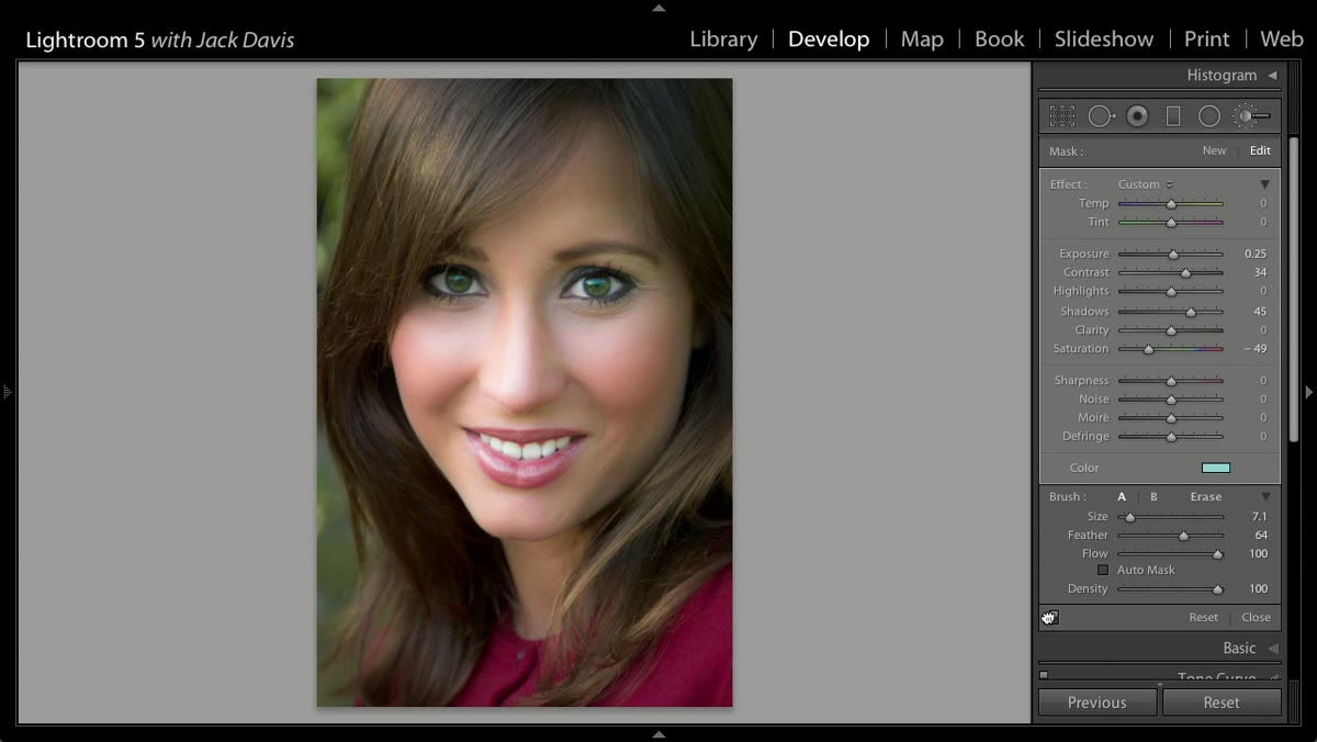 Tint slider being adjusted inside the local adjustment panel
With the saturation reduced, the Tint slider inside that same local adjustment becomes your color source. Drag it toward the hue you want to introduce. Because you’ve already cleared most of the competing color out, the tint lands cleanly and reads as a genuine color shift rather than a color cast on top of an existing one. The degree of the shift is a creative call, but the instructor makes a good point here: more is not better. A subtle push that reads as “that person has unusually vivid eyes” is the goal. A push that reads as “that person is wearing costume contacts” is where things go wrong.
Tint slider being adjusted inside the local adjustment panel
With the saturation reduced, the Tint slider inside that same local adjustment becomes your color source. Drag it toward the hue you want to introduce. Because you’ve already cleared most of the competing color out, the tint lands cleanly and reads as a genuine color shift rather than a color cast on top of an existing one. The degree of the shift is a creative call, but the instructor makes a good point here: more is not better. A subtle push that reads as “that person has unusually vivid eyes” is the goal. A push that reads as “that person is wearing costume contacts” is where things go wrong.
Step 3: Choose the Radial Filter Over the Brush for the Pupil Work
 Radial Filter tool selected in the local adjustments toolbar
Here’s where the tutorial shifts from color to depth, and where the tool choice actually matters. The adjustment brush seems like the obvious pick for painting over a pupil, but there’s a real limitation: if you paint at the wrong hardness and want to change it later, you have to repaint the whole thing. The Radial Filter gives you a circle you can resize, reposition, and re-feather at any point after you’ve placed it. For a subject with wide-open eyes, the radial circle maps closely enough to the iris shape to work well. For squinting or partially closed eyes, you may need to fall back on the brush, but try the radial first.
Radial Filter tool selected in the local adjustments toolbar
Here’s where the tutorial shifts from color to depth, and where the tool choice actually matters. The adjustment brush seems like the obvious pick for painting over a pupil, but there’s a real limitation: if you paint at the wrong hardness and want to change it later, you have to repaint the whole thing. The Radial Filter gives you a circle you can resize, reposition, and re-feather at any point after you’ve placed it. For a subject with wide-open eyes, the radial circle maps closely enough to the iris shape to work well. For squinting or partially closed eyes, you may need to fall back on the brush, but try the radial first.
Step 4: Invert the Mask and Darken the Midtones
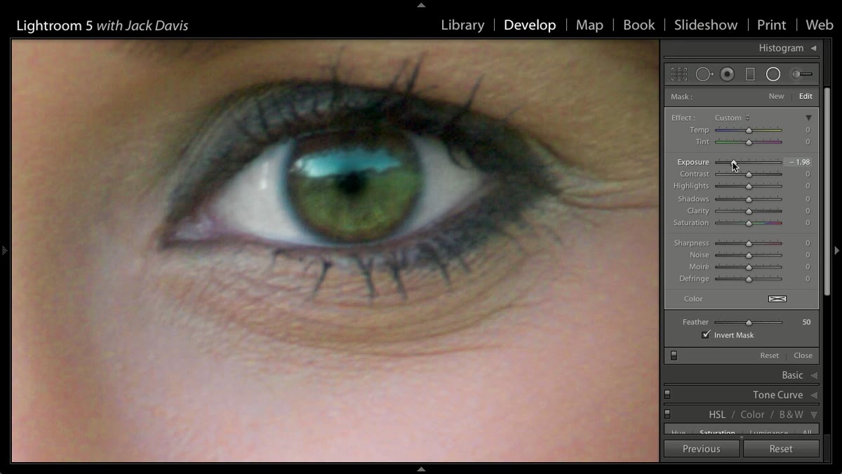 Exposure slider being pulled down with mask inverted on the pupil
By default, the Radial Filter applies its effect to the area outside the circle, like a vignette tool. You need to invert that so the effect hits the inside of the circle instead. Once inverted, pull the Exposure down to darken the pupil area. The key distinction here, and something I’ve seen people miss, is that you’re targeting midtone values rather than crushing everything to black. Pupils in real photographs carry ambient light and surface reflection. A pure black circle reads as a cartoon, not a photograph. Bring the exposure down far enough to suggest depth, then stop before it looks artificial.
Exposure slider being pulled down with mask inverted on the pupil
By default, the Radial Filter applies its effect to the area outside the circle, like a vignette tool. You need to invert that so the effect hits the inside of the circle instead. Once inverted, pull the Exposure down to darken the pupil area. The key distinction here, and something I’ve seen people miss, is that you’re targeting midtone values rather than crushing everything to black. Pupils in real photographs carry ambient light and surface reflection. A pure black circle reads as a cartoon, not a photograph. Bring the exposure down far enough to suggest depth, then stop before it looks artificial.
Step 5: Control the Edge with Feathering and Clarity
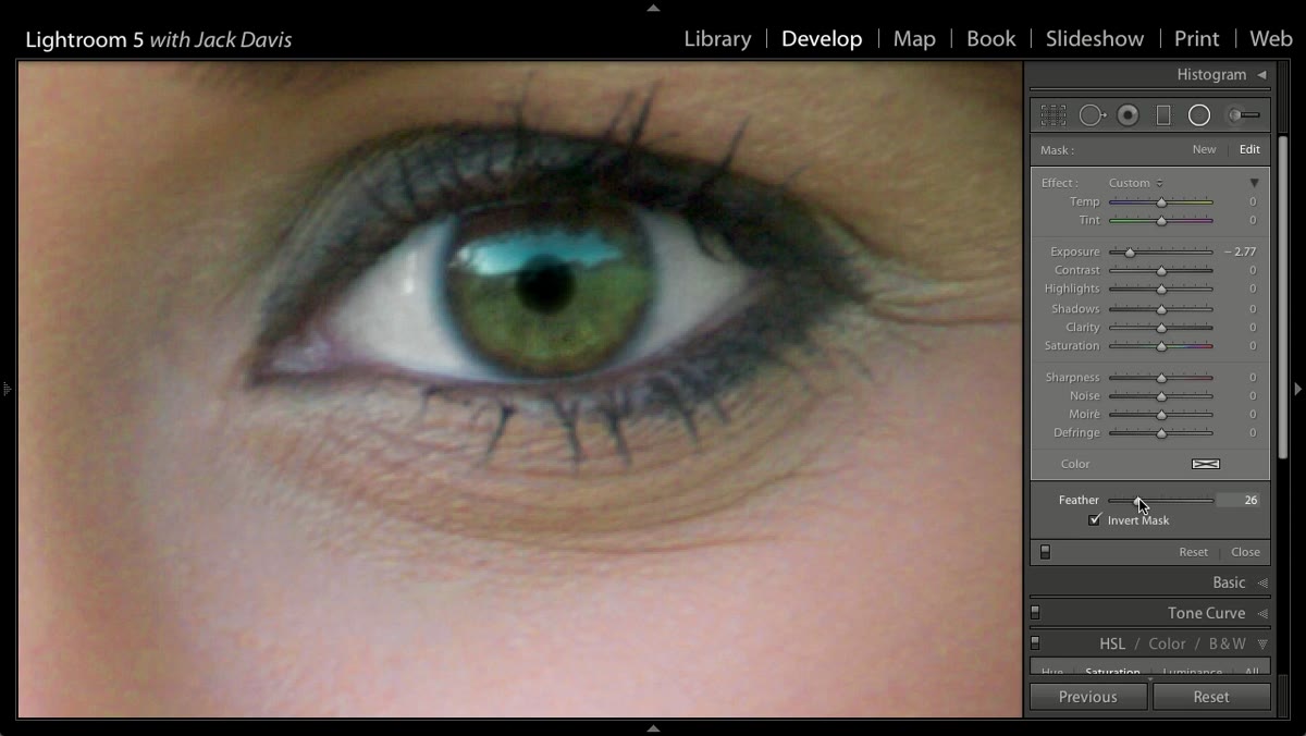 Feather slider and Clarity slider being adjusted on the radial filter
Reduce the Feather slider to tighten the edge of your radial circle so it follows the iris boundary more precisely. Then add Clarity to increase local contrast at that edge. What this does is make the transition between the iris and the pupil visually sharper, which reads as better-defined eye structure. You want to be able to see what the instructor calls the “horizon line” inside the eye, the subtle ring where the iris meets the darkened pupil. Don’t overdo the Clarity here. A little goes a long way, and too much creates an uncanny texture that looks like it came from an over-sharpened HDR landscape, not a portrait.
Feather slider and Clarity slider being adjusted on the radial filter
Reduce the Feather slider to tighten the edge of your radial circle so it follows the iris boundary more precisely. Then add Clarity to increase local contrast at that edge. What this does is make the transition between the iris and the pupil visually sharper, which reads as better-defined eye structure. You want to be able to see what the instructor calls the “horizon line” inside the eye, the subtle ring where the iris meets the darkened pupil. Don’t overdo the Clarity here. A little goes a long way, and too much creates an uncanny texture that looks like it came from an over-sharpened HDR landscape, not a portrait.
Step 6: Preserve the Specular Highlight
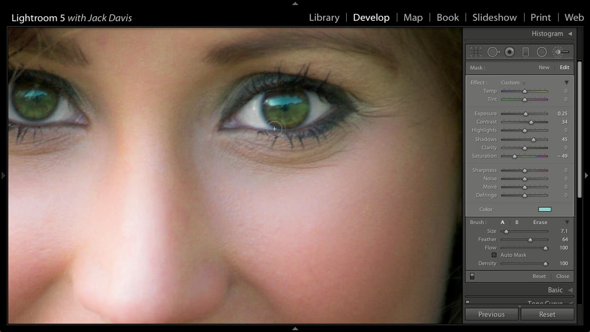
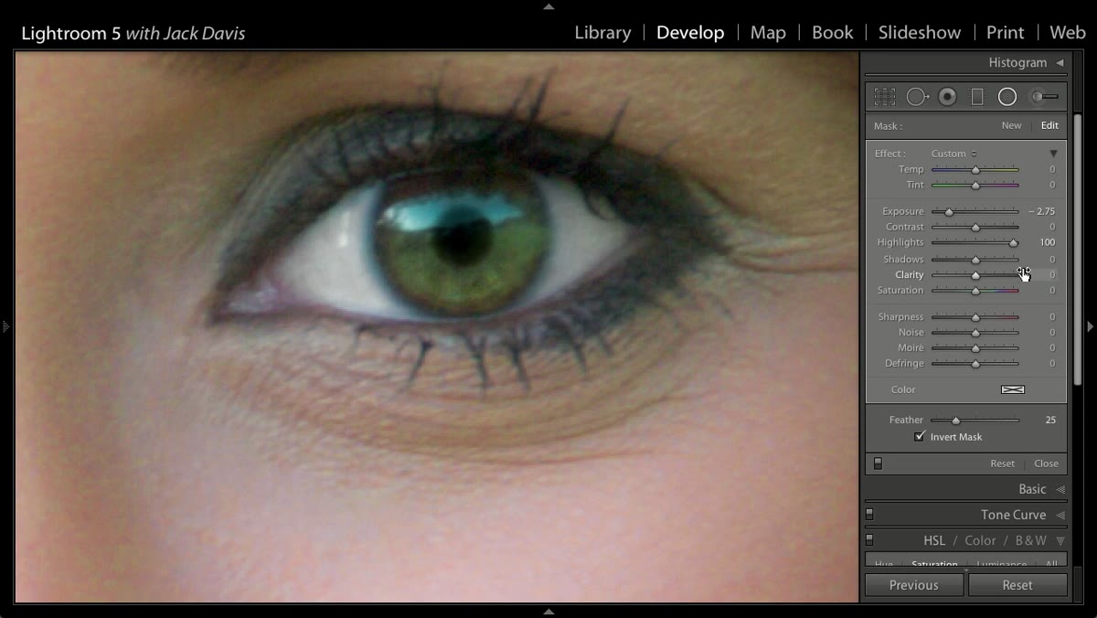 Specular highlight remaining visible inside the darkened pupil area
This is the step most tutorials skip entirely, and it’s probably the most important one for realism. Eyes catch light. There’s almost always a small specular highlight sitting on the surface of the eye, a bright pinpoint or soft shape from the light source. When you darken the pupil area, you need to make sure that highlight survives. The Radial Filter’s ability to handle highlights separately from midtones is what makes this possible. If the highlight disappears into your darkening adjustment, the eye immediately looks flat and dead. Keep checking it as you adjust.
Specular highlight remaining visible inside the darkened pupil area
This is the step most tutorials skip entirely, and it’s probably the most important one for realism. Eyes catch light. There’s almost always a small specular highlight sitting on the surface of the eye, a bright pinpoint or soft shape from the light source. When you darken the pupil area, you need to make sure that highlight survives. The Radial Filter’s ability to handle highlights separately from midtones is what makes this possible. If the highlight disappears into your darkening adjustment, the eye immediately looks flat and dead. Keep checking it as you adjust.
Step 7: Duplicate the Pin to Match the Second Eye
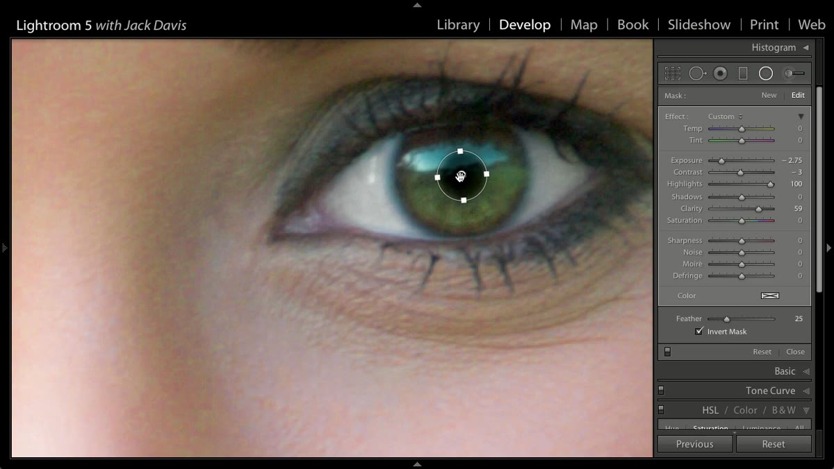 Duplicate pin being dragged to the second eye with settings intact
This is one of my favorite Lightroom 5 additions and it saves a real amount of time. Once your radial filter is dialed in on the first eye, hold Option and Command (Mac) or Control and Alt (PC) and drag the pin to duplicate it. All of your settings - the exposure, feather, clarity, everything - come along for the ride. Drop the duplicate over the second eye, reposition it to center on that iris, and make any minor adjustments needed. The eyes may not be at identical angles or identical distances from camera, so don’t assume the settings will be perfect. But they’ll be close, and close is a much better starting point than zero.
Duplicate pin being dragged to the second eye with settings intact
This is one of my favorite Lightroom 5 additions and it saves a real amount of time. Once your radial filter is dialed in on the first eye, hold Option and Command (Mac) or Control and Alt (PC) and drag the pin to duplicate it. All of your settings - the exposure, feather, clarity, everything - come along for the ride. Drop the duplicate over the second eye, reposition it to center on that iris, and make any minor adjustments needed. The eyes may not be at identical angles or identical distances from camera, so don’t assume the settings will be perfect. But they’ll be close, and close is a much better starting point than zero.
One Thing I’d Add From My Own Experience
The duplicate pin trick is brilliant, but here’s something I’ve learned the hard way: human eyes are almost never perfectly symmetrical, and that asymmetry is often part of what makes a face interesting. When I apply this technique, I check both eyes at 1:1 zoom against each other before I export. The pupil size in particular needs to match between eyes. Even a small mismatch reads as unsettling to viewers who can’t articulate why. A quick side-by-side comparison in the Navigator panel before you deliver the image is worth the thirty seconds it takes.
The single most important takeaway from this tutorial is the desaturate-then-tint approach. It’s the difference between a color shift that looks like a retouching decision and one that looks like a software error. Strip the existing color first, then introduce the new one. That logic holds whether you’re working on eyes, apparel, or product photography.
Watch the full tutorial on YouTube to see the instructor walk through both the eye color change and the pupil deepening technique on an actual image. Watching the feather and clarity adjustments happen in real time adds context that’s hard to fully capture in text.
Comments (2)
Quality content like this is rare. Keep it up.
This is the kind of content that keeps me coming back.
Leave a Comment