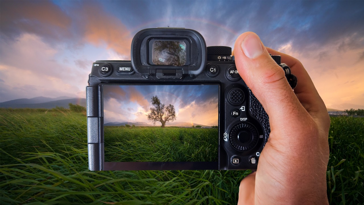
Lately I’ve been sitting with a problem that I think a lot of landscape shooters hit: you get up before dawn, drive somewhere cold, and actually catch something special. The light is soft, there’s a rainbow, the whole scene looks like a screensaver. Then you open the RAW file and it looks like a muddy gray nothing. You start pulling sliders and suddenly your sky is nuclear orange and your shadows are crushed to oblivion. The shot survives, technically, but the feeling doesn’t.
That gap, between what the camera recorded and what you actually saw, is where most edits fall apart. I’ve been refining my approach to bridging it, and watching this William Patino tutorial on editing a sunrise rainbow scene crystallized a few things I was doing half-right and a couple I was doing completely wrong.
Why RAW Files Look Wrong Before They Look Right
William opens by acknowledging something a lot of tutorials skip: the RAW file out of camera is supposed to look flat. That’s not a failure, that’s the point. The camera isn’t applying the same JPEG rendering that makes in-camera previews look punchy. You’re looking at the raw sensor data, which is linear and wide, and it needs your interpretation to become a photograph.
The mistake most people make here is panic-dragging the exposure and contrast sliders up immediately. William’s approach is to resist that and first understand what the file actually contains. A sunrise RAW file captured in good light will have luminance information in the highlights that you cannot recover once you blow them out chasing vibrancy in the first thirty seconds of your edit.
The Tone Foundation: Work Top to Bottom and Slow Down
William’s tonal workflow follows a disciplined top-to-bottom logic inside the Basic panel. He brings the highlights down significantly, often pushing them toward -70 or lower, to pull back that sky detail before touching anything else. Shadows come up, usually somewhere in the +40 to +60 range, to open up the foreground without creating that artificial HDR look that plagues a lot of landscape edits.
Whites and blacks are set conservatively. He’s not trying to stretch the histogram to the edges at this stage. The goal is a balanced, full-range image that still has room to breathe. Clarity stays low or at zero early in the process, because adding texture before you’ve sorted your tones just exaggerates problems.
What I noticed is that William spends real time here before moving to color. That patience matters more than any specific slider value.
Color Grading the Sunrise Without Overworking It
Once the tones are stable, William moves into the HSL panel to work the colors selectively. This is where a lot of the magic happens with a rainbow scene, because you’re dealing with distinct color bands that need to stay separated and readable without going cartoonish.
He targets the oranges and yellows specifically for the warm sunrise tones, adjusting hue slightly to push them toward a richer, more golden feel rather than a flat amber. Saturation on those channels gets a modest boost, not a big one. The discipline here is that he’s always checking the actual image, not the slider position. He’s asking whether the color looks like a sunrise or like a stock photo of a sunrise.
For the rainbow itself, the approach is restraint. Rainbows in photographs already look unreal. Your job isn’t to intensify them, it’s to make sure they hold their natural gradation. He uses luminance adjustments to keep the rainbow visible without making it glow like neon.
Selective Masking to Ground the Tree and Foreground
One of the more practical moves in the tutorial is how William handles the lone tree in the foreground. It’s a silhouette against a bright sky, and without some local adjustment work, it reads as a flat cutout with no dimension.
He creates a radial or brush mask around the tree and foreground to lift the shadows locally, giving the tree some separation and depth without affecting the sky exposure. It’s a targeted adjustment, probably around +25 to +35 on shadows within the mask, with some texture added to bring out bark detail if any is visible. The result is that the tree becomes an anchor point rather than a hole in the image.
This technique works for any foreground element that competes with a bright sky. I use a version of it regularly on Nashville skyline shots where the buildings silhouette hard against an evening gradient.
Where I’d Push This Further
William’s approach is refined and controlled, which is exactly right for preserving the feeling of a real sunrise. My one extension would be to revisit the color grading step using the Color Grading panel rather than stopping at HSL alone. Specifically, I’ll often add a subtle cool shift to the shadows, somewhere in the blue-teal range, to create a temperature contrast between the warm sky and the ground. It makes the warmth in the highlights read as warmer by comparison, without touching the highlights at all.
This can go wrong fast. Push the shadow color too far and it looks like a bad split-tone preset from 2013. But used with a light hand, maybe 10 to 15 on the hue wheel with low saturation, it adds a dimension that pure HSL work doesn’t fully get to.
I name most of my presets after songs and I’ve got one built around this shadow-cool technique called “Emmylou,” because it adds something warm and old to images that might otherwise feel clinical. That’s the kind of thing you find through experimentation after you’ve got the fundamentals locked, which is what watching something like William’s tutorial is good for.
The single most important thing to take from this workflow is that tonal discipline before color grading is not optional. You cannot fix disordered tones with color, but solid tones make color grading almost easy.
Watch the full tutorial to see William work through the actual file in real time. Watching him make decisions on a real image teaches things that written instructions can’t fully carry.
Comments
Leave a Comment