I keep a folder on my desktop called “Saved From Disaster.” It’s where I dump the RAW files that looked hopeless at import and somehow came back to life in post. Most of them are golden hour or sunrise shots where I either clipped the highlights chasing exposure, or crushed the shadows so hard the whole image went muddy. Sunrise light is fast, it’s uneven, and it rewards you with the kind of color that looks fake even when it’s real. Editing it well means working with what the scene actually captured, not against it.
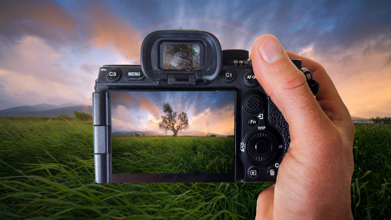
That’s what pulled me into this William Patino tutorial on editing a sunrise rainbow shot. The scenario he’s working with is genuinely difficult: a single tree, a full rainbow arc, and that transitional light that’s half magic and half technical nightmare. His approach to handling the RAW file gave me a sharper framework for a problem I hit constantly.
Why RAW Files Look Terrible at First and That’s the Point
The first thing Patino addresses is the gap between what your camera screen showed you and what lands in Lightroom. A sunrise RAW file at import looks flat, dull, and sometimes a little green. That’s not a failure. That’s the format doing its job, holding all the latitude you need to recover light in both directions.
His starting move is resisting the urge to fix everything immediately with Exposure. Instead, he goes to the Whites and Highlights sliders first, pulling them back to recover the blown areas in the sky. The rainbow and the gradient behind it are where all the visual interest lives, and if you lose that tonal range in the sky, no amount of Vibrance or HSL work will save it. Pull Highlights down before you touch anything else. Then assess.
Building the Foundation: Tone Curve and Basic Panel Order
After recovering the sky, Patino establishes his base exposure with a conservative Exposure lift and a Shadows boost to bring up the foreground without flattening the overall contrast. The order matters here. He’s working top-down through the Basic panel but not treating the sliders as a checklist. He’s building a relationship between the sky and the ground, keeping the tree readable without making it compete with the rainbow.
The Tone Curve is where he does the heavier lifting on contrast. Rather than hammering the Contrast slider in the Basic panel (which applies a fixed S-curve that often feels blunt on scenes with complex light), he shapes his own curve with a gentle lift in the shadows, a slight pull-down in the highlights, and keeps the midtones relatively untouched. This gives the image depth without the crushed, over-processed look that kills sunrise shots.
This is also where working in RAW pays off most visibly. You have enough information in the file to move these points without banding or noise pulling you backward.
Color Grading the Rainbow Without Oversaturating Everything Around It
The HSL panel is where this tutorial gets specific in a way I found genuinely useful. A rainbow sits across multiple hue ranges simultaneously, which means a blanket Saturation or Vibrance boost will amplify the whole image and make the scene look like a fever dream.
Patino works through the HSL Saturation and Luminance tabs color by color, targeting the oranges and yellows in the sunrise sky separately from the blues and purples that anchor the deeper parts of the gradient. He lifts the orange saturation to punch up the warmth without touching the red, which keeps skin tones and earthy tones from going overcooked. The luminance adjustments are subtle but important: he brings the blue luminance down slightly to keep the sky from going too light and washing out the rainbow’s arc against it.
For color grading, he uses the Color Grading panel (the three-wheel layout) to add a warm push into the shadows and a cooler, slightly more neutral tone into the highlights. This separation keeps the image from reading as monochromatic warm, which is the trap most sunrise edits fall into.
Where I’d Push This Technique Further
My one genuine extension to what Patino demonstrates: masking. In my own sunrise edits, I’ll often run his entire approach on the global adjustments, then create a Luminance Mask targeting just the sky to make a second, more targeted pass on the color grading wheels. The sky and the foreground have different color temperature needs after the sun has just cleared the horizon, and trying to balance both in global adjustments is always a compromise.
If you use a Radial or Linear Gradient mask to isolate the sky and then apply a separate Color Grading curve to that region, you get much finer control over where the warmth lives and where it fades out. It adds maybe five minutes to the edit and saves the kind of back-and-forth where you fix the sky and break the ground, fix the ground and break the sky.
This technique also has a limit worth naming: it works best when your foreground has some natural separation from the sky in terms of tone or color. In Patino’s image, the tree is a dark silhouette against a bright sky, so the contrast already does a lot of work. If your foreground and sky are similar in luminosity, you’ll need to lean on masking from the start rather than treating it as a refinement step.
The Discipline of Not Overdoing It
The single most useful takeaway from this tutorial is restraint applied in the right sequence. Recover before you build. Shape the tone curve before you touch color. Address hues individually before you reach for global Vibrance. Every slider move should be solving a specific problem, not just making things brighter or more saturated because the image looks dull at import.
Watch the full video to see Patino work through these decisions in real time on the actual RAW file. Reading about slider values is useful, but watching someone make judgment calls on a live edit is how the logic actually clicks: Sunrise, Rainbows And How To Edit RAW Files by William Patino.
Comments
Leave a Comment