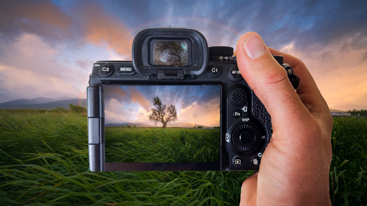
There’s a specific kind of heartbreak that landscape photographers know too well. You wake up before dawn, drive somewhere cold and beautiful, and something genuinely magical happens in front of your lens. You drive home buzzing. You pull up the RAW files. And then, nothing. Flat skies. Muddy colors. A scene that looks like a slightly overcast Tuesday instead of the light show you just witnessed with your own eyes. I’ve been editing photos long enough to know this isn’t a skill problem. It’s just what RAW files do, especially with soft, atmospheric light like rainbows and golden hour glow. The camera captures data, not feelings.
In this William Patino tutorial, he chases an actual rainbow over a lone tree in a wide open field, shooting with a 10mm lens into incoming weather. Then he sits down at Lightroom and shows exactly how he bridges the gap between what the sensor recorded and what he actually experienced standing in that field. The whole edit is built around one principle: you’re not fabricating anything. You’re recovering what was genuinely there. That framing matters, because it changes how you approach every slider. Watch the full tutorial on YouTube
The field work in this video is short but instructive. Patino shoots at 1/160 to 1/200 of a second to freeze wind-blown grass, gets low to build foreground depth, and keeps the rainbow from clipping the top of the lone tree by adjusting his position rather than his framing. Smart decisions in-camera mean less heavy lifting in post. Then the real lesson begins.
Step 1: See the RAW for What It Is, Not What You Remember
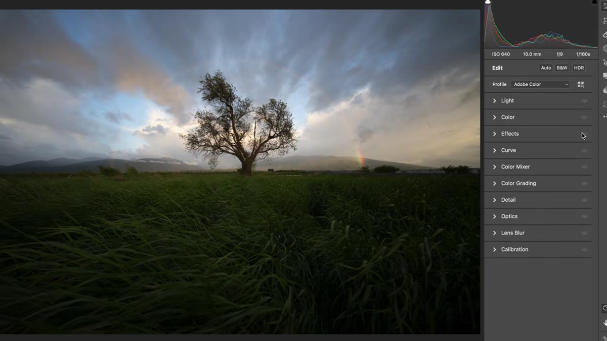 Raw unedited file open in Lightroom before any adjustments
Before touching a single slider, Patino resets the image to show the true unprocessed RAW. It looks flat, cool, and almost colorless compared to both his memory of the scene and the phone video he shot as a reference. This step is less about technique and more about mindset: your job in post is to work with what the sensor gave you, not fight it. Get in the habit of resetting and looking at your baseline before you do anything. It tells you what you actually have to work with, and it stops you from chasing a mental image that the file can never become.
Raw unedited file open in Lightroom before any adjustments
Before touching a single slider, Patino resets the image to show the true unprocessed RAW. It looks flat, cool, and almost colorless compared to both his memory of the scene and the phone video he shot as a reference. This step is less about technique and more about mindset: your job in post is to work with what the sensor gave you, not fight it. Get in the habit of resetting and looking at your baseline before you do anything. It tells you what you actually have to work with, and it stops you from chasing a mental image that the file can never become.
Step 2: Establish Your Crop and Composition First
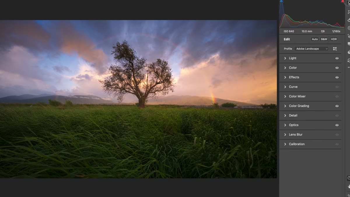 Cropped 16x9 version of the rainbow image in Lightroom
Patino crops to a 16x9 ratio before doing any tone or color work. This is a habit worth stealing. Composition decisions affect how you judge exposure and color across the frame, so committing to your crop early means you’re not making tonal decisions based on parts of the image that won’t make the final cut. If you’re shooting for social or video-adjacent formats, that 16x9 crop also immediately reframes how the image sits, often strengthening the horizon line and giving the sky more room to breathe.
Cropped 16x9 version of the rainbow image in Lightroom
Patino crops to a 16x9 ratio before doing any tone or color work. This is a habit worth stealing. Composition decisions affect how you judge exposure and color across the frame, so committing to your crop early means you’re not making tonal decisions based on parts of the image that won’t make the final cut. If you’re shooting for social or video-adjacent formats, that 16x9 crop also immediately reframes how the image sits, often strengthening the horizon line and giving the sky more room to breathe.
Step 3: Work Color, Not Just Exposure
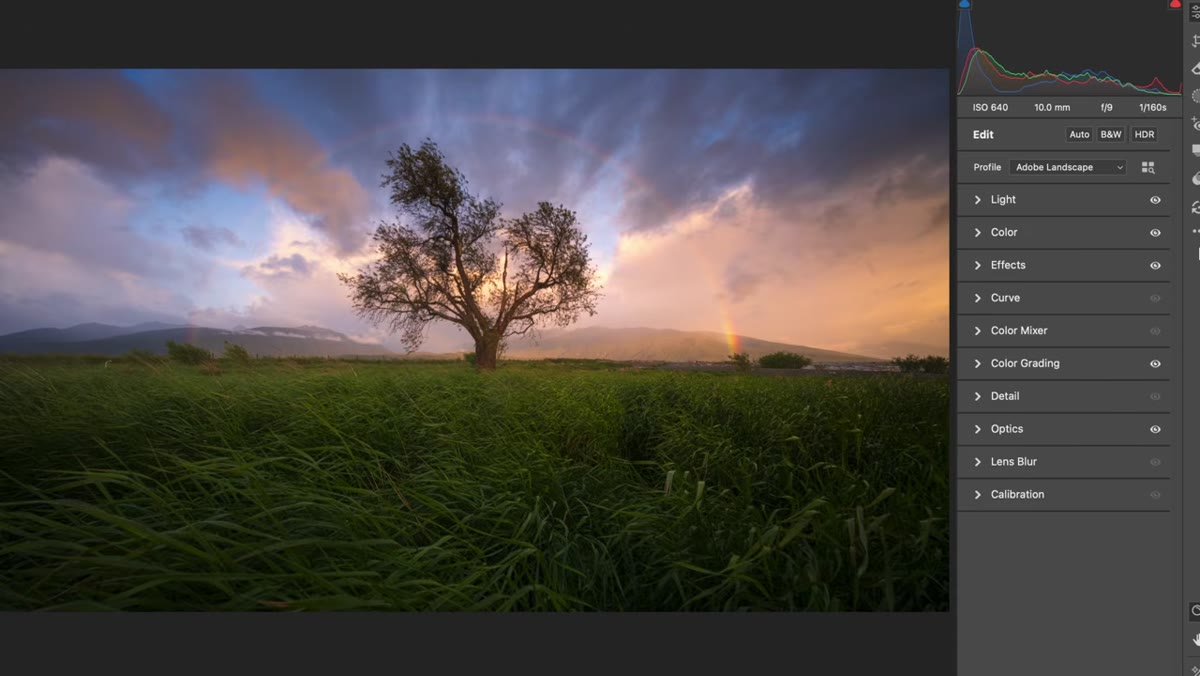 Lightroom color grading panel open with adjustments being applied
This is the core of Patino’s lesson and the part most people skip too fast. When a landscape image looks flat, the instinct is to reach for contrast and clarity. But Patino leads with color, specifically looking at which hues the camera underrepresented and which it shifted. RAW files from sunrise and golden hour situations often compress warm tones and push the scene cooler than reality. Before you boost contrast, ask yourself whether the colors are even in the right place to begin with. Fixing the color first means your contrast adjustments are enhancing something accurate rather than just making a wrong color more intense.
Lightroom color grading panel open with adjustments being applied
This is the core of Patino’s lesson and the part most people skip too fast. When a landscape image looks flat, the instinct is to reach for contrast and clarity. But Patino leads with color, specifically looking at which hues the camera underrepresented and which it shifted. RAW files from sunrise and golden hour situations often compress warm tones and push the scene cooler than reality. Before you boost contrast, ask yourself whether the colors are even in the right place to begin with. Fixing the color first means your contrast adjustments are enhancing something accurate rather than just making a wrong color more intense.
Step 4: Use Color Grading to Restore Atmospheric Warmth
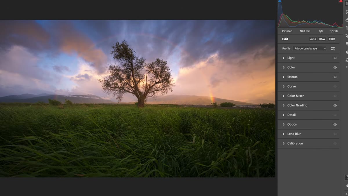 Color grading sliders being adjusted to recover warm sunrise tones
The color grading panel, not the HSL panel, is where Patino does his heavy lifting for atmospheric light. The shadows, midtones, and highlights wheels let you push warmth into specific tonal ranges without affecting the whole image evenly. For sunrise and golden hour shots, a subtle push of amber or orange into the midtones can restore the glow that the camera muted. Be conservative here. The goal is to echo what the light actually looked like, not to add color that wasn’t present. If you find yourself going past what the scene had, you’ve crossed from restoration into fabrication.
Color grading sliders being adjusted to recover warm sunrise tones
The color grading panel, not the HSL panel, is where Patino does his heavy lifting for atmospheric light. The shadows, midtones, and highlights wheels let you push warmth into specific tonal ranges without affecting the whole image evenly. For sunrise and golden hour shots, a subtle push of amber or orange into the midtones can restore the glow that the camera muted. Be conservative here. The goal is to echo what the light actually looked like, not to add color that wasn’t present. If you find yourself going past what the scene had, you’ve crossed from restoration into fabrication.
Step 5: Let the Foreground and Sky Tell Different Stories
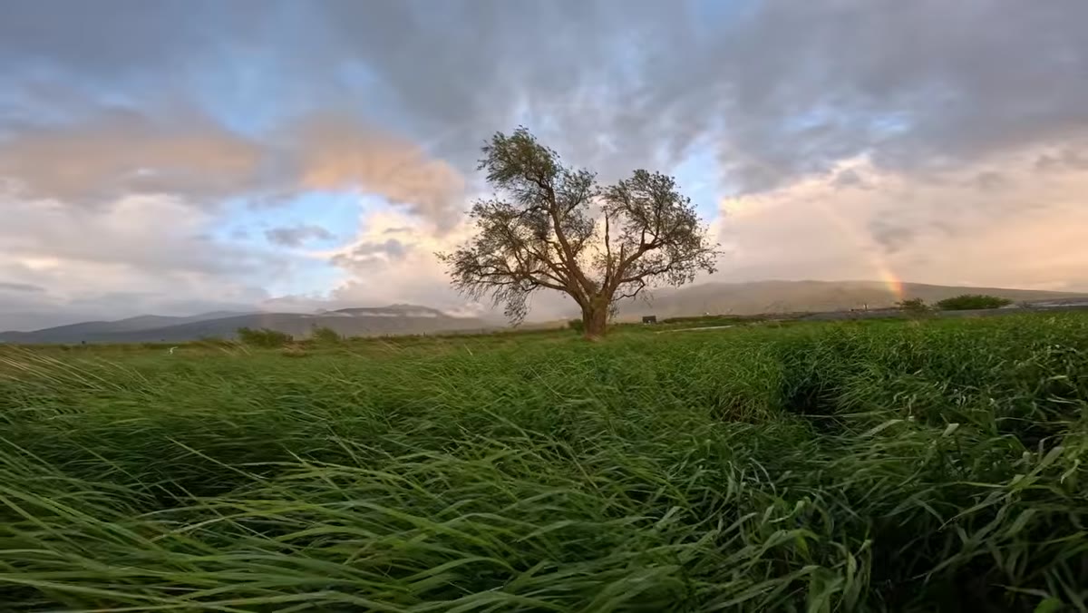 Low angle composition showing grass foreground and rainbow sky
One thing Patino does in-camera that pays off in post is shooting low to include the grass as a foreground element. In Lightroom, this gives you a natural tonal separation to work with. The foreground grass will hold different luminosity values than the sky, which means you can use a gradient mask or luminance range mask to treat each region independently. If the grass is going muddy while you brighten the sky, pull it back with a separate adjustment. Keeping both elements reading as realistic keeps the image grounded and stops it from looking like a composite.
Low angle composition showing grass foreground and rainbow sky
One thing Patino does in-camera that pays off in post is shooting low to include the grass as a foreground element. In Lightroom, this gives you a natural tonal separation to work with. The foreground grass will hold different luminosity values than the sky, which means you can use a gradient mask or luminance range mask to treat each region independently. If the grass is going muddy while you brighten the sky, pull it back with a separate adjustment. Keeping both elements reading as realistic keeps the image grounded and stops it from looking like a composite.
Step 6: Check Your Rainbow Tones Last
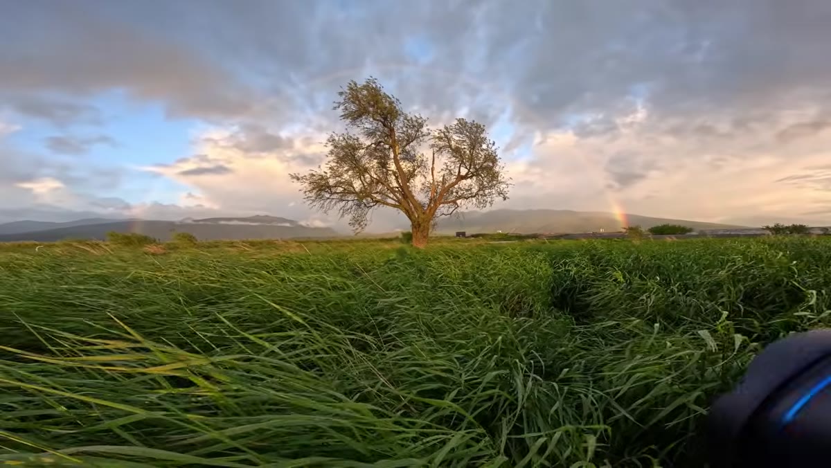 Rainbow visible over lone tree in the wide angle frame
Rainbows are one of the trickiest subjects to grade because they contain every color and their saturation in-camera is almost always lower than what the eye perceives. After your global adjustments are done, zoom in and look at the bow specifically. If it’s still reading as a faint arc, a targeted HSL adjustment to reds, oranges, and violets can bring it forward without oversaturating the rest of the image. The key is using luminance as well as saturation. Lifting the luminance of the yellow and orange range inside the rainbow can make it appear to glow rather than just look more colorful.
Rainbow visible over lone tree in the wide angle frame
Rainbows are one of the trickiest subjects to grade because they contain every color and their saturation in-camera is almost always lower than what the eye perceives. After your global adjustments are done, zoom in and look at the bow specifically. If it’s still reading as a faint arc, a targeted HSL adjustment to reds, oranges, and violets can bring it forward without oversaturating the rest of the image. The key is using luminance as well as saturation. Lifting the luminance of the yellow and orange range inside the rainbow can make it appear to glow rather than just look more colorful.
One Thing I’d Add: Use Your Phone Video as a Reference File
This is something Patino mentions in passing that I think deserves more attention. He notes that even the phone video he shot in the field showed more color than the RAW file. Your phone camera applies significant processing automatically, and while that makes it a poor shooting tool for serious work, it makes it a surprisingly useful reference for what a scene actually looked like to the human eye. I keep a second monitor open with my field footage or phone photos when I’m editing landscapes. It’s not about copying the phone’s look. It’s about using it as a reality check when your RAW adjustments start drifting somewhere artificial.
The single biggest takeaway from Patino’s approach is that color grading in landscape photography is an act of translation, not invention. The sensor speaks a different language than your visual memory, and post-processing is just how you interpret between the two. Get that philosophy right and the technical steps follow naturally.
Watch the full tutorial on YouTube to see Patino’s complete edit and the full rainbow sequence from the field.
Comments (4)
Wow, I had no idea you could do this. Mind blown.
Really solid breakdown. This pairs perfectly with the business work I've been writing about.
Finally someone explains this in a way that actually makes sense.
Great article! I actually covered something related on my site — the workflows angle is really complementary to this.
Leave a Comment