
Most of my work lives in Lightroom. Sliders, HSL panels, tone curves named after Wilco songs. That’s my comfort zone. But I shoot video too, and for a long time my footage looked exactly like what it was: stills-shooter-attempts-video. Decent composition, completely lifeless color. The two disciplines share a visual language, but the tools and the pipeline are different enough that my Lightroom instincts didn’t transfer cleanly.
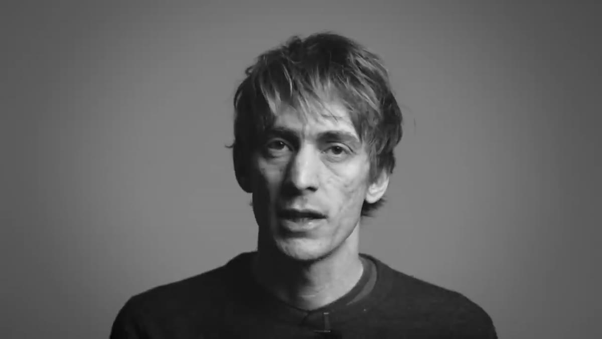
That changed when I worked through Watch the full tutorial on YouTube from Sean Tucker, where he breaks down his entire color grading process for video. Tucker shoots on Canon DSLRs with flat picture profiles, which is exactly what I do when I bother to switch my camera to video mode, and his three-stage framework gave me a repeatable process instead of just poking at settings until something looked roughly cinematic. The bonus at the end, building a custom LUT inside Photoshop, is the kind of practical trick that nobody teaches in beginner video courses.
What follows is a walkthrough of the technique so you can apply it without having to pause and rewind every thirty seconds.
Step 1: Understand Why Flat Profiles Look Terrible (and Why That’s the Point)
 Timeline showing six raw, flat, desaturated video clips
Tucker opens with six raw clips on a Final Cut Pro X timeline and they look rough. Gray, washed out, low contrast, barely any color. That’s not a mistake. Shooting on a flat picture profile, whether that’s Technicolor CineStyle, a Canon Log imitation, or any similar option, compresses the image data so your camera holds onto more highlight and shadow detail. You’re trading a pretty picture in-camera for more flexible material in post. If you go straight from a flat profile to export without grading, you get that lifeless look. The grade is where you build the image back up from that compressed starting point.
Timeline showing six raw, flat, desaturated video clips
Tucker opens with six raw clips on a Final Cut Pro X timeline and they look rough. Gray, washed out, low contrast, barely any color. That’s not a mistake. Shooting on a flat picture profile, whether that’s Technicolor CineStyle, a Canon Log imitation, or any similar option, compresses the image data so your camera holds onto more highlight and shadow detail. You’re trading a pretty picture in-camera for more flexible material in post. If you go straight from a flat profile to export without grading, you get that lifeless look. The grade is where you build the image back up from that compressed starting point.
The practical note here: Tucker flags that Canon DSLRs in particular need careful handling in this stage. You’re not locked in to what the camera decided. You have raw material to work with.
Step 2: Run Your Primary Grade - Exposure, Contrast, and Neutral Color
 Color board panel open in Final Cut Pro X
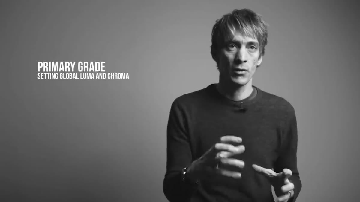
The primary grade covers the whole image. This is not a creative step yet. Your only goal is accuracy: get the brightness and contrast to a reasonable baseline, and make sure your colors are neutral and correct. Think of it the way you’d approach a global exposure and white balance correction in Lightroom before you touch anything else. Tucker uses Final Cut Pro X’s color board for this stage, though he’s upfront that it’s not the most intuitive tool. Premiere Pro’s Lumetri Color panel and DaVinci Resolve’s color wheels are both more comfortable for this work, and Resolve is free with industry-standard tools. Use whatever you have, but do this step before anything else. Trying to do creative grading on footage that’s still clipped in the highlights or color-shifted from a bad white balance is like mixing a song in a room with bad acoustics.
Color board panel open in Final Cut Pro X
The primary grade covers the whole image. This is not a creative step yet. Your only goal is accuracy: get the brightness and contrast to a reasonable baseline, and make sure your colors are neutral and correct. Think of it the way you’d approach a global exposure and white balance correction in Lightroom before you touch anything else. Tucker uses Final Cut Pro X’s color board for this stage, though he’s upfront that it’s not the most intuitive tool. Premiere Pro’s Lumetri Color panel and DaVinci Resolve’s color wheels are both more comfortable for this work, and Resolve is free with industry-standard tools. Use whatever you have, but do this step before anything else. Trying to do creative grading on footage that’s still clipped in the highlights or color-shifted from a bad white balance is like mixing a song in a room with bad acoustics.
Step 3: Apply Your Secondary Grade - Tweak Specific Colors and Use Windows
 Secondary color controls targeting specific hues in the image
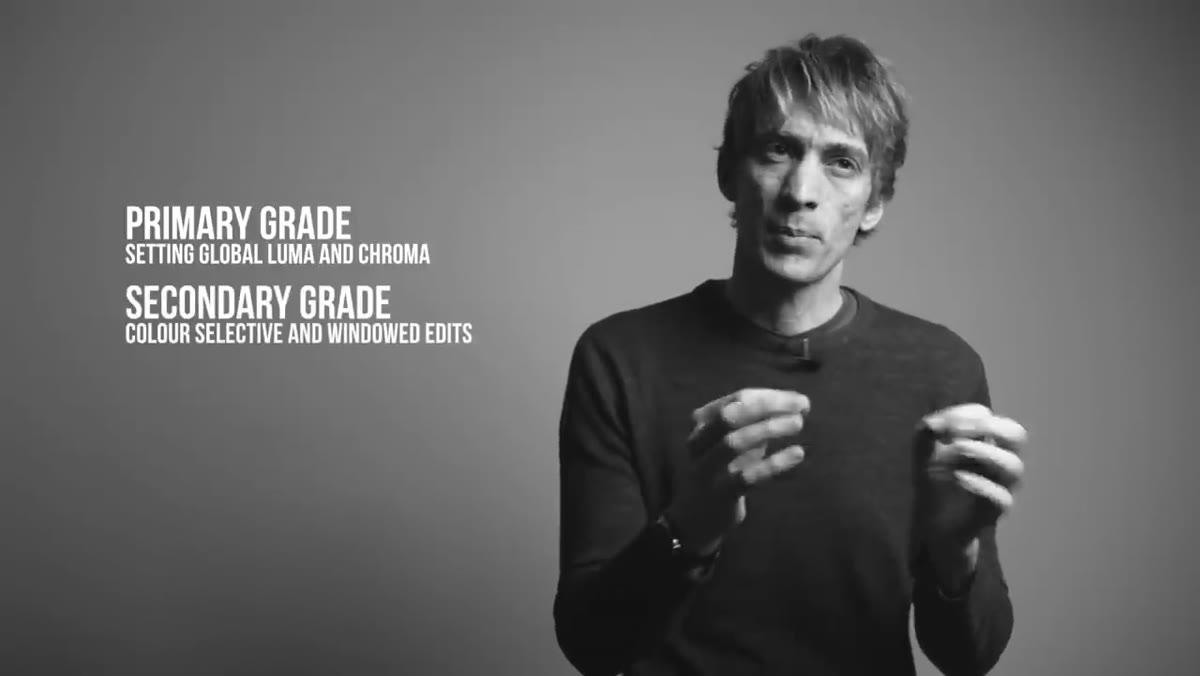
Once your baseline is solid, the secondary grade lets you get surgical. This is where you isolate specific colors in the image and push them in a direction. Maybe the sky needs a cooler blue, or the skin tones are reading slightly orange and you want to pull them back toward neutral. Tucker also introduces the concept of windows here, which is what video colorists call a mask or a selection. You draw a shape around a region of the frame, a face, a bright background, a product, and apply a correction only to that area. If you’ve used the Lightroom radial filter or a luminance mask, this is the same idea. It lets you direct the viewer’s eye without affecting the parts of the image that are already working.
Secondary color controls targeting specific hues in the image
Once your baseline is solid, the secondary grade lets you get surgical. This is where you isolate specific colors in the image and push them in a direction. Maybe the sky needs a cooler blue, or the skin tones are reading slightly orange and you want to pull them back toward neutral. Tucker also introduces the concept of windows here, which is what video colorists call a mask or a selection. You draw a shape around a region of the frame, a face, a bright background, a product, and apply a correction only to that area. If you’ve used the Lightroom radial filter or a luminance mask, this is the same idea. It lets you direct the viewer’s eye without affecting the parts of the image that are already working.
Step 4: Create the Look - Your Mastering Stage
 Final stylized look applied across the footage timeline
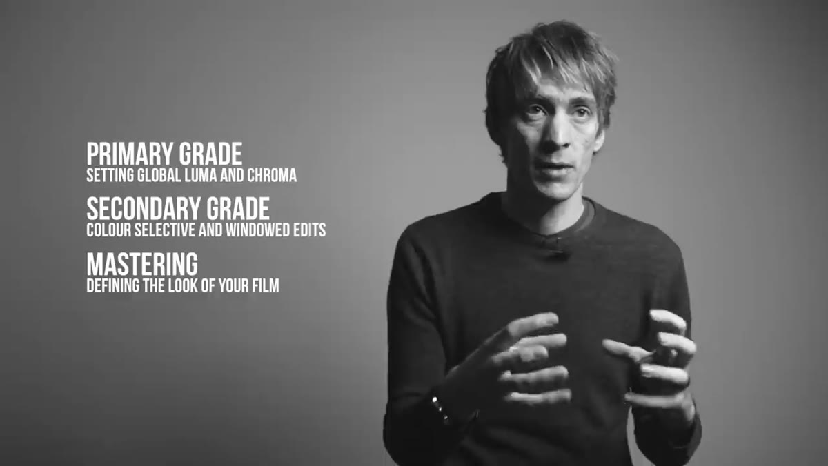
The third stage is where the footage stops looking corrected and starts looking intentional. Tucker describes this as the mastering stage, and it’s where you build the mood and style of the piece. This might mean lifting the shadows slightly for a faded film feel, adding a color cast to the highlights, pushing the contrast harder, or shifting specific hues toward a complementary palette. The goal is that every clip in your edit feels like it belongs to the same visual world. This is also the stage that separates footage that looks graded from footage that looks filtered. You’re not slapping a preset on top, you’re making considered decisions about what the image should feel like.
Final stylized look applied across the footage timeline
The third stage is where the footage stops looking corrected and starts looking intentional. Tucker describes this as the mastering stage, and it’s where you build the mood and style of the piece. This might mean lifting the shadows slightly for a faded film feel, adding a color cast to the highlights, pushing the contrast harder, or shifting specific hues toward a complementary palette. The goal is that every clip in your edit feels like it belongs to the same visual world. This is also the stage that separates footage that looks graded from footage that looks filtered. You’re not slapping a preset on top, you’re making considered decisions about what the image should feel like.
Step 5: Build a Custom LUT in Photoshop and Export It
 Photoshop open with color grading adjustments for LUT export
This is the step that earns the whole tutorial. A LUT, lookup table, is a small file that stores your color transformation as data. Once you’ve dialed in a look you love, you can export it as a LUT and apply it to other footage in any software that accepts .cube or .3dl files, which is nearly everything. Tucker walks through building one inside Photoshop using adjustment layers to define the grade, then exporting it via File - Export - Color Lookup Tables. You give it a name, choose your format, and Photoshop generates the file. Drop that LUT into Final Cut, Premiere, Resolve, or even Lightroom’s Color Grading panel for video stills, and your look travels with it. The practical value here is huge. Instead of recreating a grade from memory on every project, you build it once and apply it in seconds.
Photoshop open with color grading adjustments for LUT export
This is the step that earns the whole tutorial. A LUT, lookup table, is a small file that stores your color transformation as data. Once you’ve dialed in a look you love, you can export it as a LUT and apply it to other footage in any software that accepts .cube or .3dl files, which is nearly everything. Tucker walks through building one inside Photoshop using adjustment layers to define the grade, then exporting it via File - Export - Color Lookup Tables. You give it a name, choose your format, and Photoshop generates the file. Drop that LUT into Final Cut, Premiere, Resolve, or even Lightroom’s Color Grading panel for video stills, and your look travels with it. The practical value here is huge. Instead of recreating a grade from memory on every project, you build it once and apply it in seconds.
What I’d Add from My Own Workflow
Tucker’s three-stage framework maps almost directly to how I work in Lightroom on stills, and that parallel is what made it click for me. Primary grade equals global tone and white balance. Secondary grade equals HSL sliders and selective corrections. Mastering stage equals the creative curve and color toning work I do last.
The one thing I’d add is to do your primary grade on a adjustment layer or effect that you can bypass with a single click. When you’re deep in a session and you’ve lost your reference point, toggling the primary correction off and seeing the flat original for two seconds resets your eyes. It’s the video equivalent of looking at a white wall to clear a color cast out of your vision. Small habit, genuinely useful.
I’d also strongly recommend Tucker’s suggestion to try DaVinci Resolve if you haven’t. I came to it late because Lightroom and Photoshop already covered most of my needs, but the node-based color workflow in Resolve makes the three-stage approach feel almost architectural. Each stage gets its own node and you can troubleshoot them independently.
The biggest thing Tucker’s tutorial taught me is that color grading isn’t one move. It’s a sequence, and the sequence has a logic. Correcting before creating, global before local. Get those right and the look you’re after stops feeling accidental.
Watch the full tutorial on YouTube to see Tucker walk through each stage on real footage and build the LUT export from scratch inside Photoshop.
Comments
Leave a Comment