There is a specific kind of frustration that only photographers who print their work truly understand. You spend an hour getting a photo looking exactly right on screen, you send it to the printer, and what comes out looks like a different photo entirely. The colors are duller, the reds have gone muddy, and the whole thing feels flat. I have been there more times than I want to admit, usually around midnight with a deadline the next morning.
Lightroom 4 introduced two features that directly attack this problem: soft proofing in the Develop module and a Print Brightness slider in the Print module. In this KelbyOne tutorial, the instructor walks through both tools in a way that actually explains the logic behind them, not just the clicks. Watch the full tutorial on YouTube if you want to follow along, but everything you need to apply this yourself is laid out below.
The honest truth is that soft proofing is one of those features that sits in the “I should probably learn this” category for a lot of Lightroom users. It can feel technical and intimidating. But once you understand what it is actually showing you, it becomes one of the most practical tools in your print workflow.
Step 1: Enable Soft Proofing in the Develop Module
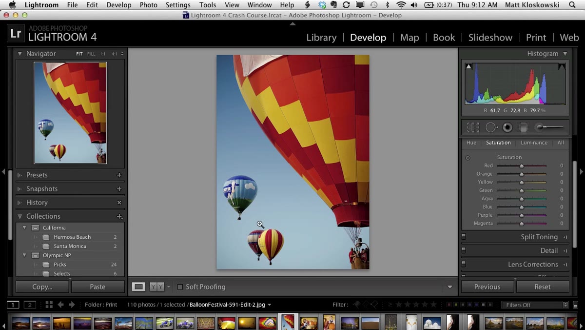 Soft proofing toggle activated inside the Develop module
Soft proofing lives in the Develop module, which might feel counterintuitive at first. You might expect it in the Print module, but the reason it belongs in Develop is simple: if the proofing reveals a color problem, the Develop module is where you fix it. Having it anywhere else would just send you bouncing back and forth.
Soft proofing toggle activated inside the Develop module
Soft proofing lives in the Develop module, which might feel counterintuitive at first. You might expect it in the Print module, but the reason it belongs in Develop is simple: if the proofing reveals a color problem, the Develop module is where you fix it. Having it anywhere else would just send you bouncing back and forth.
To turn it on, go to the Develop module and activate the soft proofing toggle along the bottom toolbar. The moment you do, your image shifts visually. It’s now being displayed against a paper white simulation rather than your screen’s default background, which gives you a more accurate preview of how the final print will actually render.
Step 2: Understand the New Soft Proofing Panel
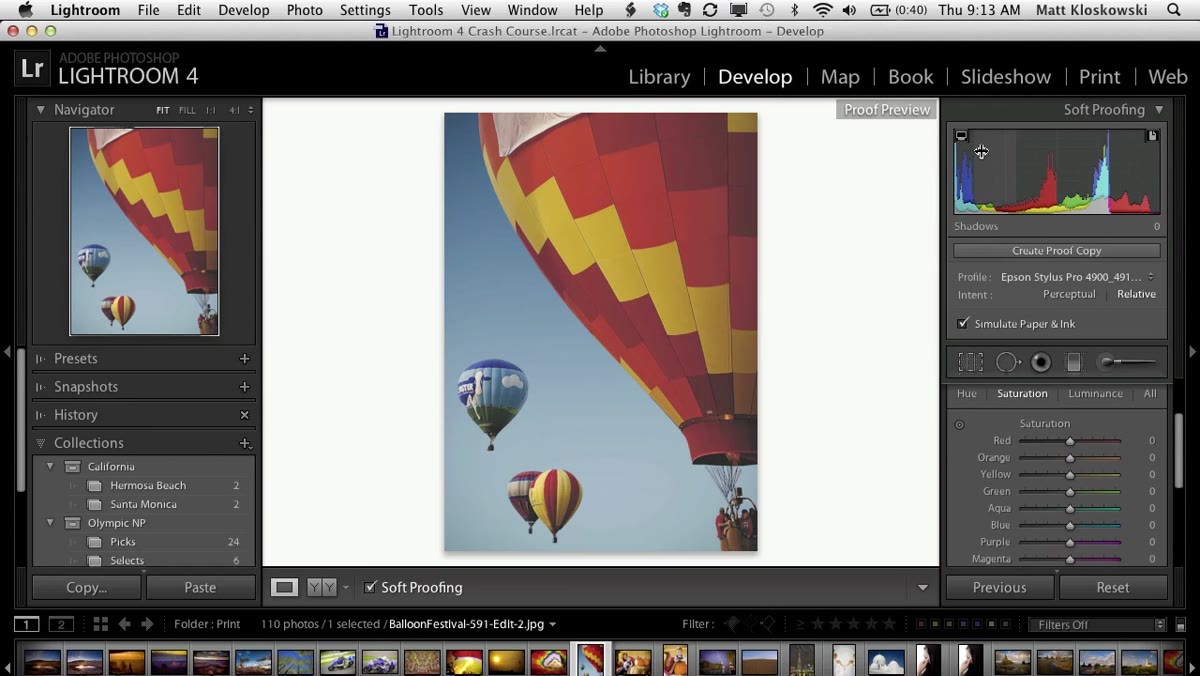 Soft proofing panel replacing the histogram in top right corner
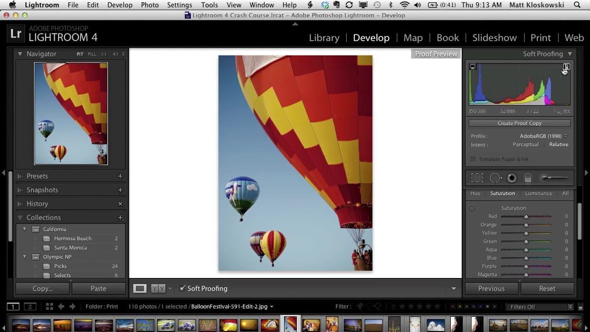
Once soft proofing is active, the histogram in the top right corner is replaced by the soft proofing panel. This panel has two clipping warning buttons that work similarly to the highlight and shadow clipping warnings you already know, but they’re checking something different.
Soft proofing panel replacing the histogram in top right corner
Once soft proofing is active, the histogram in the top right corner is replaced by the soft proofing panel. This panel has two clipping warning buttons that work similarly to the highlight and shadow clipping warnings you already know, but they’re checking something different.
The left warning button flags colors that are out of gamut for your monitor. The right one, which is the one that actually matters for print work, flags colors that are out of gamut for your chosen printer profile. Think of it as your printer raising its hand and saying “I cannot reproduce that color faithfully.” That warning is what drives the rest of this workflow.
Step 3: Choose Your Printer Profile
 Profile dropdown open showing Epson paper options listed
This is where the real customization happens. Click on the profile dropdown inside the soft proofing panel and select “Other” to load profiles that are specific to your printer and paper combination. If you haven’t downloaded ICC profiles for your printer and paper types yet, that needs to happen before this step means anything. Printer manufacturers and paper companies publish these for free on their websites.
Profile dropdown open showing Epson paper options listed
This is where the real customization happens. Click on the profile dropdown inside the soft proofing panel and select “Other” to load profiles that are specific to your printer and paper combination. If you haven’t downloaded ICC profiles for your printer and paper types yet, that needs to happen before this step means anything. Printer manufacturers and paper companies publish these for free on their websites.
In the tutorial, the instructor loads two profiles for comparison: one for Epson Premium Luster, which is a glossy-style paper, and one for a fine art matte paper. The difference between the two is significant, and that comparison is the clearest way to understand why profile selection matters so much.
Step 4: Enable the Gamut Warning and Read What It’s Telling You
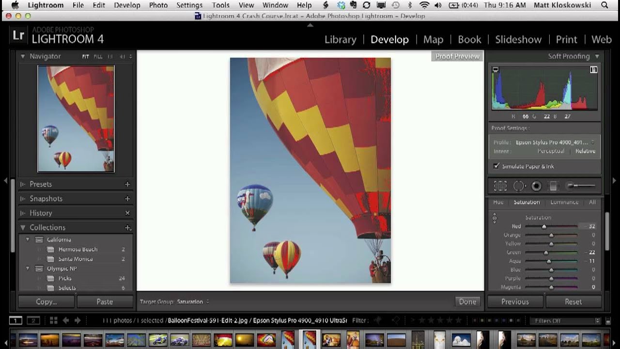
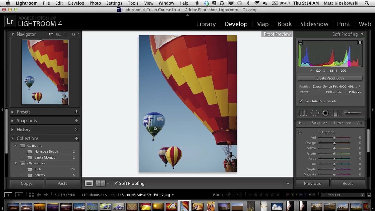 Red gamut warning overlay appearing on image around saturated areas
With a profile selected, click the print gamut warning button to overlay the out-of-gamut areas directly onto your image. Colors that your chosen paper and printer cannot reproduce accurately show up as red patches on the photo.
Red gamut warning overlay appearing on image around saturated areas
With a profile selected, click the print gamut warning button to overlay the out-of-gamut areas directly onto your image. Colors that your chosen paper and printer cannot reproduce accurately show up as red patches on the photo.
With the Premium Luster (glossy) profile loaded, you might see only a few tiny red specks on highly saturated areas. Not worth losing sleep over. But switch to the fine art matte paper profile and the red overlay expands considerably. Matte papers have a narrower color gamut than glossy papers, so they simply cannot handle the same range of colors. The soft proof is not judging your edit. It’s giving you accurate information so you can make a decision.
Step 5: Fix Out-of-Gamut Colors Using the HSL Panel
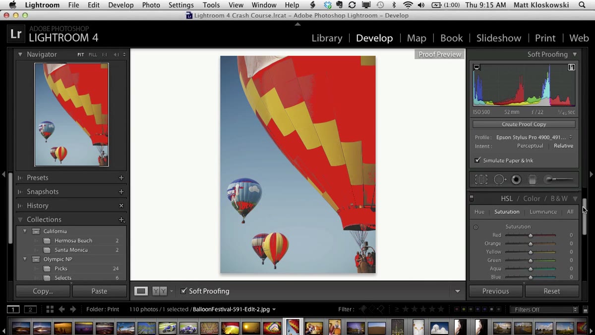 HSL saturation panel open with target adjustment tool selected
Now that you can see where the problem is, you can fix it without guessing. Drop down to the HSL panel in Develop and click on the Saturation tab. Select the Target Adjustment Tool (the small bullseye icon), hover it over one of the red-flagged areas in your image, and drag downward to reduce the saturation of that specific color range.
HSL saturation panel open with target adjustment tool selected
Now that you can see where the problem is, you can fix it without guessing. Drop down to the HSL panel in Develop and click on the Saturation tab. Select the Target Adjustment Tool (the small bullseye icon), hover it over one of the red-flagged areas in your image, and drag downward to reduce the saturation of that specific color range.
The key here is that you’re making a surgical adjustment to only the colors causing the gamut issue, not reducing saturation globally and flattening the whole image. As you pull those problem colors back into range, the red overlay shrinks. You’re dialing the photo in for the specific paper and printer you’re actually using.
Step 6: Save a Proof Copy
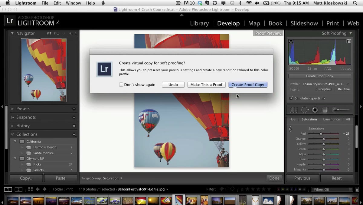 Dialog box prompting user to create a proof copy of the image
When you release the target adjustment tool after making a change, Lightroom will ask whether you want to create a proof copy. The answer should almost always be yes. This creates a virtual copy of your image with the soft proof adjustments baked in, leaving your original edit completely untouched.
Dialog box prompting user to create a proof copy of the image
When you release the target adjustment tool after making a change, Lightroom will ask whether you want to create a proof copy. The answer should almost always be yes. This creates a virtual copy of your image with the soft proof adjustments baked in, leaving your original edit completely untouched.
This is a genuinely smart workflow. Your screen edit and your print edit coexist as separate virtual copies. If you print on multiple paper types, you can maintain a separate proof copy for each one, all branching off the same original.
What I’d Add From My Own Print Workflow
The tutorial covers the mechanics cleanly, but there’s one thing I’d layer on top of it: calibrate your monitor before soft proofing matters. Soft proofing simulates how a profile will interpret your colors, but if your monitor is not calibrated, the simulation is built on a shaky foundation. I use a hardware calibrator and run it every few weeks. It’s one of those investments that feels boring until the day a client print comes back looking exactly like it should, and then it feels like the best money you ever spent.
I’d also suggest starting your soft proofing experiments with a photo you’ve already printed before. Something where you know what went wrong. Load the ICC profile for that paper, toggle the gamut warning, and see if the red overlay lines up with the colors that looked bad in your actual print. It usually does. That confirmation moment is what makes soft proofing click from abstract to essential.
Getting consistent, accurate prints used to feel like a combination of experience and luck. Soft proofing turns it into a repeatable process. The most important thing to take away is this: your edit lives on screen, but your print lives in the physical world, and those two environments follow different rules. Soft proofing is how you bridge them before ink hits paper.
Watch the full tutorial on YouTube to see the instructor toggle between paper profiles in real time. Seeing the gamut overlay shift between the glossy and matte profiles side by side is the kind of visual that makes the concept stick.
Comments (2)
Love how you break down complex stuff into manageable steps.
I've watched a dozen tutorials on this and yours is the clearest by far.
Leave a Comment