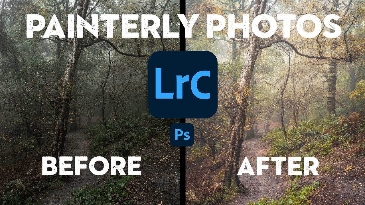
There’s a specific kind of woodland photo that stops me mid-scroll every time. It’s not sharp-everything, every-leaf-in-focus landscape photography. It’s something softer. More felt than seen. The kind of image that makes you think of oil paintings before you think of cameras. I’ve been chasing that look for a while, and I kept running into the same wall: I’d get into the woods, shoot something I thought had potential, bring it into Lightroom, and watch it turn into… a perfectly fine photo of some trees. Not what I wanted.
That changed when I watched this tutorial from Nigel Danson, a landscape photographer whose woodland work genuinely looks like it belongs in a gallery next to 19th-century paintings. Watch the full tutorial on YouTube before or after reading this, because seeing his prints and the before/after comparisons makes everything click harder. What I want to do here is pull out the technique, add some context from my own editing experience, and give you a practical roadmap you can actually follow.
The thing Danson makes clear from the start is that this look is not purely an editing problem. And that reframe alone saved me hours of frustration.
Step 1: Understand Your Artistic Influences Before You Touch a Slider
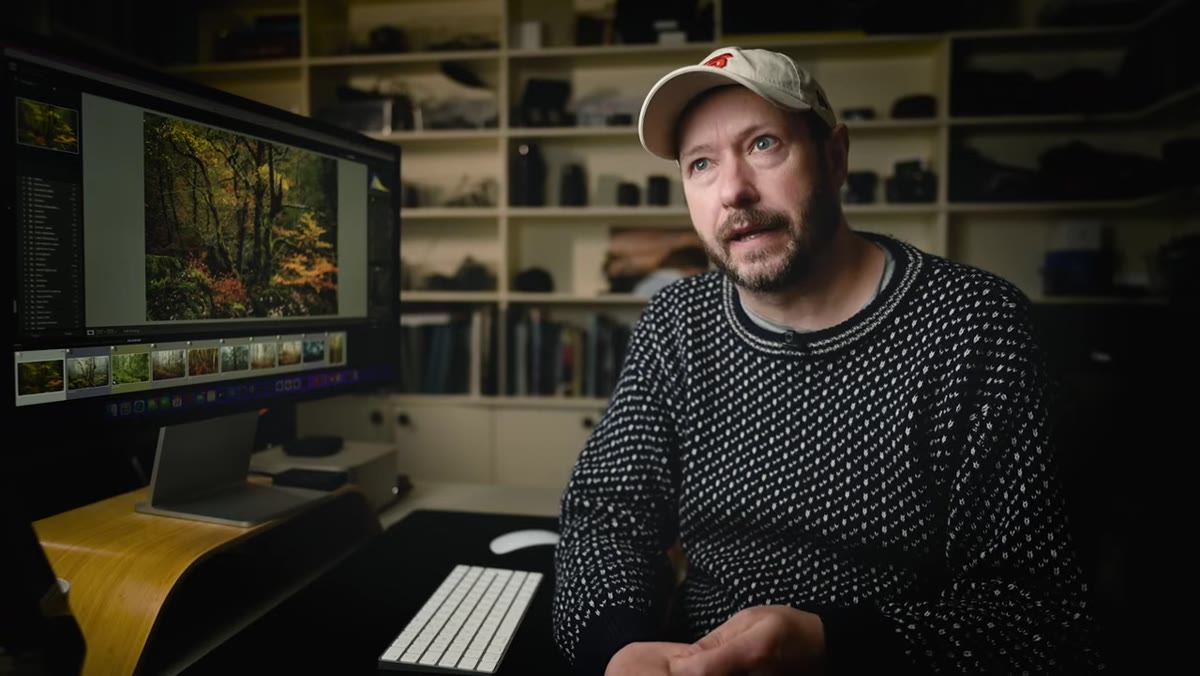 Danson discussing painter influences on his woodland style
Before Danson opens Lightroom, he talks about painters. Caspar David Friedrich, John Constable, Thomas Gainsborough, and a lesser-known woodland painter named James Thomas Watts who he discovered a few years ago. This isn’t name-dropping for credibility. It’s a practical creative step.
Danson discussing painter influences on his woodland style
Before Danson opens Lightroom, he talks about painters. Caspar David Friedrich, John Constable, Thomas Gainsborough, and a lesser-known woodland painter named James Thomas Watts who he discovered a few years ago. This isn’t name-dropping for credibility. It’s a practical creative step.
When you have a visual reference point that isn’t photography, you stop trying to make your photo look like other photos. You start asking different questions. What mood does this image carry? Where is the light source coming from emotionally, not just physically? If you don’t have a painting, a film still, or an illustration that represents the feeling you’re after, spend ten minutes finding one before your next shoot. Pin it somewhere you’ll actually see it.
Step 2: Set Up Your Editing Environment Correctly
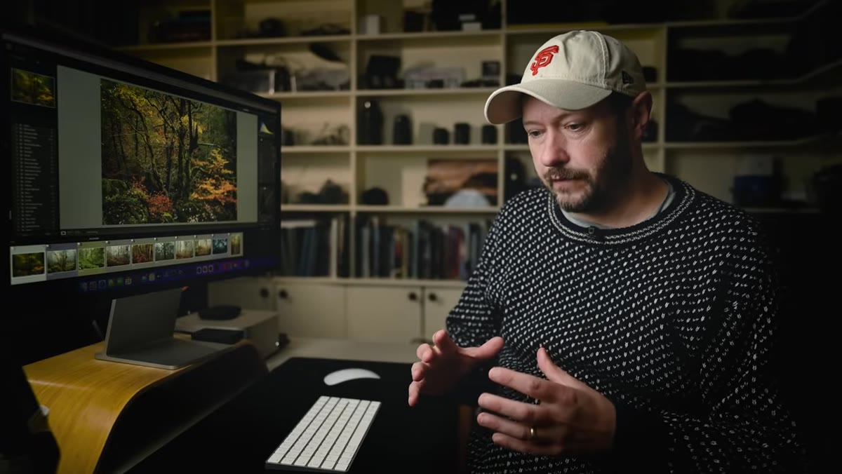 Monitor setup and room lighting for accurate color editing
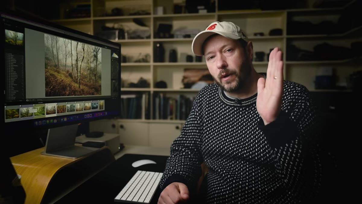
Danson spends real time on editing environment, and I think most tutorials skip this entirely. The core idea is consistency. Your eyes dilate differently depending on how much light is in the room, and that directly affects how bright you think your monitor needs to be. If you’re editing in a bright room one day and a dark room the next, you’re not editing the same photo twice.
Monitor setup and room lighting for accurate color editing
Danson spends real time on editing environment, and I think most tutorials skip this entirely. The core idea is consistency. Your eyes dilate differently depending on how much light is in the room, and that directly affects how bright you think your monitor needs to be. If you’re editing in a bright room one day and a dark room the next, you’re not editing the same photo twice.
His recommendation is controlled, consistent room lighting with no direct light hitting the monitor. He edits on a MacBook and keeps brightness at around four to five points on the scale. If you’re on an iMac or a well-regarded laptop display, factory calibration is often close enough, but running a calibration tool like a Datacolor Spyder every few months is worth doing if color accuracy matters to you. I edit in a dedicated corner of my home studio in Nashville with the overhead light on a dimmer, always at the same level. It sounds fussy until you notice how much more consistent your exports look.
Step 3: Shoot in the Right Conditions - Editing Can’t Manufacture Atmosphere
 Side-by-side comparison of foggy vs. clear woodland shots
This is the one that will either save you or frustrate you, depending on where you are in your photography. Danson shows a direct comparison: the same group of trees shot on a clear day after fog lifted, and then again with fog present. The foggy version has depth, mystery, and softness. The clear version has trees.
Side-by-side comparison of foggy vs. clear woodland shots
This is the one that will either save you or frustrate you, depending on where you are in your photography. Danson shows a direct comparison: the same group of trees shot on a clear day after fog lifted, and then again with fog present. The foggy version has depth, mystery, and softness. The clear version has trees.
No editing workflow in Lightroom or Capture One (yes, I have opinions about both) can add genuine atmospheric depth that wasn’t there when the shutter fired. What editing can do is draw out and enhance the atmosphere that already exists. Fog, mist, light rain, and overcast diffused light are your friends for this style. Plan shoots around these conditions deliberately. Check weather apps that show humidity and fog forecasts, not just cloud cover. Season matters too. Danson notes that late spring and early summer greens produce a completely different image than the same composition shot in autumn.
Step 4: Start Your Edit by Protecting the Mood, Not Correcting the Exposure
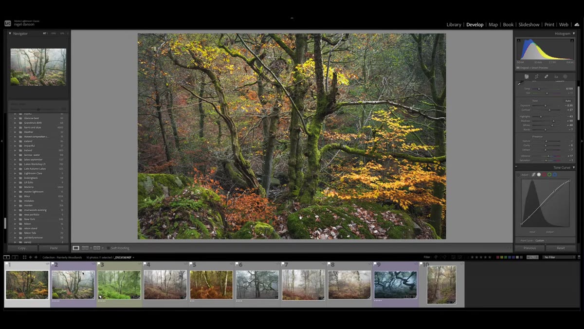 Lightroom develop panel open on a foggy woodland image
When Danson brings his images into Lightroom, his first instinct isn’t to “fix” them toward some neutral standard. It’s to identify what the conditions already gave him and protect that. For foggy images, that means being careful with highlights and whites. Blown-out fog loses its texture and starts to look like a mistake rather than a feature.
Lightroom develop panel open on a foggy woodland image
When Danson brings his images into Lightroom, his first instinct isn’t to “fix” them toward some neutral standard. It’s to identify what the conditions already gave him and protect that. For foggy images, that means being careful with highlights and whites. Blown-out fog loses its texture and starts to look like a mistake rather than a feature.
Pull highlights down enough to recover detail in the brighter areas of the mist. Lift shadows gently rather than aggressively. The painterly look depends on a relatively narrow tonal range where nothing is crushed black and nothing is blown white. Think of it like the tonal palette a painter would mix on a grey day. If your histogram looks like a mountain range, you’re probably too contrasty for this style.
Step 5: Use Color Grading to Shift the Emotional Temperature of the Image
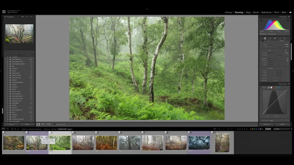 Color grading tools being applied to woodland tones
The soft, unified color palette in Danson’s work is what makes it read as painterly rather than just soft. In Lightroom’s Color Grading panel, he works to create harmony between the shadows, midtones, and highlights rather than letting them pull in different directions. For woodland images, this often means warming the highlights slightly while adding a cooler or more neutral tone to the shadows. This mimics the way natural light actually behaves in a canopy environment.
Color grading tools being applied to woodland tones
The soft, unified color palette in Danson’s work is what makes it read as painterly rather than just soft. In Lightroom’s Color Grading panel, he works to create harmony between the shadows, midtones, and highlights rather than letting them pull in different directions. For woodland images, this often means warming the highlights slightly while adding a cooler or more neutral tone to the shadows. This mimics the way natural light actually behaves in a canopy environment.
Don’t go heavy-handed here. Small hue shifts of five to fifteen degrees in the color grading wheels make a significant difference. Large shifts look like a filter was applied. Small shifts look like the photo was taken at magic hour even when it wasn’t.
Step 6: Apply Local Adjustments to Guide the Viewer’s Eye
 Masking and local adjustment tools applied to tree subjects
Danson uses local adjustments, masking specific areas to add subtle luminosity or warmth to the subject trees while keeping the background slightly more recessed. This is how painters control depth and focus without changing the actual focal length. You’re not sharpening a subject. You’re brightening it just enough that the eye finds it first.
Masking and local adjustment tools applied to tree subjects
Danson uses local adjustments, masking specific areas to add subtle luminosity or warmth to the subject trees while keeping the background slightly more recessed. This is how painters control depth and focus without changing the actual focal length. You’re not sharpening a subject. You’re brightening it just enough that the eye finds it first.
In Lightroom, use the subject mask or a radial gradient centered on your main element. Bring exposure up by a quarter to half a stop. Sometimes a slight clarity bump helps the bark texture read more like brushwork. Keep it subtle. If someone can name the tool you used, you went too far.
What I’d Add From My Own Experience
The one thing Danson doesn’t focus on heavily in this video is black-and-white conversion as a testing tool. Before I finalize any painterly woodland edit, I temporarily desaturate the image to check the tonal structure. If the image reads well in black and white, with clear separation between subject and background, the color version almost always works. If the tones are muddy in greyscale, adding color back doesn’t fix the underlying problem. It’s a fast sanity check that’s saved me from exporting images that looked good in color but fell apart when printed.
The single most important thing Danson teaches in this video is that the painterly look is a system, not a preset. It starts with knowing what you’re chasing visually, continues with choosing the right shooting conditions, and finishes in Lightroom with edits that protect and enhance rather than overwrite what the light already did. Get the conditions right and the editing becomes almost intuitive. Try to manufacture the conditions in post and you’ll be fighting the file the whole time.
Watch the full tutorial on YouTube to see Danson’s actual prints and the real-time before/after comparisons. Seeing the physical prints especially changes how you think about what you’re trying to achieve.
Comments
Leave a Comment