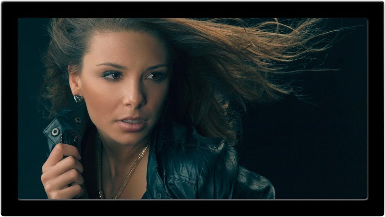
There’s a specific problem I run into every time I shoot portraits in flat, midday light: the image looks technically fine but emotionally flat. The colors are accurate, the exposure is clean, and I want to fall asleep looking at it. What it’s missing is the kind of intentional color contrast that makes a movie still feel cinematic even when nothing is happening on screen. That’s exactly what this technique fixes.
In this Aaron Nace (PHLEARN) tutorial, Watch the full tutorial on YouTube, Aaron adapts a video color grading concept originally developed for film editing and brings it into Photoshop for still photography. The core idea is simple but powerful: push your shadows toward teal (blue and green), and push your highlights toward orange (red and yellow). These are complementary colors on opposite ends of the spectrum, which creates natural visual tension and gives portraits that warm-skin-against-cool-background separation that you see in almost every big-budget movie poster.
The technique is built around a single adjustment layer, which keeps everything non-destructive and tweakable. Here’s how it works, step by step.
Step 1: Add a Color Balance Adjustment Layer
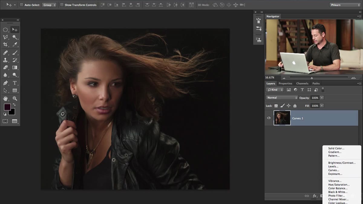 Color Balance adjustment layer panel open in Photoshop
Go to your Layers panel and add a Color Balance adjustment layer. You’ll find it under the adjustment layer icon (the half-filled circle at the bottom of the Layers panel) or through Image > Adjustments if you prefer a destructive edit, though I’d push you toward the adjustment layer every time. Before you touch a single slider, check the “Preserve Luminosity” box. This keeps your tones intact while you shift the color, which is crucial. Without it, you’ll start losing contrast and the whole thing falls apart.
Step 2: Avoid Over-Editing the Shadows
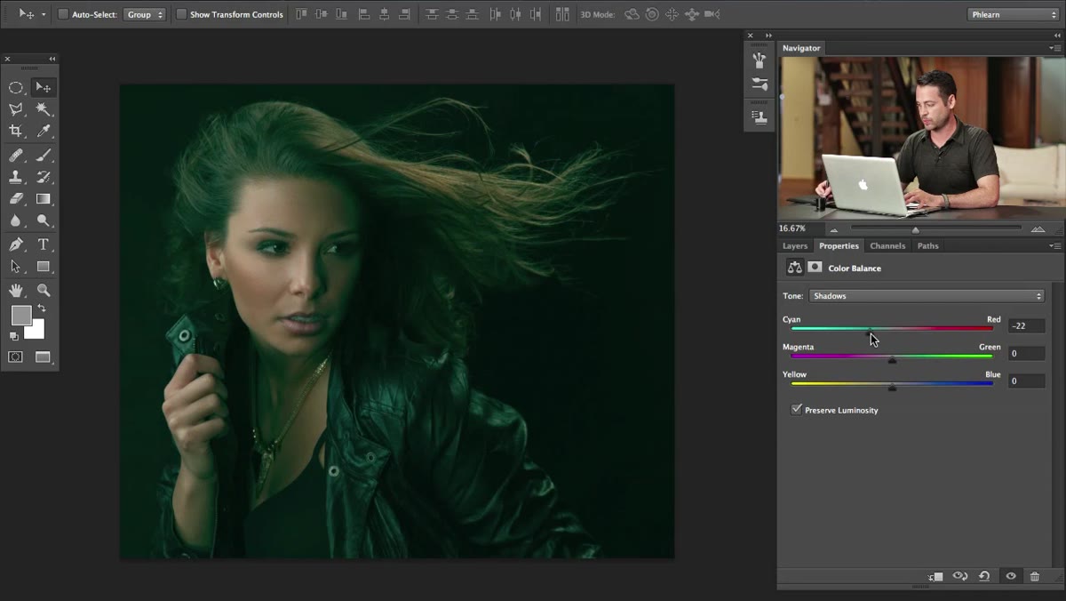 Shadows option selected in Color Balance with minimal adjustment
Color Balance lets you adjust Shadows, Midtones, and Highlights separately. The temptation with cinematic grading is to slam the shadows toward blue and teal right away, but Aaron makes an important point here: pushing shadows too hard tends to look strange and unnatural in still photography. It works differently than it does in video. Leave the shadows alone or keep any adjustments there subtle. The heavy lifting happens in the midtones.
Step 3: Push the Midtones Toward Blue and Green
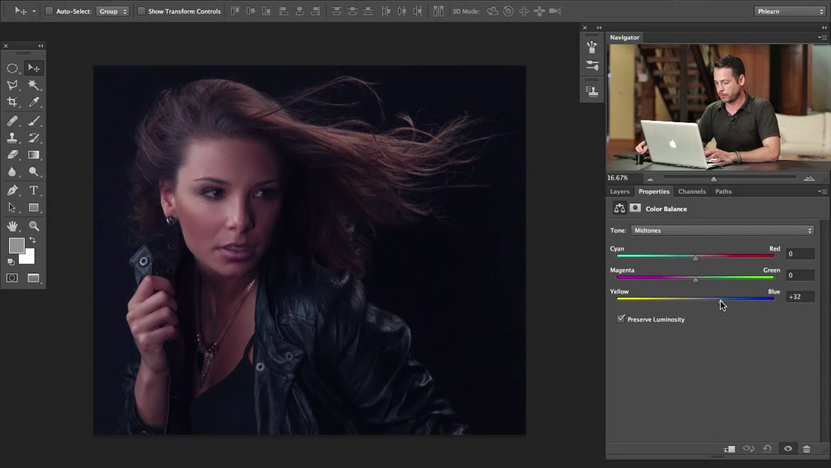 Midtones selected, sliders pushed toward Cyan and Blue
Select Midtones in the Color Balance panel. Now push the top slider toward Cyan (away from Red), and push the bottom slider toward Blue (away from Yellow). Aaron exaggerates this in the tutorial on purpose, so you can clearly see what’s happening. In a real edit, you’d dial this back to taste. A good starting point is somewhere around -15 to -25 on the Cyan/Red axis and -10 to -20 on the Yellow/Blue axis. The goal is a cool, slightly teal cast in your midrange tones, not a smurf filter. If your shadows are sitting mostly in areas that aren’t skin, like backgrounds, clothing, and hair, this is where the teal look gets built without touching the face directly.
Step 4: Shift the Highlights Toward Red and Yellow
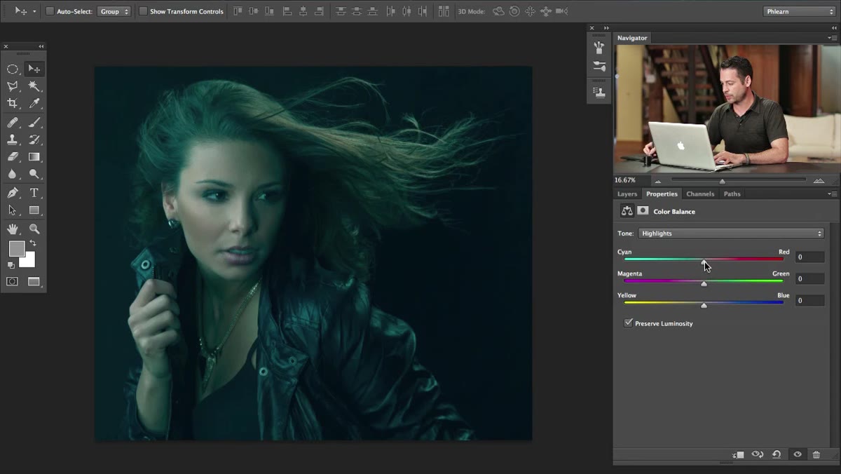 Highlights selected, sliders pushed toward Red and Yellow
Now switch to Highlights in the Color Balance panel. This is where the warm side of the equation happens. Push the top slider toward Red and push the middle slider toward Yellow. The mix of red and yellow lands you in orange territory, which is exactly where skin tones naturally live. This step is what prevents your subject from looking like they were cryogenically frozen. The highlight detail in a standard portrait is often concentrated in the face and skin, so warming up the highlights effectively warms up your subject while the cool midtones handle the rest of the frame. These two moves together create the visual separation that makes cinematic color work.
Step 5: Step Away Before You Finalize
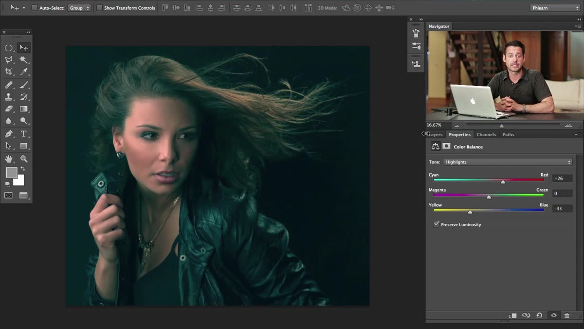 Final color-graded image visible in Photoshop canvas
This is the step most people skip, and it’s the one Aaron specifically calls out: once you get the image to a place that looks good, stop. Close your laptop, make coffee, do something else for ten minutes. Color grading is one of those adjustments where your eyes adapt to what you’ve done faster than you think. What looks like a subtle teal shift after twenty minutes of staring at it might look insane to fresh eyes. Coming back to the image with a reset perspective lets you catch when you’ve pushed the sliders too far, which is almost always the direction edits drift when you’re in the zone.
My Extension: Mask the Adjustment to Protect Skin
This technique works beautifully on a lot of images, but it can create a problem on close-up portraits where there isn’t much separation between highlights and midtones. If your subject’s face is filling most of the frame, the midtone shift toward teal can creep into the skin and make things look sickly.
My fix is to paint a mask on the Color Balance adjustment layer. After you’ve set your sliders, click on the white mask thumbnail next to the layer. Set your brush to black, drop the opacity to around 30-40%, and lightly paint over the face. This pulls back the teal influence specifically where skin dominates, while keeping the effect strong in the background and clothing. It takes an extra two minutes and it’s the difference between a color grade that holds up at full resolution and one that makes the client ask “why does she look cold?”
The single biggest lesson from this technique is that cinematic color isn’t a filter. It’s a deliberate decision about which part of the frame gets warm and which gets cool. Teal shadows and orange highlights work because they mimic how our eyes respond to natural light at golden hour, candlelight, and practical lighting situations where warm and cool sources compete. When you apply it in post, you’re borrowing a visual language that audiences already respond to emotionally, even if they can’t name why.
Watch the full tutorial on YouTube to see Aaron walk through the actual slider movements in real time. Watching his hands work is half the tutorial.
Comments (1)
Just used this on a wedding shoot edit. Client was thrilled.
Leave a Comment