
Every time I sit down with a client’s RAW files, the histogram is the first place I look before I touch a single slider. Not because I’m a data nerd (though, fair), but because the histogram tells me instantly whether I’m working with a file that has room to breathe or one that’s already fighting against me. I learned to think about it this way after years of trial and error, but honestly, I wish I’d watched this CreativeLive tutorial by Julieanne Kost a lot earlier in my editing life. Watch the full tutorial on YouTube
In it, Kost breaks down the histogram from first principles, which sounds basic until you realize how many photographers misread it every single day. The most common mistake isn’t blowing highlights or crushing shadows on purpose. It’s making exposure decisions during the shoot based on a misunderstanding of what the histogram is actually showing you, then compounding the problem in Lightroom later. This tutorial gets at the root of that habit.
What I appreciate most about Kost’s approach is that she treats the histogram as a diagnostic tool rather than a rulebook. That reframe alone changed how I shoot and edit, and I think it’ll do the same for you.
Step 1: Understand What the Histogram Is Actually Showing You
 Side-by-side comparison of high-contrast and low-contrast image histograms
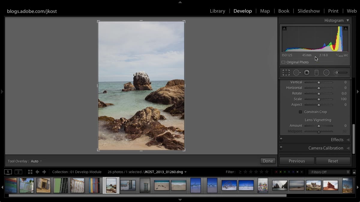
Before you can use the histogram intelligently, you need to understand what the shape represents. Kost uses a brilliant analogy here: imagine your image as a mosaic, where every single pixel is its own tile. Now pull those tiles off the wall and sort them into stacks by brightness, from darkest on the left to brightest on the right. The height of each stack is what you’re seeing in the histogram. A tall spike on the left means a lot of dark pixels. A tall spike on the right means a lot of bright ones.
Side-by-side comparison of high-contrast and low-contrast image histograms
Before you can use the histogram intelligently, you need to understand what the shape represents. Kost uses a brilliant analogy here: imagine your image as a mosaic, where every single pixel is its own tile. Now pull those tiles off the wall and sort them into stacks by brightness, from darkest on the left to brightest on the right. The height of each stack is what you’re seeing in the histogram. A tall spike on the left means a lot of dark pixels. A tall spike on the right means a lot of bright ones.
That’s it. The histogram isn’t judging your photo. It’s just describing it mathematically. A portrait shot in a dark studio will skew left. A snowy landscape will skew right. Neither is wrong on its own.
Step 2: Compare High-Contrast and Low-Contrast Images Side by Side
 Two images displayed side by side in Lightroom’s develop module
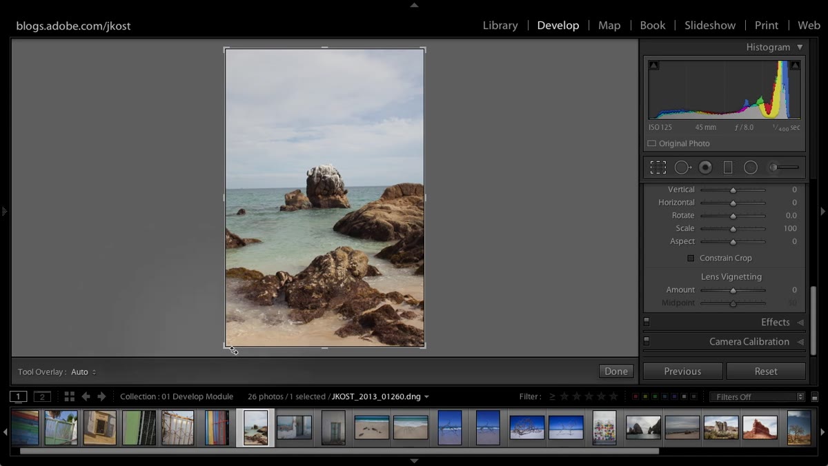
Kost demonstrates this using two images with very different tonal ranges. The high-contrast image has pixel data spread across the entire width of the histogram, from deep blacks all the way through bright whites. The low-contrast image, by comparison, has a histogram that clusters in the middle, with little to no data in the far highlights or deep shadows.
Two images displayed side by side in Lightroom’s develop module
Kost demonstrates this using two images with very different tonal ranges. The high-contrast image has pixel data spread across the entire width of the histogram, from deep blacks all the way through bright whites. The low-contrast image, by comparison, has a histogram that clusters in the middle, with little to no data in the far highlights or deep shadows.
Neither of these histograms is wrong. The low-contrast image simply doesn’t have values at the extremes of the tonal range, and that’s an accurate reflection of the scene. Once you start reading histograms comparatively like this, you stop trying to force every photo’s data to fill edge to edge.
Step 3: Recognize That There Is No “Correct” Histogram Shape
 Kost gesturing toward the histogram panel while explaining tonal distribution
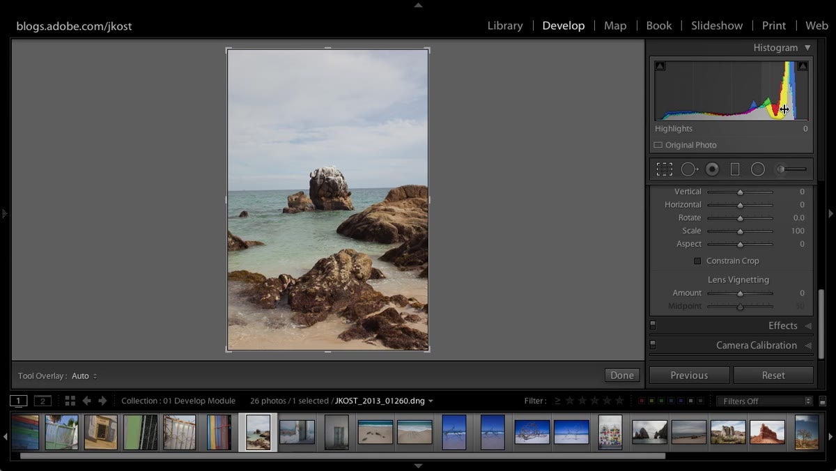
This is the mindset shift the whole tutorial hinges on. Kost is direct about it: the histogram is a visual representation of your image, not a grade on your exposure. If you photograph a black cat at night, nearly all your data will pile up on the shadow end of the histogram. If you photograph a white dog in bright sunlight, the opposite happens. Trying to “correct” either of those histograms by forcing the data toward the center would actually ruin the image.
Kost gesturing toward the histogram panel while explaining tonal distribution
This is the mindset shift the whole tutorial hinges on. Kost is direct about it: the histogram is a visual representation of your image, not a grade on your exposure. If you photograph a black cat at night, nearly all your data will pile up on the shadow end of the histogram. If you photograph a white dog in bright sunlight, the opposite happens. Trying to “correct” either of those histograms by forcing the data toward the center would actually ruin the image.
The practical takeaway is this: before you reach for the Exposure slider in Lightroom, look at your histogram and ask whether the distribution makes sense for the scene you actually shot. If it does, your job in the edit might be smaller than you think.
Step 4: Know Where Overexposure Actually Hurts You
 Histogram showing clipped highlight region pushed to pure white
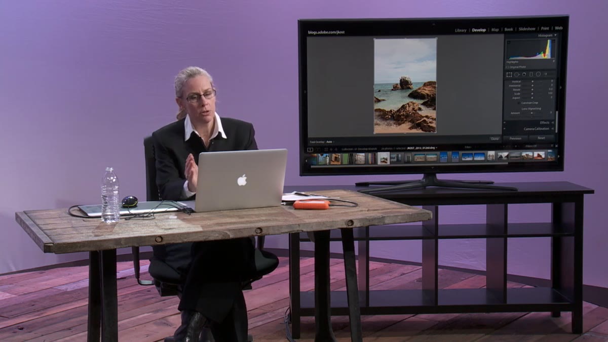
Kost gets specific about the one case where an extreme histogram does become a problem: when highlights clip to pure white. When pixels hit 255, 255, 255 in RGB, there’s no detail left to recover. Lightroom’s Highlights and Whites sliders are powerful, but they can’t reconstruct information that was never captured. You’ll just get a smoother gradient to gray instead of actual texture.
Histogram showing clipped highlight region pushed to pure white
Kost gets specific about the one case where an extreme histogram does become a problem: when highlights clip to pure white. When pixels hit 255, 255, 255 in RGB, there’s no detail left to recover. Lightroom’s Highlights and Whites sliders are powerful, but they can’t reconstruct information that was never captured. You’ll just get a smoother gradient to gray instead of actual texture.
The fix for this is in-camera, not in post. If your histogram shows a hard wall on the right edge with no gradual falloff, dial down your exposure compensation by a third or two-thirds of a stop and reshoot. Recover that data at capture, not at your desk.
Step 5: Understand Why Underexposure Is Not the Safe Alternative
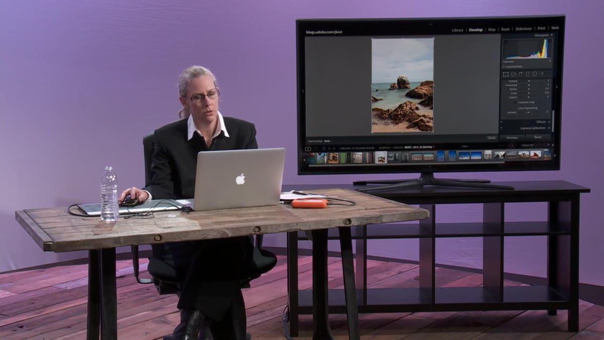 Kost demonstrating a flat underexposed image in the Lightroom Develop module
Here’s where a lot of photographers get tripped up. They hear “don’t blow your highlights” and overcorrect by deliberately underexposing everything. The logic feels sound: better to protect the highlights and brighten later. The problem is noise.
Kost demonstrating a flat underexposed image in the Lightroom Develop module
Here’s where a lot of photographers get tripped up. They hear “don’t blow your highlights” and overcorrect by deliberately underexposing everything. The logic feels sound: better to protect the highlights and brighten later. The problem is noise.
Digital camera sensors capture exponentially more light data in the brighter parts of the tonal range. The shadow regions, even when they look fine on the back of your camera, contain significantly more noise. When you underexpose and then push Exposure up in Lightroom’s Basic panel, you’re pulling that noisy shadow data up into the midtones where it becomes visible. What looked like a clean file at minus one stop becomes a grainy mess after brightening.
Step 6: Watch What Happens When You Push Exposure on an Underexposed File
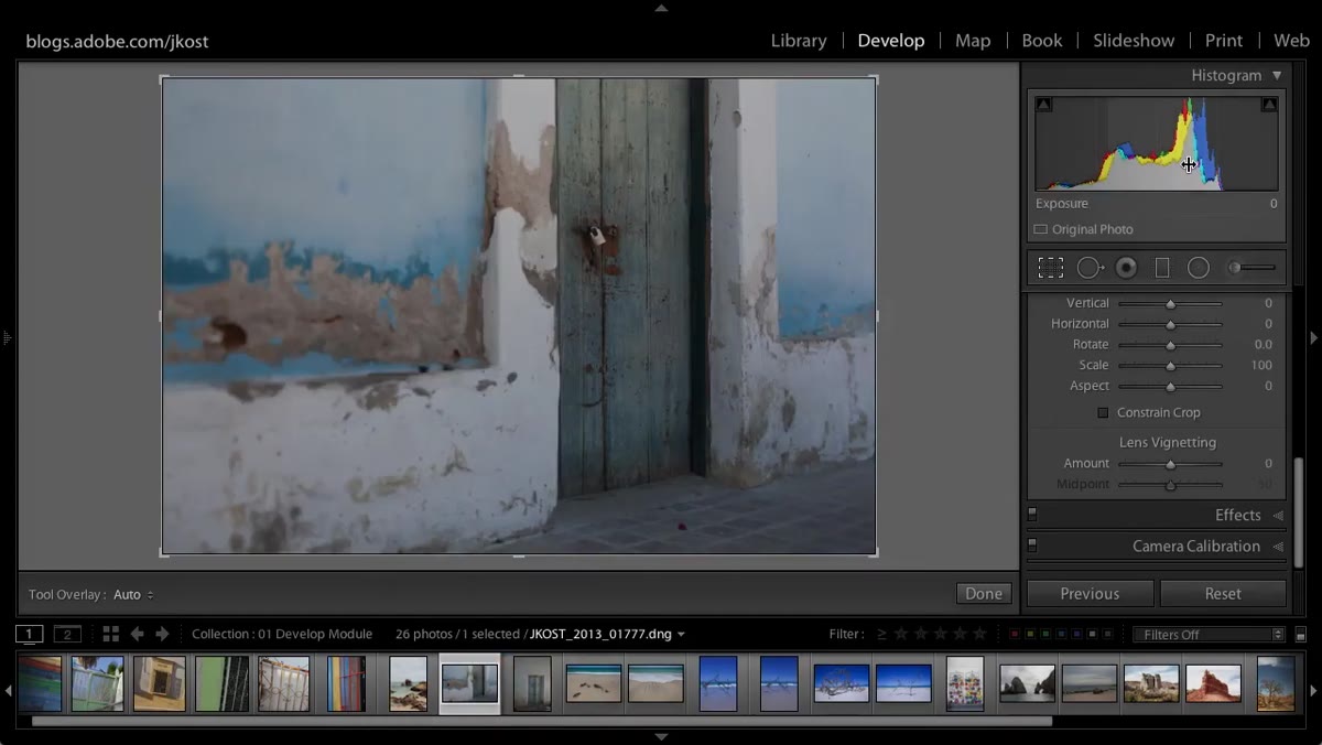 Exposure slider being increased on underexposed flat image in Basic panel
Kost demonstrates this live in Lightroom by taking a flat, underexposed image and increasing the Exposure slider. As the image brightens, the histogram shifts right and the image looks better at first glance. But those shadow tones that looked acceptable when the image was dark are now sitting in the midtone range, and the noise they carried comes with them.
Exposure slider being increased on underexposed flat image in Basic panel
Kost demonstrates this live in Lightroom by taking a flat, underexposed image and increasing the Exposure slider. As the image brightens, the histogram shifts right and the image looks better at first glance. But those shadow tones that looked acceptable when the image was dark are now sitting in the midtone range, and the noise they carried comes with them.
The visual result is a photo that looks technically brighter but tonally muddy, with grain that no amount of Noise Reduction will fully clean up without also softening detail. This is the core argument for exposing correctly at the moment of capture rather than treating Lightroom as an exposure fixer.
My Take: Use the Histogram to Set a Floor, Not a Target
I’ve started thinking about the histogram in two separate phases: one during the shoot and one during the edit. At the shoot, I’m watching for clipping on the right edge and noise risk on the left. I want to expose as far right as I can without losing highlight detail. That’s it. That’s the whole in-camera job.
In Lightroom, I’m not trying to reshape the histogram into some ideal bell curve. I’m using the tonal sliders to serve the image’s mood. A lot of my moody, low-key edit presets (I name them after songs, for what it’s worth) actually push the histogram back left after I’ve captured clean shadow data. You can always subtract light in post. Recovering lost detail is a much harder problem.
The single most important thing Kost communicates here is something that took me longer to internalize than I’d like to admit: Lightroom is a creative tool, not a correction service. The histogram helps you understand what you captured. Your job is to capture it well. After that, the editing is the fun part.
Watch the full tutorial on YouTube
Comments (2)
Would love to see a follow-up going deeper into this topic.
Applied this to my portfolio shots and the improvement is noticeable.
Leave a Comment