
There is a specific kind of frustration that comes from knowing a tool exists inside Lightroom and having no idea where it lives. I spent embarrassingly long periods of my early editing life right-clicking on things hoping something useful would appear. Thumbnail customization was one of those blind spots. I knew the grid view could show me more information. I did not know I had surgical control over exactly what that information was, where it appeared, or how to kill it instantly when it got in the way.
That changed when I sat down with this episode of The Lightroom Show from KelbyOne, hosted by Scott Kelby and RC Concepcion. Watch the full tutorial on YouTube before or after reading this, but what follows is the practical version you can open Lightroom alongside and actually work through. These are not glamorous techniques. They are the kind of workflow refinements that quietly save you ten minutes every session, which adds up to a lot of recovered time across a year of editing.
The specific problem this tutorial solves is orientation. When you are culling 400 images from a shoot, your grid view is your cockpit. If it is showing you the wrong instruments, or none at all, you are flying blind. Scott and RC walk through exactly how to configure that cockpit for maximum information density, then show you how to strip it back down when you need clean visual space again.
Step 1: Choose Your Starting View Style
 Grid view showing plain thumbnails with no extras visible
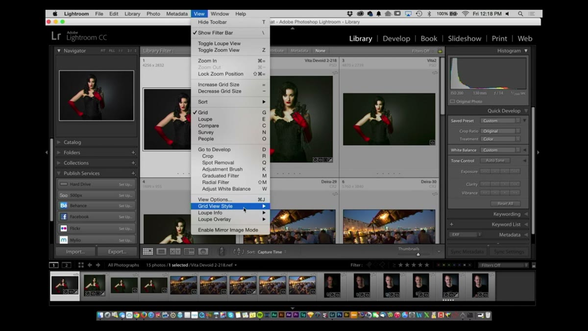
Open Lightroom and head to the Library module. By default you are probably looking at a clean grid of thumbnails with no metadata showing. That is fine for quick browsing, but it tells you nothing about the files. Go to View in the menu bar, then View Style, and select Show Extras. This reveals header information above each thumbnail and a row of small icons below each one called badges. Badges are shorthand indicators. They tell you at a glance whether an image has been edited, has keywords applied, belongs to a collection, or has been cropped. Think of them as the notification icons on your phone, but actually useful.
Grid view showing plain thumbnails with no extras visible
Open Lightroom and head to the Library module. By default you are probably looking at a clean grid of thumbnails with no metadata showing. That is fine for quick browsing, but it tells you nothing about the files. Go to View in the menu bar, then View Style, and select Show Extras. This reveals header information above each thumbnail and a row of small icons below each one called badges. Badges are shorthand indicators. They tell you at a glance whether an image has been edited, has keywords applied, belongs to a collection, or has been cropped. Think of them as the notification icons on your phone, but actually useful.
Step 2: Switch Between Expanded and Compact Cells
 Compact cells view with badges visible but header text removed
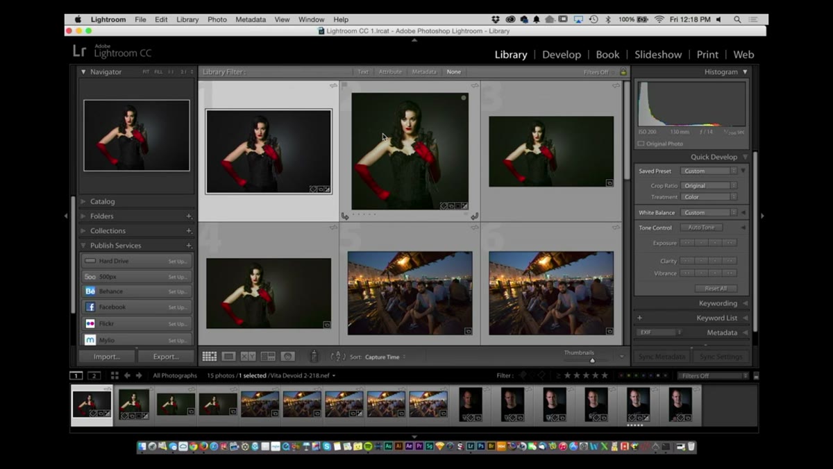
Still inside View and View Style, you have two main cell options: Expanded and Compact. Expanded cells give you the full header text above the image plus the badges below. Compact cells drop the header but keep the badges. Here is when I personally use each one. Expanded is for initial culling sessions when I want to see star ratings, file names, and capture times without hovering over anything. Compact is for later in the process when I am comparing selects and the extra text starts to feel like visual noise. The thumbnails themselves resize slightly between modes to accommodate the surrounding information, so your grid density shifts a little. That is expected behavior, not a bug.
Compact cells view with badges visible but header text removed
Still inside View and View Style, you have two main cell options: Expanded and Compact. Expanded cells give you the full header text above the image plus the badges below. Compact cells drop the header but keep the badges. Here is when I personally use each one. Expanded is for initial culling sessions when I want to see star ratings, file names, and capture times without hovering over anything. Compact is for later in the process when I am comparing selects and the extra text starts to feel like visual noise. The thumbnails themselves resize slightly between modes to accommodate the surrounding information, so your grid density shifts a little. That is expected behavior, not a bug.
Step 3: Drill Into View Options for Granular Control
 View Options dialog showing compact and expanded cell configuration panels
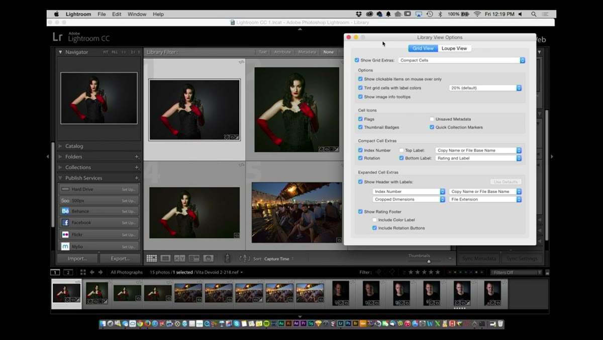
Here is where most people never go, and where most of the actual power lives. Press Command+J on Mac (Control+J on Windows) to open the View Options dialog. This panel lets you configure independently what appears in Compact mode and what appears in Expanded mode. You can toggle the header on or off entirely, choose which metadata fields populate each available slot, and decide whether the badge row appears at all. Uncheck the header checkbox and that row of text above your thumbnails disappears across every image simultaneously. This is not a one-image setting. It applies globally to your grid. Spend five minutes in this dialog building a configuration that matches how you actually cull, and you will not need to touch it again for months.
View Options dialog showing compact and expanded cell configuration panels
Here is where most people never go, and where most of the actual power lives. Press Command+J on Mac (Control+J on Windows) to open the View Options dialog. This panel lets you configure independently what appears in Compact mode and what appears in Expanded mode. You can toggle the header on or off entirely, choose which metadata fields populate each available slot, and decide whether the badge row appears at all. Uncheck the header checkbox and that row of text above your thumbnails disappears across every image simultaneously. This is not a one-image setting. It applies globally to your grid. Spend five minutes in this dialog building a configuration that matches how you actually cull, and you will not need to touch it again for months.
Step 4: Move Into Loop View and Configure the Info Overlay
 Loop view showing image with info overlay text displayed in upper corner
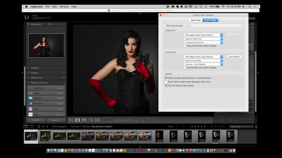
Double-click any thumbnail to enter Loop view, which is Lightroom’s single-image view inside the Library module. You will notice a text overlay appears in the corner of your image showing metadata. This overlay is configurable the same way the grid is. Look at the overlay options in the toolbar or revisit the View Options dialog, this time focusing on the Loupe View tab. You can set two different info presets and toggle between them.
Loop view showing image with info overlay text displayed in upper corner
Double-click any thumbnail to enter Loop view, which is Lightroom’s single-image view inside the Library module. You will notice a text overlay appears in the corner of your image showing metadata. This overlay is configurable the same way the grid is. Look at the overlay options in the toolbar or revisit the View Options dialog, this time focusing on the Loupe View tab. You can set two different info presets and toggle between them.
Step 5: Use the New Camera Plus Lens Plus Settings Option (Lightroom CC and 6)
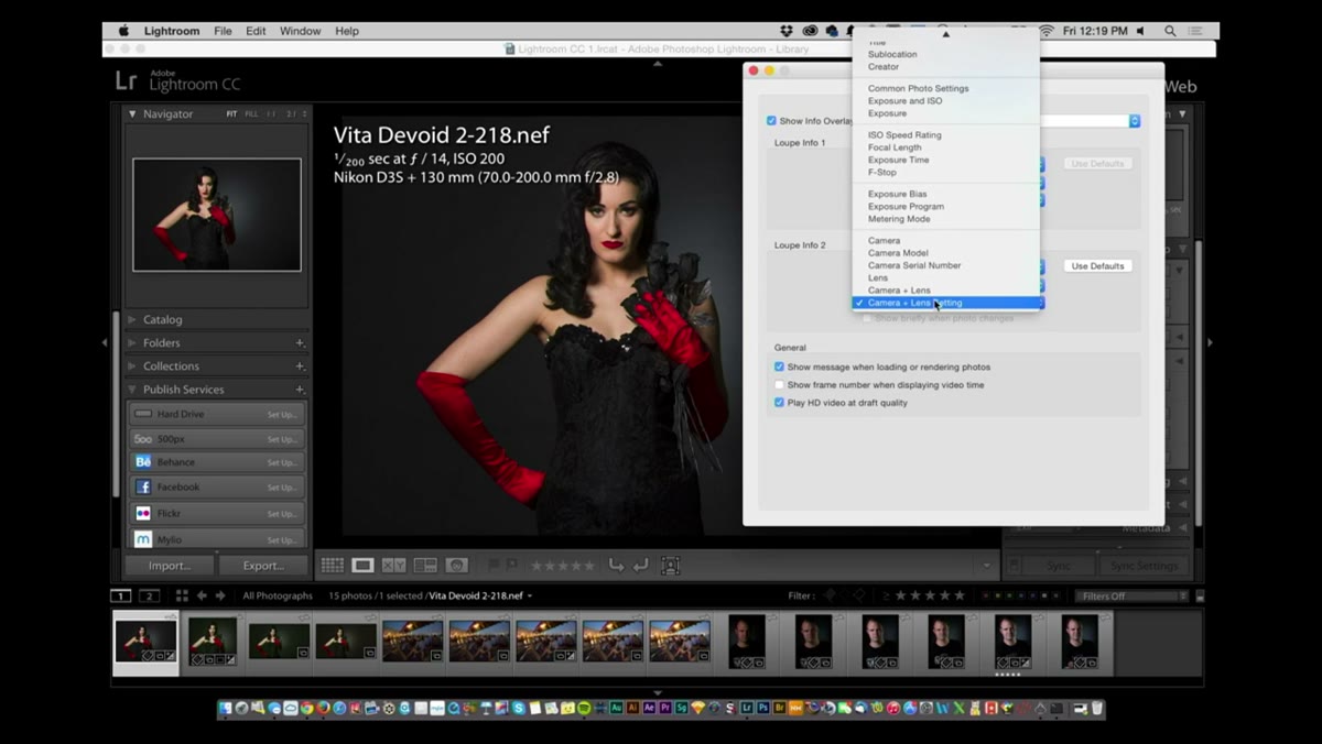 Loop view info overlay showing camera, lens, and shooting settings simultaneously
This is the piece of the tutorial that made me immediately open Lightroom to verify it was there. In the Loupe View info options, there is a new display mode that Scott and RC highlight as a Lightroom CC addition. Instead of just showing which camera body captured an image, you can now select Camera Plus Lens Plus Settings. That single line of overlay text then shows you the camera body, the specific lens attached, and the key shooting parameters, including shutter speed, aperture, and ISO, all at once. For gear-obsessed shooters tracking which lens combinations produce certain results, this is genuinely useful. I use it when reviewing portraits because I want to see the focal length next to the image, not dig into the metadata panel on the right.
Loop view info overlay showing camera, lens, and shooting settings simultaneously
This is the piece of the tutorial that made me immediately open Lightroom to verify it was there. In the Loupe View info options, there is a new display mode that Scott and RC highlight as a Lightroom CC addition. Instead of just showing which camera body captured an image, you can now select Camera Plus Lens Plus Settings. That single line of overlay text then shows you the camera body, the specific lens attached, and the key shooting parameters, including shutter speed, aperture, and ISO, all at once. For gear-obsessed shooters tracking which lens combinations produce certain results, this is genuinely useful. I use it when reviewing portraits because I want to see the focal length next to the image, not dig into the metadata panel on the right.
Step 6: Toggle the Info Overlay Off Instantly with Command+I
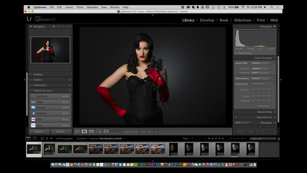 Loop view with info overlay hidden after keyboard shortcut applied
Knowing the overlay exists is one thing. Knowing how to make it disappear without clicking through menus is what separates a smooth editing session from a constantly interrupted one. The shortcut is Command+I on Mac, Control+I on Windows. Press it once, the overlay appears. Press it again, it is gone. Scott specifically calls this out because it is one of the most common questions he gets from newer Lightroom users who accidentally triggered the overlay and could not figure out how to clear the text off their image. Memorize this shortcut before you close this tab.
Loop view with info overlay hidden after keyboard shortcut applied
Knowing the overlay exists is one thing. Knowing how to make it disappear without clicking through menus is what separates a smooth editing session from a constantly interrupted one. The shortcut is Command+I on Mac, Control+I on Windows. Press it once, the overlay appears. Press it again, it is gone. Scott specifically calls this out because it is one of the most common questions he gets from newer Lightroom users who accidentally triggered the overlay and could not figure out how to clear the text off their image. Memorize this shortcut before you close this tab.
Step 7: Resize Thumbnails with the Plus and Minus Keys
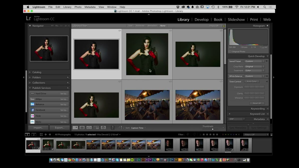 Grid view with thumbnail size increasing via keyboard shortcut
RC drops this as a quick bonus at the end of the thumbnail section, and it is the kind of thing that sounds small until you use it every day. Instead of dragging the thumbnail size slider in the toolbar at the bottom of the grid, just hit the Plus key to increase thumbnail size and the Minus key to decrease it. It steps through the size range incrementally and keeps your hands on the keyboard instead of hunting for the slider.
Grid view with thumbnail size increasing via keyboard shortcut
RC drops this as a quick bonus at the end of the thumbnail section, and it is the kind of thing that sounds small until you use it every day. Instead of dragging the thumbnail size slider in the toolbar at the bottom of the grid, just hit the Plus key to increase thumbnail size and the Minus key to decrease it. It steps through the size range incrementally and keeps your hands on the keyboard instead of hunting for the slider.
One Thing I Would Add From My Own Workflow
The tutorial covers the what and the where, but not always the when. My personal rule is to run Expanded cells with the full header during a first-pass cull, then switch to Compact before I start rating and rejecting in earnest. The visual compression helps me evaluate images more honestly because I am looking at the photograph instead of the file name. If you shoot tethered in the studio, the reverse is sometimes true. You want maximum data visible because you are making real-time decisions about lighting adjustments and the metadata is part of that feedback loop.
The single most important thing this tutorial taught me is that the grid view is not a fixed interface. It is a configurable workspace, and configuring it to match your actual process costs almost no time and pays back immediately. Stop editing in whatever default view Lightroom opened with and build one that fits how you think.
Watch the full tutorial on YouTube to see Scott and RC walk through these settings live, including additional workflow changes introduced in the Lightroom CC update covered later in the episode.
Comments
Leave a Comment