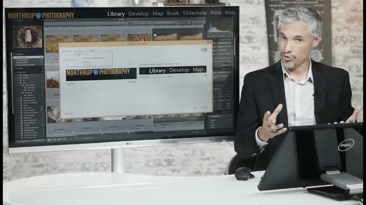
Every time I open Lightroom in front of a client, I want them to see my name, not Adobe’s. That sounds like a small vanity thing, but think about the moment: someone is sitting next to you, you’re about to show them their wedding portraits or their band’s press shots, and the first thing they clock in the top left corner is a prompt to “Get started with Lightroom Mobile.” Not exactly the professional first impression you were going for.
In this Tony & Chelsea Northrup tutorial, Tony walks through exactly how to replace that default identity plate with your own custom logo, and it’s one of those five-minute tweaks that pays off every single time you open the app. I’ve had my own name in that corner for years, and I’m a little embarrassed it took me as long as it did to set it up. If you want to follow along visually, Watch the full tutorial on YouTube before diving into the steps below.
The whole process lives inside one dialog box, and the hardest part is honestly just knowing where to click first. Here’s how to do it.
Step 1: Open the Identity Plate Settings
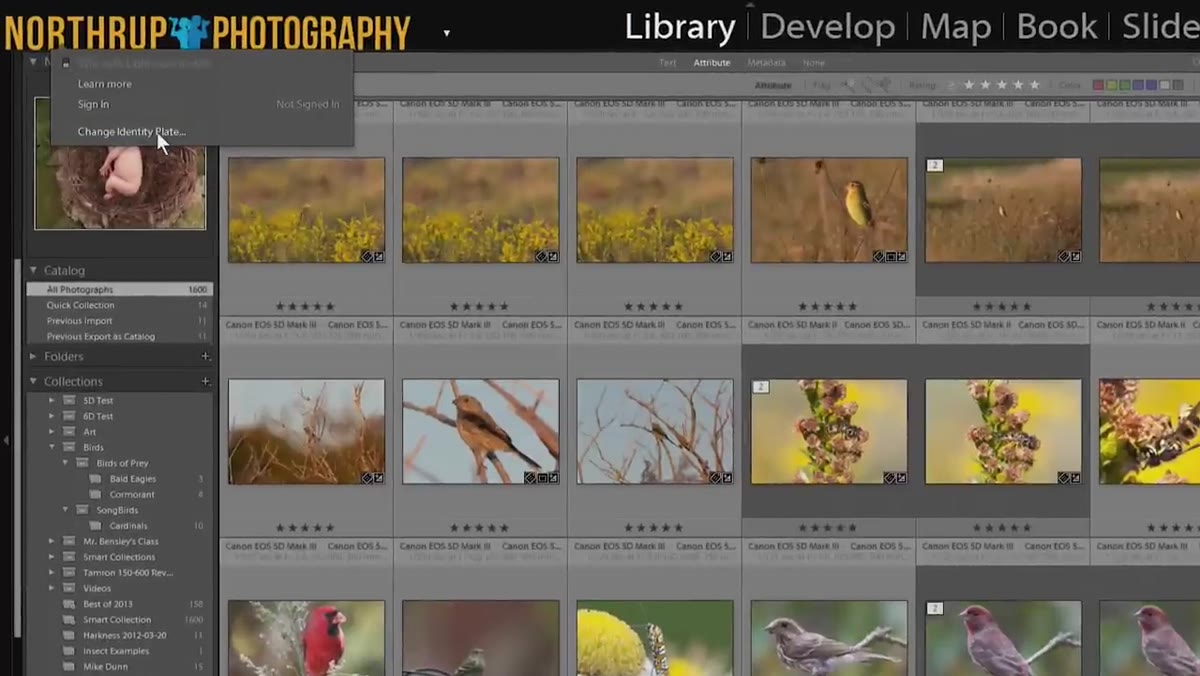 Clicking the identity plate area in the top left corner
Look at the very top-left corner of your Lightroom interface. You’ll see either Adobe’s default branding or, if someone else has been in here before you, a name or logo already sitting there. Click directly on it. A small dropdown will appear, and you want to select “Edit Identity Plate.” That opens the main dialog where all of this happens.
Clicking the identity plate area in the top left corner
Look at the very top-left corner of your Lightroom interface. You’ll see either Adobe’s default branding or, if someone else has been in here before you, a name or logo already sitting there. Click directly on it. A small dropdown will appear, and you want to select “Edit Identity Plate.” That opens the main dialog where all of this happens.
If you’ve never touched this setting, Lightroom is probably showing you the “Lightroom Mobile” default. Tony’s take on this in the video is pretty blunt, and I agree completely: nobody wants an advertisement for a different Adobe product every time they boot up their own editing software. Change it immediately.
Step 2: Choose “Personalized” and Select “Custom”
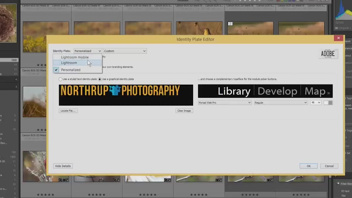 Identity plate dialog showing personalized option selected
Inside the dialog, you’ll see a toggle at the top that lets you switch between the default Adobe plate and a “Personalized” option. Select “Personalized.” From there, you’ll see a secondary option to use either a styled text identity plate or a graphical one. Either way, make sure the dropdown underneath reads “Custom” rather than any saved preset, so you’re working with a clean slate.
Identity plate dialog showing personalized option selected
Inside the dialog, you’ll see a toggle at the top that lets you switch between the default Adobe plate and a “Personalized” option. Select “Personalized.” From there, you’ll see a secondary option to use either a styled text identity plate or a graphical one. Either way, make sure the dropdown underneath reads “Custom” rather than any saved preset, so you’re working with a clean slate.
This dialog also doubles as the place where you can save multiple versions of your identity plate and switch between them later. If you share a machine with another photographer or shoot under multiple brands, you can build out a small library of plates and swap them in seconds. That’s genuinely useful.
Step 3: Set Up a Text-Based Identity Plate
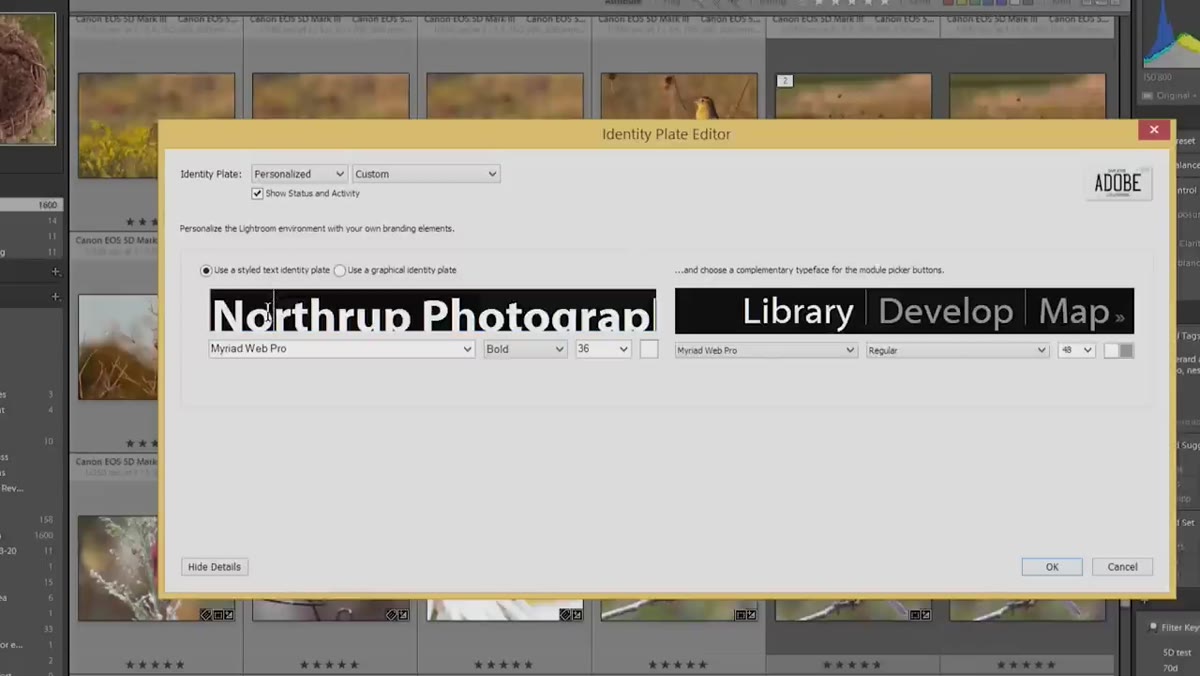 Styled text option selected with font picker visible
The fastest route to something that looks good is the “Use a styled text identity plate” option. Type your name or studio name into the text field, then use the font controls below to choose a typeface that fits your brand. Tony picks a pirate-style novelty font in the video mostly for laughs, but his actual point is solid: pick something that says what you’re about. If you’re shooting corporate headshots, a serif font reads differently than a hand-lettered script, and both are going to serve you better than Adobe’s default.
Styled text option selected with font picker visible
The fastest route to something that looks good is the “Use a styled text identity plate” option. Type your name or studio name into the text field, then use the font controls below to choose a typeface that fits your brand. Tony picks a pirate-style novelty font in the video mostly for laughs, but his actual point is solid: pick something that says what you’re about. If you’re shooting corporate headshots, a serif font reads differently than a hand-lettered script, and both are going to serve you better than Adobe’s default.
You can also adjust the color here, which matters if your logo or brand has a specific palette. Even if you’re keeping it simple with your name in a clean sans-serif, matching the color to something in your actual branding makes the whole interface feel more intentional.
Step 4: Design Your Graphical Logo at Exactly 45 Pixels Tall
 Logo file loaded but overflowing the identity plate area
If you have an actual logo file, or if you want to mock something up in Photoshop, this is where the one technical rule in the whole process shows up: your logo needs to be 45 pixels tall. Not approximately. Exactly 45.
Logo file loaded but overflowing the identity plate area
If you have an actual logo file, or if you want to mock something up in Photoshop, this is where the one technical rule in the whole process shows up: your logo needs to be 45 pixels tall. Not approximately. Exactly 45.
Tony shows what happens when you ignore this, and it’s a little painful to watch. A 60-pixel-tall logo gets its top sliced off. A large, unresized file scrolls completely off-screen. Lightroom doesn’t scale the image for you, which is a baffling design choice from a piece of software whose entire job is resizing images. The fix is simple: design your logo at whatever size feels comfortable to work in, then export or save-as with a maximum height of 45 pixels. Most export dialogs in Photoshop or Affinity Photo will let you constrain by height. Do that before you bring it into Lightroom.
One other tip from the video worth keeping: design your logo to be wide and short rather than square or tall. The identity plate area is a horizontal rectangle, so a standard square logo is going to either overflow or leave awkward empty space.
Step 5: Load the Graphical File and Save Your Plate
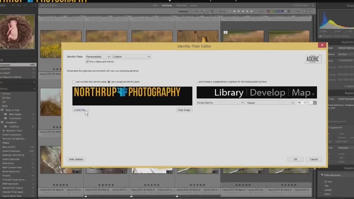 Correctly sized 45px logo fitting cleanly in the identity plate
Back in the identity plate dialog, switch to “Use a graphical identity plate” and click the “Locate File” button. Navigate to your 45-pixel-tall PNG or JPEG and select it. If you sized it correctly, it should drop right into place and look clean inside the preview area at the top of the dialog.
Correctly sized 45px logo fitting cleanly in the identity plate
Back in the identity plate dialog, switch to “Use a graphical identity plate” and click the “Locate File” button. Navigate to your 45-pixel-tall PNG or JPEG and select it. If you sized it correctly, it should drop right into place and look clean inside the preview area at the top of the dialog.
Once it looks right, hit the dropdown that says “Custom” and choose “Save Current Settings as New Preset.” Give it a name you’ll recognize later, something descriptive like your studio name or “Main Logo.” Click OK, and you’re done. That plate is now saved and available from the top-left corner dropdown anytime you want to switch back to it.
Step 6: Resize the Module Picker Text While You’re in There
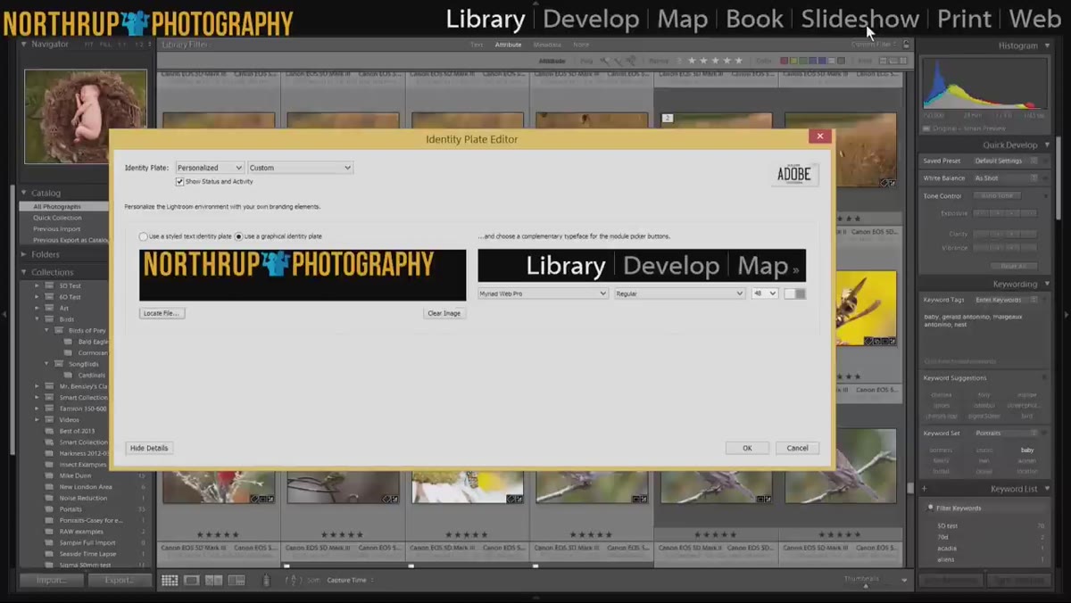 Module picker buttons Library Develop Map shown in larger font size
The same dialog controls the font size of the module buttons across the top of Lightroom: Library, Develop, Map, Book, and the rest. By default these are set pretty small, around 14 or 18 points, and Tony’s instinct to bump them up is one I share. He goes to 48, which is more than I’d personally use, but anything in the 24-36 range makes the interface a lot easier to navigate, especially on a high-DPI display where those labels can get tiny.
Module picker buttons Library Develop Map shown in larger font size
The same dialog controls the font size of the module buttons across the top of Lightroom: Library, Develop, Map, Book, and the rest. By default these are set pretty small, around 14 or 18 points, and Tony’s instinct to bump them up is one I share. He goes to 48, which is more than I’d personally use, but anything in the 24-36 range makes the interface a lot easier to navigate, especially on a high-DPI display where those labels can get tiny.
One Thing I’d Add: Use a Transparent PNG
The video doesn’t get into file format specifics, but from experience, always export your graphical logo as a PNG with a transparent background rather than a JPEG with a white or solid fill. Lightroom’s interface uses a dark charcoal header, and a logo with a white background box around it looks immediately amateur. A transparent PNG lets the logo sit cleanly on whatever color the panel happens to be, which also makes it more resilient if Adobe ever tweaks the UI color in an update.
The single most important thing to take away from this tutorial: size your logo to exactly 45 pixels tall before you bring it into Lightroom, because the software will not do it for you. Everything else in this process is flexible and reversible. That dimension is the one thing that will either make your logo look sharp or make it look broken.
Watch the full tutorial on YouTube to see Tony walk through the whole thing live, including the part where an oversized logo does something genuinely ridiculous to the interface.
Comments
Leave a Comment