
Every time I finished a project and moved into the Book module, I’d spend ten minutes scrolling through the built-in layout templates, picking the least-wrong one, and moving on. Not the best one. The least wrong one. There’s a difference, and if you’ve used Lightroom’s Book module for anything more than a quick blurb project, you know exactly what I mean. The templates are fine for generic use, but the moment you have a specific vision for how three tall portraits should sit side by side, or how an image should bleed into a particular corner, the template library starts feeling like trying to find a song you like on a radio station that’s almost right.
That changed when I watched Scott Kelby’s Lightroom Tip Tuesday tutorial on creating custom book layouts. It’s one of those features Adobe quietly dropped into the Book module without throwing a parade about it, and most people are still clicking through the same 40-odd preset layouts without knowing they can build their own from scratch. The workflow is genuinely fast once you see it. Here’s the full breakdown. Watch the full tutorial on YouTube
Step 1: Open the Book Module and Start With a Single Layout
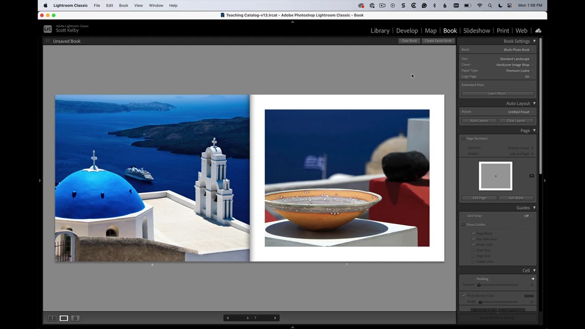 Book module open with a single full-page layout selected
Start in the Book module with a page that has at least one layout applied. You don’t need to gut your existing layout to do this. Kelby begins with a standard single-image page, which is as clean a starting point as any. The key insight here is that you’re not replacing the existing cell system. You’re adding to it, layering your own custom cells on top of the page canvas.
Book module open with a single full-page layout selected
Start in the Book module with a page that has at least one layout applied. You don’t need to gut your existing layout to do this. Kelby begins with a standard single-image page, which is as clean a starting point as any. The key insight here is that you’re not replacing the existing cell system. You’re adding to it, layering your own custom cells on top of the page canvas.
If you’re starting fresh, click the small layout icon in the corner of any page in the book editor to load a basic single-photo layout. That gives you one cell to work from before you start building out the rest manually.
Step 2: Click the Existing Image Cell to Reveal the Handles
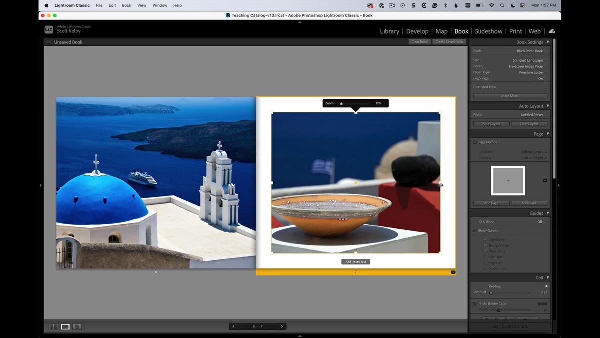 Image cell selected with resize handles visible on page
Click directly on the image on your page and you’ll see the familiar resize handles appear around the cell. This is where custom layout building begins. The cell is now live and repositionable. You can drag the edges to resize it, and drag from the center point to move the entire cell around the canvas.
Image cell selected with resize handles visible on page
Click directly on the image on your page and you’ll see the familiar resize handles appear around the cell. This is where custom layout building begins. The cell is now live and repositionable. You can drag the edges to resize it, and drag from the center point to move the entire cell around the canvas.
The first thing Kelby does here is resize the existing cell into a tall, narrow column shape, positioned toward one side of the page. This becomes your first of three portrait-orientation cells. Pull the right edge inward, the top and bottom edges toward the page boundaries, and you’ve got your template for what the other cells will match.
Step 3: Right-Click an Empty Area and Add a New Photo Cell
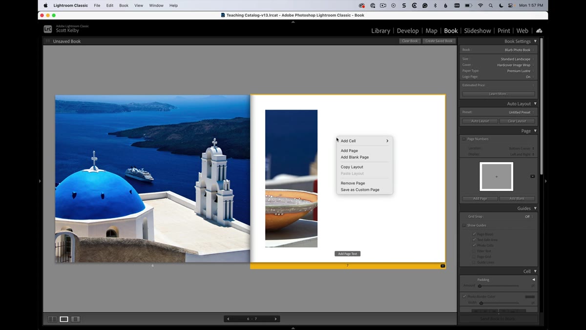 Right-click context menu showing Add Cell and Photo option
Here’s the move most people don’t know about. Right-click on any empty space on the page canvas, and a context menu appears with an “Add Cell” option. Hover over that, and you get the choice to add a Photo cell or a Text cell. Choose Photo.
Right-click context menu showing Add Cell and Photo option
Here’s the move most people don’t know about. Right-click on any empty space on the page canvas, and a context menu appears with an “Add Cell” option. Hover over that, and you get the choice to add a Photo cell or a Text cell. Choose Photo.
A new blank cell drops onto the page. It won’t have an image in it yet, and that’s fine. Think of it as a placeholder you’ll size, position, and then fill. You can add as many of these as your layout needs. Kelby adds two more for his three-column portrait layout, right-clicking in empty space each time to summon a fresh cell.
Step 4: Resize and Position Each Cell Using the Center Handle vs. Edge Handles
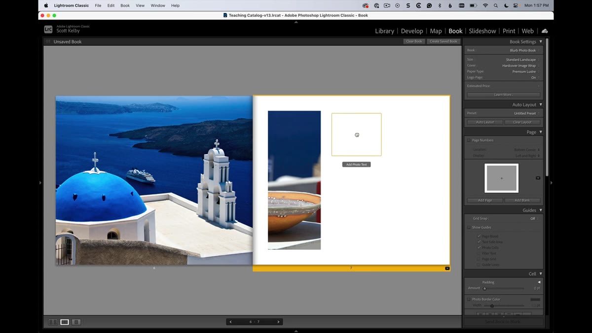 Cell being repositioned using center move handle on canvas
This is the part that trips people up once or twice before it clicks. Each cell has two types of interaction points: the edges and corners (which resize the cell), and the center dot (which moves the entire cell without resizing it). If you’re trying to nudge a cell across the page and it keeps stretching instead of moving, you’re clicking the wrong spot.
Cell being repositioned using center move handle on canvas
This is the part that trips people up once or twice before it clicks. Each cell has two types of interaction points: the edges and corners (which resize the cell), and the center dot (which moves the entire cell without resizing it). If you’re trying to nudge a cell across the page and it keeps stretching instead of moving, you’re clicking the wrong spot.
Grab the center dot to drag the whole cell into position. Grab any edge or corner handle to resize. For a three-column layout, you want each cell roughly the same width, tall enough to nearly fill the page height, and spaced evenly. You don’t have to eyeball the spacing perfectly, though, because the next step takes care of that.
Step 5: Turn On Grid Snap to Align Cells Cleanly
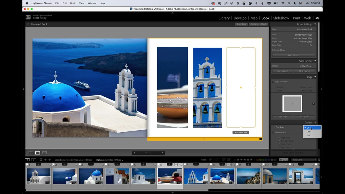 Grid Snap setting being toggled on in the right panel
In the right-side panel of the Book module, there’s a “Grid Snap” option that defaults to off. Turn it on. Once enabled, you can set it to snap to Cells or to the full grid. The Cells option makes your custom cells snap relative to each other, which is exactly what you need when you’re trying to get three columns sitting flush with identical gaps.
Grid Snap setting being toggled on in the right panel
In the right-side panel of the Book module, there’s a “Grid Snap” option that defaults to off. Turn it on. Once enabled, you can set it to snap to Cells or to the full grid. The Cells option makes your custom cells snap relative to each other, which is exactly what you need when you’re trying to get three columns sitting flush with identical gaps.
With Grid Snap active, drag your cells into position and you’ll feel them lock into place rather than drifting by a few pixels. Kelby demonstrates this clearly: once snap is on, the cell almost pulls itself into alignment. For anyone who’s spent ten minutes trying to pixel-push cells into a clean grid manually, this setting is the thing that makes the whole system usable.
Step 6: Drag and Drop Photos Into Each Custom Cell
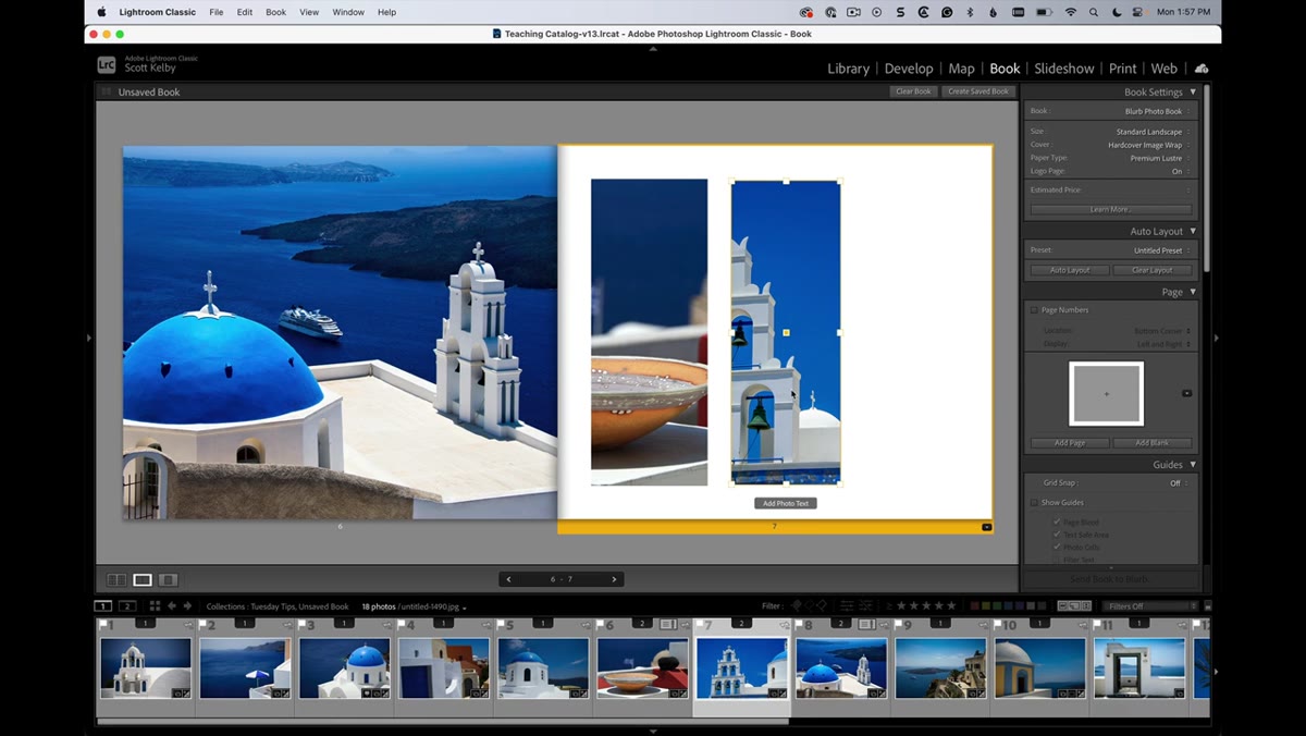 Photo being dragged from filmstrip into a custom cell
Custom cells don’t auto-populate from your book’s image sequence. You fill them by dragging a photo directly from the filmstrip at the bottom of the screen into the cell on the canvas. Drag until the cell highlights, then release.
Photo being dragged from filmstrip into a custom cell
Custom cells don’t auto-populate from your book’s image sequence. You fill them by dragging a photo directly from the filmstrip at the bottom of the screen into the cell on the canvas. Drag until the cell highlights, then release.
Once the photo is inside the cell, you can reposition it within the cell boundaries by clicking and dragging inside the cell, as long as you avoid the center dot (which would move the whole cell again). This lets you pan the photo to control which part of the image shows within the frame. Tighten a crop, shift the subject into a better position, or let negative space breathe on one side. The cell is the frame. The photo floats inside it.
One Thing I’d Add: Save the Layout as a Template Before You Close
Kelby covers the mechanics cleanly, but there’s one practical step the tutorial doesn’t dwell on: once you’ve built a custom layout you like, save it. You can do this by clicking the layout icon on the page and choosing to save it as a custom template. Give it an actual name you’ll recognize later. I name mine after whatever project they came from, the same way I name presets after songs. A layout I built for a Nashville street photography project is saved as “Wide Street Triptych” and I’ve reused it half a dozen times since.
If you skip this step and close the book, the layout stays on that page but isn’t available as a reusable starting point for future projects. Take 15 seconds to save it. Future you will be grateful.
The single most important thing to take away from this technique is that the Book module’s custom cell system is genuinely flexible, and the barrier to using it is much lower than it looks. Right-click, add cell, resize, snap, fill. That’s the whole loop. Once you run through it once, you’ll stop reaching for the template library as a first resort.
Watch the full tutorial on YouTube to see Scott Kelby walk through the whole thing in real time. It’s a short one, and every second of it is useful.
Comments (2)
The before and after really sells it. Incredible difference.
Great article! I actually covered something related on my site — the photography angle is really complementary to this.
Leave a Comment