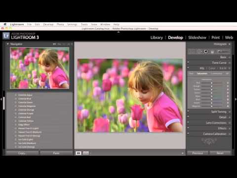
Every photographer I know has a folder of photos they never finished editing. Not because the images were bad, but because they couldn’t figure out the look fast enough before creative momentum died. They’d drag the orange saturation down, pull the blues, squint at the result, hate it, and then spend ten minutes resetting everything by hand. By then the magic was gone.
I ran into this exact problem when I was building the preset pack I ended up giving away a few years back. I’d spent a whole weekend creating selective color grades manually for each photo, one at a time, and the process was exhausting. So when I came across this KelbyOne tutorial on colorizing presets and the thinking behind them, it clicked hard. Watch the full tutorial on YouTube - it’s short, but the concept is dense enough that a written breakdown is worth having alongside it.
The core idea is deceptively simple. Instead of building one “finished” preset, you build a collection of single-color presets that each preserve exactly one hue and strip saturation from everything else. You hover over them in the Navigator panel, preview the result instantly, and move on. No committing. No resetting. No friction. Here’s how to build that system from scratch.
Step 1: Set Up Your First Selective Color Look in the HSL Panel
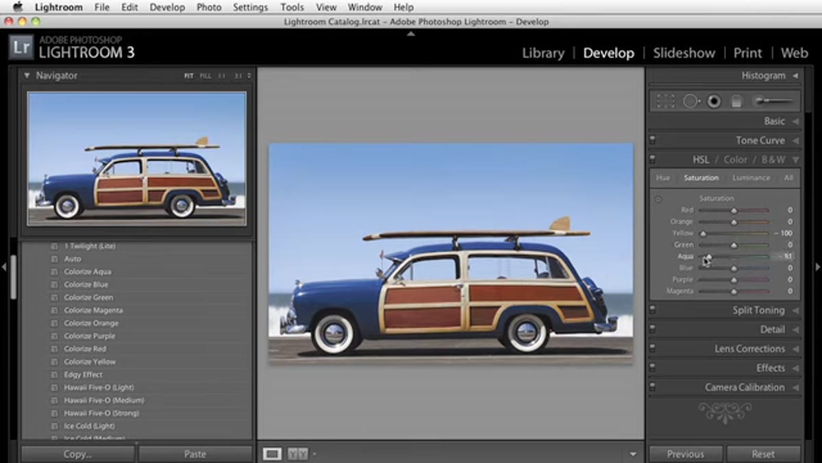 HSL panel with most color saturation sliders pulled to zero
Open any image in Lightroom’s Develop module and navigate to the HSL/Color panel. Pull the Saturation sliders for every color channel down to zero - except for the one you want to keep. For your first preset, try keeping just the Reds fully saturated while everything else goes to zero. You’re creating a look where only red-toned subjects hold their color, and the rest of the image reads almost monochrome. Think red car on a gray street.
HSL panel with most color saturation sliders pulled to zero
Open any image in Lightroom’s Develop module and navigate to the HSL/Color panel. Pull the Saturation sliders for every color channel down to zero - except for the one you want to keep. For your first preset, try keeping just the Reds fully saturated while everything else goes to zero. You’re creating a look where only red-toned subjects hold their color, and the rest of the image reads almost monochrome. Think red car on a gray street.
The effect hits differently depending on what’s in the frame. On a portrait, red-only saturation can look dramatic but slightly ghoulish. On architecture or product shots, it can feel bold and graphic. Don’t judge the look in isolation - that’s what the preview step is for.
Step 2: Save It as a Preset with Color Adjustments Only
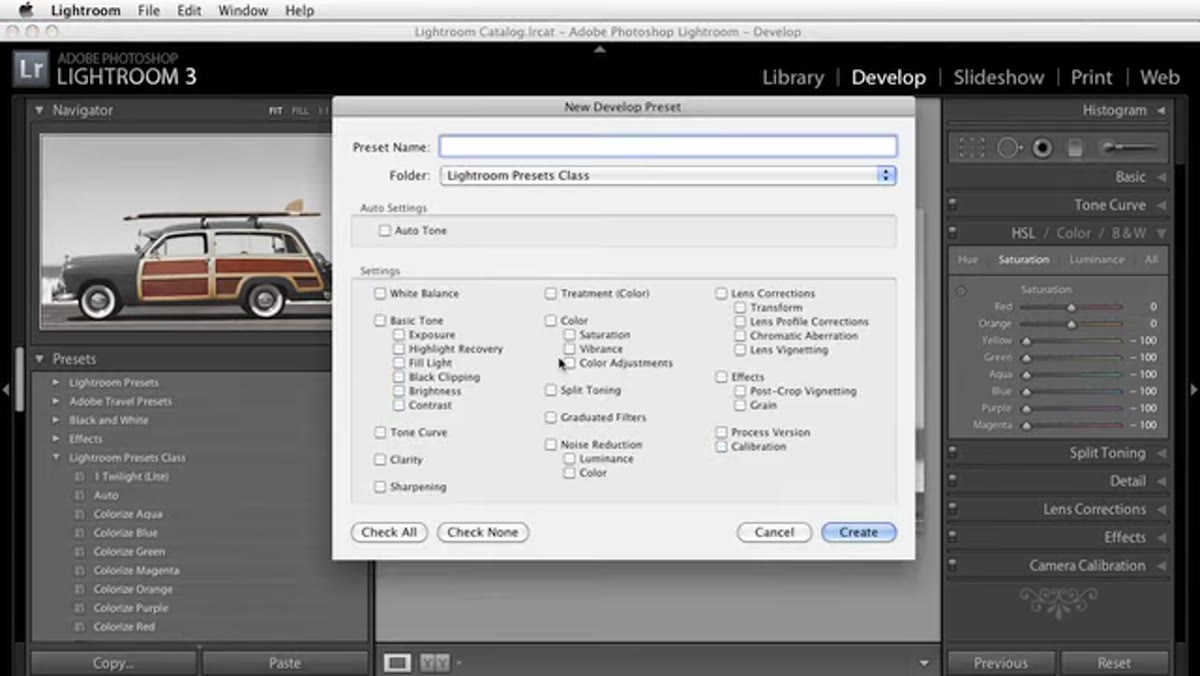 New preset dialog with “Color Adjustments” checkbox selected
Here’s where most people make the mistake of saving everything. When you click the “+” icon to create a new preset, click “Check None” first to deselect all the options, then turn on only your Color Adjustments (HSL/Color/B&W). That’s it. Nothing else.
New preset dialog with “Color Adjustments” checkbox selected
Here’s where most people make the mistake of saving everything. When you click the “+” icon to create a new preset, click “Check None” first to deselect all the options, then turn on only your Color Adjustments (HSL/Color/B&W). That’s it. Nothing else.
This keeps the preset surgical. It will only apply your saturation changes and won’t override the exposure, tone curve, or sharpening settings you’ve already dialed in for the image. Give it a name that actually means something to you. I name mine after songs, so my red-only preset is called “Little Red Corvette.” Your system can be whatever makes you move faster.
Step 3: Repeat for Every Color in the Spectrum
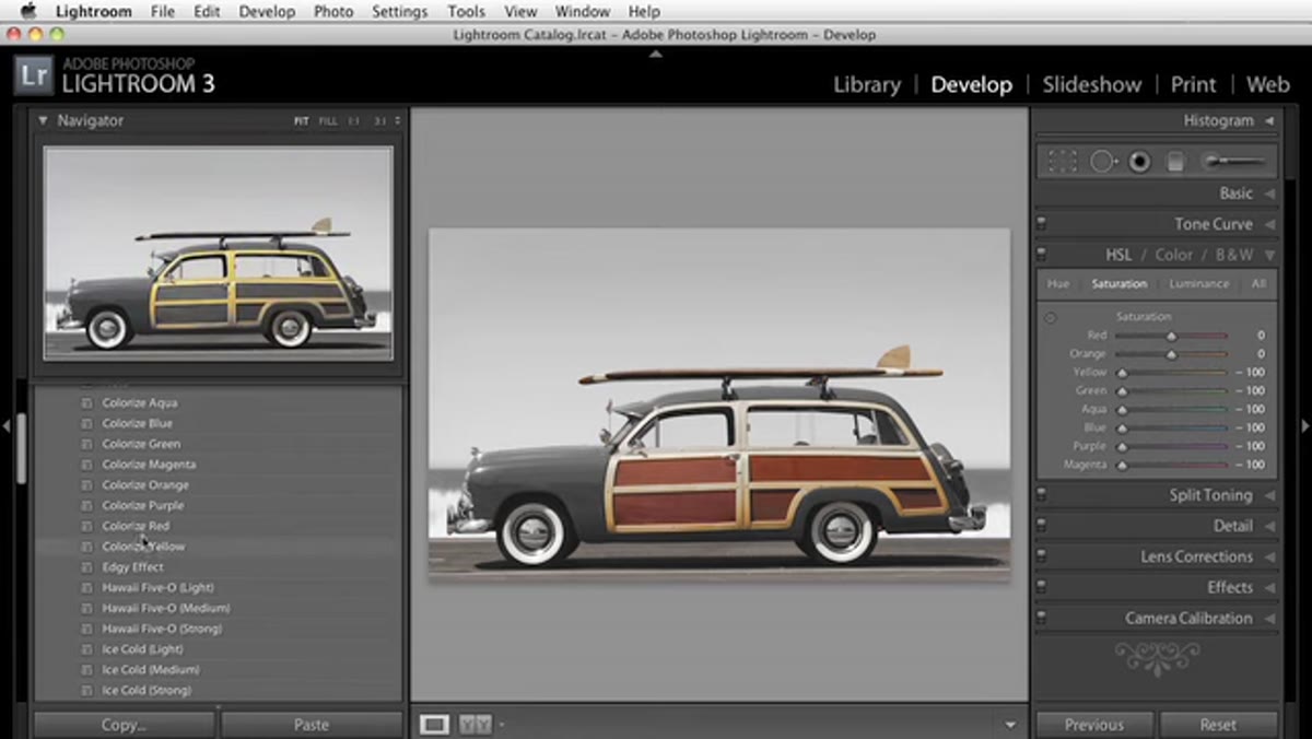 Preset panel showing a list of colorize presets for multiple hues
Build the same preset for each major hue - orange, yellow, green, aqua, blue, purple, and magenta. Each one follows the same logic: saturation at zero for every channel except the one you’re featuring. You also want to consider combinations. A red-plus-orange preset is particularly useful for portraits because skin tones live in the orange range, and pulling orange out of a face makes people look like they’ve seen a ghost.
Preset panel showing a list of colorize presets for multiple hues
Build the same preset for each major hue - orange, yellow, green, aqua, blue, purple, and magenta. Each one follows the same logic: saturation at zero for every channel except the one you’re featuring. You also want to consider combinations. A red-plus-orange preset is particularly useful for portraits because skin tones live in the orange range, and pulling orange out of a face makes people look like they’ve seen a ghost.
The setup time is maybe 20 minutes total if you work quickly, and you only do it once. After that, this is a permanent asset in your catalog.
Step 4: Use the Navigator Panel to Preview Without Committing
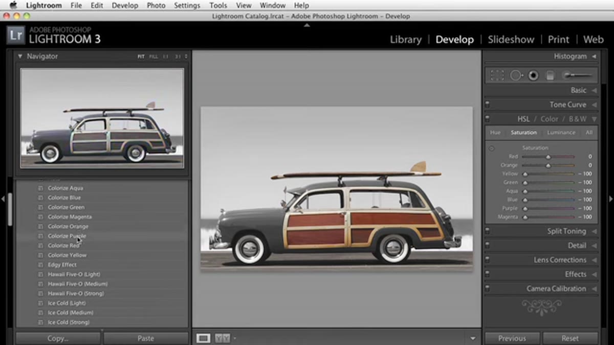 Navigator panel showing live preview while hovering over preset name
This is the part of the workflow that actually saves time. In your Presets panel, hover slowly over each colorizing preset. The Navigator panel in the upper left updates in real time to show you what that grade would look like on your current image. You’re not applying anything. You’re not changing any sliders. You’re just watching the preview update and making creative decisions at browsing speed.
Navigator panel showing live preview while hovering over preset name
This is the part of the workflow that actually saves time. In your Presets panel, hover slowly over each colorizing preset. The Navigator panel in the upper left updates in real time to show you what that grade would look like on your current image. You’re not applying anything. You’re not changing any sliders. You’re just watching the preview update and making creative decisions at browsing speed.
This changes how you interact with selective color entirely. Instead of a slow iterative process, you’re scanning possibilities like flipping through vinyl at a record store. Something either grabs you or it doesn’t. Move on.
Step 5: Reset Saturation Quickly with the Option/Alt Shortcut
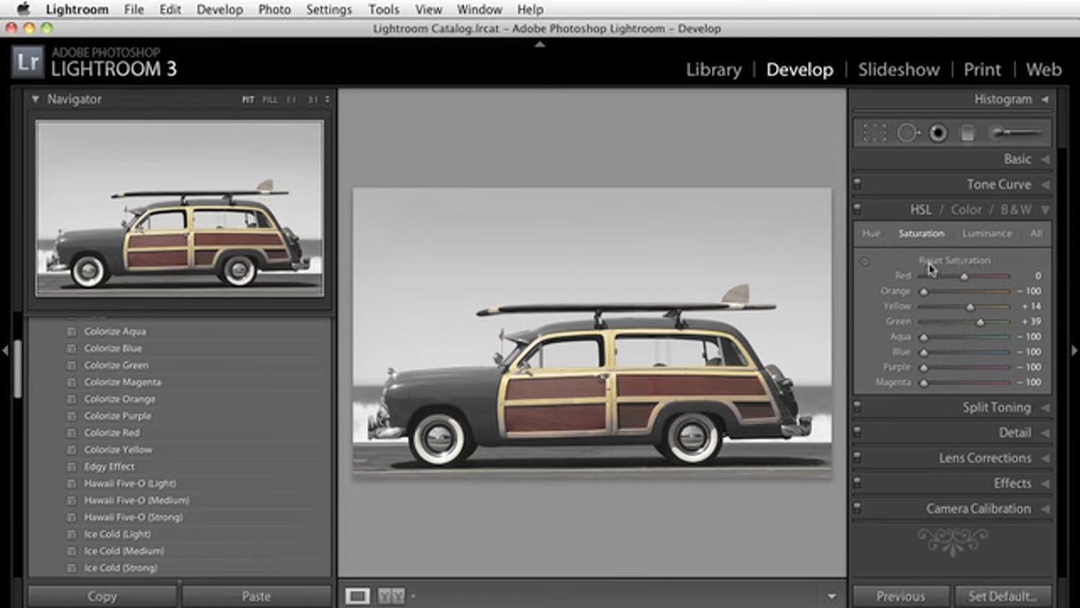 HSL panel with cursor near reset button, Option key held down
When you do want to clear your HSL settings and start fresh, don’t drag every slider back to zero manually. Hold Option on Mac (Alt on PC) and click the “Saturation” label inside the HSL panel. It flips to a Reset button and zeroes everything out in one click. This is one of those shortcuts that sounds minor until the third time you’re undoing 8 sliders and you remember you forgot about it.
HSL panel with cursor near reset button, Option key held down
When you do want to clear your HSL settings and start fresh, don’t drag every slider back to zero manually. Hold Option on Mac (Alt on PC) and click the “Saturation” label inside the HSL panel. It flips to a Reset button and zeroes everything out in one click. This is one of those shortcuts that sounds minor until the third time you’re undoing 8 sliders and you remember you forgot about it.
Build this muscle memory now. The faster the reset, the more freely you experiment.
Step 6: Apply the Same Approach to Split Toning
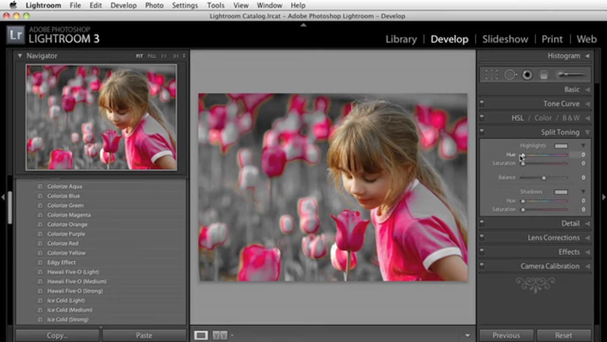 Split Toning panel with Hue slider adjusted and Saturation around 50
The preset-per-variation strategy isn’t limited to HSL. The same logic works beautifully in the Split Toning panel (or the Color Grading panel if you’re on a newer version of Lightroom). Set your Shadows or Highlights Hue to a specific color, push the Saturation up to around 50%, and save that as a preset. Then create a new one for each major hue position across the color wheel - reds, yellows, greens, blues.
Split Toning panel with Hue slider adjusted and Saturation around 50
The preset-per-variation strategy isn’t limited to HSL. The same logic works beautifully in the Split Toning panel (or the Color Grading panel if you’re on a newer version of Lightroom). Set your Shadows or Highlights Hue to a specific color, push the Saturation up to around 50%, and save that as a preset. Then create a new one for each major hue position across the color wheel - reds, yellows, greens, blues.
When you hover through these in the Navigator, you’re previewing full cinematic grade shifts on your image without touching a single slider. You’ll stumble onto combinations you’d never have tried manually. That’s the real win here - the preset system turns discovery into part of the workflow instead of an accident.
My Extension: Layer These with Exposure Presets for Faster Full Edits
I’ve taken this concept one step further in my own practice. I keep a second tier of presets that handle basic tonal corrections - a slight S-curve, a touch of lifted blacks for a faded look - saved separately from the color presets. Because the color presets are scoped to color adjustments only, I can apply a tonal base preset first and then hover through the colorizing options without either one overwriting the other.
It’s a two-layer system, and it means I can rough out a fully graded image in under two minutes. The first layer handles structure. The second layer handles mood. I arrived at this after that weekend of preset-building I mentioned earlier, and it’s stuck around in my workflow ever since.
The single most important thing this tutorial teaches isn’t a specific setting. It’s the idea that your preset library should function as a visual browsing tool, not just a time-saving shortcut. When you build presets with tight, focused scopes and use the Navigator panel as a real-time preview, you shift from editing to exploring. That shift is where the interesting work happens.
Watch the full tutorial on YouTube to see the hover-preview workflow in motion. Some things land better when you see them moving.
Comments
Leave a Comment