Why Your Color Grades Fall Apart (And the Lightroom Workflow That Fixed Mine)

Why Your Color Grades Fall Apart (And the Lightroom Workflow That Fixed Mine)

The Problem Shows Up at the Worst Possible Moment I was culling a 340-image wedding gallery last spring, halfway through a cup of coffee, when I realized my color grade looked completely different on the shaded reception shots than it did on the golden hour portraits. Same preset. Same camera. Same shooting conditions, more or less. But the images looked like they came from two different photographers with two different aesthetic philosophies.
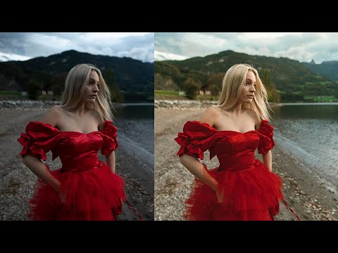

How Jessica Kobeissi Edits Outdoor Portraits in Lightroom (And What I Stole From Her Workflow)

How Jessica Kobeissi Edits Outdoor Portraits in Lightroom (And What I Stole From Her Workflow)

Most of my go-to editing habits were built by watching other photographers work out loud. Not reading about theory, not studying color wheels. Watching someone actually move sliders and second-guess themselves and change their mind three times before landing somewhere great. That’s the kind of tutorial that actually sticks. In this Jessica Kobeissi tutorial on editing outdoor portraits in Lightroom, that’s exactly what you get. She walks through a set of photos shot at different times of day, each with its own lighting challenge, and works through exposure, tone, and color grading in a way that feels more like watching a real editing session than a polished classroom demo.

Why Your Colors Look Dull After Editing (And the Lightroom Workflow That Actually Fixes It)

Why Your Colors Look Dull After Editing (And the Lightroom Workflow That Actually Fixes It)

There’s a photo sitting in my Lightroom catalog from about six years ago that I genuinely cannot look at without cringing. It was a band press shot, natural light, golden hour, the whole thing. And I absolutely destroyed it. I pushed the saturation to somewhere around +60, dragged the vibrance up to match, and called it “edited.” The sky turned a color I can only describe as radioactive mango. The guitarist’s skin looked like he’d spent a month on the surface of Mars.

Why Your Colors Look Flat After Editing (And the HSL Fix Nobody Talks About)

Why Your Colors Look Flat After Editing (And the HSL Fix Nobody Talks About)

I was editing a portrait session last spring when I realized the skin tones looked like someone had smeared a thin coat of caramel over a gray wall. The colors were technically correct. White balance was dialed in. Exposure was clean. But something about the image felt defeated, like it was trying its best and still coming up short. The problem wasn’t the exposure. It wasn’t the white balance. It was the hue shift that happens when you push saturation without touching luminance.

Mastering HSL in Lightroom: The Secret Weapon for Selective Color Grading

Mastering HSL in Lightroom: The Secret Weapon for Selective Color Grading

Mastering HSL in Lightroom: The Secret Weapon for Selective Color Grading I used to think that getting the perfect color grade meant either nailing it in-camera or spending hours with masks and brushes. Then I discovered the HSL panel in Lightroom, and it completely changed my workflow. If you’re not using it yet, you’re leaving serious creative potential on the table. HSL stands for Hue, Saturation, and Luminance—three separate controls that let you adjust specific color ranges independently.