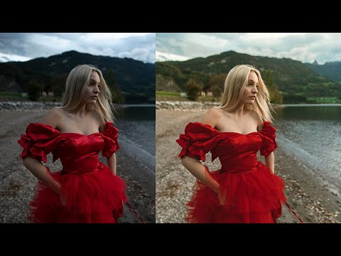
Most of my go-to editing habits were built by watching other photographers work out loud. Not reading about theory, not studying color wheels. Watching someone actually move sliders and second-guess themselves and change their mind three times before landing somewhere great. That’s the kind of tutorial that actually sticks.
In this Jessica Kobeissi tutorial on editing outdoor portraits in Lightroom, that’s exactly what you get. She walks through a set of photos shot at different times of day, each with its own lighting challenge, and works through exposure, tone, and color grading in a way that feels more like watching a real editing session than a polished classroom demo. Watch the full tutorial on YouTube - it’s worth your time.
What I found most useful was her attitude about the order of operations. She’s not precious about it. She adjusts color toning first, then circles back to exposure and contrast once the colors are in place. That’s the opposite of what most beginner guides teach, and honestly, it makes a lot more sense once you try it. Here’s the full breakdown of what she does and how to follow along yourself.
Step 1: Set Your Exposure Baseline
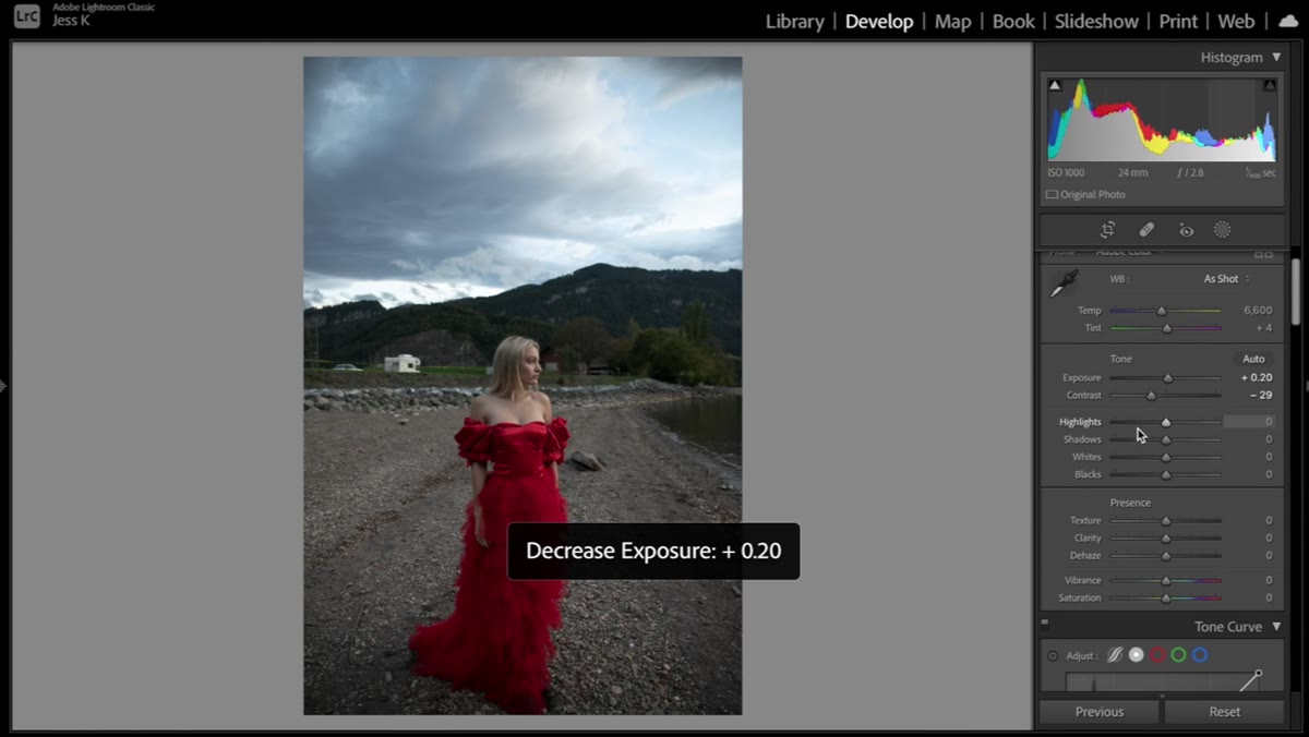 Lightroom exposure slider being increased on portrait
Before touching anything in the color panels, Jessica bumps the exposure up to get the image to a workable brightness. This isn’t a final value. Think of it as clearing the fog off the windshield before you start driving. The goal is to see what you’re actually working with.
Lightroom exposure slider being increased on portrait
Before touching anything in the color panels, Jessica bumps the exposure up to get the image to a workable brightness. This isn’t a final value. Think of it as clearing the fog off the windshield before you start driving. The goal is to see what you’re actually working with.
The key word here is “increase.” Outdoor portraits shot in fading light tend to be underexposed by default, and you need the image bright enough that your color adjustments read accurately. A dark image will always look more saturated than it actually is, which means you’ll underdo the color work and wonder why it falls flat when you share it.
Step 2: Recover Highlights, Lift Shadows
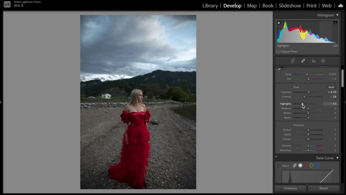 Highlights slider pulled down to recover sky detail
With exposure set, Jessica pulls the highlights down to bring back detail in the sky. Even when the sky is already reasonably well-exposed, dragging highlights down adds a quality that reads as “intentional” rather than “snapped.” It’s the difference between a photo that looks finished and one that looks captured.
Highlights slider pulled down to recover sky detail
With exposure set, Jessica pulls the highlights down to bring back detail in the sky. Even when the sky is already reasonably well-exposed, dragging highlights down adds a quality that reads as “intentional” rather than “snapped.” It’s the difference between a photo that looks finished and one that looks captured.
She also lifts the shadows and blacks slightly. Her reasoning is about softness. Lifting the black point takes away some of that harsh shadow contrast and gives the whole image a more cinematic, film-adjacent quality. She doesn’t go far - just enough to feel it. If you’re following along, try a value around +15 to +20 on shadows as a starting point, and bring blacks up only a few points. You can always pull them back after you see how the color grading sits against them.
Step 3: Add a Touch of Clarity and Sharpen
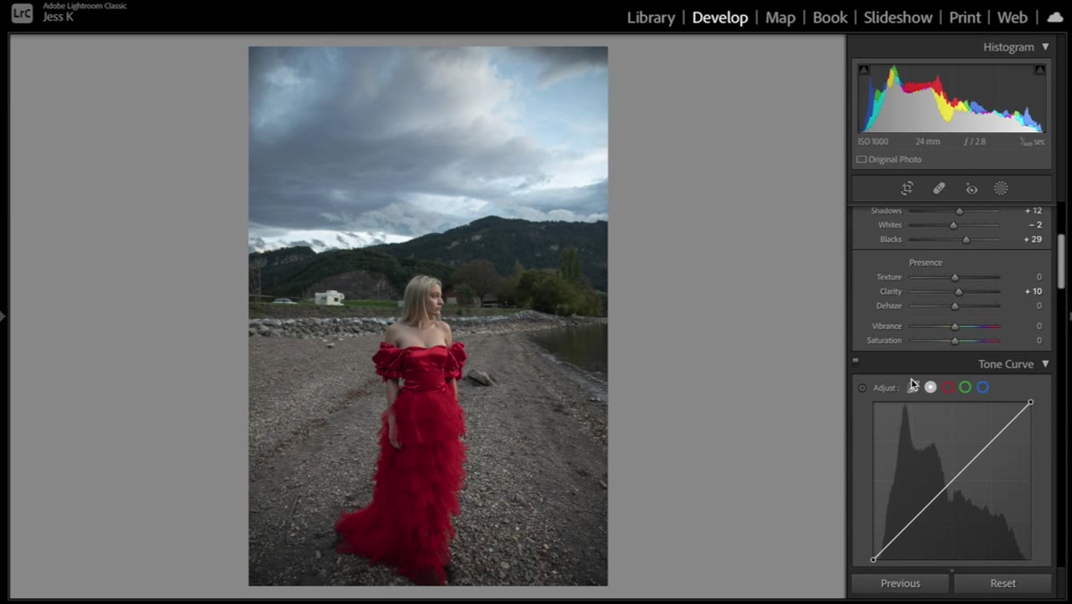 Clarity and sharpening sliders in the Detail panel
Jessica mentions that she doesn’t usually reach for the clarity slider, but here she adds a small amount to bring a little structure into the midtones. She’s quick to note that clarity is a tool that can go wrong fast. Too much and your subject starts looking like an over-processed landscape photo. Just a whisper of it, around +10 or so, adds definition without crossing into crunchy territory.
Clarity and sharpening sliders in the Detail panel
Jessica mentions that she doesn’t usually reach for the clarity slider, but here she adds a small amount to bring a little structure into the midtones. She’s quick to note that clarity is a tool that can go wrong fast. Too much and your subject starts looking like an over-processed landscape photo. Just a whisper of it, around +10 or so, adds definition without crossing into crunchy territory.
On sharpening, she’s more generous. She notes that sharpening has become a bigger part of her workflow lately, which tracks with how much content is now consumed on high-res phone screens. If you’re not sharpening enough, your portraits can look soft in ways that read as technical failures rather than stylistic choices. The default Lightroom sharpening of 40 is a reasonable floor. Jessica’s settings appeared to already be sitting higher, which she acknowledged with some amusement.
Step 4: Use HSL Luminance to Shape the Dress Color
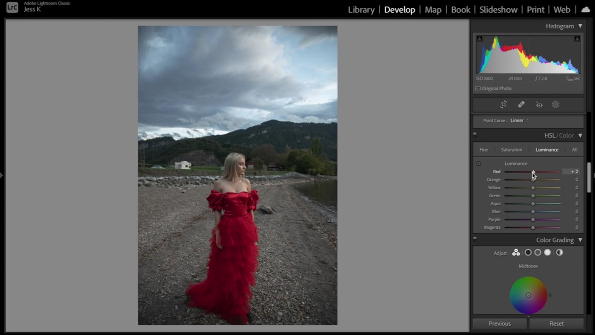 HSL Luminance panel with red slider being pulled down
This is where the edit gets interesting. In the HSL panel, under the Luminance tab, Jessica pulls down the reds. The subject is wearing a bright red dress, and raw camera red tends to read as slightly aggressive on screen. Darkening the luminance of the red channel brings the dress into a richer, more deliberate tone without desaturating it.
HSL Luminance panel with red slider being pulled down
This is where the edit gets interesting. In the HSL panel, under the Luminance tab, Jessica pulls down the reds. The subject is wearing a bright red dress, and raw camera red tends to read as slightly aggressive on screen. Darkening the luminance of the red channel brings the dress into a richer, more deliberate tone without desaturating it.
This technique is underused and worth burning into your muscle memory. If a clothing color is fighting with your overall image, your first instinct might be to desaturate it. But changing luminance instead preserves the color’s presence while controlling how much visual weight it carries. Try pulling reds down to around -20 and see how the whole frame settles.
Step 5: Boost Saturation Selectively in the HSL Panel
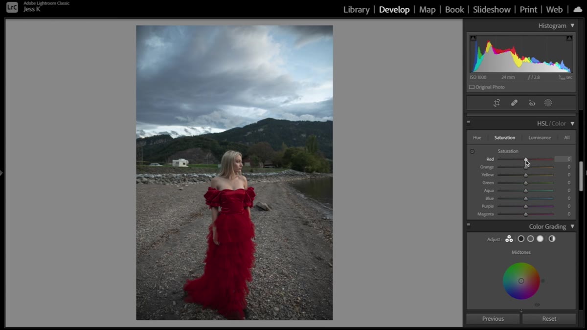 HSL Saturation panel with red and green sliders adjusted
Still in the HSL panel, Jessica switches to the Saturation tab and does something specific. Rather than boosting global saturation, she targets individual color channels. She increases the saturation on reds to make the dress pop more deliberately, and separately bumps the greens to make the background foliage feel alive.
HSL Saturation panel with red and green sliders adjusted
Still in the HSL panel, Jessica switches to the Saturation tab and does something specific. Rather than boosting global saturation, she targets individual color channels. She increases the saturation on reds to make the dress pop more deliberately, and separately bumps the greens to make the background foliage feel alive.
She also experiments with the blues. The sky can take a meaningful blue saturation boost, but she keeps it restrained because pushing the blues too hard creates a conflict with the warm red dress. She lands around +15 on the blues and adds a touch of aqua, which shifts the sky tone slightly cooler and adds depth. This kind of targeted saturation work takes more time than moving the global vibrance slider, but the results are in a completely different league.
Step 6: Refine Hue to Dial In Specific Colors
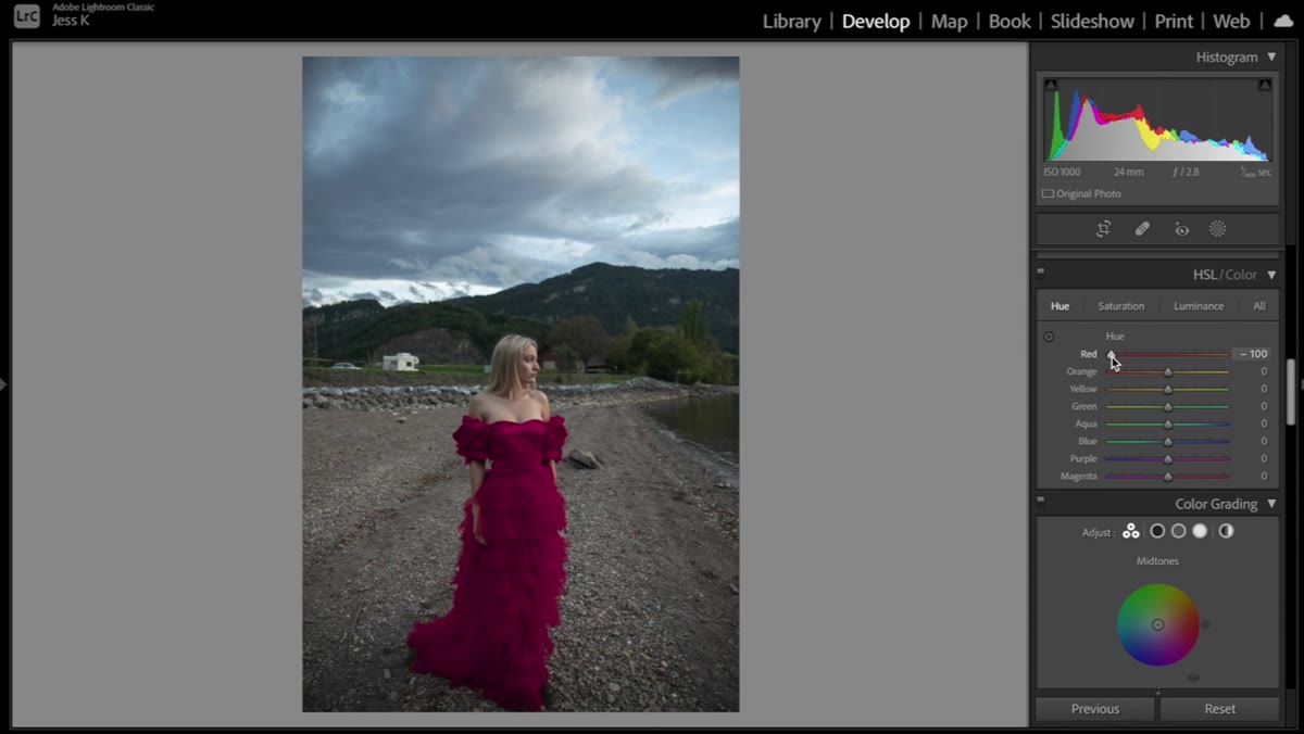 HSL Hue panel with green and red sliders being adjusted
The final HSL step is moving into the Hue tab to fine-tune which version of each color you’re actually showing. Jessica checks the red hue and notes that she could push it toward pink if she wanted. She keeps it closer to the original tone because it suits the image, but the point is clear: you’re not stuck with the color the camera recorded.
HSL Hue panel with green and red sliders being adjusted
The final HSL step is moving into the Hue tab to fine-tune which version of each color you’re actually showing. Jessica checks the red hue and notes that she could push it toward pink if she wanted. She keeps it closer to the original tone because it suits the image, but the point is clear: you’re not stuck with the color the camera recorded.
She also experiments with the green hue to find the version of the background foliage that feels most natural. Small hue adjustments of 5 to 10 points can shift greens from a sickly yellow-green to a rich forest tone. This is especially useful in summer outdoor portraits where the vegetation can look almost neon straight out of camera.
What I’d Add From My Own Experience
Jessica’s workflow is solid, but one thing I’d layer on top of it is a split tone adjustment in the Color Grading panel after all the HSL work is done. Adding a very subtle warm tone to the shadows and a slightly cooler tone to the highlights creates a cinematic push-pull that makes the HSL adjustments feel intentional rather than isolated. Think of it as giving the individual color corrections somewhere to live as a unified image.
I’ve been doing this in almost every outdoor portrait edit for the past two years, and it’s become one of those habits where I notice its absence more than its presence. If you build Jessica’s workflow first and then drop a light split tone on top, you’ll end up somewhere really strong.
The single most important thing Jessica demonstrates here is that selective color control through the HSL panel is more powerful than any global saturation or vibrance adjustment. Moving one slider to affect the whole image is a shortcut. Moving six sliders to affect six specific colors is editing. The difference shows up immediately.
Watch the full tutorial on YouTube to see the before and after comparisons across the full set of images. Watching Jessica talk herself through decisions in real time is where the real value is.
Comments (1)
Just used this on a wedding shoot edit. Client was thrilled.
Leave a Comment