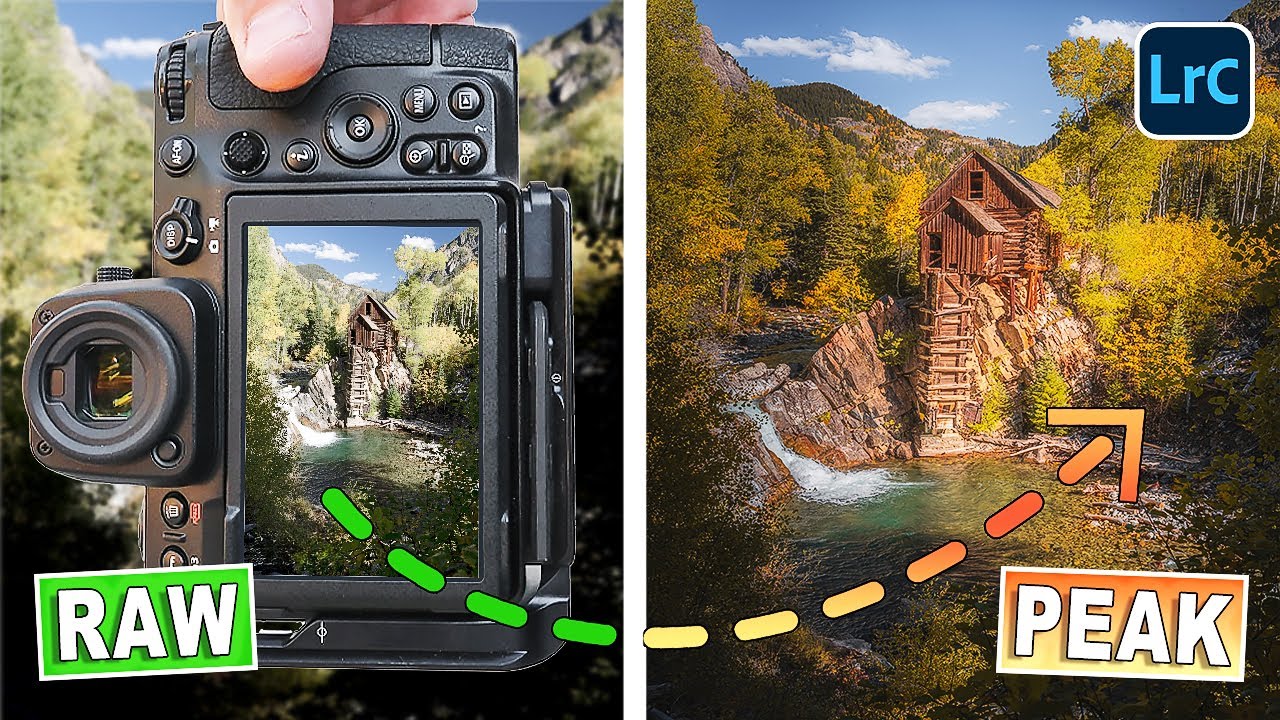
Every fall I have the same conversation with myself. I check the foliage maps. I pick a weekend. I drive two hours to some gorgeous mountain overlook. And the trees are either still stubbornly green or they’ve already gone brown and flat. Timing peak fall color feels less like planning and more like gambling. I’ve made peace with the fact that I’ll probably never nail it perfectly, which is exactly why this technique from landscape photographer Mark Denney stopped me mid-scroll when I came across it. Watch the full tutorial on YouTube
In this Mark Denney tutorial, the premise is straightforward but the payoff is real: if your fall photo has some color to work with, the Camera Calibration panel in Lightroom can push that latent warmth into something that looks like you showed up on the best possible day. The catch he’s upfront about, and it’s an important one, is that this isn’t a magic trick for spring greens. You need actual fall tones in the frame. Yellows, oranges, even early amber. Give the tool something to work with and it delivers. Try to fake the whole season from scratch and it just looks wrong.
What makes this land for me personally is that the Calibration panel is the part of Lightroom I see people skip constantly. It sits at the very bottom of the Develop module, below HSL, below Split Toning, and most tutorials never touch it. Denney has built a reputation for actually teaching this panel, and this video is a tight, focused demonstration of one specific use case. Here’s how he does it.
Step 1: Start With a Solid Base Edit
 Raw file displayed alongside a virtual copy in Develop module
Before touching color, Denney gets the foundational edit in place. In his example image, he’s working from a raw file with basic tone adjustments applied: exposure, contrast, highlights, shadows. He also has a tone curve dialed in and a few masks that gently lift the midground. Nothing dramatic. The key point is that he’s not leaning on the Basic panel to do any color work at all. That job belongs entirely to the Calibration section.
Raw file displayed alongside a virtual copy in Develop module
Before touching color, Denney gets the foundational edit in place. In his example image, he’s working from a raw file with basic tone adjustments applied: exposure, contrast, highlights, shadows. He also has a tone curve dialed in and a few masks that gently lift the midground. Nothing dramatic. The key point is that he’s not leaning on the Basic panel to do any color work at all. That job belongs entirely to the Calibration section.
If you’re following along, make a virtual copy of your raw file before you start so you can toggle between the original and the edited version. It’s the fastest way to sanity-check your progress and Denney uses this exact workflow throughout the video.
Step 2: Navigate to the Camera Calibration Panel
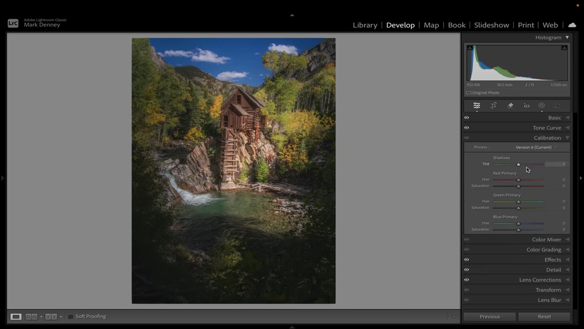 Camera Calibration panel open at the bottom of Develop module
Scroll all the way to the bottom of the Develop module’s right-hand panel. Below Color Grading, below Detail, you’ll find Camera Calibration. It’s easy to overlook because it doesn’t look like much at first glance. You’ll see a Profile dropdown at the top and then three sets of sliders: Red Primary, Green Primary, and Blue Primary. Each has a Hue and a Saturation slider. Denney describes this as probably the most confusing and simultaneously most powerful color tool in all of Lightroom. That’s not hyperbole.
Camera Calibration panel open at the bottom of Develop module
Scroll all the way to the bottom of the Develop module’s right-hand panel. Below Color Grading, below Detail, you’ll find Camera Calibration. It’s easy to overlook because it doesn’t look like much at first glance. You’ll see a Profile dropdown at the top and then three sets of sliders: Red Primary, Green Primary, and Blue Primary. Each has a Hue and a Saturation slider. Denney describes this as probably the most confusing and simultaneously most powerful color tool in all of Lightroom. That’s not hyperbole.
The reason it’s confusing is that these sliders don’t behave the way HSL sliders do. You’re not just shifting a color range. You’re adjusting the raw color channels that Lightroom builds the entire image from, which means small moves here create large, organic-feeling color shifts across the whole photo.
Step 3: Shift the Blue Primary Hue
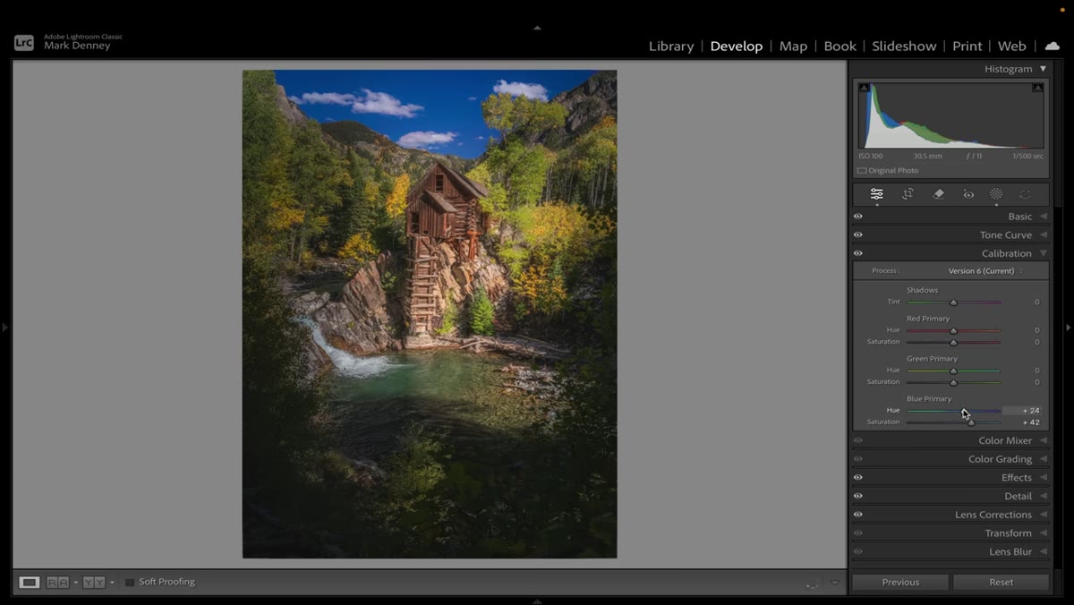
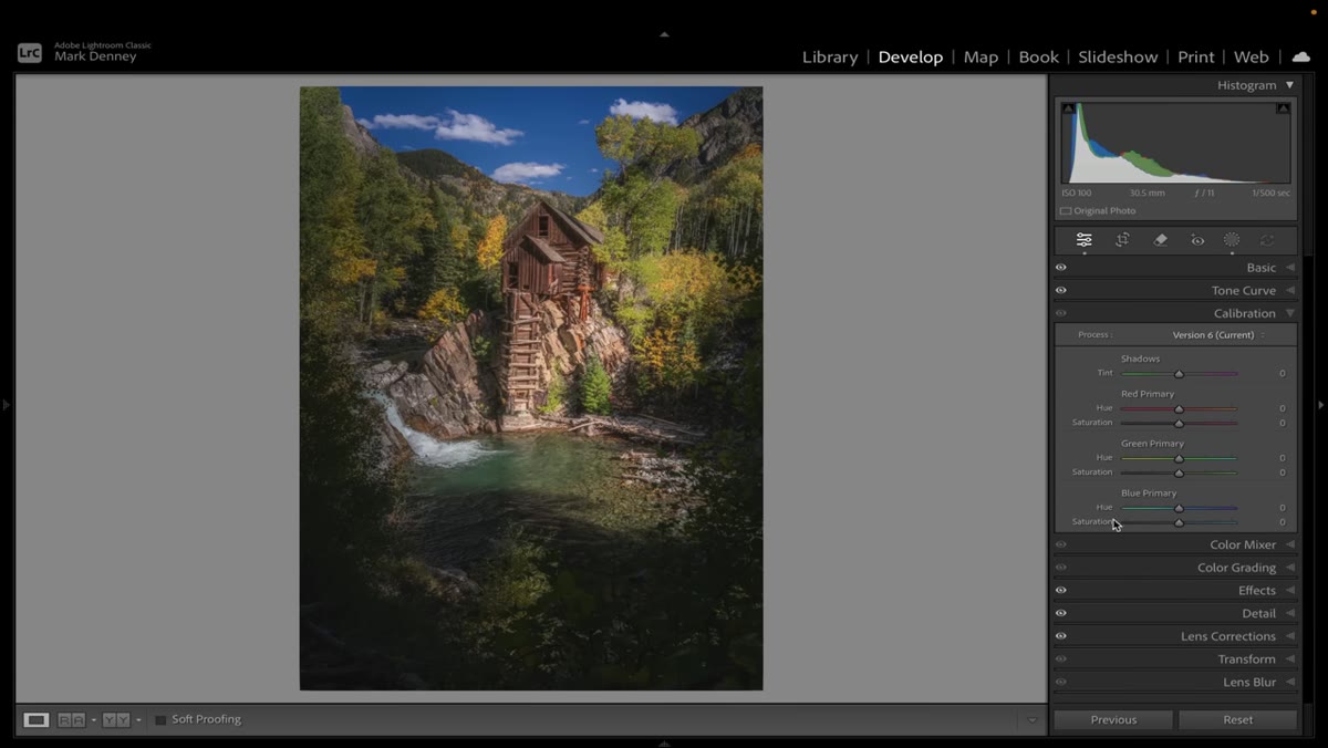 Blue Primary Hue slider being dragged left in Calibration panel
This is the core of Denney’s technique, and it’s the slider he calls the most impactful in the entire panel. Drag the Blue Primary Hue slider to the left. As you do, watch what happens to the greens in your image. They begin pulling toward teal, which visually separates them from the warm yellows and oranges in the frame. The fall tones don’t just get more saturated, they get more distinct. The image starts to read as having more color contrast, more depth, more season.
Blue Primary Hue slider being dragged left in Calibration panel
This is the core of Denney’s technique, and it’s the slider he calls the most impactful in the entire panel. Drag the Blue Primary Hue slider to the left. As you do, watch what happens to the greens in your image. They begin pulling toward teal, which visually separates them from the warm yellows and oranges in the frame. The fall tones don’t just get more saturated, they get more distinct. The image starts to read as having more color contrast, more depth, more season.
How far you push it depends on your image. Denney isn’t working with fixed numbers here because every photo is different. Watch the greens and the yellows simultaneously. You’re looking for the point where the yellows glow without the whole image tipping into something artificial.
Step 4: Use Blue Primary Saturation to Control Intensity
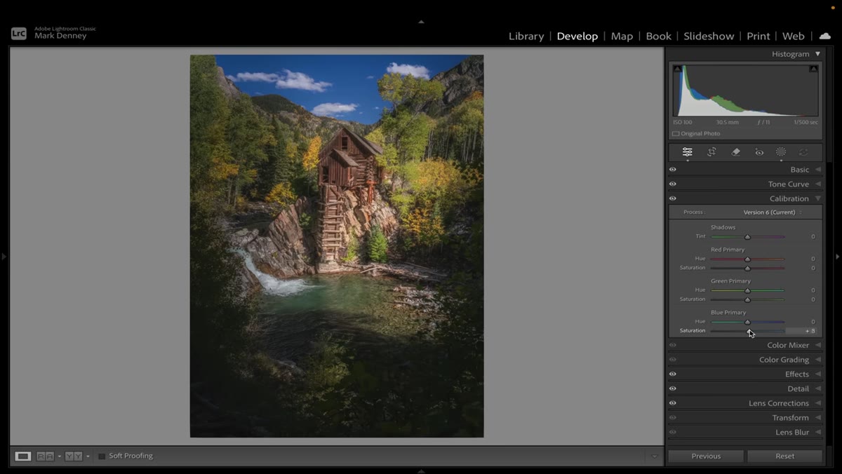 Blue Primary Saturation slider adjusted alongside Hue in Calibration panel
The Saturation slider directly below Blue Primary Hue works in tandem with the Hue shift. Once you’ve moved the Hue, pulling the Saturation up or down lets you control how aggressively the rest of the color palette responds. If things start looking oversaturated or the shadows go muddy, back the Saturation off a touch.
Blue Primary Saturation slider adjusted alongside Hue in Calibration panel
The Saturation slider directly below Blue Primary Hue works in tandem with the Hue shift. Once you’ve moved the Hue, pulling the Saturation up or down lets you control how aggressively the rest of the color palette responds. If things start looking oversaturated or the shadows go muddy, back the Saturation off a touch.
This two-slider combination, Hue and Saturation in the Blue Primary, is what Denney refers to as the “combination” he relies on. The Hue shift does the heavy lifting on separation and warmth. The Saturation adjustment keeps it believable. Together they’re doing more targeted work than anything you’d get from dragging the global Vibrance or Saturation sliders up.
Step 5: Compare Before and After With the Backslash Key
 Before and after view toggled showing raw versus edited fall image
Hit the backslash key to toggle between your before and after. Denney does this repeatedly throughout the video because the effect is genuinely dramatic when you see it side by side. What looked like an early-season landscape with patches of color becomes something that reads as full peak fall.
Before and after view toggled showing raw versus edited fall image
Hit the backslash key to toggle between your before and after. Denney does this repeatedly throughout the video because the effect is genuinely dramatic when you see it side by side. What looked like an early-season landscape with patches of color becomes something that reads as full peak fall.
This toggle is also where you calibrate your own taste. If the before looks more realistic but the after looks more like what you actually wanted the day to look like, you’ve hit the right balance. If the after looks like a fall-themed phone wallpaper, you’ve gone too far.
One Thing I’d Add From My Own Experience
The Calibration panel plays very differently depending on your camera profile. Before you touch the Blue Primary, check what profile is selected in the Profile dropdown at the top of the Calibration section. Adobe Color, Adobe Landscape, and Adobe Vivid all respond differently to these moves. Adobe Vivid in particular can push things into garish territory fast. I’ve had the best results with Adobe Color as a starting point when I’m doing this kind of color work. It gives the sliders a more predictable, linear feel.
It’s also worth knowing that the Calibration panel is global, meaning you can’t mask it the way you can with other tools in Lightroom. If the blue shift is doing great things to your trees but wrecking your sky, you’ll need to address the sky separately with a masked adjustment using the HSL panel or a Color Range mask. It’s an extra step, but it’s worth it.
The single most important thing I took from this tutorial is that the Calibration panel isn’t a finishing touch, it’s a foundation-level color tool that most people are just leaving on the table. If you shoot fall landscapes and you’re relying entirely on HSL and Vibrance to get your color, you’re working harder than you need to.
Watch the full tutorial on YouTube to see Denney’s before and after in real time. The visual difference between the raw file and the finished image is the kind of thing that’s easier to see than to describe.
Comments
Leave a Comment