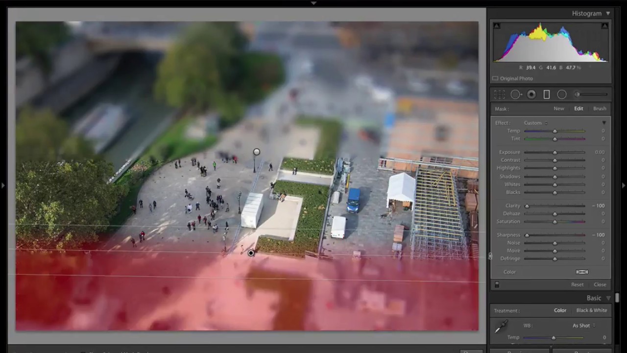
There’s a certain kind of aerial or street photo that stops people mid-scroll. The cars look like Matchbox toys. The pedestrians look like they belong in a model train set. The whole scene has this uncanny, hyper-real quality that makes you lean closer to the screen. That’s the tilt shift effect, and for years I assumed getting it right meant a round trip to Photoshop and a few minutes wrestling with the Blur Gallery. Turns out, Lightroom has everything you need and the whole thing takes about ninety seconds once you know where to look.
Scott Kelby walks through exactly this in a recent KelbyOne tutorial. Watch the full tutorial on YouTube before diving in here, or follow the steps below and reference the video for visual confirmation. Kelby is one of those instructors who strips a technique down to its actual mechanics without padding it out, which I appreciate more every time I sit down to learn something new.
The core idea is simple: real tilt shift photography works by physically tilting the lens plane so that only a narrow horizontal strip of the scene stays in focus. Everything above and below that strip blurs out. Our brains interpret that shallow focus as a sign of a macro shot, which makes the scene read as a tiny physical model rather than a full-scale environment. We’re faking that lens behavior using two graduated filters and a bit of Clarity and Sharpness manipulation.
Step 1: Choose the Right Image (and Size It Down)
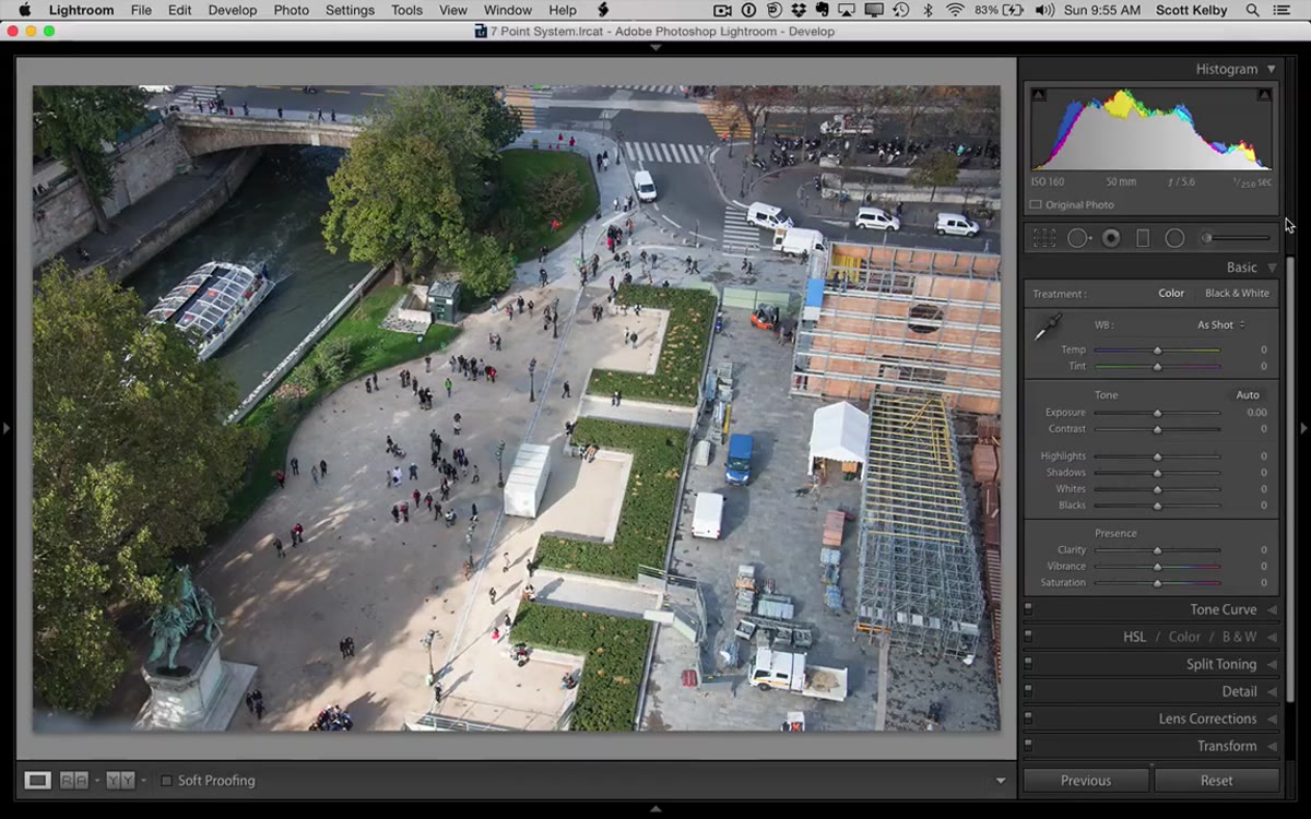 Low resolution image open in Lightroom Develop module
Before you touch a single slider, your image choice matters. This effect works significantly better on low-resolution files, specifically the kind of pixel dimensions you’d use for web or social. Kelby suggests sizing your image down to something like 1080 pixels wide before applying the effect. If you’re working from a full-resolution RAW file, export a resized JPEG first, re-import it, and work from that. The blur simulation we’re about to build reads as more convincing on a smaller file. On a high-res image it can look soft and unconvincing rather than deliberately blurred.
Good subject choices include any scene shot from above or at a slight elevated angle: city streets, busy intersections, sports fields, outdoor markets. The technique loses its magic quickly on flat horizon shots or portraits. You want depth, tiny people, and a sense of scale.
Step 2: Open the Graduated Filter Tool and Reset All Sliders
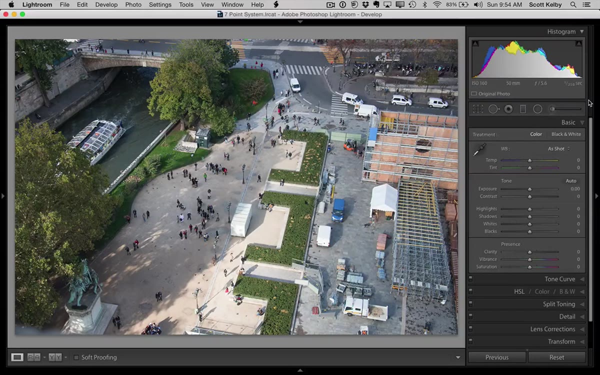 Graduated Filter tool selected in Lightroom toolbar
Select the Graduated Filter from the toolbar at the top of the right panel in the Develop module. It looks like a small rectangle with a gradient inside. Once it’s active, look for the “Effect” label at the top of the panel on the right. Double-click that word directly. This resets every slider in the Graduated Filter panel to zero, which is exactly where you want to start. It’s a small habit worth building anytime you open a local adjustment tool, because Lightroom sometimes carries over settings from your last session and that will absolutely wreck your starting point here.
Step 3: Set Clarity to -100 and Sharpness to -100
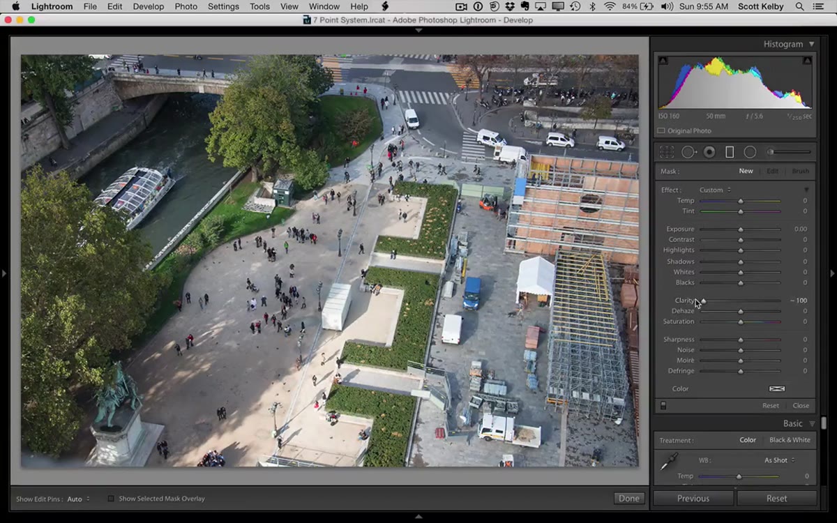 Clarity and Sharpness sliders pulled to minus 100
With all sliders zeroed out, pull Clarity all the way to -100. Then pull the Sharpness slider all the way to -100 as well. Together these two adjustments simulate blur. Clarity at -100 kills the midtone contrast and creates a soft, hazy quality. Sharpness at -100 de-focuses local detail. It isn’t a true Gaussian blur the way Photoshop’s filter works, but on a properly sized image the difference is minimal and the result is convincing. Leave everything else at zero. No exposure changes, no color shifts, nothing else.
Step 4: Drag the First Gradient Down From the Top
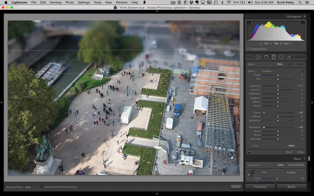 First graduated filter dragged down from top of image
Now drag your first gradient from the top of the image downward. You’ll see the top portion of the photo go heavy and blurry as the filter takes effect. Don’t drag it all the way down. You want the gradient to cover roughly the top half of the image, but the goal is to leave a clear, unaffected strip somewhere in the middle of the frame. After you drop the gradient, you can tighten the transition zone by dragging the bottom pin upward. Making that transition band narrow creates a more abrupt shift from sharp to blurry, which looks more like real tilt shift glass and less like a soft vignette.
Step 5: Add a Second Gradient Coming Up From the Bottom
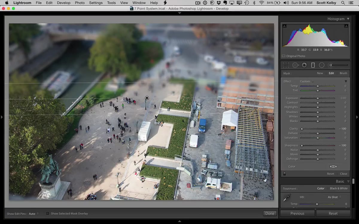 Second graduated filter dragged upward from bottom of image
Hit “New” in the Graduated Filter panel to start a fresh filter, then apply the same settings: Clarity -100, Sharpness -100. This time drag from the bottom of the image upward, mirroring what you just did from the top. You’re creating bookends of blur. The goal is a relatively narrow horizontal band in the center of the image that remains sharp while everything above and below it falls into soft focus. Adjust the top pin of this lower gradient to tighten the transition just like you did with the first one. When both filters are active, the effect snaps into place and the scene starts to read as miniature.
Step 6: Duplicate Filters for High-Resolution Images
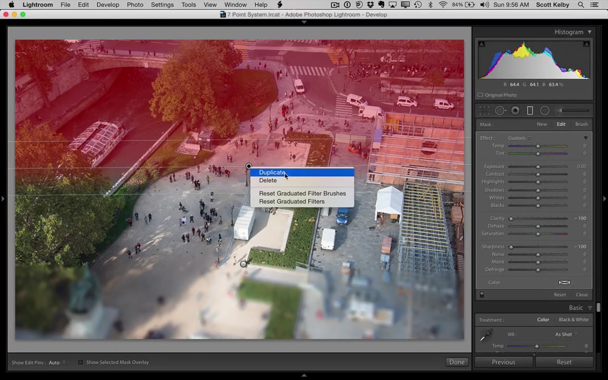 Right-click menu showing Duplicate option on a gradient
If you ignored the earlier advice and you’re working on a larger file, the effect will look weak because Lightroom’s simulated blur can only push so far in a single pass. The fix is simple: right-click on one of your existing graduated filters and choose “Duplicate.” This stacks an identical filter on top of the first, doubling the effective blur without you having to redraw anything. You can do this more than once if needed. Keep duplicating until the blur looks dense enough to sell the miniature illusion. This isn’t necessary on web-sized images, but it’s a useful workaround that keeps you from exporting and re-importing yet another resized version.
One Thing I’d Add: Push the Saturation
Kelby keeps this tutorial tight and focused, which is exactly the right call for a quick technique video. But in my own workflow, I almost always pair the tilt shift blur with a saturation bump on the unmasked center strip. Real miniature models and dioramas tend to have that slightly oversaturated, too-perfect look to them. Boosting saturation by 20 to 30 points on a targeted adjustment in that sharp center band leans into the toy aesthetic and reinforces the illusion. I also sometimes add a slight warmth shift to the sharp zone, because model paint always looks a little more vivid than real life. Try it on your next attempt and see if it pushes the effect over the edge.
The single most important thing to take away from this technique is that image resolution is not optional. Get the file small before you start, and the effect basically works itself. Fight that step, and you’ll spend twice as long chasing results that never quite land.
Watch the full tutorial on YouTube to see Scott Kelby run through the whole thing in real time. Seeing the before and after flip on a finished image is what finally made the mechanics click for me.
Comments (2)
Simple but effective. Sometimes that's all you need.
Would love to see a follow-up going deeper into this topic.
Leave a Comment