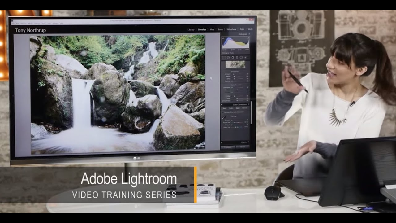
Waterfall shots have a way of humbling you. You nail the composition, you get the silky water effect with a slow shutter, and then you pull the image into Lightroom and realize half your frame is speckled with lens mist and the colors look like wet cardboard. I’ve been there more times than I’d like to admit. It’s one of those situations where the camera did its job and you still walk away with a photo that doesn’t match what you saw standing at the falls.
That’s exactly why I keep coming back to this tutorial from Tony and Chelsea Northrup. Watch the full tutorial on YouTube - Chelsea walks through a full waterfall edit in Lightroom, and what makes it useful isn’t just the steps themselves, it’s the reasoning behind each decision. She explains why a setting is wrong before she shows you what right looks like. That’s a rare quality in a tutorial and it’s the kind of thing that actually changes how you edit, not just how you edit one photo.
Here’s how the workflow breaks down, with the settings and logic you need to follow along on your own image.
Step 1: Remove Water Spots with the Heal Tool
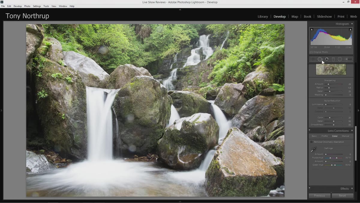 Spot removal tool selected in the Lightroom toolbar
Before any tonal or color work, deal with the lens mist. Water droplets on glass scatter light and create soft, circular blur spots that sit right on top of your detail. Chelsea goes straight to the Spot Removal tool and sets feathering to around 30-40%. That range is specific for a reason. Too much feathering and Lightroom blends outward too aggressively, leaving a visible halo where the fix was applied. Too little and the edges of the correction look cut out and fake. The 30-40% range gives the algorithm enough softness to blend naturally without giving it so much room that it advertises itself.
Spot removal tool selected in the Lightroom toolbar
Before any tonal or color work, deal with the lens mist. Water droplets on glass scatter light and create soft, circular blur spots that sit right on top of your detail. Chelsea goes straight to the Spot Removal tool and sets feathering to around 30-40%. That range is specific for a reason. Too much feathering and Lightroom blends outward too aggressively, leaving a visible halo where the fix was applied. Too little and the edges of the correction look cut out and fake. The 30-40% range gives the algorithm enough softness to blend naturally without giving it so much room that it advertises itself.
She also uses the Heal mode rather than Clone. Clone copies pixels directly. Heal blends the sampled area with the surrounding texture, which matters enormously on organic surfaces like rock faces or moving water where no two patches are identical. After placing each correction, pressing H toggles the overlay off so you can judge the result in context. If it doesn’t look right, delete it and try again with a brush size that better matches the spot, because a brush that’s too small clips the edge of the blemish and a brush that’s too large pulls in surrounding texture that doesn’t match.
Step 2: Set Your Whites Without Blowing the Sky
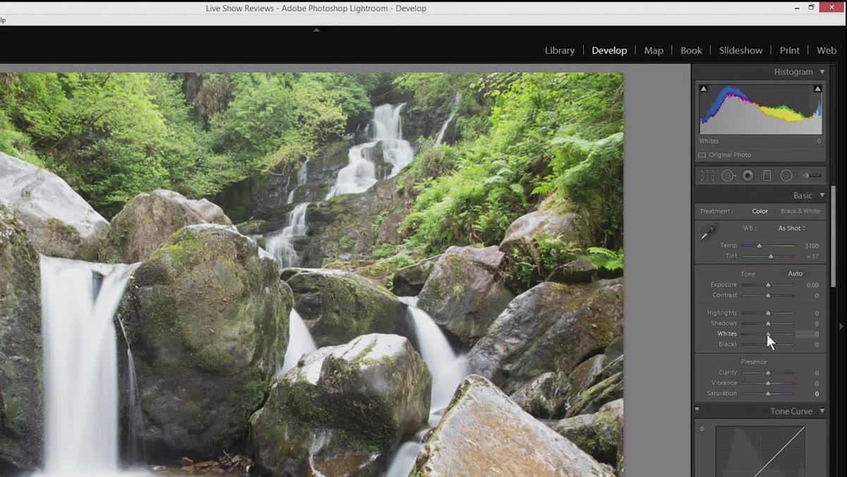 White slider being adjusted with Alt key held, showing clipping preview
Once the spots are gone, Chelsea moves to exposure. The overall brightness of the image is close, so rather than touching the Exposure slider, she goes directly to Whites and Blacks. Holding Alt (Option on Mac) while dragging the Whites slider activates the clipping preview. The screen goes black and any area that is blown out lights up in color. A small patch of highlight clipping on something like rushing white water is acceptable. Clipping across an entire sky or a broad reflective surface is a problem.
White slider being adjusted with Alt key held, showing clipping preview
Once the spots are gone, Chelsea moves to exposure. The overall brightness of the image is close, so rather than touching the Exposure slider, she goes directly to Whites and Blacks. Holding Alt (Option on Mac) while dragging the Whites slider activates the clipping preview. The screen goes black and any area that is blown out lights up in color. A small patch of highlight clipping on something like rushing white water is acceptable. Clipping across an entire sky or a broad reflective surface is a problem.
The key judgment call here is resisting the urge to pull Whites too far down just to eliminate every clipped pixel. Flatten the whites completely and the image loses its sense of light. Chelsea leaves the slider close to where it started because the image already had a reasonable tonal range. The goal is confirmation, not correction.
Step 3: Crush the Blacks Just Enough to Add Depth
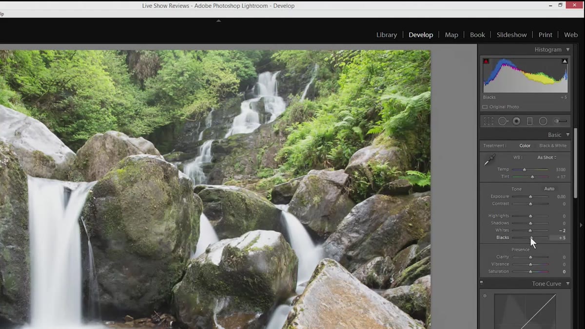 Black slider being pulled down to introduce shadow depth
The same Alt-key trick works on the Blacks slider. Hold it while dragging left and the screen goes white. Any area that is fully blocked up to pure black shows in color. Chelsea brings the blacks down until a small amount of true black appears in the shadows. Pure black in a landscape image creates visual anchors. Without them, even a well-exposed photo can look milky or flat, like someone stretched a gray filter across the whole thing.
Black slider being pulled down to introduce shadow depth
The same Alt-key trick works on the Blacks slider. Hold it while dragging left and the screen goes white. Any area that is fully blocked up to pure black shows in color. Chelsea brings the blacks down until a small amount of true black appears in the shadows. Pure black in a landscape image creates visual anchors. Without them, even a well-exposed photo can look milky or flat, like someone stretched a gray filter across the whole thing.
This isn’t a dramatic move. It’s a few points in either direction and then you stop. The point is to ensure the tonal range spans from a genuine black to a genuine white, which gives the histogram something to work with and gives the viewer’s eye a sense of contrast and depth.
Step 4: Apply Clarity with Restraint
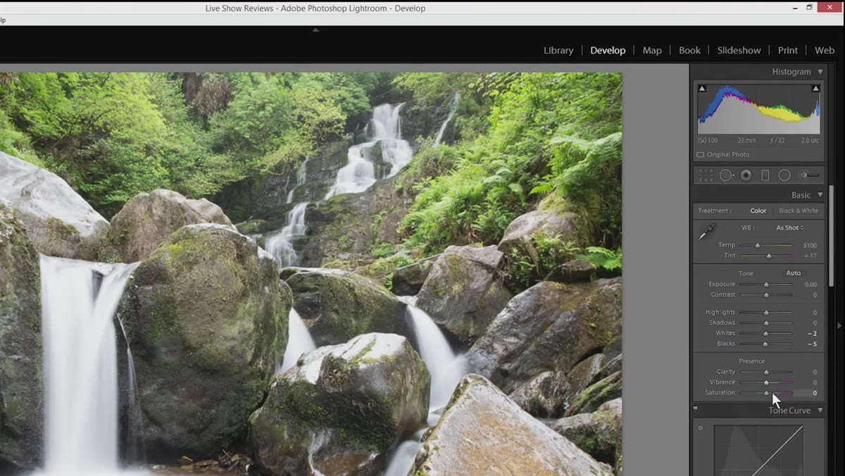 Clarity slider being increased slightly in the Basic panel
Chelsea adds a small amount of Clarity to bring out midtone contrast, the kind that makes rock texture and water movement feel tactile. The warning she gives here is worth taking seriously. Clarity is one of the most over-applied sliders in Lightroom. Pushed too hard it creates an HDR-style glow around edges that screams “heavily edited” and distracts from the actual subject. A value in the 10-20 range is usually enough to add presence without making the image look processed.
Clarity slider being increased slightly in the Basic panel
Chelsea adds a small amount of Clarity to bring out midtone contrast, the kind that makes rock texture and water movement feel tactile. The warning she gives here is worth taking seriously. Clarity is one of the most over-applied sliders in Lightroom. Pushed too hard it creates an HDR-style glow around edges that screams “heavily edited” and distracts from the actual subject. A value in the 10-20 range is usually enough to add presence without making the image look processed.
If you’re not sure, zoom to 100% and look at a detailed area like the rock surface or the edge where water meets stone. The texture should look cleaner and more defined, not ringed with light halos.
Step 5: Shift the Orange Hue to Warm the Rocks
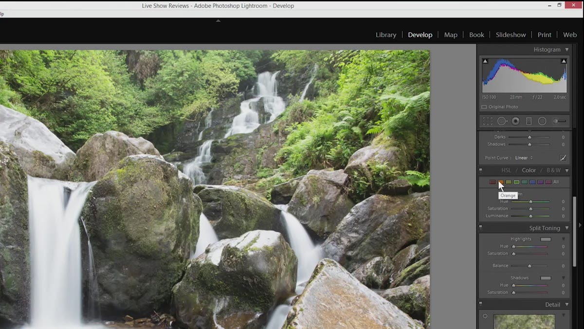 HSL panel open with Orange Hue slider being adjusted
Color grading starts in the HSL panel. Chelsea targets the Orange channel because the rocks in a waterfall scene typically carry warm tones, and shifting the Orange hue slightly toward red makes them feel richer and more saturated without touching saturation directly. Hue adjustments change the character of a color, not its intensity, so the result looks natural rather than pumped up.
HSL panel open with Orange Hue slider being adjusted
Color grading starts in the HSL panel. Chelsea targets the Orange channel because the rocks in a waterfall scene typically carry warm tones, and shifting the Orange hue slightly toward red makes them feel richer and more saturated without touching saturation directly. Hue adjustments change the character of a color, not its intensity, so the result looks natural rather than pumped up.
She also demonstrates a useful diagnostic habit: drag the slider to an extreme in both directions before settling on a value. Going to the edges reveals which parts of the image contain that color, including areas you might not expect. Skin tones, wood, warm stone, sunlit foliage - they all sit in the orange-red range, and a hue shift that looks great on rocks can create an unnatural color cast somewhere else in the frame.
Step 6: Boost Green Luminance to Make Foliage Pop
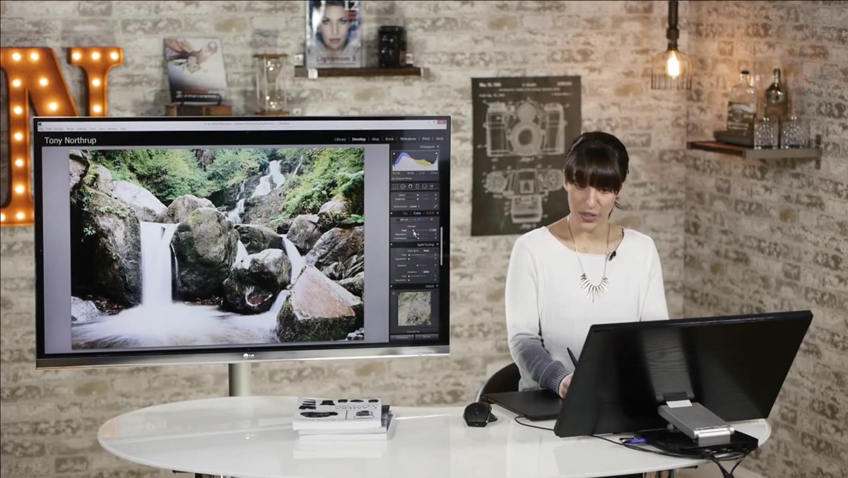 Green Luminance slider being increased in the HSL panel
The final move in the tutorial is lifting the Luminance of the greens and nudging their hue slightly. Increasing luminance on greens brightens them without washing them out, which helps foliage read as lush rather than dark and muddy. A small hue shift toward a slightly more saturated green pulls the color away from yellow-green (which can look sickly) toward the richer mid-greens that feel natural in forest and waterfall environments.
Green Luminance slider being increased in the HSL panel
The final move in the tutorial is lifting the Luminance of the greens and nudging their hue slightly. Increasing luminance on greens brightens them without washing them out, which helps foliage read as lush rather than dark and muddy. A small hue shift toward a slightly more saturated green pulls the color away from yellow-green (which can look sickly) toward the richer mid-greens that feel natural in forest and waterfall environments.
One Thing I’d Add from My Own Experience
The spot removal work Chelsea demonstrates is solid, but on images with a lot of mist - especially shots taken close to the falls - I’ll often run a second pass after all the global edits are done. Color grading can make previously subtle spots more visible because the contrast or hue shift draws attention to them. Finishing the technical cleanup before color grading is the right sequence, but a final check at the end has saved me from publishing images I thought were clean.
The single most important thing this tutorial reinforced for me is that restraint isn’t timidity. Every slider Chelsea touches, she moves carefully and evaluates in context. The edits that hold up in landscape work - the ones that look real a year later - are almost always the ones where someone had the discipline to stop before it was “too much.” That instinct is worth practicing deliberately.
Watch the full tutorial on YouTube to see Chelsea’s source image and follow the edit from start to finish.
Comments (2)
Wow, I had no idea you could do this. Mind blown.
Love how you break down complex stuff into manageable steps.
Leave a Comment