What This Year’s Ocean Photography Winners Can Teach Us About Color Grading
The United Nations just crowned the champions of their World Oceans Day photography competition, and I’ve been absolutely mesmerized by what won. Not just because the images are stunning—though they absolutely are—but because they showcase some seriously thoughtful color grading decisions that we can all learn from.
Competing in the Deep Blue
This year’s edition introduced a fresh category called “Connecting Oceans,” which feels like the perfect evolution for a competition that’s grown increasingly competitive. The winning submissions span everything from colossal underwater cave systems to wildlife moments that’ll make your heart melt (those bear cubs? I can’t even).
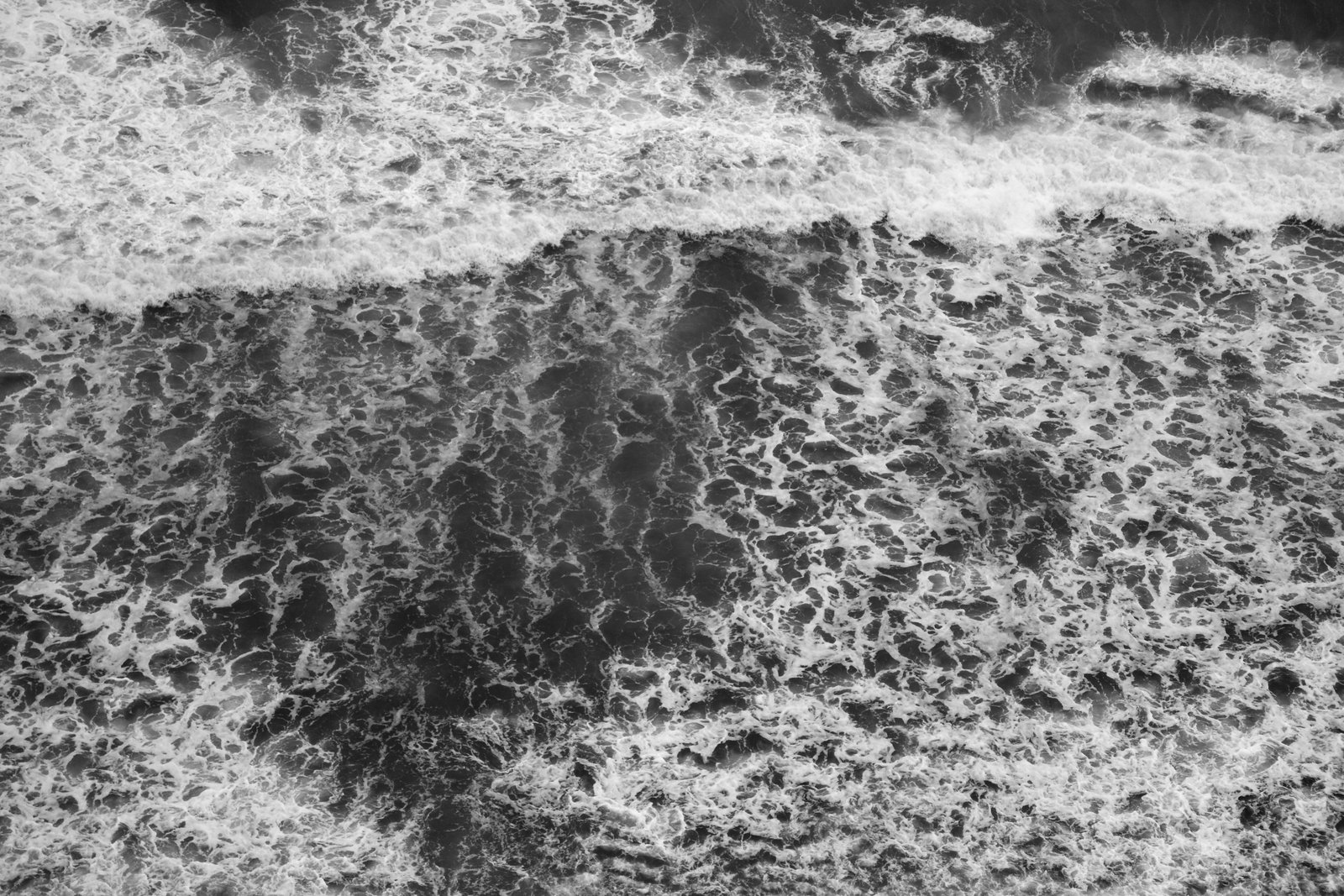
What strikes me most is how these photographers used color to tell their stories. In underwater photography especially, you’re working with brutal color cast challenges—the deeper you go, the more your warm tones disappear into the blue abyss. The winners clearly understood how to dance with this limitation rather than fight it.
The Editing Philosophy Behind the Wins
Here’s what I noticed reviewing these winners: the best shots weren’t over-processed. They felt alive and natural, which tells me these photographers invested time in their Lightroom adjustments rather than throwing trendy presets at their images and calling it a day.
The underwater cave imagery, for instance, shows masterful shadow recovery and selective saturation work. Rather than cranking global vibrance to the moon, the winners clearly used targeted adjustments—probably HSL sliders and local adjustment brushes—to bring out detail without pushing into that oversaturated look that screams “heavily edited.”
The wildlife shots demonstrated another editing principle entirely: restraint with warmth. When you’ve got those golden-hour bear cubs, the temptation is to push temperature sliders until everything looks like Instagram’s “Golden Hour” filter. The winning photographers didn’t fall for it. Their edits felt warm but credible.
Lessons for Our Own Work
I’m taking three things away from this year’s winners:
First: Understand your light source. Underwater scenes have different color properties than forest scenes. Respect those differences in your edits.
Second: Use selective color adjustments instead of global ones. Your blues should be different from your cyans, and your greens from your teals.
Third: Leave breathing room. The most compelling images aren’t trying to convince you they’re heavily edited. They’re confident in their light and composition.
Whether you’re editing vacation snapshots or competing for international recognition, these principles hold. Color grading isn’t about making things look “better”—it’s about making them look true.
Comments
Leave a Comment