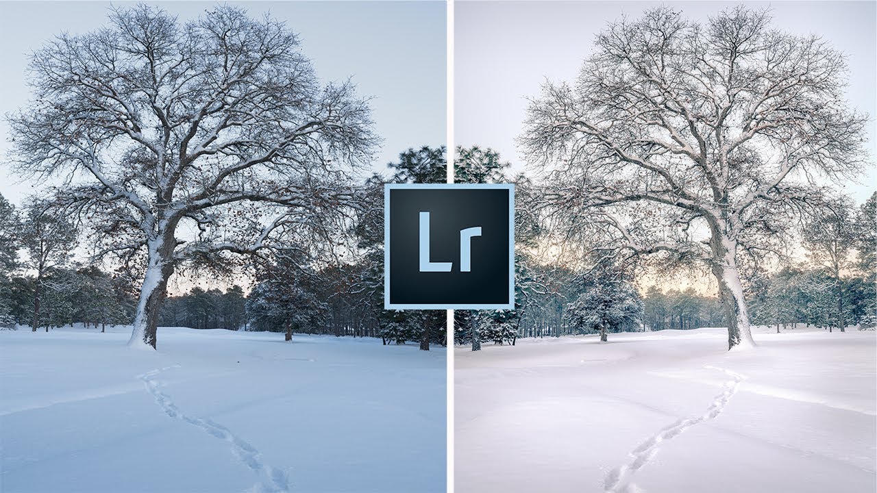
Every January I open a folder of winter shots and think the same thing: why does my snow look like a gas station slushie? Sometimes it’s blue from a clear sky acting as a giant overhead reflector. Sometimes it’s that flat, greenish-gray you get from overcast light. Either way, the camera captured it faithfully and Lightroom handed me a problem to solve.
Winter editing isn’t hard in the way that, say, compositing is hard. But it has a specific set of traps that catch you off guard precisely because they look like they should be easy. Snow is white. White should be easy to fix. And yet here we are. That disconnect is exactly what Mark Denney breaks down in this tutorial, walking through seven practical adjustments you can make in Lightroom to take cold-weather landscape photos from flat or color-casted to clean and atmospheric. Watch the full tutorial on YouTube if you want to follow along with his actual footage. What follows is my walkthrough of each step with the settings spelled out so you can apply them without pausing and rewinding.
The thing I appreciate most about Denney’s approach here is that he starts with something almost embarrassingly simple, and it turns out to make a real difference. I wish someone had told me this years ago when I was squinting at snowy shots on a gray background wondering why nothing looked right.
Step 1: Change Your Canvas to White
 Canvas right-click menu with white background selected
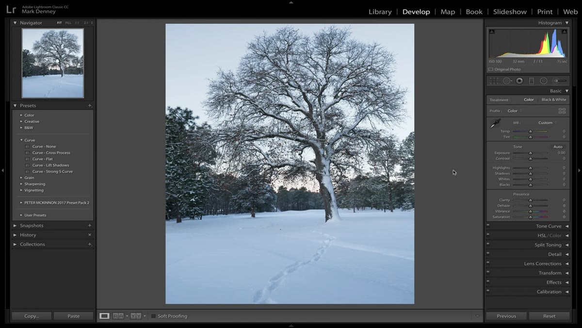
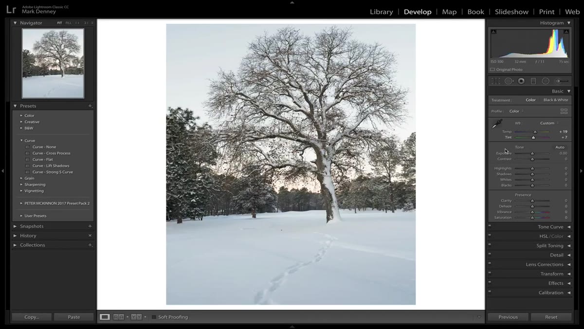
Before touching a single slider, right-click on the background canvas around your photo inside Lightroom’s Develop module and switch it to white. That’s the whole tip, and it’s genuinely one of the most useful things you can do for winter editing specifically. A dark or medium gray canvas gives you no visual anchor for evaluating snow tones. A white border gives you an immediate reference point for what true white actually looks like, so your eye can calibrate while you work. When your snow looks slightly blue or warm, you’ll catch it faster because you have something neutral sitting right next to it.
Canvas right-click menu with white background selected
Before touching a single slider, right-click on the background canvas around your photo inside Lightroom’s Develop module and switch it to white. That’s the whole tip, and it’s genuinely one of the most useful things you can do for winter editing specifically. A dark or medium gray canvas gives you no visual anchor for evaluating snow tones. A white border gives you an immediate reference point for what true white actually looks like, so your eye can calibrate while you work. When your snow looks slightly blue or warm, you’ll catch it faster because you have something neutral sitting right next to it.
This takes two seconds and costs nothing. Make it a habit every time you open a winter or high-key image.
Step 2: Fix White Balance Without Trusting Auto
 White balance panel showing Auto values applied to snowy scene
Here’s where most people go wrong, and I’ve done this myself more times than I want to count. You grab the white balance eyedropper, click on the snow (which looks neutral and white and seems like the obvious target), and Lightroom immediately cranks the temperature up and makes the whole scene look like it was shot in a sauna. Snow picks up color from the sky above it. When the sky is blue, the snow is blue. Lightroom sees that blue tint and overcorrects aggressively toward warm to compensate.
White balance panel showing Auto values applied to snowy scene
Here’s where most people go wrong, and I’ve done this myself more times than I want to count. You grab the white balance eyedropper, click on the snow (which looks neutral and white and seems like the obvious target), and Lightroom immediately cranks the temperature up and makes the whole scene look like it was shot in a sauna. Snow picks up color from the sky above it. When the sky is blue, the snow is blue. Lightroom sees that blue tint and overcorrects aggressively toward warm to compensate.
Denney’s fix is clean. Use Auto white balance as a starting point, but then cut both the Temperature and Tint values roughly in half. If Auto lands you at +33 Temperature and +10 Tint, dial those back to around +17 and +5. That’s your actual foundation. You’ll probably revisit these values after you’ve made other adjustments, but halving the Auto numbers gets you into a believable range without the washed-out warmth that wrecks cold-weather atmosphere.
Step 3: Set Exposure with the Alt/Option Key Preview
 Exposure slider with threshold clipping preview visible
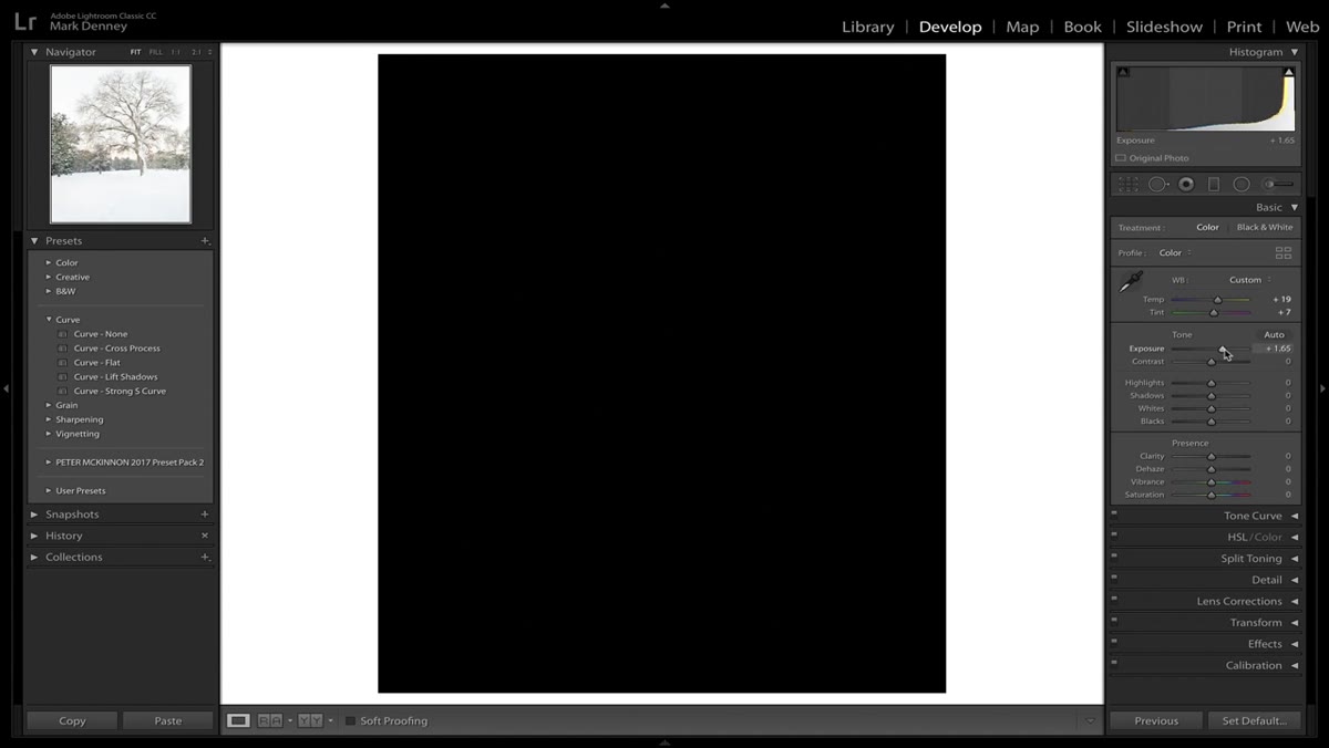
Snow scenes almost always come in underexposed straight from camera. Your meter reads all that bright white and decides the scene is brighter than it is, then stops down to compensate. The result is snow that looks dingy instead of crisp.
Exposure slider with threshold clipping preview visible
Snow scenes almost always come in underexposed straight from camera. Your meter reads all that bright white and decides the scene is brighter than it is, then stops down to compensate. The result is snow that looks dingy instead of crisp.
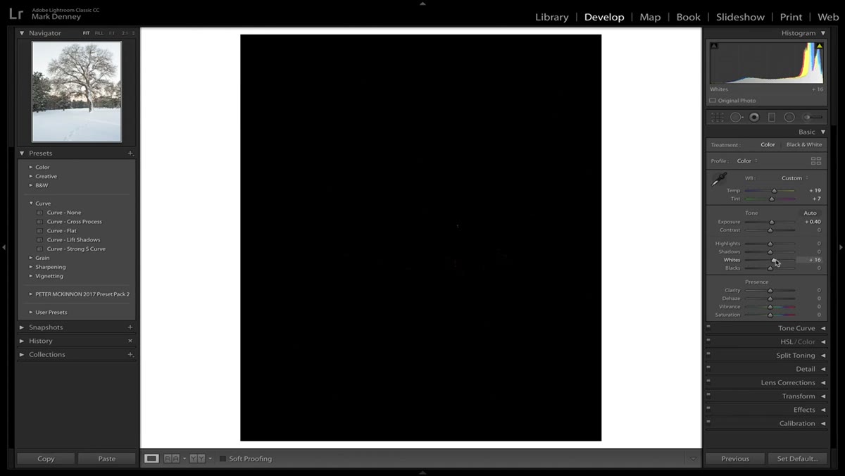
When adjusting Exposure in Lightroom, hold Alt (Windows) or Option (Mac) while dragging the slider. This activates the threshold preview, which shows clipping in white and protected areas in black. The goal is to push your exposure up until you start seeing the earliest hints of white appearing in the brightest snow areas, then back off just slightly. This gives you bright, clean snow without blowing out the highlights entirely. It’s more reliable than eyeballing the histogram alone, especially for high-contrast winter scenes where bright snow sits right next to deep shadows in trees or rocks.
Step 4: Recover Highlights Carefully
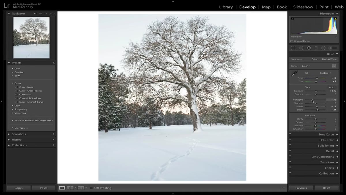
 Highlights slider being pulled left to recover blown snow detail
Once exposure is set, snow highlights will likely be sitting right on the edge of clipping. Pull the Highlights slider left, sometimes significantly, to bring texture and detail back into the bright snow areas. The trick here is not to pull it so far that the snow goes flat and gray. You want luminous and detailed, not muddy. Watch the histogram’s right edge as you drag and stop when it pulls cleanly away from the wall without losing that sense of brightness.
Highlights slider being pulled left to recover blown snow detail
Once exposure is set, snow highlights will likely be sitting right on the edge of clipping. Pull the Highlights slider left, sometimes significantly, to bring texture and detail back into the bright snow areas. The trick here is not to pull it so far that the snow goes flat and gray. You want luminous and detailed, not muddy. Watch the histogram’s right edge as you drag and stop when it pulls cleanly away from the wall without losing that sense of brightness.
Step 5: Open Shadows to Reveal Depth
 Shadows slider being raised to lift dark areas in winter scene
Winter landscapes often have deep, inky shadows under trees, in footprints in the snow, or along rock faces. Lifting the Shadows slider adds dimension and prevents the image from feeling like a flat white sheet with dark blobs. Denney treats this as a balancing move against the Highlights recovery. You’re essentially compressing the dynamic range toward the middle so both extremes read as intentional rather than accidental.
Shadows slider being raised to lift dark areas in winter scene
Winter landscapes often have deep, inky shadows under trees, in footprints in the snow, or along rock faces. Lifting the Shadows slider adds dimension and prevents the image from feeling like a flat white sheet with dark blobs. Denney treats this as a balancing move against the Highlights recovery. You’re essentially compressing the dynamic range toward the middle so both extremes read as intentional rather than accidental.
Don’t go too far here either. Pushed shadows in snow scenes can introduce noise and give the image a milky, low-contrast look. Subtle lifts, think +20 to +40 depending on the shot, usually do the job.
Step 6: Address Blue Snow with HSL
 HSL panel with Blues Hue and Saturation sliders adjusted
This is the fix I use constantly. Open the HSL panel and go straight to the Blues channel. If your snow has a cold blue cast, you can reduce the Saturation of Blues to pull that tint out without affecting the sky or other intentional blue tones as dramatically. You can also nudge the Hue slider to shift those blues slightly toward purple or cyan depending on which direction looks more neutral in context.
HSL panel with Blues Hue and Saturation sliders adjusted
This is the fix I use constantly. Open the HSL panel and go straight to the Blues channel. If your snow has a cold blue cast, you can reduce the Saturation of Blues to pull that tint out without affecting the sky or other intentional blue tones as dramatically. You can also nudge the Hue slider to shift those blues slightly toward purple or cyan depending on which direction looks more neutral in context.
This is more surgical than trying to fix snow color through the Temperature slider alone, which moves everything in the frame at once. The HSL panel lets you target the problem area specifically.
Step 7: Add a Touch of Warmth Selectively
 Color Grading or HSL panel being used to add warmth to midtones
The final move Denney describes is reintroducing a small amount of warmth, but not globally. Winter scenes read as cold for a reason, and you don’t want to fight that entirely. The goal is to add just enough warmth in the shadows or midtones to make the image feel alive rather than sterile. Pushing a slight orange or amber tone into the shadows through the Color Grading panel works well here. Keep the saturation value low, usually under 20, and let it function as a mood suggestion rather than a color statement.
Color Grading or HSL panel being used to add warmth to midtones
The final move Denney describes is reintroducing a small amount of warmth, but not globally. Winter scenes read as cold for a reason, and you don’t want to fight that entirely. The goal is to add just enough warmth in the shadows or midtones to make the image feel alive rather than sterile. Pushing a slight orange or amber tone into the shadows through the Color Grading panel works well here. Keep the saturation value low, usually under 20, and let it function as a mood suggestion rather than a color statement.
One Thing I’d Add: Check Your Blues on Multiple Exports
The blue snow problem Denney addresses in the HSL panel can look fixed on screen and then creep back in when you export to JPEG or view the image on a phone. I’ve lost count of how many times I’ve finalized an edit on my monitor, sent a proof, and gotten back a note that the snow looks like someone poured Windex on it. Before calling a winter edit done, export a test file, drop it into your phone’s photo app, and check it against a white background. The extra two minutes saves embarrassment.
Cold-weather landscapes are some of the most rewarding images to get right, and most of the heavy lifting happens in a few targeted corrections: a white canvas for reference, a halved white balance from Auto, and precise highlight recovery. Get those three right and you’re most of the way there. The rest is refinement.
Watch the full tutorial on YouTube to follow along with Denney’s actual before-and-after footage. Seeing the canvas background change and the white balance shift in real time is worth the watch even if you absorb everything here.
Comments
Leave a Comment