Last spring I was shooting a friend’s engagement session at Centennial Park when their other photographer canceled two hours before golden hour. I ended up shooting the whole thing on my Sony A7IV and editing the delivery batch on my phone that same night, because my laptop was at a repair shop with a dead keyboard. Twenty-four RAW files. Lightroom Mobile. A glass of water and a bad attitude.
The edits were some of the cleanest I’ve delivered all year.
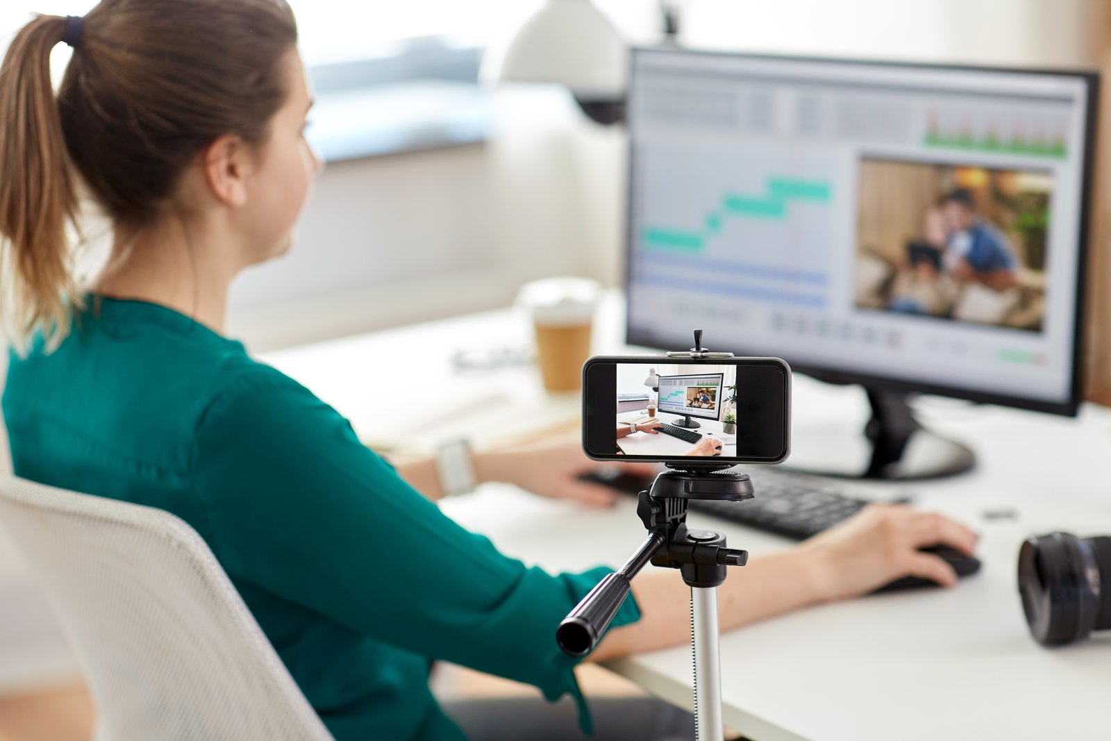
Mobile editing has a reputation problem. People assume it’s what you do when you don’t have access to “real” tools, like it’s the editing equivalent of eating cereal for dinner. But Lightroom Mobile in 2024 is running the same parametric editing engine as the desktop version. The math is identical. The only things that change are your screen size, your input method, and, critically, your file handling if you don’t set things up correctly from the start.
Why Your Mobile Edits Look Different on Desktop (And How to Stop That)
This is the thing that trips people up most. You edit a photo on your phone, it looks great, you open it on your desktop, and something is off. Usually it’s one of two problems.
The first is color profile mismatch. If your phone screen is not calibrated and you’re editing by eye, you’re essentially mixing paint under the wrong light. The iPhone 15 Pro and Samsung Galaxy S24 Ultra both have excellent displays, but they still skew warmer and more saturated than a calibrated monitor. Knowing that, I deliberately push my shadows slightly cooler on mobile, around minus 10 on the Tint slider, and bring my Vibrance down 5 points from where it looks “right” on my phone. Those small corrections almost always land closer to neutral on a desktop display.
The second problem is proxies. If you’re not shooting RAW or haven’t enabled “Store a Copy” in your Lightroom Mobile settings, you may be editing a compressed JPEG preview without realizing it. Go to your app settings, then “Local Storage,” and confirm that your RAW originals are actually syncing. If your file sizes are showing as 2-4 MB per image instead of 20-40 MB, you’re editing a proxy. That’s fixable, but it’s a conversation you don’t want to have after you’ve already delivered a job.
The Mobile Color Grade That Takes Under Four Minutes
Here’s the actual sequence I run on mobile for a fast color grade. This assumes you’ve already applied a base preset, which should do the heavy lifting on tone.
Start in the Color Mix panel. On mobile, this is buried under the third icon in the editing toolbar. I spend about 45 seconds here adjusting Hue and Luminance on the orange and yellow channels for skin tones, usually pulling orange Luminance up 8-12 points and shifting orange Hue toward red by about 5-7 points. That alone does more for portraits than most people’s entire edit.
Then I move to Curves. Tap the circle icon, switch to the Blue channel, and add a very gentle S-curve: lift the shadows slightly and pull the highlights down just a touch. This is the fastest way to get a warm-film look without making your image look like it was processed through a Nashville Instagram filter from 2013.
Last stop is the Color Grading panel. I keep my Midtones hue around 30-35 (a soft amber), Saturation around 12, and Luminance at 0. Shadows get a hue near 220 (cool blue), Saturation at 8. Highlights stay mostly neutral, maybe Saturation at 5 with a hue near 45. The whole thing takes about 90 seconds once it’s muscle memory.
Using Presets on Mobile Without Losing Your Mind
I name all my presets after songs. “Harvest Moon” is my fall outdoor edit. “Blue in Green” is my go-to for overcast portraits. It’s not a system that scales for a team, but it means I can find what I need in under five seconds, which is the only metric that matters when you’re editing quickly on a small screen.
On mobile, presets live in the “Presets” panel at the bottom of your editing stack. The thing most people don’t know is that you can preview presets in real time by holding your finger on the preset name. That single feature saves me from applying and undoing probably 15 times per session.
One strong recommendation: keep a separate preset folder for mobile-specific adjustments. My desktop presets sometimes overcook the clarity and texture on mobile because I’m seeing them on a screen that renders micro-contrast differently. Having a mobile folder with slightly dialed-back Texture values (usually minus 5 from my desktop version) keeps things consistent.
Syncing Edits Across Devices Without Losing Work
Lightroom’s sync is mostly reliable, but “mostly” is doing a lot of work in that sentence. The one habit that has saved me from losing edits is always confirming the sync status icon in the top right corner before closing the app. A small circle with lines means it’s still uploading. A checkmark means you’re good. Closing the app mid-sync on a large batch can cause edits to roll back, and that’s a fun problem to discover at 11pm before a delivery deadline.
If you’re on a slower connection, switch Lightroom Mobile to sync over WiFi only (under App Settings, then “Sync”) and wait until you’re connected before closing out. It adds maybe ten minutes to your workflow and removes an entire category of potential disasters.
The real secret to mobile editing isn’t a trick or a hidden panel. It’s accepting that your phone is a legitimate editing tool and building a workflow around its actual constraints, instead of just improvising and hoping the results hold up on a bigger screen. Treat it like a darkroom with a touchscreen and it’ll behave like one.
Comments
Leave a Comment