I spend a lot of time chasing the right starting point. Not the final edit - the moment before the moment, where the raw file either cooperates or fights back. For years, profiles were the answer I defaulted to: slap on Adobe Color, get a reasonable baseline, then start pushing sliders. It works. It’s fine. But “fine” is a weird place to park your workflow when better options exist.
In this Matt Kloskowski tutorial covering the February 2025 Lightroom update, the feature that stopped me mid-scroll was Adaptive Profiles. They’ve been living inside Adobe Camera Raw for a while, but they’ve finally landed in both Lightroom Classic and the cloud-based Lightroom - and the difference between an adaptive profile and a standard one is bigger than I expected. Watch the full tutorial on YouTube
The short version: standard profiles change contrast and color. Adaptive profiles actually read the tonal content of your specific image and adjust highlights, shadows, and overall exposure as part of the profile application. It’s less like choosing a film simulation and more like handing your raw file to something that’s genuinely paying attention. Here’s how to put it to work.
Step 1: Confirm You’re Working on a Raw File
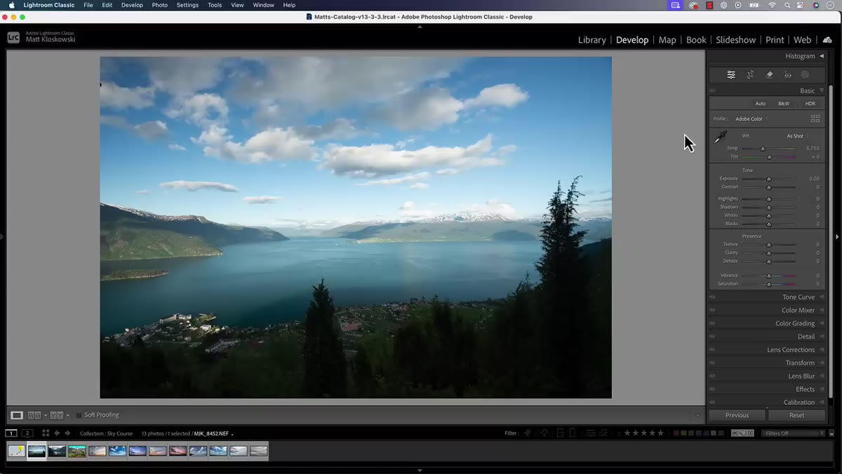 Profile panel open in Lightroom Classic edit mode
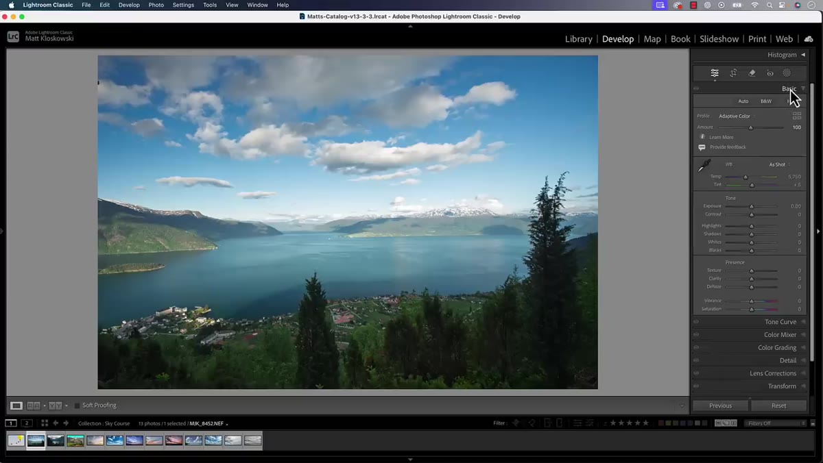
Adaptive Profiles only function on raw files. This isn’t a soft recommendation - it’s a hard requirement built into how the feature operates. Before you go hunting for the Adaptive section, check that you’re not working on a JPEG or TIFF. If you are, the option simply won’t appear. Open a raw file in your Develop module (Lightroom Classic) or the Edit panel (Lightroom), and you’re good to proceed.
Profile panel open in Lightroom Classic edit mode
Adaptive Profiles only function on raw files. This isn’t a soft recommendation - it’s a hard requirement built into how the feature operates. Before you go hunting for the Adaptive section, check that you’re not working on a JPEG or TIFF. If you are, the option simply won’t appear. Open a raw file in your Develop module (Lightroom Classic) or the Edit panel (Lightroom), and you’re good to proceed.
Step 2: Open the Profile Browser
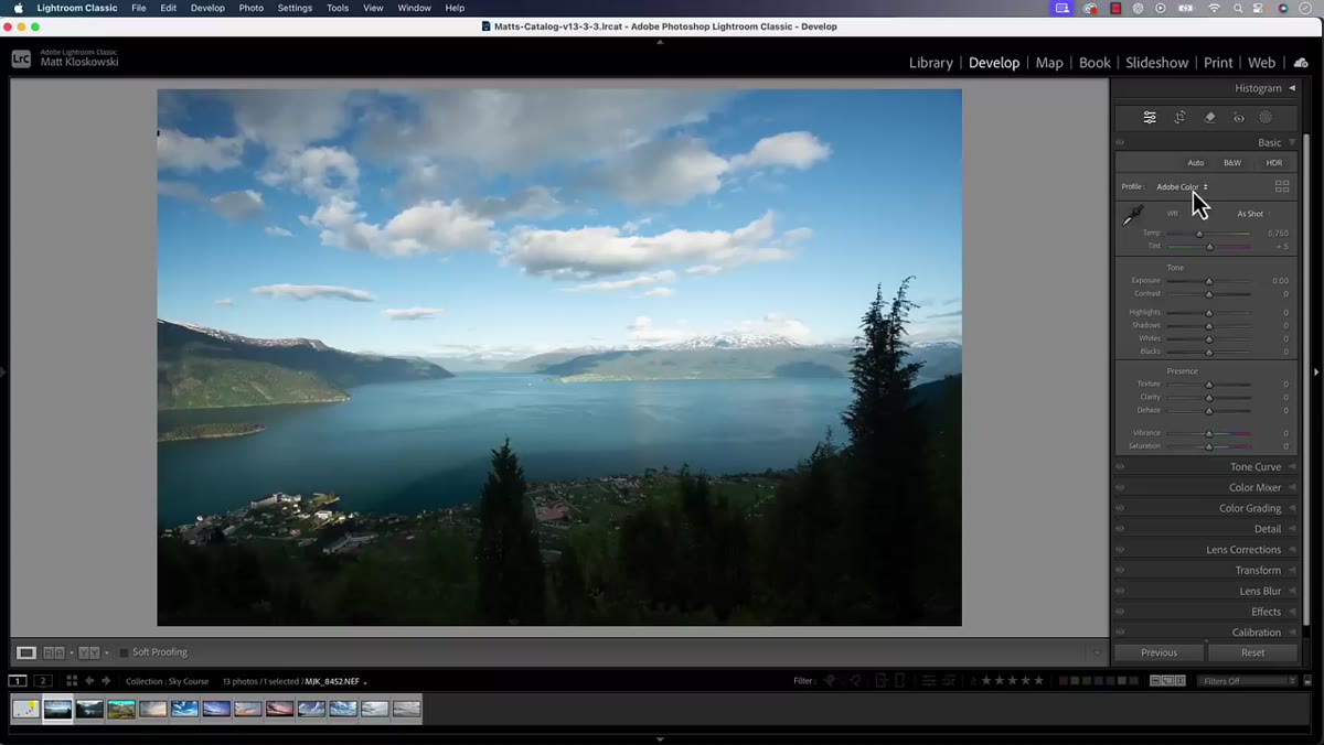 Browse button highlighted in the Profile section at top of Edit panel
At the very top of your edit panel, you’ll see the Profile section. Most people have Adobe Color sitting here and they never touch it again. Click the grid icon (or the “Browse” button depending on your version) to expand the full profile browser. This is where you’ll find not just the Adobe standard profiles, but also any third-party profiles you’ve installed - and now, the Adaptive section.
Browse button highlighted in the Profile section at top of Edit panel
At the very top of your edit panel, you’ll see the Profile section. Most people have Adobe Color sitting here and they never touch it again. Click the grid icon (or the “Browse” button depending on your version) to expand the full profile browser. This is where you’ll find not just the Adobe standard profiles, but also any third-party profiles you’ve installed - and now, the Adaptive section.
Don’t rush past this panel. It’s genuinely worth spending time here if you haven’t lately. The profile you start with affects every slider you touch afterward, which means choosing the right one early saves you from fighting your own edit later.
Step 3: Locate the Adaptive Section
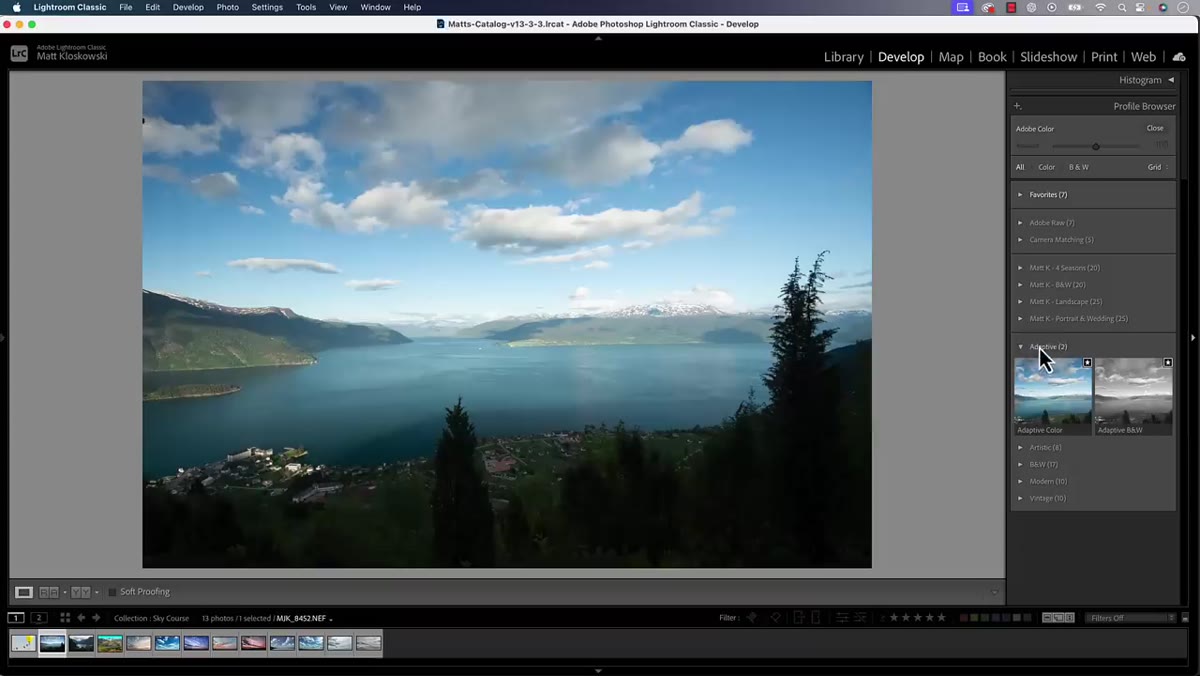 Adaptive section visible at bottom of Profile Browser panel
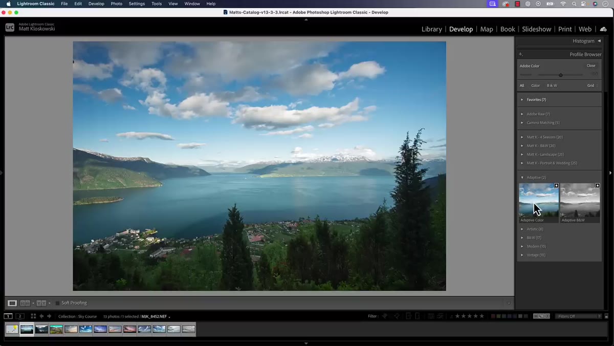
Scroll toward the bottom of the profile browser and you’ll find the Adaptive group. Inside it, there are currently two options: Adaptive Color and Adaptive Black and White. They’re not buried or hidden - Adobe has given them their own clearly labeled section. Select Adaptive Color for any image you’re editing in color (the black and white version follows the same logic, just without the chroma component).
Adaptive section visible at bottom of Profile Browser panel
Scroll toward the bottom of the profile browser and you’ll find the Adaptive group. Inside it, there are currently two options: Adaptive Color and Adaptive Black and White. They’re not buried or hidden - Adobe has given them their own clearly labeled section. Select Adaptive Color for any image you’re editing in color (the black and white version follows the same logic, just without the chroma component).
Step 4: Apply the Profile and Compare
 Before and after view showing tonal changes from Adaptive Color profile
Click Adaptive Color and then close the browser. Hit the backslash key to toggle between your before and after states. This is where the “oh, that’s different” moment happens. Standard profiles tend to shift contrast and color rendering in a fairly uniform way across images. Adaptive Color is doing something more targeted - it’s reading where your highlights are sitting, how much shadow detail exists, and what the overall tonal balance of this particular frame looks like.
Before and after view showing tonal changes from Adaptive Color profile
Click Adaptive Color and then close the browser. Hit the backslash key to toggle between your before and after states. This is where the “oh, that’s different” moment happens. Standard profiles tend to shift contrast and color rendering in a fairly uniform way across images. Adaptive Color is doing something more targeted - it’s reading where your highlights are sitting, how much shadow detail exists, and what the overall tonal balance of this particular frame looks like.
In the tutorial, Matt points to the foreground trees and the cloud definition in the sky as the tell. There’s more contrast, and the cloud structure gets noticeably sharper-looking without any manual dodging or highlight recovery. That’s the adaptive behavior at work - it’s not applying a generic curve, it’s responding to the image in front of it.
Step 5: Skip the Auto Button
 Warning prompt shown when Auto and Adaptive Profile are used together
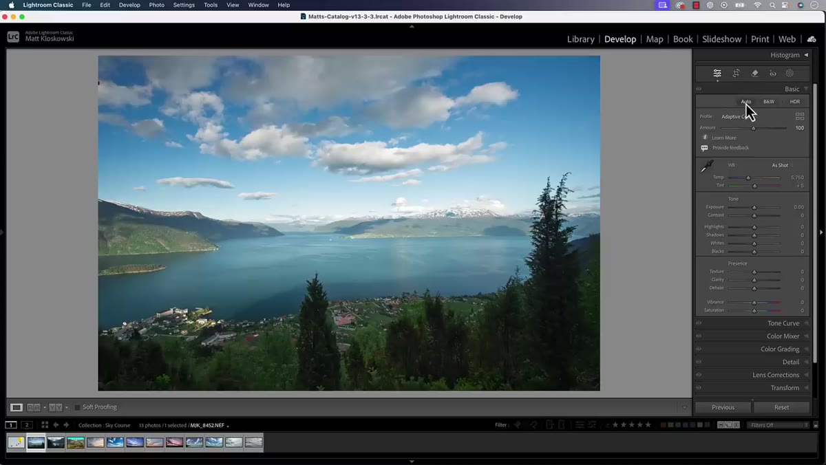
Here’s the catch that will save you a headache: do not use the Auto setting in your edit panel alongside an Adaptive Profile. Adobe actually flags this with an on-screen reminder when you try it. The two systems overlap in what they’re doing, and running both at once creates competing adjustments that muddy your starting point rather than clarifying it.
Warning prompt shown when Auto and Adaptive Profile are used together
Here’s the catch that will save you a headache: do not use the Auto setting in your edit panel alongside an Adaptive Profile. Adobe actually flags this with an on-screen reminder when you try it. The two systems overlap in what they’re doing, and running both at once creates competing adjustments that muddy your starting point rather than clarifying it.
Think of it this way - the Adaptive Profile is already functioning as a smarter version of Auto at the profile level. Stacking the Auto button on top of it is like applying two different noise reduction passes. More is not better here. Pick one approach and commit.
Step 6: Edit Forward From the New Baseline
 Develop sliders visible after Adaptive Profile has been applied
Once the Adaptive Profile is applied, your sliders haven’t moved - but your starting point has shifted underneath them. This is the part that takes a small mental adjustment. Your exposure, highlights, and shadows readings are now relative to an already-adapted baseline. Resist the urge to immediately drag sliders back toward where they’d be with Adobe Color applied. Trust the new floor you’re standing on and make adjustments from there.
Develop sliders visible after Adaptive Profile has been applied
Once the Adaptive Profile is applied, your sliders haven’t moved - but your starting point has shifted underneath them. This is the part that takes a small mental adjustment. Your exposure, highlights, and shadows readings are now relative to an already-adapted baseline. Resist the urge to immediately drag sliders back toward where they’d be with Adobe Color applied. Trust the new floor you’re standing on and make adjustments from there.
What I’ve found is that images with challenging dynamic range - backlit portraits, golden hour landscapes, anything with a blown-sky problem - respond especially well. The Adaptive Profile does some of the heavy lifting that I used to handle manually with graduated filters or luminosity masks.
My Take: Where Adaptive Profiles Fit in a Real Workflow
I won’t swap my custom presets for every genre of work - some of my session-specific presets (I name them after songs, which is either charming or deeply strange) capture a look that I’ve dialed in over dozens of shoots. But for first passes on raw selects, especially when I’m moving fast through a large batch, Adaptive Color has genuinely changed my opening move.
The workflow I’ve landed on: apply Adaptive Color as the profile, do a rough cull pass to see which images are keepers, then apply my session preset on top. The adaptive adjustment doesn’t conflict with a manually-applied preset the same way it conflicts with Auto. You’re essentially letting the profile normalize the tonal starting point, then letting your creative choices build on top of that normalized base.
One thing Matt mentions near the end - if you have an HDR-capable monitor, this feature pairs especially well with HDR editing mode. I’d consider that the advanced version of this workflow, but even without an HDR display, the Adaptive Profile alone is worth integrating.
The single most important thing to take from this feature: profiles have always mattered more than most people treat them, and Adaptive Profiles finally make that importance visible in a way you can actually see on your screen before touching a single slider.
Watch the full tutorial on YouTube - Matt also covers the other features in the February 2025 update, and if you’re a Lightroom (cloud) user, he timestamps the section specifically for you.
Comments (1)
I keep coming back to this article. It's that useful.
Leave a Comment