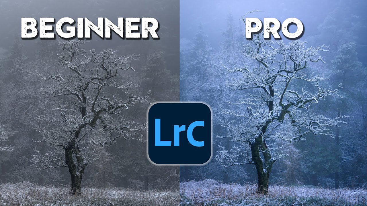
Every once in a while, a tutorial reframes something I thought I already understood. I’ve been editing in Lightroom long enough that I named my first preset pack after a Wilco album, but watching Nigel Danson work through the same two photos at three different skill levels made me pause and audit my own habits. Not because the tools were unfamiliar. Because the thinking behind them was.
The premise of Watch the full tutorial on YouTube is deceptively simple: take two landscape photos and edit each one the way a beginner, intermediate, and pro would approach them. What Nigel reveals isn’t just a list of Lightroom sliders. It’s a map of how your decision-making evolves as your eye develops. If you’ve ever looked at your edit and thought “it looks fine but something’s off,” this breakdown will probably tell you exactly what that something is.
The two images he works with are a snowy tree scene with moody directional light, and a second landscape with a strong horizon. Both are good captures. Both get wildly different results depending on the level of intentionality behind the edit. Here’s how to follow along and apply each approach yourself.
Step 1: Start With the Crop Before You Touch Anything Else
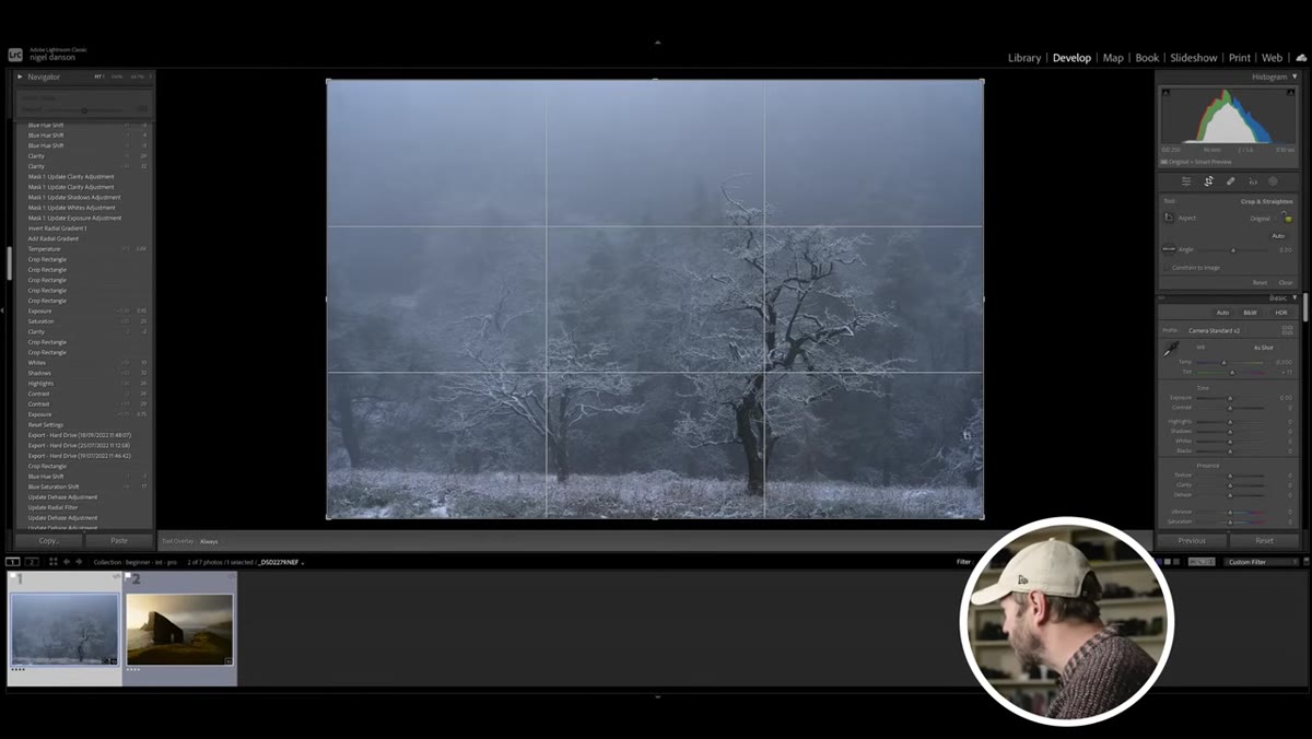 Lightroom crop tool applied to snowy tree image
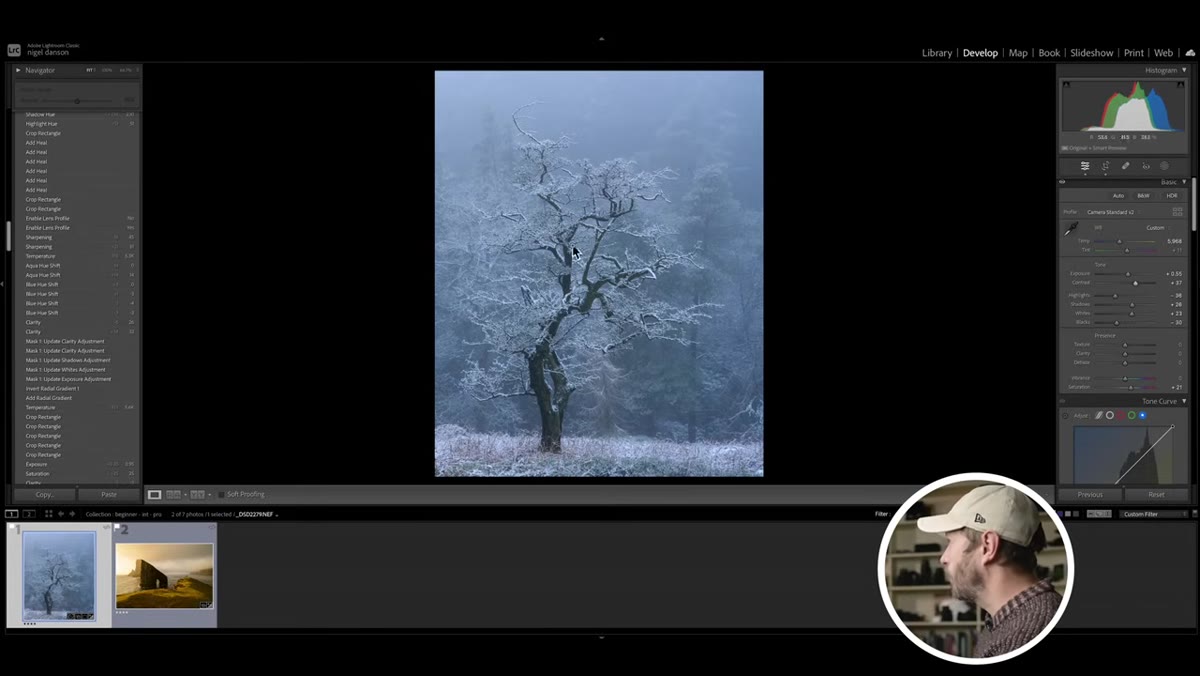
Before a single slider moves, the first thing to establish is composition inside the frame. On the snow image, that means deciding what the photo is actually about. Tighten the edges slightly to remove visual noise at the borders, consider centering the primary subject (here, the trees), and optionally crop the top to reduce empty sky. On the second image, the original crop held up well, but the horizon needed a quick check. Use the Angle tool under the crop overlay to make sure the horizon reads level. This takes thirty seconds and affects how the entire image feels.
Lightroom crop tool applied to snowy tree image
Before a single slider moves, the first thing to establish is composition inside the frame. On the snow image, that means deciding what the photo is actually about. Tighten the edges slightly to remove visual noise at the borders, consider centering the primary subject (here, the trees), and optionally crop the top to reduce empty sky. On the second image, the original crop held up well, but the horizon needed a quick check. Use the Angle tool under the crop overlay to make sure the horizon reads level. This takes thirty seconds and affects how the entire image feels.
Step 2: Run the Basic Panel Top to Bottom
 Basic panel sliders adjusted on the snow scene
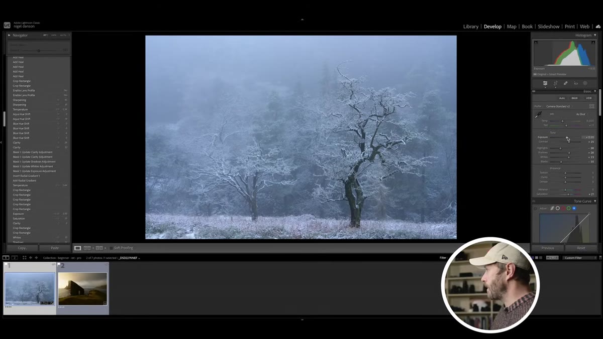
The beginner approach to the Basic panel is still the right starting point at any level. Work from top to bottom: exposure, contrast, highlights, shadows, whites, blacks. On the snow image, pulling highlights down recovers detail in the bright areas while pushing shadows up lifts the darker foreground. Increasing whites slightly restores the luminance range you compressed with that highlights pull. Dropping exposure a touch while doing this can shift the image cooler, which on a snow scene actually reinforces the mood rather than fighting it. On the warmer landscape image, the logic flips. Bump exposure up, warm the temp slider slightly, and the image starts breathing almost immediately.
Basic panel sliders adjusted on the snow scene
The beginner approach to the Basic panel is still the right starting point at any level. Work from top to bottom: exposure, contrast, highlights, shadows, whites, blacks. On the snow image, pulling highlights down recovers detail in the bright areas while pushing shadows up lifts the darker foreground. Increasing whites slightly restores the luminance range you compressed with that highlights pull. Dropping exposure a touch while doing this can shift the image cooler, which on a snow scene actually reinforces the mood rather than fighting it. On the warmer landscape image, the logic flips. Bump exposure up, warm the temp slider slightly, and the image starts breathing almost immediately.
Step 3: Add Saturation or Vibrance - But Know the Difference
 Saturation slider being increased in Basic panel
At the beginner stage, adding saturation is the go-to finishing move. It works, mostly. But vibrance is the smarter default for most images because it boosts muted colors more aggressively while protecting skin tones and already-saturated hues from going nuclear. On the snow image, a small saturation bump deepens the blue cast in the shadows without nuking the whites. On the warmer image, vibrance adds punch to the greens and golds without making the whole thing look like a Instagram filter from 2012. Either slider should be a light touch. If you can immediately tell you moved it, you probably moved it too far.
Saturation slider being increased in Basic panel
At the beginner stage, adding saturation is the go-to finishing move. It works, mostly. But vibrance is the smarter default for most images because it boosts muted colors more aggressively while protecting skin tones and already-saturated hues from going nuclear. On the snow image, a small saturation bump deepens the blue cast in the shadows without nuking the whites. On the warmer image, vibrance adds punch to the greens and golds without making the whole thing look like a Instagram filter from 2012. Either slider should be a light touch. If you can immediately tell you moved it, you probably moved it too far.
Step 4: Question Every Element in the Frame at the Intermediate Stage
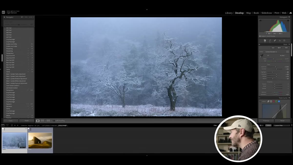 Crop being reconsidered to remove distracting branch
This is where the intermediate mindset diverges from the beginner approach and it has nothing to do with sliders. It’s about looking at the image critically after the initial edit and asking: is everything in this frame earning its place? On the snow image, a branch at the edge of the frame competes with the main tree grouping. The intermediate move is to crop it out. But here’s the wrinkle Nigel catches: the tree has a natural lean and gesture to it, so the crop has to respect that directionality or the composition starts to feel cut off. This kind of spatial awareness is what separates an edit that looks “fixed” from one that looks considered.
Crop being reconsidered to remove distracting branch
This is where the intermediate mindset diverges from the beginner approach and it has nothing to do with sliders. It’s about looking at the image critically after the initial edit and asking: is everything in this frame earning its place? On the snow image, a branch at the edge of the frame competes with the main tree grouping. The intermediate move is to crop it out. But here’s the wrinkle Nigel catches: the tree has a natural lean and gesture to it, so the crop has to respect that directionality or the composition starts to feel cut off. This kind of spatial awareness is what separates an edit that looks “fixed” from one that looks considered.
Step 5: Use the HSL Panel to Control Color Regionally
 HSL panel open with individual color channels adjusted
Once the beginner adjustments are locked in, the intermediate and pro levels both reach for the HSL panel (Hue, Saturation, Luminance) to stop treating color as a single uniform property. On the snow image, the blues in the shadows can be shifted slightly toward cyan or purple to add atmosphere without affecting the neutral whites. On the warmer landscape, pulling down the luminance on yellows and oranges adds depth to the light without making the image muddy. The HSL panel is where your color grading actually starts. Everything in the Basic panel is exposure management. This is where the image gets a mood.
HSL panel open with individual color channels adjusted
Once the beginner adjustments are locked in, the intermediate and pro levels both reach for the HSL panel (Hue, Saturation, Luminance) to stop treating color as a single uniform property. On the snow image, the blues in the shadows can be shifted slightly toward cyan or purple to add atmosphere without affecting the neutral whites. On the warmer landscape, pulling down the luminance on yellows and oranges adds depth to the light without making the image muddy. The HSL panel is where your color grading actually starts. Everything in the Basic panel is exposure management. This is where the image gets a mood.
Step 6: Work Back Through the Image With Fresh Eyes
 Before/after toggle showing beginner edit result
After each round of adjustments, toggle the before/after view (backslash key in Lightroom) and look at both versions for ten seconds without touching anything. Your eye will go straight to whatever is bothering you. Maybe the edit got too bright overall when you lifted shadows. Maybe the color shift from cooling the temp slider made the image feel disconnected from the warm afternoon light in the original scene. Give yourself permission to pull back on changes that aren’t serving the image. The best edits usually involve subtracting something you added earlier, not stacking more adjustments on top.
Before/after toggle showing beginner edit result
After each round of adjustments, toggle the before/after view (backslash key in Lightroom) and look at both versions for ten seconds without touching anything. Your eye will go straight to whatever is bothering you. Maybe the edit got too bright overall when you lifted shadows. Maybe the color shift from cooling the temp slider made the image feel disconnected from the warm afternoon light in the original scene. Give yourself permission to pull back on changes that aren’t serving the image. The best edits usually involve subtracting something you added earlier, not stacking more adjustments on top.
What I’d Add From My Own Workflow
One thing Nigel doesn’t get into here - understandably, given the scope of the video - is saving these decision-making frameworks as starting-point presets for different scene types. After watching this, I went back and created a “beginner baseline” preset that pre-loads the top-to-bottom Basic panel logic he describes: highlights down, shadows up, whites slightly lifted, vibrance over saturation. It’s not a look, it’s a starting position. I’ve been calling it “Helpless” (after the Neil Young song) and it’s saved me from starting every edit from scratch. The intermediate crop-and-question habit is harder to automate, but the technical starting point absolutely can be.
The single most transferable idea from this tutorial is that editing skill isn’t primarily about knowing more sliders. It’s about asking better questions at each stage. Beginners ask “does this look good?” Intermediates ask “is everything in this frame working?” Pros ask both, in that order, several times throughout the edit.
Watch the full tutorial on YouTube to see Nigel walk through the pro-level edits, which push these same images significantly further using local adjustments and masking that I’ll be breaking down in a follow-up post here.
Comments
Leave a Comment