Most of my black and white conversions used to follow the same lazy pattern: desaturate, push the contrast, call it done. They looked fine. Fine is the enemy of interesting. What I was missing wasn’t effort, it was a smarter starting point, specifically, using Lightroom’s B&W creative profiles as a foundation rather than an afterthought.
Watch the full tutorial on YouTube
In this Scott Kelby tutorial, he works through a Venice street scene that, by his own admission, isn’t a trophy shot. Blown sky, flat midtones, not exactly a portfolio anchor. But that’s exactly why it’s a useful teaching image. The techniques he uses to rescue it are the same ones worth having ready for every difficult frame you almost deleted. I watched it twice, took notes, and rebuilt the workflow from scratch on a few of my own Nashville street photos. Here’s what I learned, step by step.
Step 1: Use the V Key to Audition Your Image for Black and White
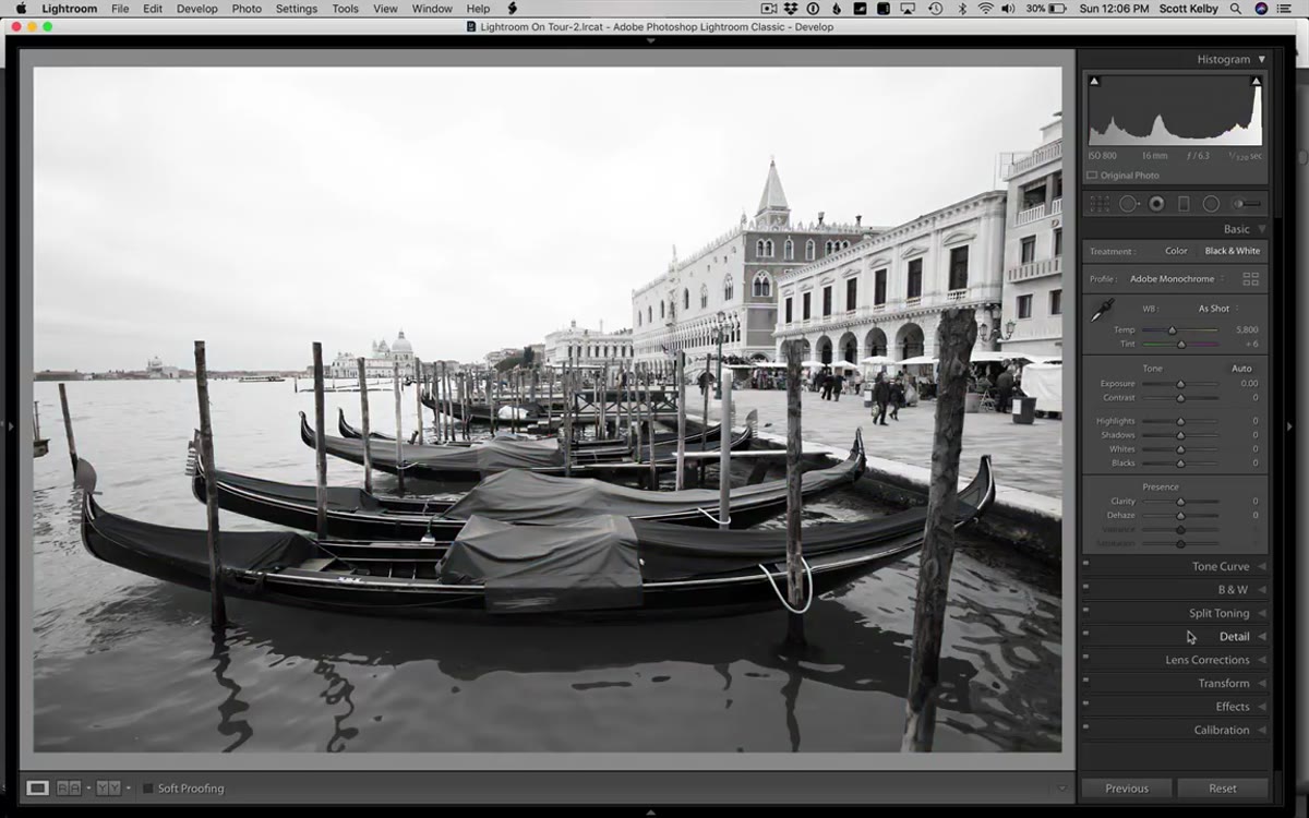 Scott pressing V to preview a quick black and white conversion
Before committing a single slider to a black and white conversion, hit the letter V on your keyboard. This applies a default grayscale conversion instantly and gives you a fast gut-check on whether the image has the contrast and tonal range to hold up without color. If the preview looks muddy or flat with zero adjustments, that’s a signal, not a death sentence, but worth knowing early. Hit V again or click Reset to return to color. Think of it as the black and white equivalent of squinting at a print.
Scott pressing V to preview a quick black and white conversion
Before committing a single slider to a black and white conversion, hit the letter V on your keyboard. This applies a default grayscale conversion instantly and gives you a fast gut-check on whether the image has the contrast and tonal range to hold up without color. If the preview looks muddy or flat with zero adjustments, that’s a signal, not a death sentence, but worth knowing early. Hit V again or click Reset to return to color. Think of it as the black and white equivalent of squinting at a print.
Step 2: Apply a B&W Creative Profile from the Profile Browser
 Profile browser open, scrolling through B&W creative profiles
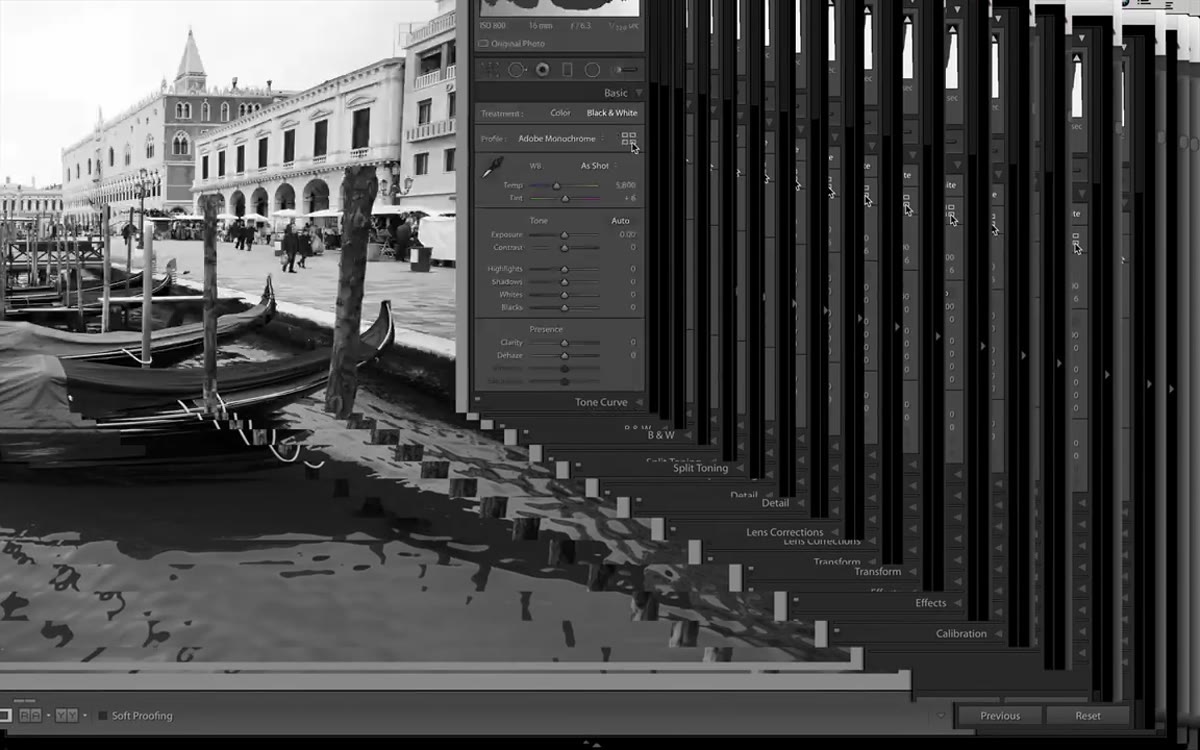
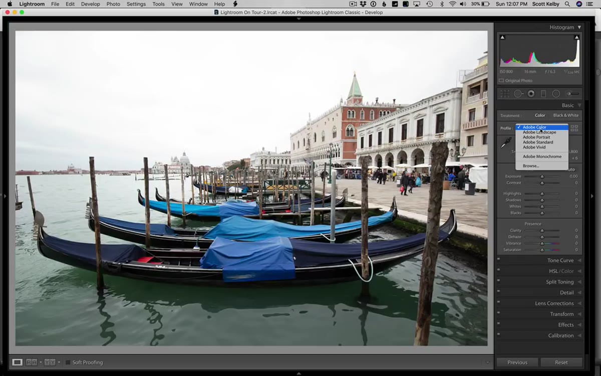
This is where the workflow gets interesting and where most people are leaving quality on the table. Instead of going straight to Adobe Monochrome and sliding things around, open the Profile Browser by clicking the four small rectangles icon next to the Profile dropdown at the top of the Basic panel. Scroll past the Monochrome section and into the Creative profiles. You’ll find 17 different black and white options here. Hover over each one and Lightroom previews the look live on your image. Kelby lands on B&W 09 for his Venice shot, but the point isn’t to copy that choice. The point is to pick a profile that already gets you 70 percent of the way to the mood you want, then adjust from there. These profiles are doing more sophisticated tonal work than a simple desaturation.
Profile browser open, scrolling through B&W creative profiles
This is where the workflow gets interesting and where most people are leaving quality on the table. Instead of going straight to Adobe Monochrome and sliding things around, open the Profile Browser by clicking the four small rectangles icon next to the Profile dropdown at the top of the Basic panel. Scroll past the Monochrome section and into the Creative profiles. You’ll find 17 different black and white options here. Hover over each one and Lightroom previews the look live on your image. Kelby lands on B&W 09 for his Venice shot, but the point isn’t to copy that choice. The point is to pick a profile that already gets you 70 percent of the way to the mood you want, then adjust from there. These profiles are doing more sophisticated tonal work than a simple desaturation.
Step 3: Expose for the Sky First, Then Recover Everything Else
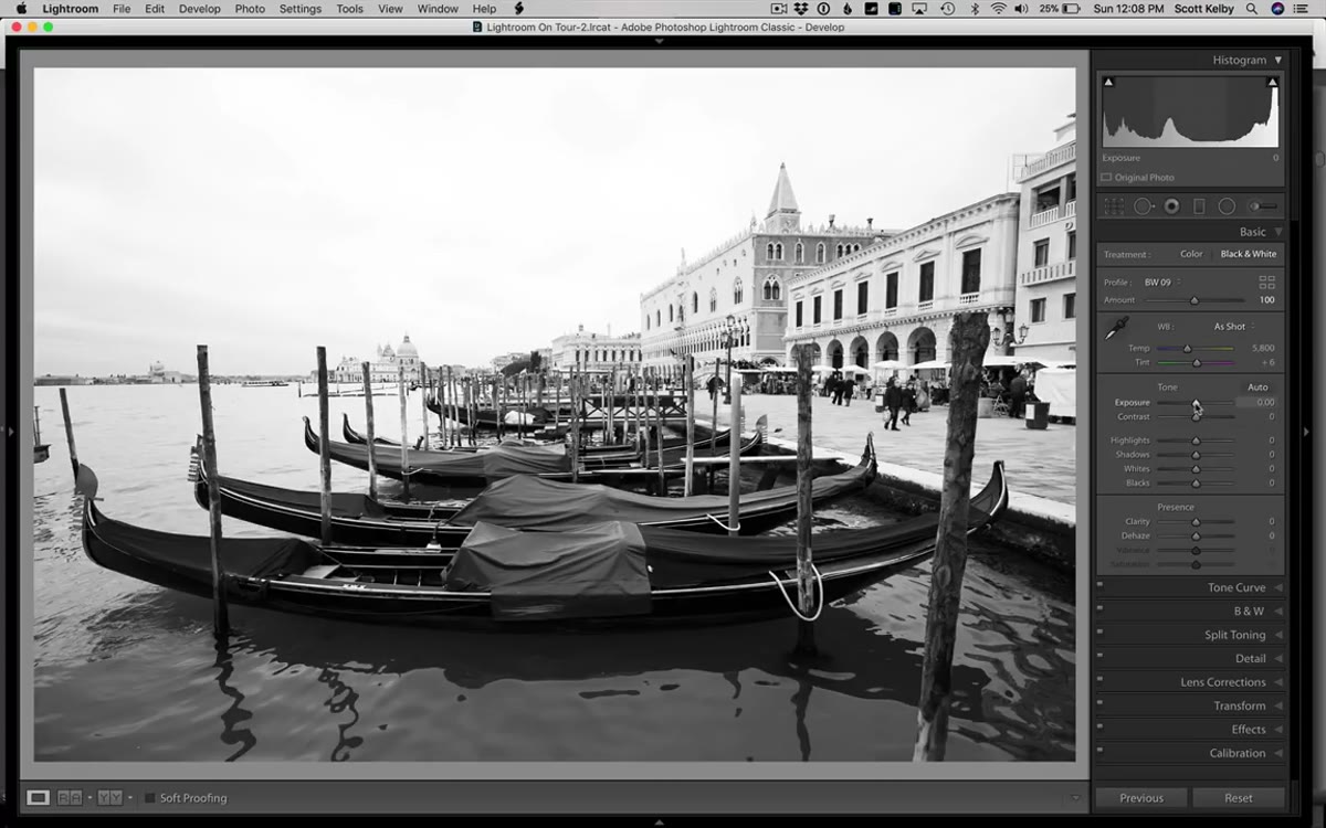 Exposure slider pulled down dramatically, sky detail reappearing
This is the trick I’ve started using on almost every high-contrast outdoor shot, color or black and white. When you’re dealing with a blown or nearly blown sky, drag the Exposure slider down until the sky looks correct. Not the whole image, just the sky. Yes, your foreground will go dark and look terrible. That’s fine. You’ve just established the correct exposure ceiling for the most problematic part of the frame. From there, pull the Highlights slider down further to recover any remaining sky detail, then push Shadows all the way up to start lifting the foreground back. Bump the Whites carefully, just enough to restore some brightness without kissing that sky goodbye again. Increase Contrast to add structure back to the midtones. The image won’t be perfect yet, but you’ve solved the hardest problem first.
Exposure slider pulled down dramatically, sky detail reappearing
This is the trick I’ve started using on almost every high-contrast outdoor shot, color or black and white. When you’re dealing with a blown or nearly blown sky, drag the Exposure slider down until the sky looks correct. Not the whole image, just the sky. Yes, your foreground will go dark and look terrible. That’s fine. You’ve just established the correct exposure ceiling for the most problematic part of the frame. From there, pull the Highlights slider down further to recover any remaining sky detail, then push Shadows all the way up to start lifting the foreground back. Bump the Whites carefully, just enough to restore some brightness without kissing that sky goodbye again. Increase Contrast to add structure back to the midtones. The image won’t be perfect yet, but you’ve solved the hardest problem first.
Step 4: Use Clarity to Bring Out Surface Texture
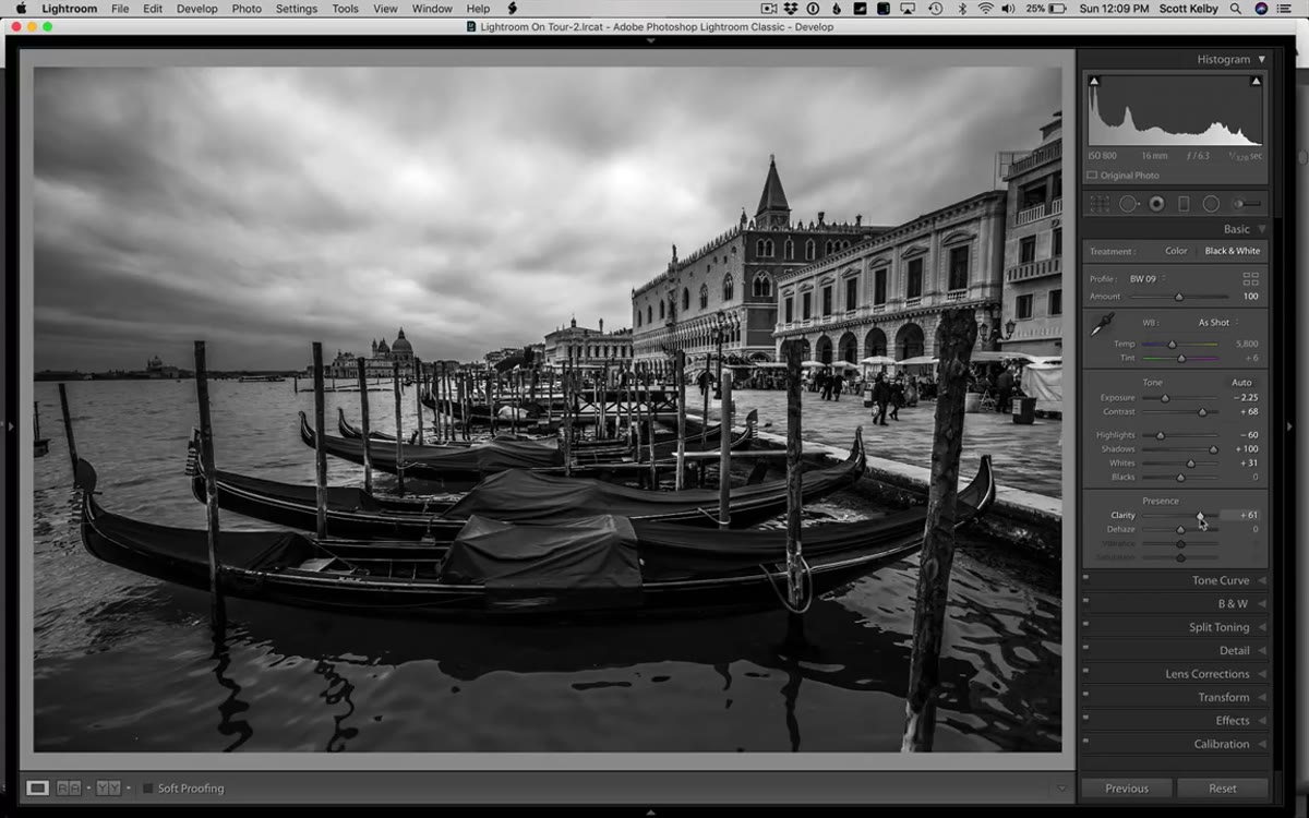
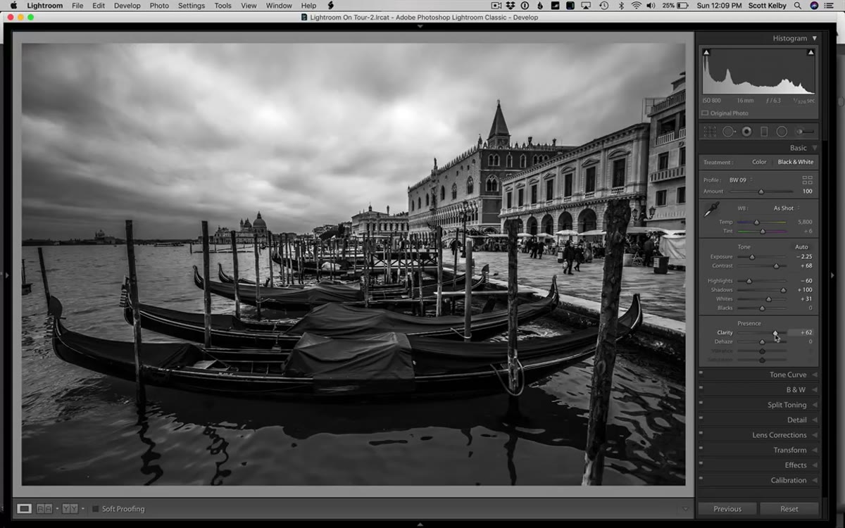 Clarity slider being increased, water texture becoming more defined
In a black and white image, texture is doing a lot of the heavy lifting that color used to do. Clarity adds midtone contrast and makes surfaces, especially water, stone, and skin, feel more present and three-dimensional. Kelby pushes Clarity up noticeably on the Venice shot and the reflections in the canal water snap into focus in a way that gives the image real depth. Don’t treat Clarity as a subtle tool in B&W. It earns its keep here.
Clarity slider being increased, water texture becoming more defined
In a black and white image, texture is doing a lot of the heavy lifting that color used to do. Clarity adds midtone contrast and makes surfaces, especially water, stone, and skin, feel more present and three-dimensional. Kelby pushes Clarity up noticeably on the Venice shot and the reflections in the canal water snap into focus in a way that gives the image real depth. Don’t treat Clarity as a subtle tool in B&W. It earns its keep here.
Step 5: Use the Dehaze Slider as a Contrast Booster
 Dehaze slider increased, overall image tonal range expanding dramatically
Here’s the one that surprised me the most when I tried it myself. The Dehaze slider is technically designed to cut atmospheric haze from landscape and outdoor shots. But Kelby makes a point that stuck with me: in a black and white image, Dehaze functions as a powerful form of contrast enhancement, and you can push it much further than you’d ever dare on a color photo without the image falling apart. On a color image, cranking Dehaze often produces oversaturated, weird-looking skies. In monochrome, those color artifacts don’t exist, so you get the contrast and drama without the side effects. Try dragging it higher than feels comfortable. You might be surprised where it lands.
Dehaze slider increased, overall image tonal range expanding dramatically
Here’s the one that surprised me the most when I tried it myself. The Dehaze slider is technically designed to cut atmospheric haze from landscape and outdoor shots. But Kelby makes a point that stuck with me: in a black and white image, Dehaze functions as a powerful form of contrast enhancement, and you can push it much further than you’d ever dare on a color photo without the image falling apart. On a color image, cranking Dehaze often produces oversaturated, weird-looking skies. In monochrome, those color artifacts don’t exist, so you get the contrast and drama without the side effects. Try dragging it higher than feels comfortable. You might be surprised where it lands.
Step 6: Tweak Individual Tones with the B&W Color Mix Panel
 HSL panel switching to B&W panel after monochrome profile is applied
Once you’ve applied a monochrome profile, the HSL/Color panel in the Develop module transforms into a B&W panel with sliders for each color channel: Reds, Oranges, Yellows, Greens, Aquas, Blues, Purples, and Magentas. These sliders control how light or dark each color from the original image renders in your black and white conversion. Dragging the Blues slider down darkens skies. Pulling Oranges up brightens skin tones. This is where you can fine-tune the tonal separation between areas that look similar in grayscale but came from different colors. It’s a more targeted approach than just pushing overall contrast, and it gives you control that a generic filter can’t match.
HSL panel switching to B&W panel after monochrome profile is applied
Once you’ve applied a monochrome profile, the HSL/Color panel in the Develop module transforms into a B&W panel with sliders for each color channel: Reds, Oranges, Yellows, Greens, Aquas, Blues, Purples, and Magentas. These sliders control how light or dark each color from the original image renders in your black and white conversion. Dragging the Blues slider down darkens skies. Pulling Oranges up brightens skin tones. This is where you can fine-tune the tonal separation between areas that look similar in grayscale but came from different colors. It’s a more targeted approach than just pushing overall contrast, and it gives you control that a generic filter can’t match.
What I’d Add From My Own Experience
The workflow Kelby demonstrates is tight and efficient, but one thing I always layer on at the end is a slight vignette through the Effects panel. Not the heavy, obvious kind that screams “Instagram 2012,” but a gentle darkening of the outer edges with Feather pushed high, maybe -15 to -25 on the Amount. In black and white, a subtle vignette draws the eye toward the center of the frame in a way that feels natural rather than artificial. The eye doesn’t have color to guide it, so a little tonal structure around the edges earns its place. I also tend to revisit the Tone Curve after all the slider work is done. A mild S-curve adds punch that the Contrast slider alone doesn’t quite deliver the same way.
The single most important thing I took from this tutorial is the idea of solving your biggest problem first. Kelby doesn’t start from the top of the Basic panel and work down methodically. He looks at the image, identifies the sky as the main issue, and goes directly at it. That’s a working photographer’s mindset, not a checklist-follower’s. Bring that instinct to your own edits and you’ll spend less time spinning sliders and more time actually finishing images.
Watch the full tutorial on YouTube
Comments
Leave a Comment