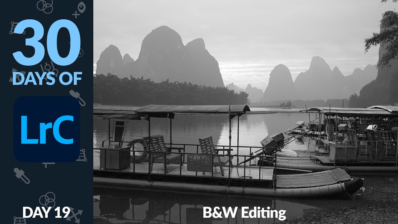
Black and white photography has a reputation problem. People treat it like a filter you slap on when a color photo isn’t working, a last resort rather than a deliberate creative decision. I used to do the same thing. Early on, my go-to move was dragging Saturation to zero and calling it a day, which produced flat, lifeless images that looked less like art and more like a printer running out of ink. It took me an embarrassingly long time to realize that Lightroom has an entire dedicated system for black and white conversion, and that it changes everything about how the final image feels.
In this Aaron Nace (PHLEARN) tutorial from his 30 Days of Lightroom series, he walks through that system clearly and efficiently. Watch the full tutorial on YouTube if you want to follow along with the original footage. What follows is my breakdown of every step, with extra context from my own time in the develop module.
Step 1: Convert to Black and White the Right Way
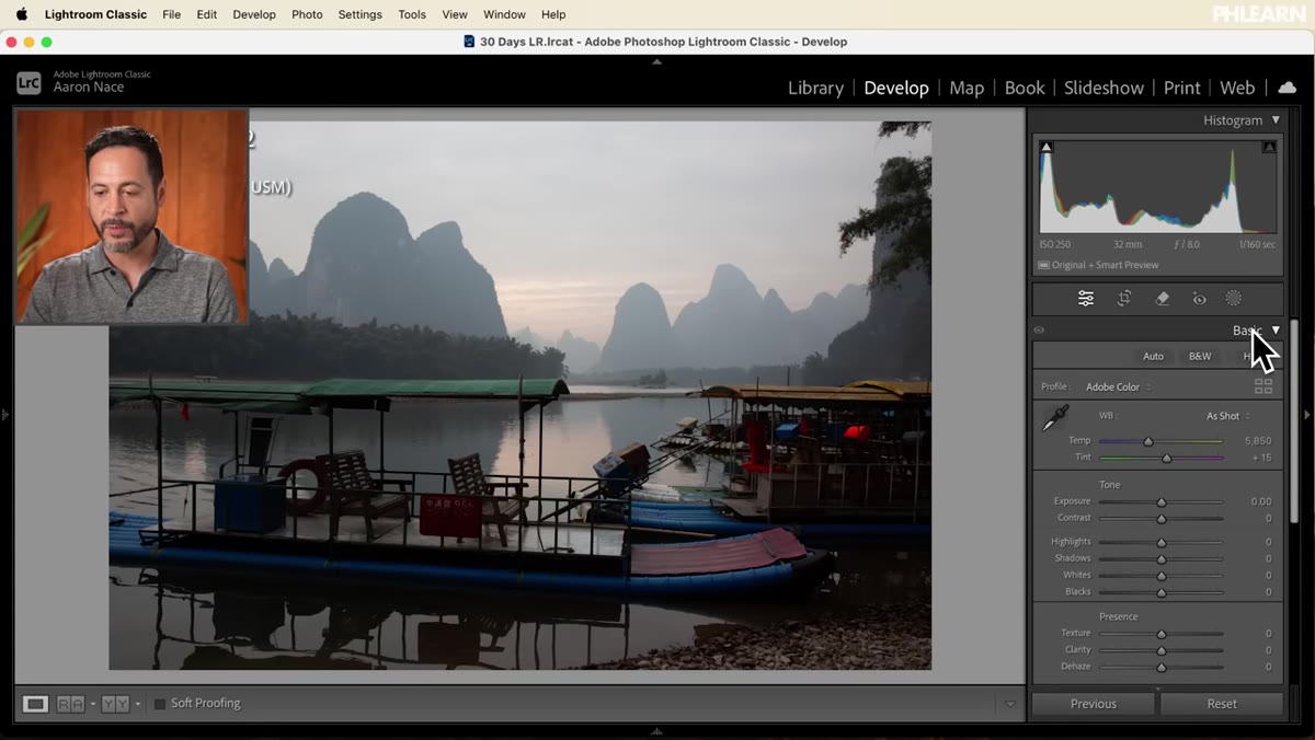 Clicking Black and White in the Basic panel treatment section
Open your image in the Develop module and look at the top of the Basic panel. You’ll see a label that reads “Treatment,” with two options: Color and Black and White. Click Black and White here rather than pulling Saturation down to zero. The difference is not cosmetic. When you use the official B&W treatment, Lightroom unlocks the Black and White Mix panel, which is where the real control lives. Desaturating destroys color information for the purpose of tonal mapping. This method preserves it.
Clicking Black and White in the Basic panel treatment section
Open your image in the Develop module and look at the top of the Basic panel. You’ll see a label that reads “Treatment,” with two options: Color and Black and White. Click Black and White here rather than pulling Saturation down to zero. The difference is not cosmetic. When you use the official B&W treatment, Lightroom unlocks the Black and White Mix panel, which is where the real control lives. Desaturating destroys color information for the purpose of tonal mapping. This method preserves it.
Step 2: Open the Black and White Mix Panel
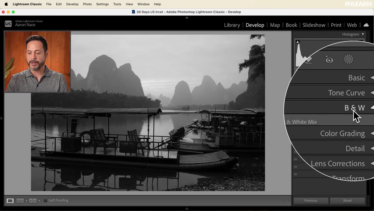 Black and White Mix panel open with color channel sliders visible
Once you’ve clicked Black and White, close the Basic panel for now and scroll down to find the new Black and White panel that has appeared. Open it. You’ll see eight sliders: Red, Orange, Yellow, Green, Aqua, Blue, Purple, and Magenta. Each one controls the brightness of pixels that were originally that color in your source image. This is the key concept worth sitting with for a moment. Even though your image looks grayscale, Lightroom still knows what color every pixel used to be. These sliders let you use that hidden color data to sculpt contrast and tone.
Black and White Mix panel open with color channel sliders visible
Once you’ve clicked Black and White, close the Basic panel for now and scroll down to find the new Black and White panel that has appeared. Open it. You’ll see eight sliders: Red, Orange, Yellow, Green, Aqua, Blue, Purple, and Magenta. Each one controls the brightness of pixels that were originally that color in your source image. This is the key concept worth sitting with for a moment. Even though your image looks grayscale, Lightroom still knows what color every pixel used to be. These sliders let you use that hidden color data to sculpt contrast and tone.
Step 3: Try Auto as a Starting Point, Then Take Over
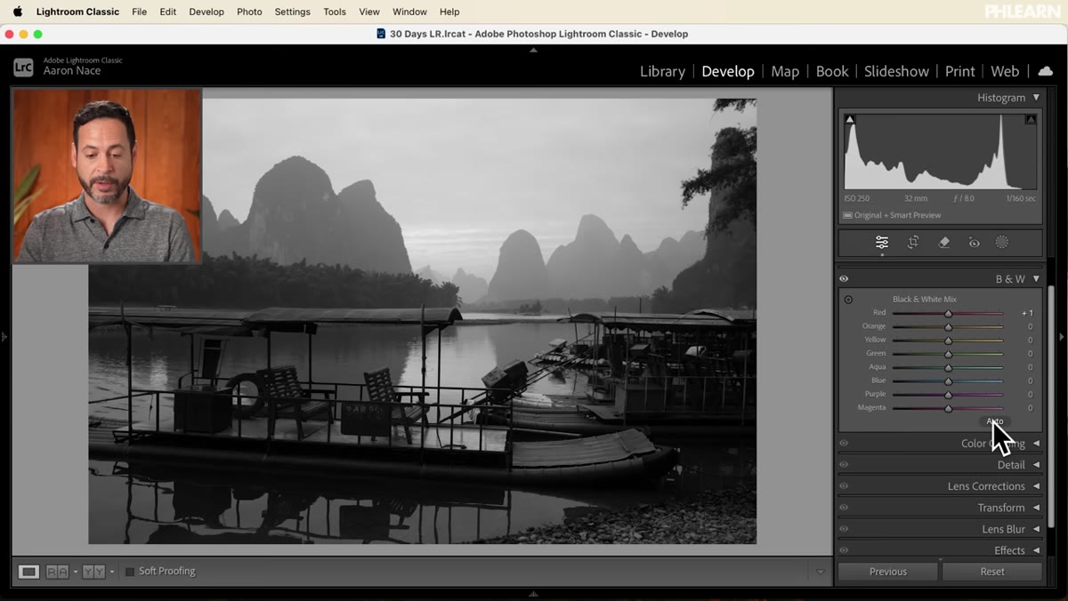 Auto button in B&W Mix panel, sliders adjusted automatically
There’s an Auto button at the top right of the Black and White panel. Click it. Lightroom will analyze the image and take a first pass at distributing the luminosity across channels. It won’t always be right, but it gives you a reasonable baseline to push against rather than starting from a flat, even conversion. Think of it like Auto White Balance: useful as a draft, not as a final answer. After Auto runs, go through each slider manually. Aaron demonstrates this by pulling the Orange slider up, which brightens skin tones and warm surfaces dramatically, adding punch and contrast without touching the Exposure slider at all.
Auto button in B&W Mix panel, sliders adjusted automatically
There’s an Auto button at the top right of the Black and White panel. Click it. Lightroom will analyze the image and take a first pass at distributing the luminosity across channels. It won’t always be right, but it gives you a reasonable baseline to push against rather than starting from a flat, even conversion. Think of it like Auto White Balance: useful as a draft, not as a final answer. After Auto runs, go through each slider manually. Aaron demonstrates this by pulling the Orange slider up, which brightens skin tones and warm surfaces dramatically, adding punch and contrast without touching the Exposure slider at all.
Step 4: Use the On-Image Adjustment Tool for Fast Targeted Edits
 Cursor clicking and dragging upward on the image using targeted adjustment tool
In the top left corner of the Black and White panel, there’s a small circular icon with a plus and minus symbol. This is the Targeted Adjustment Tool. Click it, then click directly on any area of your image and drag up or down. Dragging up brightens that tone, dragging down darkens it. Lightroom detects the original color of the pixel you clicked on and automatically adjusts the corresponding channel slider. It’s a fast way to make targeted changes without guessing which slider controls which part of the scene. That said, I tend to use the sliders directly for most work because it gives me a cleaner mental model of what’s changing and why.
Cursor clicking and dragging upward on the image using targeted adjustment tool
In the top left corner of the Black and White panel, there’s a small circular icon with a plus and minus symbol. This is the Targeted Adjustment Tool. Click it, then click directly on any area of your image and drag up or down. Dragging up brightens that tone, dragging down darkens it. Lightroom detects the original color of the pixel you clicked on and automatically adjusts the corresponding channel slider. It’s a fast way to make targeted changes without guessing which slider controls which part of the scene. That said, I tend to use the sliders directly for most work because it gives me a cleaner mental model of what’s changing and why.
Step 5: Go Back to Basic and Refine Exposure and Contrast
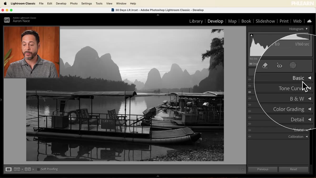 Basic panel open with Contrast and Exposure sliders being adjusted
Once your B&W Mix looks close, reopen the Basic panel. Your Exposure and Contrast sliders still apply to the final grayscale result, and they behave differently now that you’ve already sculpted the tonal relationships through the mix. Aaron brings Contrast down slightly here to get a softer, less punchy look, then nudges Exposure to compensate. Don’t assume your pre-conversion settings are still right. The B&W Mix changes the internal luminosity relationships in the image, so Exposure adjustments you made in color may now be too strong or too weak.
Basic panel open with Contrast and Exposure sliders being adjusted
Once your B&W Mix looks close, reopen the Basic panel. Your Exposure and Contrast sliders still apply to the final grayscale result, and they behave differently now that you’ve already sculpted the tonal relationships through the mix. Aaron brings Contrast down slightly here to get a softer, less punchy look, then nudges Exposure to compensate. Don’t assume your pre-conversion settings are still right. The B&W Mix changes the internal luminosity relationships in the image, so Exposure adjustments you made in color may now be too strong or too weak.
Step 6: Add Texture and Clarity to Give the Image Presence
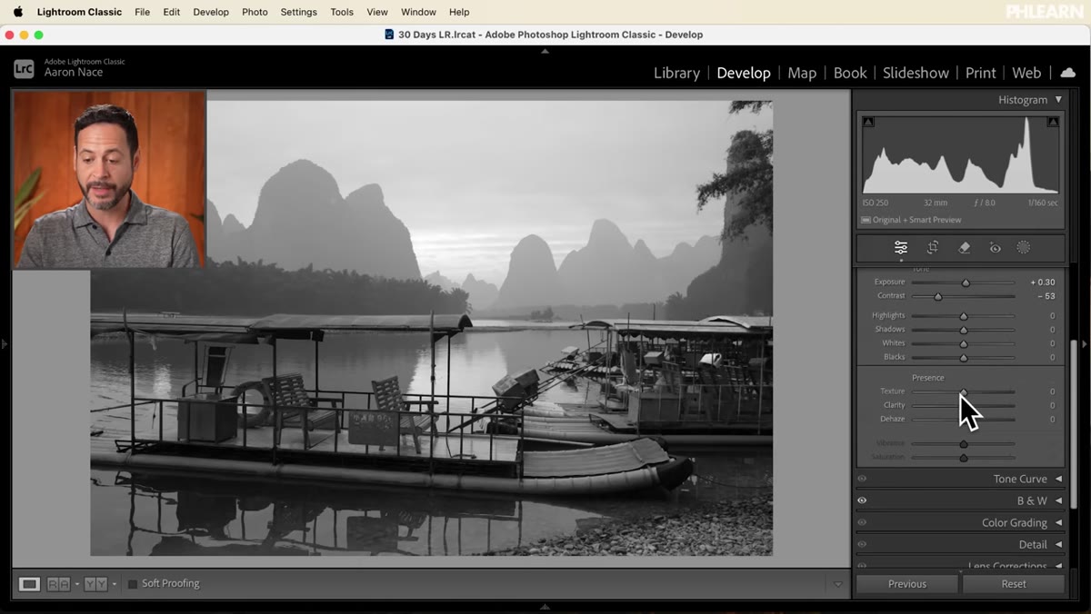 Texture and Clarity sliders being increased in the Basic panel
Black and white images often benefit from a bit more Texture and Clarity than their color counterparts. Without hue and saturation drawing the eye, the viewer’s attention shifts entirely to shape, contrast, and surface detail. Pulling Texture up adds definition to fine detail like fabric, skin, or metal without affecting the broader tonal gradations. Clarity, which increases local contrast around edges, adds a sense of weight and dimensionality. Aaron adds a small amount of both here, and the image noticeably gains presence. Keep these moderate; too much Clarity makes the image look processed and heavy.
Texture and Clarity sliders being increased in the Basic panel
Black and white images often benefit from a bit more Texture and Clarity than their color counterparts. Without hue and saturation drawing the eye, the viewer’s attention shifts entirely to shape, contrast, and surface detail. Pulling Texture up adds definition to fine detail like fabric, skin, or metal without affecting the broader tonal gradations. Clarity, which increases local contrast around edges, adds a sense of weight and dimensionality. Aaron adds a small amount of both here, and the image noticeably gains presence. Keep these moderate; too much Clarity makes the image look processed and heavy.
Step 7: Compare Before and After
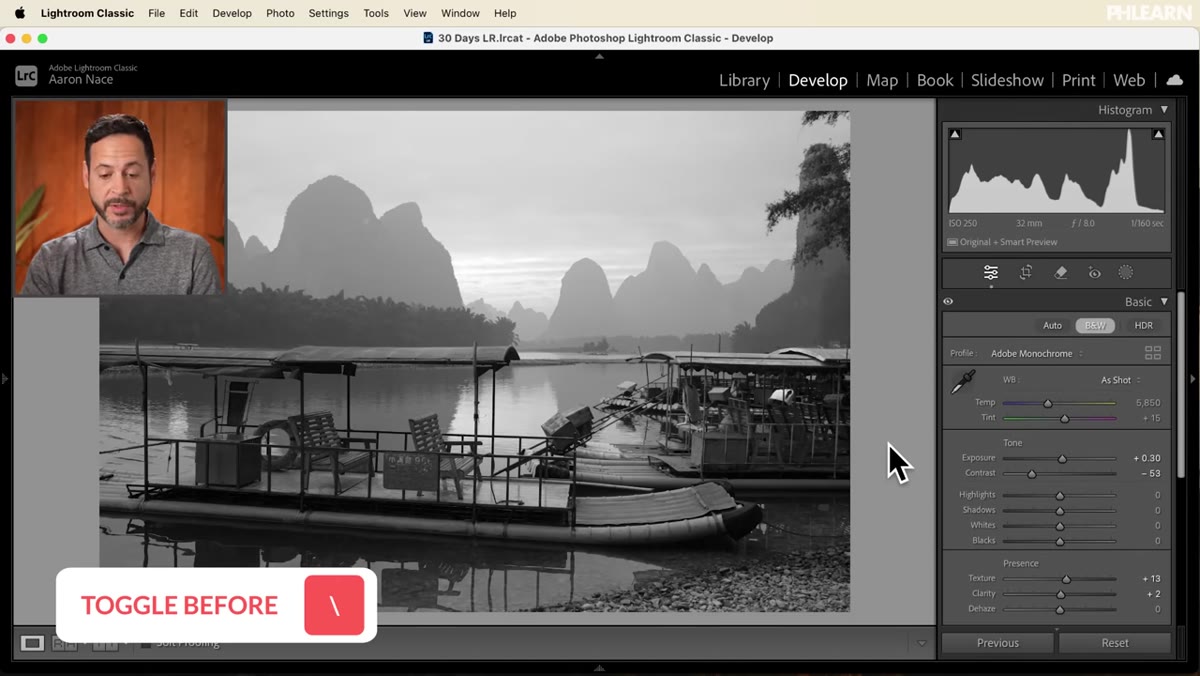 Before/after split showing original color photo vs. finished B&W edit
Press the backslash key ( \ ) to toggle between your original import and your edited version. This is one of the most useful habits in Lightroom. The before view shows the raw color photograph; the after shows your black and white interpretation. Looking at both helps you confirm that the conversion is doing something intentional, that you’ve actually improved the image rather than just changed it. If the before looks more interesting, that’s information worth having before you export.
Before/after split showing original color photo vs. finished B&W edit
Press the backslash key ( \ ) to toggle between your original import and your edited version. This is one of the most useful habits in Lightroom. The before view shows the raw color photograph; the after shows your black and white interpretation. Looking at both helps you confirm that the conversion is doing something intentional, that you’ve actually improved the image rather than just changed it. If the before looks more interesting, that’s information worth having before you export.
One Thing I’d Add: The Sepia Grade
Aaron mentions adding a sepia or color grade after the B&W conversion, and this is genuinely worth exploring. Once you’re happy with the tonal structure of your image, go to the Color Grading panel and add a warm orange or amber tone to the Midtones wheel. Keep Luminance neutral and Saturation low, around 15 to 25. The result is a split tone look that reads as vintage without being cheesy. I’ve done this for portraits and street photography and it works well in both contexts. The key is getting the black and white mix right first so the underlying tones are strong before any color wash goes over them.
The single most important thing I took from this tutorial is the idea that black and white conversion is not subtraction, it’s translation. You’re not removing color; you’re using color data as a map to build contrast and tone. The B&W Mix sliders are how you read that map. Get comfortable with them and your black and white work will look intentional instead of incidental.
Watch the full tutorial on YouTube to see Aaron’s specific settings and follow along with the raw file he provides for free in the video description.
Comments
Leave a Comment