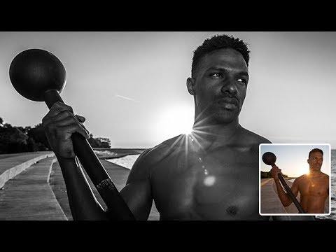
There’s a specific kind of photo that color ruins. You’ve got strong light, deep shadows, a subject with real presence, and the moment you look at it in color, it just… deflates. The tones fight each other, the sky goes muddy orange, and any grit you felt on location disappears into a sea of competing hues. I’ve been there more times than I want to admit, usually staring at a RAW file at midnight wondering why a shot that looked incredible in person looks like a stock photo from 2009.
That’s exactly the problem that black and white processing solves, and it’s why I keep coming back to it. In this Aaron Nace (PHLEARN) tutorial on processing black and white images in Lightroom, Aaron walks through his workflow using real RAW files from a sunrise shoot with a personal trainer client, think dramatic lake light, a steel mace, and the kind of high-contrast energy that practically begs for monochrome treatment. Watch the full tutorial on YouTube if you want to follow along with his exact files.
What makes this tutorial worth your time isn’t just the steps. It’s the underlying logic: black and white gives you permission to push sliders harder than you ever could in color. Highlights, shadows, contrast, texture, you can crank all of it without your skin tones going green or your sky turning an unnatural purple. That freedom is the whole game, and once you internalize it, your editing opens up considerably.
Step 1: Import Your Files and Create Virtual Copies
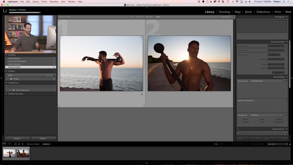 Right-click menu showing “Create Virtual Copies” option
Before touching a single slider, Aaron sets up a non-destructive workflow by creating virtual copies of both images. Select your files, right-click, and choose “Create Virtual Copies.” These copies don’t duplicate the actual RAW data on your hard drive, they just create a separate instruction set that references the original file. That means you can build out a black and white version and a color version of the same shot without doubling your storage footprint. It’s one of Lightroom’s most underused features, and it takes about four seconds to do.
Right-click menu showing “Create Virtual Copies” option
Before touching a single slider, Aaron sets up a non-destructive workflow by creating virtual copies of both images. Select your files, right-click, and choose “Create Virtual Copies.” These copies don’t duplicate the actual RAW data on your hard drive, they just create a separate instruction set that references the original file. That means you can build out a black and white version and a color version of the same shot without doubling your storage footprint. It’s one of Lightroom’s most underused features, and it takes about four seconds to do.
Step 2: Convert to Black and White in the Develop Module
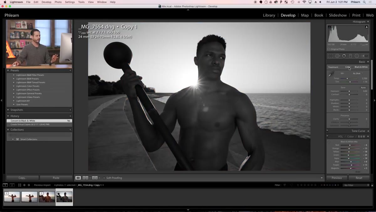 Develop panel with Black & White mix option selected
Open your virtual copy in the Develop module and click “Black & White” in the treatment section at the top of the Basic panel. You’ll see Lightroom do an initial auto-conversion, which is a decent starting point but almost never a final answer. The important thing here is that you’re working on your virtual copy, so your original color file stays untouched. From this point forward, you’re free to be aggressive with your adjustments in a way that would look completely wrong in color.
Develop panel with Black & White mix option selected
Open your virtual copy in the Develop module and click “Black & White” in the treatment section at the top of the Basic panel. You’ll see Lightroom do an initial auto-conversion, which is a decent starting point but almost never a final answer. The important thing here is that you’re working on your virtual copy, so your original color file stays untouched. From this point forward, you’re free to be aggressive with your adjustments in a way that would look completely wrong in color.
Step 3: Set Your Contrast and Tone Stack
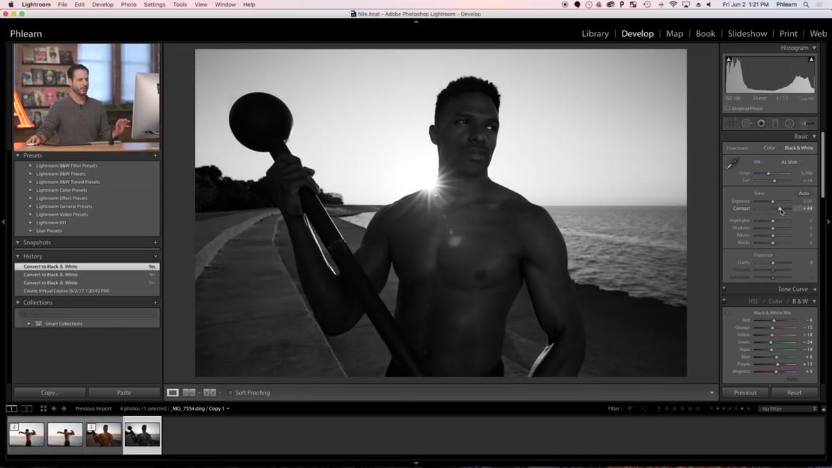 Basic panel sliders being adjusted with high contrast settings
Aaron’s first move after converting is to push contrast up meaningfully, because black and white images live and die by the separation between their tones. From there, he pulls highlights down quite a bit to darken the sky and preserve detail in the brightest parts of the frame, then lifts shadows up to keep detail in the darker areas of the subject. Whites get a slight bump, and blacks come up a touch as well. The pattern here is essentially a compressed, contrast-heavy S-curve built entirely through the Basic panel sliders. What would look like “fake HDR” garbage in a color image reads as dramatic and intentional in black and white. That’s the core insight of this whole tutorial.
Basic panel sliders being adjusted with high contrast settings
Aaron’s first move after converting is to push contrast up meaningfully, because black and white images live and die by the separation between their tones. From there, he pulls highlights down quite a bit to darken the sky and preserve detail in the brightest parts of the frame, then lifts shadows up to keep detail in the darker areas of the subject. Whites get a slight bump, and blacks come up a touch as well. The pattern here is essentially a compressed, contrast-heavy S-curve built entirely through the Basic panel sliders. What would look like “fake HDR” garbage in a color image reads as dramatic and intentional in black and white. That’s the core insight of this whole tutorial.
Step 4: Use the B&W Mix Panel to Control Tones by Original Color
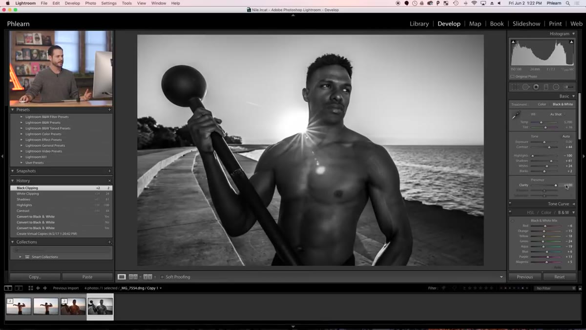 B&W Mix panel showing individual color channel sliders
This is where Lightroom’s black and white toolset gets genuinely powerful and a little addictive. The B&W Mix panel lets you control how each original color in your image translates to a gray value. Want your blue sky to go darker and more dramatic? Pull the blue and aqua sliders down. Want the skin tones on your subject to stay bright and punchy? Lift the orange and red sliders. The subject’s skin was originally a warm tone, and boosting the orange channel keeps them separated from darker background elements. This is the reason you should always shoot black and white in RAW rather than converting in-camera. You need that original color data to have this level of control.
B&W Mix panel showing individual color channel sliders
This is where Lightroom’s black and white toolset gets genuinely powerful and a little addictive. The B&W Mix panel lets you control how each original color in your image translates to a gray value. Want your blue sky to go darker and more dramatic? Pull the blue and aqua sliders down. Want the skin tones on your subject to stay bright and punchy? Lift the orange and red sliders. The subject’s skin was originally a warm tone, and boosting the orange channel keeps them separated from darker background elements. This is the reason you should always shoot black and white in RAW rather than converting in-camera. You need that original color data to have this level of control.
Step 5: Add Texture and Clarity for the Gritty Look
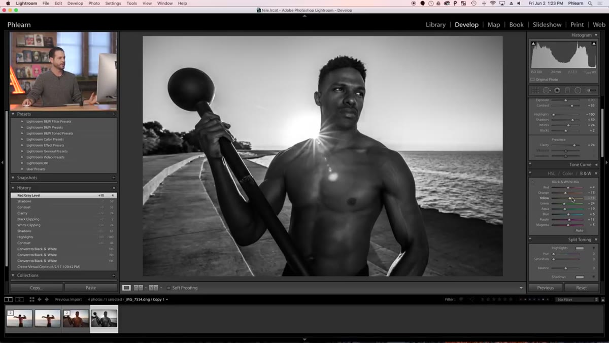 Texture and Clarity sliders being pushed up in the Basic panel
Once the tones are where you want them, Aaron adds texture and clarity to give the image that tactile, gritty quality that makes black and white portraits feel cinematic rather than flat. Texture works on the mid-frequency details, things like skin texture, fabric, and surface grain. Clarity affects the contrast around edges and gives images a more three-dimensional punch. In a color photo, pushing both of these sliders hard can make skin look unnatural and harsh. In black and white, that same aggressiveness reads as style. Push them further than you think you should, then back off slightly. That’s usually the right place.
Texture and Clarity sliders being pushed up in the Basic panel
Once the tones are where you want them, Aaron adds texture and clarity to give the image that tactile, gritty quality that makes black and white portraits feel cinematic rather than flat. Texture works on the mid-frequency details, things like skin texture, fabric, and surface grain. Clarity affects the contrast around edges and gives images a more three-dimensional punch. In a color photo, pushing both of these sliders hard can make skin look unnatural and harsh. In black and white, that same aggressiveness reads as style. Push them further than you think you should, then back off slightly. That’s usually the right place.
Step 6: Sharpen and Add Grain in the Detail Panel
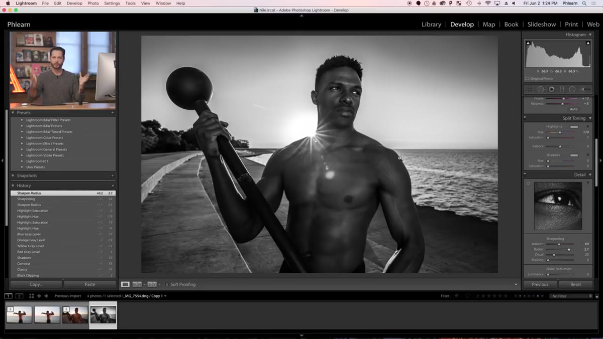 Detail panel showing Sharpening and Noise Reduction controls
Drop down to the Detail panel and add sharpening, but hold alt/option while dragging the Masking slider to see a black and white overlay that shows you exactly which parts of the image will receive the sharpening. This keeps the effect focused on the subject and edges rather than amplifying noise in smooth areas like the sky. Then head to the Effects panel and add a little grain. Black and white images with clean, digital-perfect grain look sterile. A modest film grain amount (somewhere in the 20-35 range depending on the image) ties the whole aesthetic together and makes the processing feel intentional rather than over-cooked.
Detail panel showing Sharpening and Noise Reduction controls
Drop down to the Detail panel and add sharpening, but hold alt/option while dragging the Masking slider to see a black and white overlay that shows you exactly which parts of the image will receive the sharpening. This keeps the effect focused on the subject and edges rather than amplifying noise in smooth areas like the sky. Then head to the Effects panel and add a little grain. Black and white images with clean, digital-perfect grain look sterile. A modest film grain amount (somewhere in the 20-35 range depending on the image) ties the whole aesthetic together and makes the processing feel intentional rather than over-cooked.
What I’d Do Differently: Try a Radial Filter for Subject Separation
One thing Aaron doesn’t cover in this particular tutorial, and it’s worth adding to your own workflow, is using a Radial Filter to create a gentle vignette that pulls the viewer’s eye toward the subject. In black and white work, you lose the natural visual hierarchy that color creates, so sometimes you need a subtle brightness falloff around the edges to compensate. I usually add a Radial Filter centered on the subject, drop the exposure of the outside area by about a third of a stop, and feather it heavily so it’s invisible as a distinct shape. Most people won’t notice it consciously. They’ll just feel like they can’t look away from the subject. That’s exactly what you want.
The single most important thing to take away from Aaron’s tutorial is this: black and white isn’t a fallback for when color doesn’t work. It’s a deliberate choice that fundamentally changes how hard you can push your processing. Color has guardrails. Black and white doesn’t, and learning to use that freedom without going off the rails is one of the most valuable editing skills you can develop.
Watch the full tutorial on YouTube to see Aaron walk through the actual before and after on the original RAW files.
Comments (2)
I've watched a dozen tutorials on this and yours is the clearest by far.
I've been looking for exactly this kind of tutorial. Perfect timing.
Leave a Comment