There’s a specific kind of frustration that hits when you’re building a wedding album and the layout you have in your head simply does not exist in Lightroom’s default template library. You scroll through the Book Module options, nothing fits, and you end up compromising on a layout that’s “close enough” instead of the one the client actually needs. I’ve been there more times than I’d like to admit. The fix, it turns out, has been sitting in the Print Module the whole time, and once you know how to use it, you’ll stop settling for close enough.
In this KelbyOne tutorial, Scott Kelby walks through building a custom six-cell layout from scratch: three wide horizontal photos stacked on the left side, two narrow vertical cells in the middle, and one large tall photo anchoring the right. It’s the kind of asymmetric, editorial-feeling spread that works beautifully for wedding albums and honestly for any project where you want to show off a hero image alongside supporting shots. Watch the full tutorial on YouTube
The workflow Kelby uses is clever in a way that isn’t obvious: you build the layout in the Print Module, export it as a JPEG, and reimport it into Lightroom so it can live inside the Book Module as a finished page. It’s a workaround, sure, but it’s a clean one, and it gives you access to a design flexibility that the Book Module alone can’t offer.
Step 1: Switch to the Print Module and Set Layout Style to Custom Package
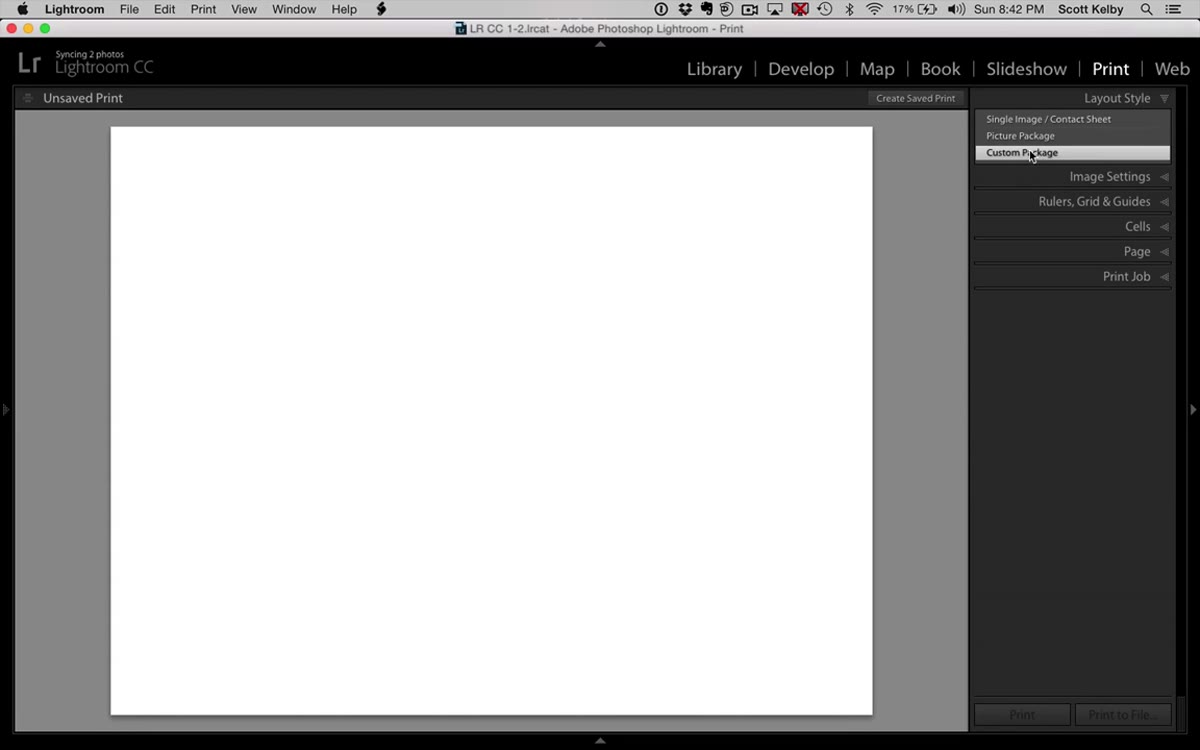 Print Module open with Custom Package layout style selected
Open the Print Module from the module picker at the top of Lightroom. This is the step most people skip because the Print Module feels like it’s just for, well, printing. But Custom Package mode is what unlocks the drag-and-drop cell system you need here. Find the Layout Style panel on the right side and select “Custom Package.” Without this, you’re locked into rigid grid formats that don’t allow mixed cell sizes.
Print Module open with Custom Package layout style selected
Open the Print Module from the module picker at the top of Lightroom. This is the step most people skip because the Print Module feels like it’s just for, well, printing. But Custom Package mode is what unlocks the drag-and-drop cell system you need here. Find the Layout Style panel on the right side and select “Custom Package.” Without this, you’re locked into rigid grid formats that don’t allow mixed cell sizes.
Step 2: Add Your First Cell from the Cells Panel
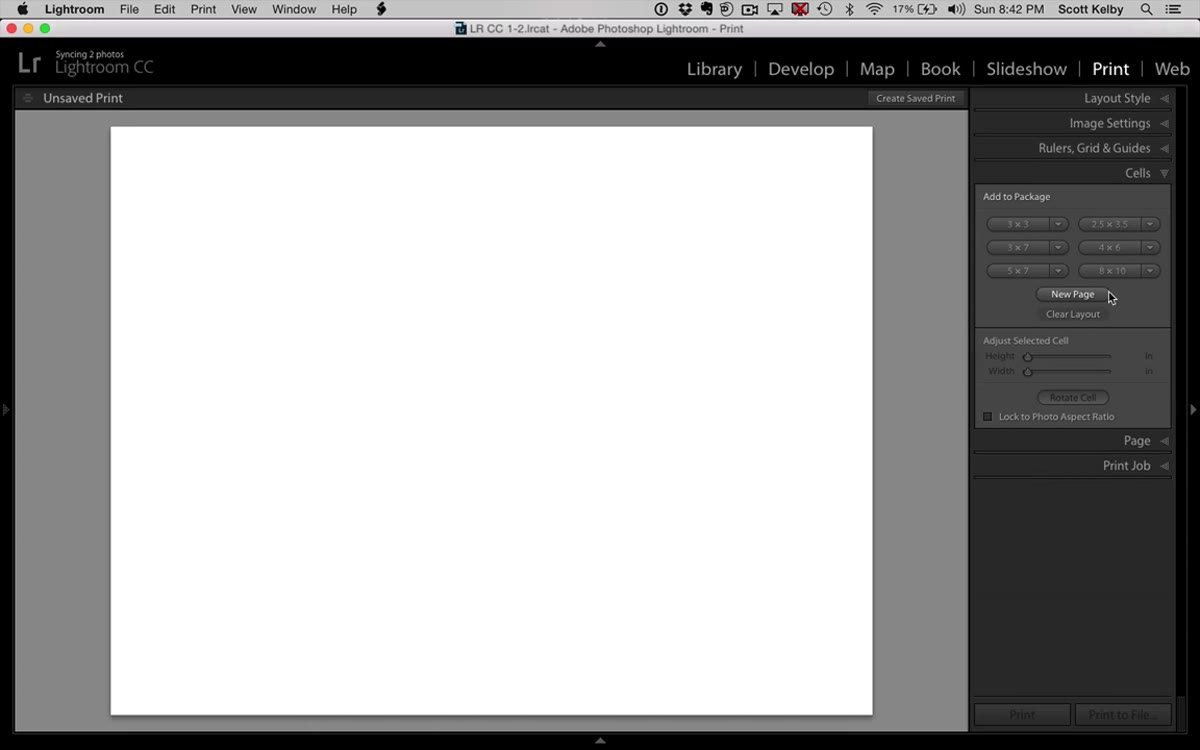 Cells panel open, 2x3.5 cell size being selected
Scroll down on the right panel to find the Cells section. Click the preset cell size that reads roughly 2 by 3.5 inches. This becomes the base cell you’ll use to build the wider horizontal photos. Once it appears on the canvas, hold Shift while dragging a corner handle to scale it down proportionally. You want something compact enough to stack three of these vertically on the left side of your spread, so bring it in until it feels right for your canvas size.
Cells panel open, 2x3.5 cell size being selected
Scroll down on the right panel to find the Cells section. Click the preset cell size that reads roughly 2 by 3.5 inches. This becomes the base cell you’ll use to build the wider horizontal photos. Once it appears on the canvas, hold Shift while dragging a corner handle to scale it down proportionally. You want something compact enough to stack three of these vertically on the left side of your spread, so bring it in until it feels right for your canvas size.
Step 3: Duplicate Cells Using the Option/Alt Key
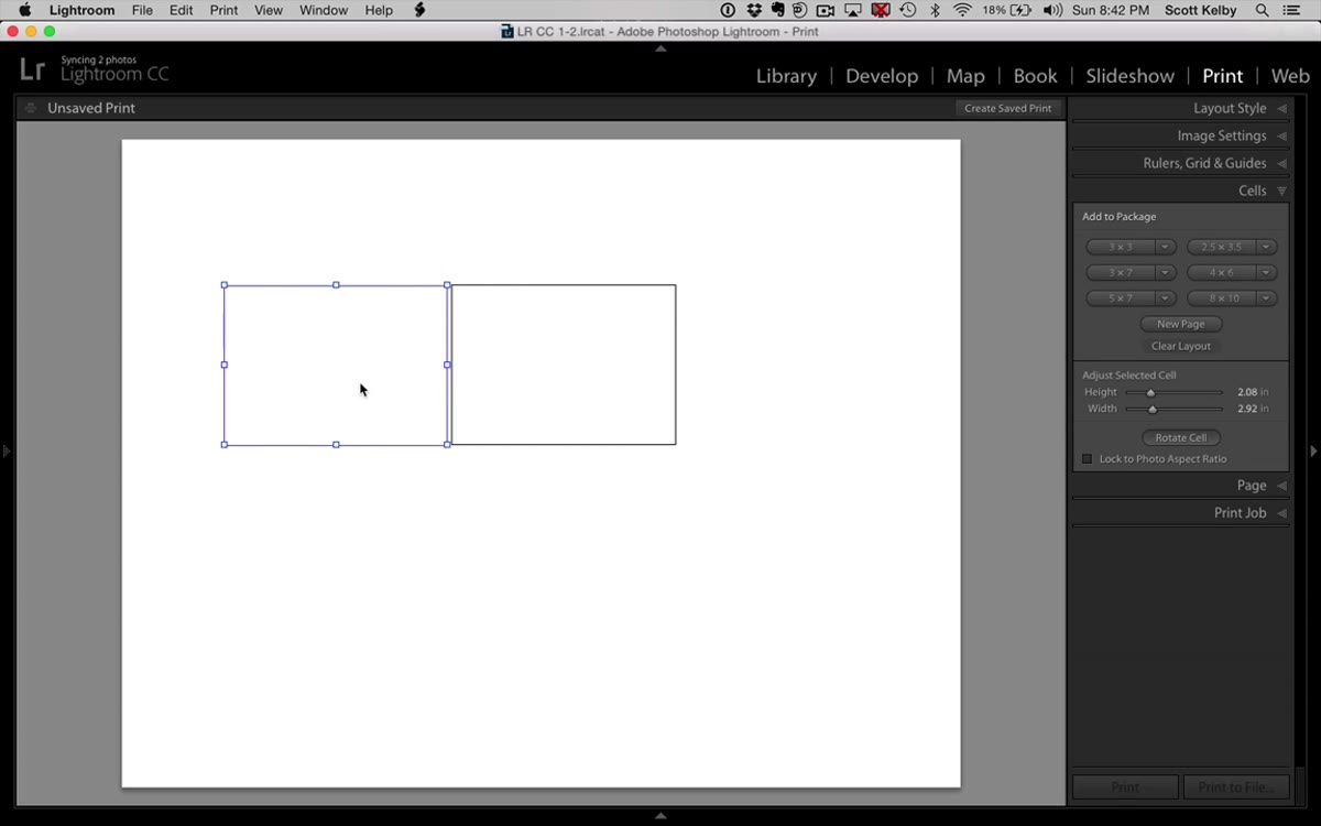 First cell being Option-dragged to create a duplicate
Here’s where the workflow gets satisfying. Hold Option on Mac (Alt on Windows) and drag the existing cell to copy it exactly. Kelby points out that this doesn’t always work perfectly in every version of Lightroom, so if it misbehaves, just try again or add a fresh cell from the panel. When it does work, you get a pixel-identical duplicate that you can position right alongside the original. Repeat this to get three matching wide cells placed side by side on the left portion of your canvas.
First cell being Option-dragged to create a duplicate
Here’s where the workflow gets satisfying. Hold Option on Mac (Alt on Windows) and drag the existing cell to copy it exactly. Kelby points out that this doesn’t always work perfectly in every version of Lightroom, so if it misbehaves, just try again or add a fresh cell from the panel. When it does work, you get a pixel-identical duplicate that you can position right alongside the original. Repeat this to get three matching wide cells placed side by side on the left portion of your canvas.
Step 4: Build the Two Narrow Vertical Cells for the Center Column
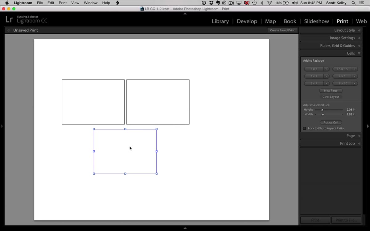 Two tall narrow cells being positioned in the center column
Using the same Option/Alt drag method, duplicate one of your existing cells and then resize it manually by dragging its side handles to make it taller and narrower. Stack two of these vertically in the middle column of your layout. The goal is for the combined height of these two cells to roughly match the total height of your three horizontal cells on the left. Getting this alignment tight is what makes the layout look intentional rather than thrown together. If Lightroom’s snap-to-grid behavior is making precise placement awkward, go to the Rulers, Grids and Guides panel and toggle the grid off temporarily.
Two tall narrow cells being positioned in the center column
Using the same Option/Alt drag method, duplicate one of your existing cells and then resize it manually by dragging its side handles to make it taller and narrower. Stack two of these vertically in the middle column of your layout. The goal is for the combined height of these two cells to roughly match the total height of your three horizontal cells on the left. Getting this alignment tight is what makes the layout look intentional rather than thrown together. If Lightroom’s snap-to-grid behavior is making precise placement awkward, go to the Rulers, Grids and Guides panel and toggle the grid off temporarily.
Step 5: Add the Large Hero Cell on the Right
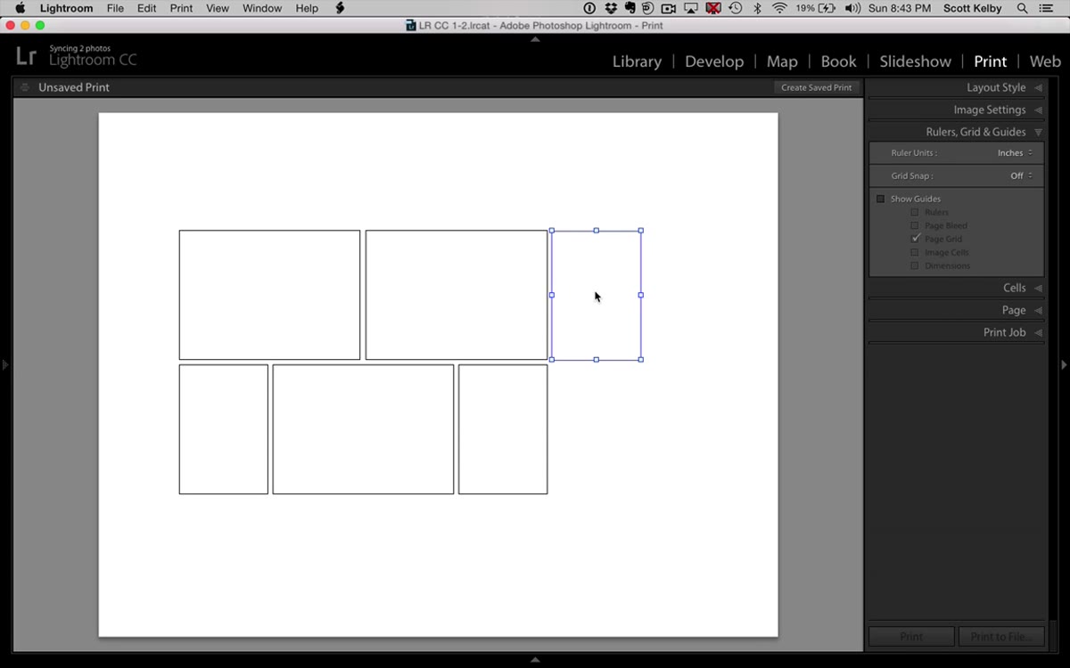 Large tall cell being resized and placed on the right side
Duplicate one more cell and drag it to the right side of the canvas. Resize it so its width is noticeably larger than either of the center cells, and its height matches the full span of the layout. This is your hero image cell, the one that will hold the strongest photo from the shoot. The visual weight of this single large cell balances the busier left and center columns and gives the eye a place to land.
Large tall cell being resized and placed on the right side
Duplicate one more cell and drag it to the right side of the canvas. Resize it so its width is noticeably larger than either of the center cells, and its height matches the full span of the layout. This is your hero image cell, the one that will hold the strongest photo from the shoot. The visual weight of this single large cell balances the busier left and center columns and gives the eye a place to land.
Step 6: Drag Photos into the Cells
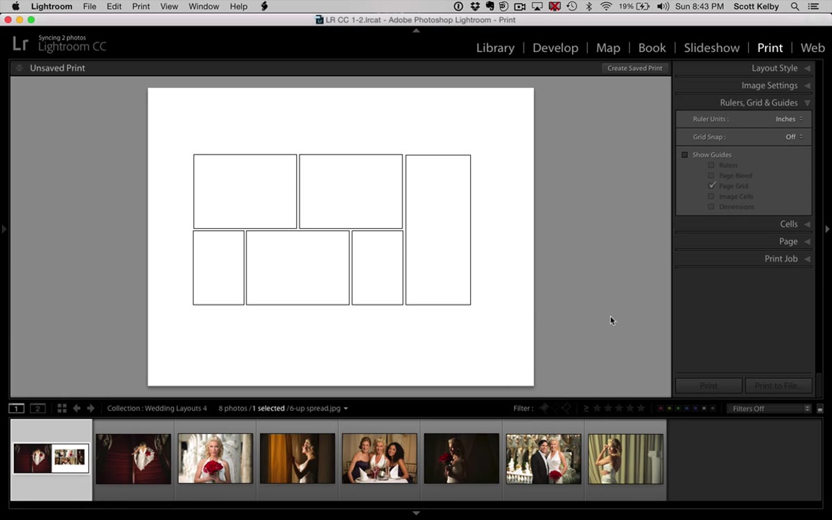 Wedding photos being dragged into the custom layout cells
With your layout built, start dragging images from the filmstrip at the bottom directly into each cell. Lightroom will auto-fit the photo to fill the cell. If the crop isn’t sitting the way you want, hold Command on Mac (Control on Windows) while clicking inside the cell and you can reposition the image within its frame without resizing the cell itself. This is a small thing that makes a big difference when you’re trying to keep faces out of corners or center a key moment in the frame.
Wedding photos being dragged into the custom layout cells
With your layout built, start dragging images from the filmstrip at the bottom directly into each cell. Lightroom will auto-fit the photo to fill the cell. If the crop isn’t sitting the way you want, hold Command on Mac (Control on Windows) while clicking inside the cell and you can reposition the image within its frame without resizing the cell itself. This is a small thing that makes a big difference when you’re trying to keep faces out of corners or center a key moment in the frame.
Step 7: Save the Template and Export as JPEG
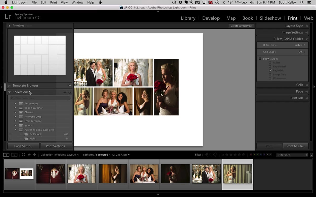 Template browser with plus sign to save new template
Before you do anything else, save the layout as a reusable template. Hit the plus sign in the Template Browser panel on the left side and give it a name you’ll actually recognize later. Once that’s done, go to the Print Job panel and change the output from “Print to Printer” to “Print to File.” Set the format to JPEG, choose a destination like your desktop, and export. This JPEG is a finished, flattened version of your entire layout page. Reimport it into Lightroom and it becomes an asset you can place inside the Book Module like any other photo, bringing a custom layout into a module that would never have let you build it natively.
Template browser with plus sign to save new template
Before you do anything else, save the layout as a reusable template. Hit the plus sign in the Template Browser panel on the left side and give it a name you’ll actually recognize later. Once that’s done, go to the Print Job panel and change the output from “Print to Printer” to “Print to File.” Set the format to JPEG, choose a destination like your desktop, and export. This JPEG is a finished, flattened version of your entire layout page. Reimport it into Lightroom and it becomes an asset you can place inside the Book Module like any other photo, bringing a custom layout into a module that would never have let you build it natively.
One Thing I’d Add: Build a Small Library of These
The moment this technique clicked for me was when I realized that saving the template is only half the job. The other half is building a small collection of these layouts in advance, before a wedding album project starts. I keep five or six custom Print Module templates ready to go, covering different compositional moods. Some are symmetrical and clean, some are editorial and dynamic like this one. When a client album lands on my desk, I’m not building from scratch under deadline pressure. I’m choosing from a palette.
It also helps to name your templates descriptively. “6-up editorial right hero” is infinitely more useful than “Custom Layout 4” when you’re three weeks removed from building it and trying to remember which one matches your mental image.
The single most important thing this tutorial unlocked for me is this: the Print Module is not just for printing. It’s one of Lightroom’s most flexible layout tools, and most people never touch it outside of making contact sheets. Learning to use it as a design workspace, and then exporting the results back into your catalog as usable assets, extends what Lightroom can do without ever leaving the app.
Watch the full tutorial on YouTube to see Kelby walk through the whole build in real time. Seeing the snap behavior and the cell duplication in motion makes the spatial logic a lot easier to follow than any written description can.
Comments (3)
This is going in my reference folder. Incredibly useful.
I keep coming back to this article. It's that useful.
I tried this on a client project yesterday and the results were way better than expected.
Leave a Comment