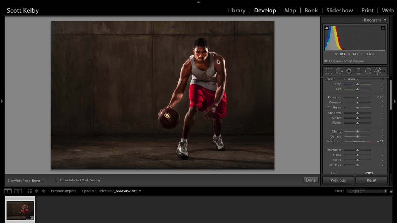
There’s a specific kind of portrait edit I used to avoid because I couldn’t figure out how to make it feel intentional rather than accidental. That gritty, high-contrast, slightly desaturated look you see on album covers and editorial shoots. I knew the ingredients existed somewhere in Lightroom’s panels, I just didn’t know how to combine them without wrecking the skin tones. Scott Kelby’s tutorial changed that for me. Watch the full tutorial on YouTube and follow along here while I break down every move.
What makes this tutorial worth your time is that Kelby doesn’t just chase a look. He diagnoses the image first, fixes the actual problems created by on-set lighting, and then builds the dramatic grade on a solid foundation. That order matters. I’ve watched plenty of tutorials that slap a preset on a broken exposure and call it creative. This one is different, and the approach translates directly to real portrait work.
Step 1: Crop for Composition Before You Touch Anything Else
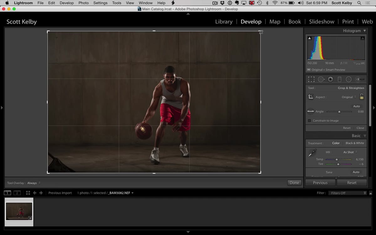 Crop tool active, rule-of-thirds grid visible over portrait
Before any tonal or color work begins, Kelby reaches for the crop tool. The original frame has a sandbag visible in the corner from a light stand, and the subject sits too centered for the mood he’s building. He pulls the crop in and places the subject along the rule-of-thirds vertical line. This sounds basic, but cropping after you’ve done detailed local adjustments is a workflow trap. If you mask and paint on a face and then reframe the shot, your adjustment pins can end up in the wrong place. Crop first, every time.
Crop tool active, rule-of-thirds grid visible over portrait
Before any tonal or color work begins, Kelby reaches for the crop tool. The original frame has a sandbag visible in the corner from a light stand, and the subject sits too centered for the mood he’s building. He pulls the crop in and places the subject along the rule-of-thirds vertical line. This sounds basic, but cropping after you’ve done detailed local adjustments is a workflow trap. If you mask and paint on a face and then reframe the shot, your adjustment pins can end up in the wrong place. Crop first, every time.
Step 2: Use the Adjustment Brush to Fix Underlit Areas
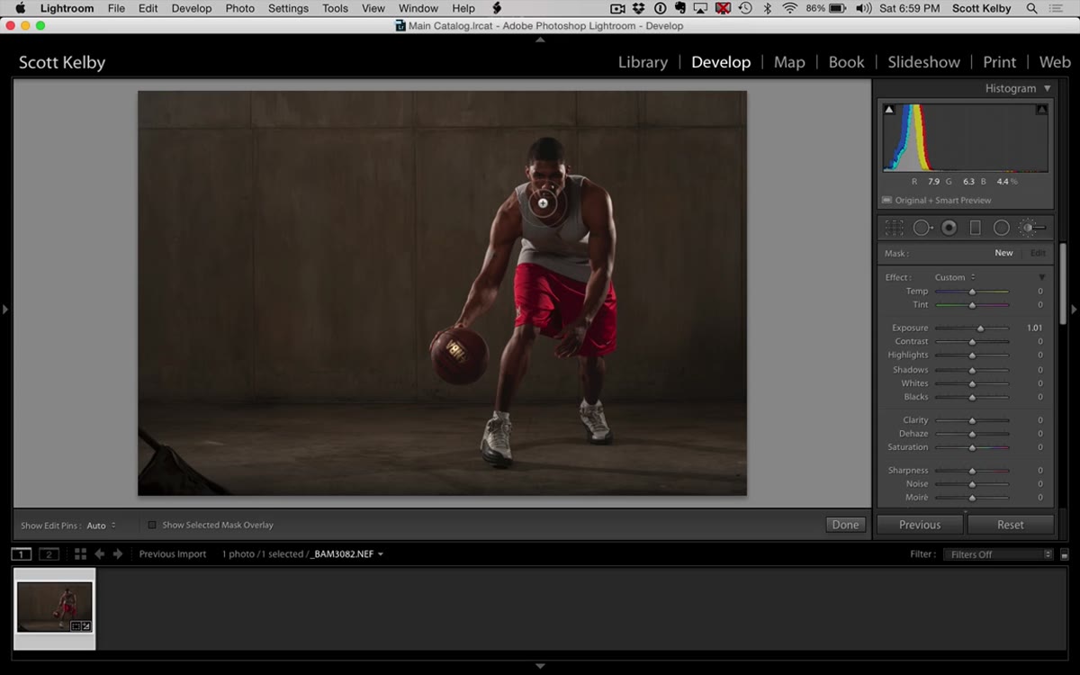 Adjustment Brush panel open, exposure slider raised, brush painting subject’s face
The beauty dish on set wasn’t producing enough light on the subject’s face, which is one of those things that happens even on well-planned shoots. Kelby grabs the Adjustment Brush, dials up the exposure, and paints across the face and arms. The key detail here is enabling Auto Mask, which keeps the brightening from bleeding onto the dark background. He then holds Option (Mac) or Alt (Windows) to switch the brush to erase mode and cleans up any spill around the edges. The exposure boost he lands on is subtle, not a rescue operation. Think of it as giving the existing light a little more room to breathe.
Adjustment Brush panel open, exposure slider raised, brush painting subject’s face
The beauty dish on set wasn’t producing enough light on the subject’s face, which is one of those things that happens even on well-planned shoots. Kelby grabs the Adjustment Brush, dials up the exposure, and paints across the face and arms. The key detail here is enabling Auto Mask, which keeps the brightening from bleeding onto the dark background. He then holds Option (Mac) or Alt (Windows) to switch the brush to erase mode and cleans up any spill around the edges. The exposure boost he lands on is subtle, not a rescue operation. Think of it as giving the existing light a little more room to breathe.
Step 3: Heal Out Distractions with the Spot Removal Tool in Paint Mode
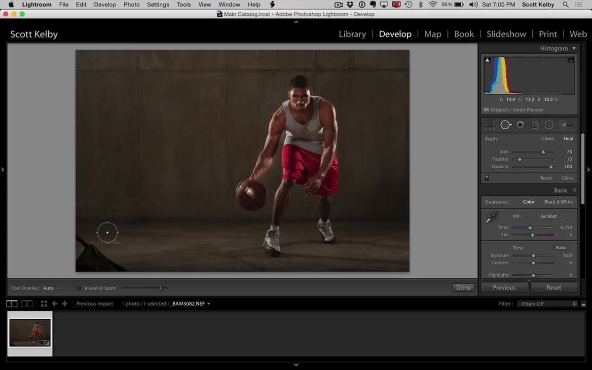 Spot Removal tool active, painted stroke visible over distraction on image
Most people use the Spot Removal tool by clicking on individual blemishes. Kelby demonstrates something that genuinely surprised me the first time I tried it: you can click and drag to paint a freeform healing stroke, just like Photoshop’s Healing Brush. This is useful for anything that runs along an edge or has an irregular shape. After painting, Lightroom suggests a source area to sample from. If the suggestion looks off, you can click and drag the source pin to a better region of the image. It takes one extra second and saves you from a patch that catches the eye of every viewer except you.
Spot Removal tool active, painted stroke visible over distraction on image
Most people use the Spot Removal tool by clicking on individual blemishes. Kelby demonstrates something that genuinely surprised me the first time I tried it: you can click and drag to paint a freeform healing stroke, just like Photoshop’s Healing Brush. This is useful for anything that runs along an edge or has an irregular shape. After painting, Lightroom suggests a source area to sample from. If the suggestion looks off, you can click and drag the source pin to a better region of the image. It takes one extra second and saves you from a patch that catches the eye of every viewer except you.
Step 4: Build the Grungy Contrast Foundation with Contrast, Whites, and Blacks
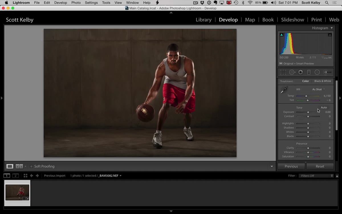 Basic panel showing Contrast, Whites, and Blacks sliders adjusted
This is where the dramatic look starts taking shape. Kelby increases Contrast in the Basic panel, which immediately deepens the midtones and gives the image more visual weight. He then nudges Whites up slightly and Blacks down slightly to stretch the tonal range without blowing out highlights or crushing shadows completely. The face gets darker as a side effect, which is expected and corrected in a later step. Don’t try to keep everything balanced here. Let the contrast build and plan to rebalance local areas afterward.
Basic panel showing Contrast, Whites, and Blacks sliders adjusted
This is where the dramatic look starts taking shape. Kelby increases Contrast in the Basic panel, which immediately deepens the midtones and gives the image more visual weight. He then nudges Whites up slightly and Blacks down slightly to stretch the tonal range without blowing out highlights or crushing shadows completely. The face gets darker as a side effect, which is expected and corrected in a later step. Don’t try to keep everything balanced here. Let the contrast build and plan to rebalance local areas afterward.
Step 5: Crank Clarity for Midtone Texture
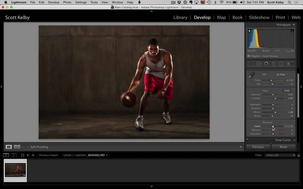 Clarity slider pushed significantly to the right in Basic panel
Clarity is doing real structural work in this edit, not just adding a haze effect. Raising it boosts midtone contrast specifically, which brings out fabric texture, skin pores, and any environmental detail in the background. On a gritty portrait, that texture reads as intention rather than imperfection. Kelby pushes it noticeably, more than you’d use on a beauty retouch. If you’re used to keeping Clarity conservative, this step will feel like overcooking it. Trust the process and keep going, because the next adjustment changes the character of the contrast entirely.
Clarity slider pushed significantly to the right in Basic panel
Clarity is doing real structural work in this edit, not just adding a haze effect. Raising it boosts midtone contrast specifically, which brings out fabric texture, skin pores, and any environmental detail in the background. On a gritty portrait, that texture reads as intention rather than imperfection. Kelby pushes it noticeably, more than you’d use on a beauty retouch. If you’re used to keeping Clarity conservative, this step will feel like overcooking it. Trust the process and keep going, because the next adjustment changes the character of the contrast entirely.
Step 6: Add Dehaze for a Different Quality of Depth
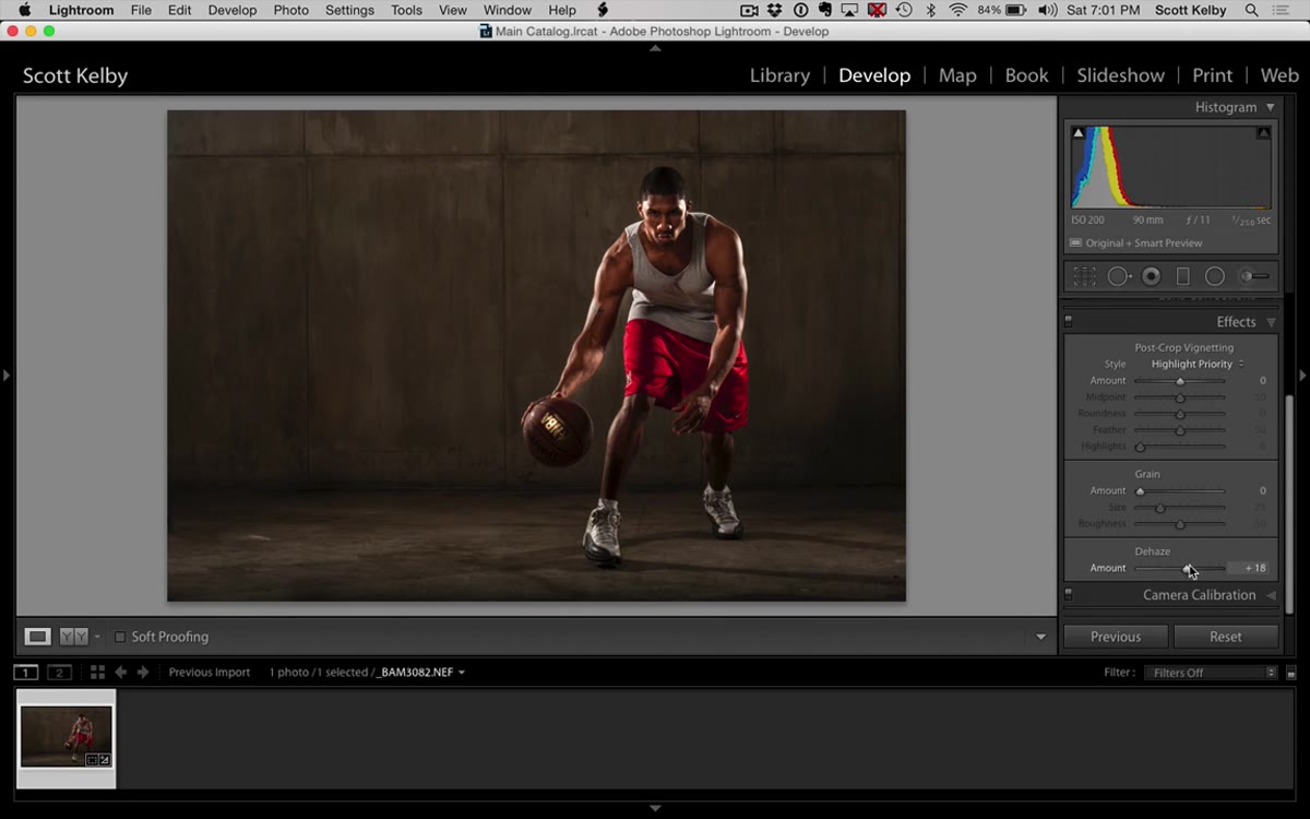 Effects panel open, Dehaze slider raised to around 20
Dehaze lives in the Effects panel and is often thought of as a landscape tool for cutting through atmospheric haze. Kelby uses it here as a contrast layer with a different quality than the Contrast slider. Where the Contrast slider pulls the tonal curve in a fairly even way, Dehaze tends to compress the shadows and deepen color saturation simultaneously. He lands at around +20, which adds density to the image without making it look like a night sky. Combined with the Clarity boost from the previous step, the image now has the dimensional, almost cinematic quality that makes dramatic portraits stand out.
Effects panel open, Dehaze slider raised to around 20
Dehaze lives in the Effects panel and is often thought of as a landscape tool for cutting through atmospheric haze. Kelby uses it here as a contrast layer with a different quality than the Contrast slider. Where the Contrast slider pulls the tonal curve in a fairly even way, Dehaze tends to compress the shadows and deepen color saturation simultaneously. He lands at around +20, which adds density to the image without making it look like a night sky. Combined with the Clarity boost from the previous step, the image now has the dimensional, almost cinematic quality that makes dramatic portraits stand out.
Step 7: Rebalance the Face and Desaturate Skin
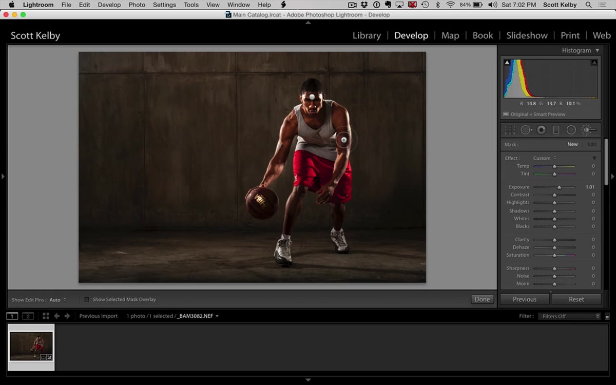 New Adjustment Brush pin on face, saturation slider pulled down
Two things need fixing after all that contrast work: the face is too dark again, and the skin has gone overly warm. Kelby returns to the Adjustment Brush, creates a new pin (using the New button so the previous exposure adjustment stays intact), and paints back some brightness on the face. Then he creates another new adjustment, zeroes out the exposure, and drops the Saturation slider to pull some warmth out of the skin tone. The goal isn’t to make the skin look grey. It’s to neutralize the orange warmth that gets amplified when you push contrast this hard, so the skin reads as cool and controlled rather than sunburned.
New Adjustment Brush pin on face, saturation slider pulled down
Two things need fixing after all that contrast work: the face is too dark again, and the skin has gone overly warm. Kelby returns to the Adjustment Brush, creates a new pin (using the New button so the previous exposure adjustment stays intact), and paints back some brightness on the face. Then he creates another new adjustment, zeroes out the exposure, and drops the Saturation slider to pull some warmth out of the skin tone. The goal isn’t to make the skin look grey. It’s to neutralize the orange warmth that gets amplified when you push contrast this hard, so the skin reads as cool and controlled rather than sunburned.
One Thing I’d Add: A Radial Gradient Vignette
The tutorial wraps up before addressing the edges of the frame, which is where I’d add one more step in my own workflow. After doing all of this, I drop a Radial Gradient over the subject and pull Exposure down by about -0.4 on the outside of the gradient. It naturally draws the eye toward the center and reinforces that moody, dramatic quality without looking like a filter. Kelby’s Clarity and Dehaze work already pushes the image in that direction. A subtle vignette closes the loop.
The real lesson here is sequencing. Crop, fix the light, clean up distractions, then build the grade. Every step in this tutorial follows from the one before it, which is why the result looks considered rather than filtered. That structure is the technique you should walk away with.
Watch the full tutorial on YouTube to see every move in real time, especially the Adjustment Brush masking and the spot healing, which are much easier to follow visually.
Comments (1)
Applied this to my portfolio shots and the improvement is noticeable.
Leave a Comment