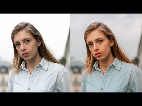
There’s a specific failure mode I see constantly in portrait edits: too much happening at once. Aggressive tone curves, oversaturated skin, highlights that blow out the sky, shadows so crushed you lose all the hair detail. The photo technically has “a look,” but it reads as effortful rather than intentional. What draws me to Jessica Kobeissi’s editing style is the opposite instinct. Her work is controlled, deliberate, and built on subtractions as much as additions. When I came across her soft peach portrait tutorial, I bookmarked it immediately, not because the look was flashy, but because the reasoning behind each step was something I could learn from. Watch the full tutorial on YouTube
The source image is a portrait shot at f/2.0, ISO 160, 1/500s on a Canon 5D Mark III with a 1.4 lens. It’s already a clean, well-exposed file, which is worth noting because this approach works best when you’re not fighting the raw. The goal is a warm, peachy grade that feels soft and editorial without losing skin texture or sky detail. Here’s how she gets there, step by step.
Step 1: Skip White Balance for Now
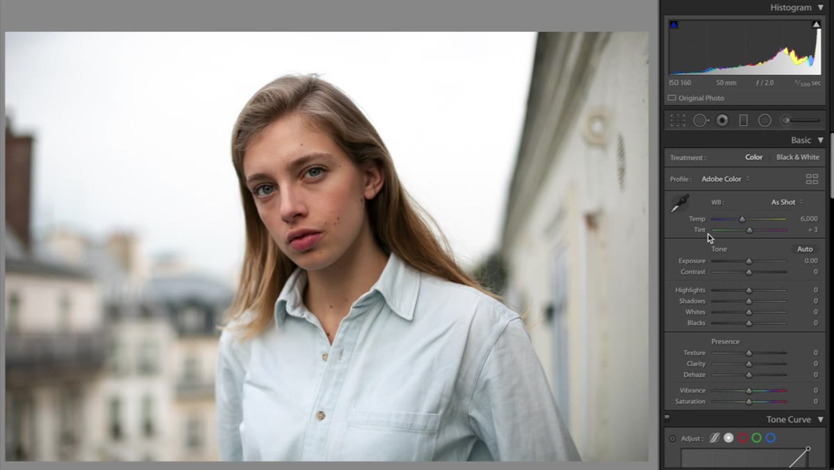 Lightroom temperature and tint sliders left untouched
This is counterintuitive, and it’s the first thing that caught my attention. Most people anchor an edit in white balance right away, adjusting temperature and tint before anything else. Kobeissi deliberately leaves those sliders alone at the start, planning to revisit them once all the color work is in place. The logic is sound: white balance interacts with every other color decision you make, so dialing it in before the grade is set means you’ll likely have to readjust it anyway. Leave it, move on, come back.
Lightroom temperature and tint sliders left untouched
This is counterintuitive, and it’s the first thing that caught my attention. Most people anchor an edit in white balance right away, adjusting temperature and tint before anything else. Kobeissi deliberately leaves those sliders alone at the start, planning to revisit them once all the color work is in place. The logic is sound: white balance interacts with every other color decision you make, so dialing it in before the grade is set means you’ll likely have to readjust it anyway. Leave it, move on, come back.
Step 2: Recover the Sky with Highlights and Whites
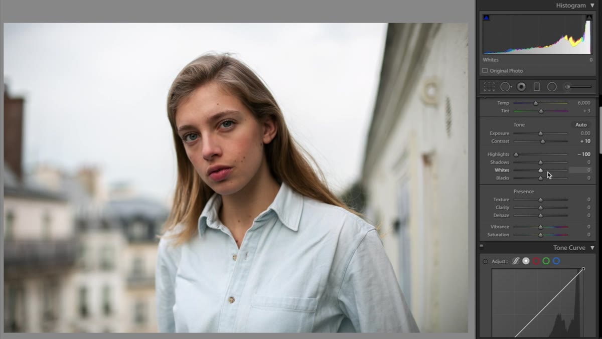 Highlights and whites sliders pulled down significantly
In the Tone section, she adds a modest amount of contrast, then brings both the Highlights and Whites sliders down considerably. If you’ve shot outdoors with a bright sky, you know how quickly that data disappears when you start pushing contrast. Pulling highlights and whites back in recovers the cloud detail and gives the image a more dimensional feel. This is one of those moves that looks subtle on screen but makes a real structural difference when you print or deliver to a client. Don’t be shy here: drag both sliders left until the sky feels present rather than blown.
Highlights and whites sliders pulled down significantly
In the Tone section, she adds a modest amount of contrast, then brings both the Highlights and Whites sliders down considerably. If you’ve shot outdoors with a bright sky, you know how quickly that data disappears when you start pushing contrast. Pulling highlights and whites back in recovers the cloud detail and gives the image a more dimensional feel. This is one of those moves that looks subtle on screen but makes a real structural difference when you print or deliver to a client. Don’t be shy here: drag both sliders left until the sky feels present rather than blown.
Step 3: Open Up Blacks and Shadows
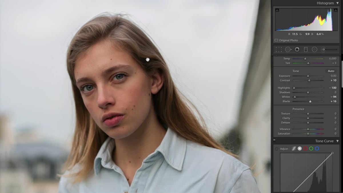 Blacks and shadows sliders brought up to lift shadow detail
After recovering the highlights, she lifts the Blacks and Shadows slightly. The reason she gives is specific and worth holding onto: in portrait work, dark shadows in hair can become muddy, and you start losing the fine strand detail that makes a portrait feel luxurious rather than flat. The adjustment here is conservative, just enough to bring back texture in the darker areas without making the image feel flat or low-contrast. Think of it as protecting the detail you already have, not making the photo brighter.
Blacks and shadows sliders brought up to lift shadow detail
After recovering the highlights, she lifts the Blacks and Shadows slightly. The reason she gives is specific and worth holding onto: in portrait work, dark shadows in hair can become muddy, and you start losing the fine strand detail that makes a portrait feel luxurious rather than flat. The adjustment here is conservative, just enough to bring back texture in the darker areas without making the image feel flat or low-contrast. Think of it as protecting the detail you already have, not making the photo brighter.
Step 4: Add Clarity and Pull Back Saturation
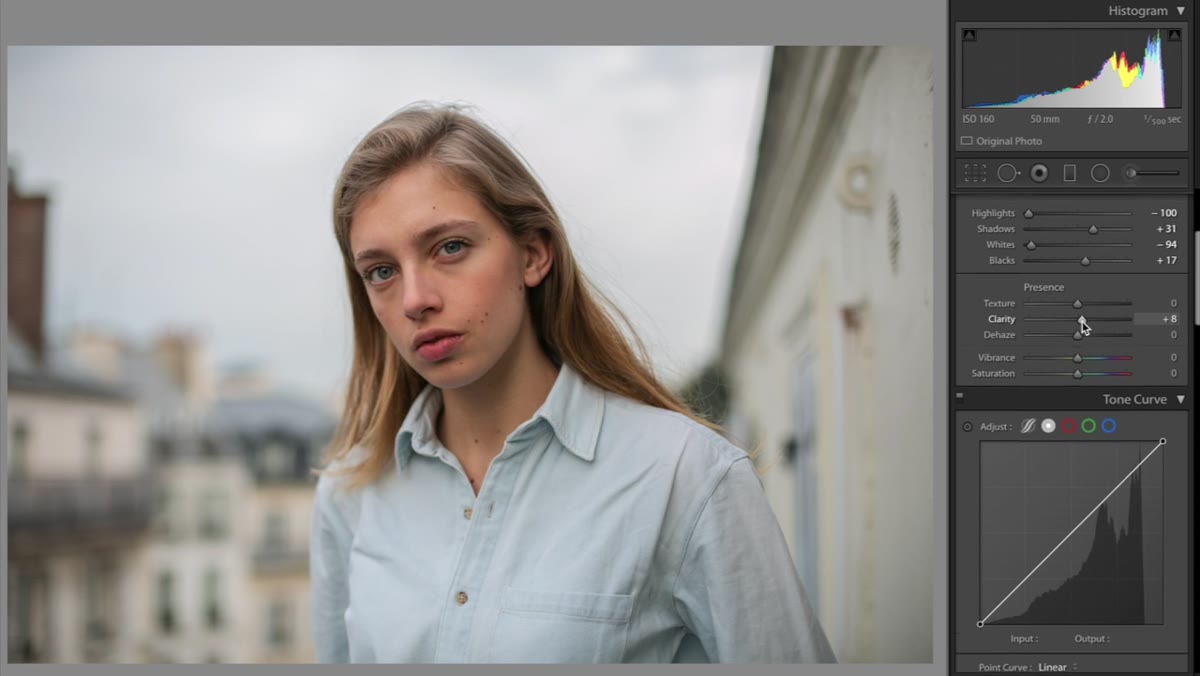 Clarity increased, vibrance or saturation pulled to negative eight
A small Clarity bump adds midtone contrast and gives the skin just a touch more definition. The more important move here is pulling Saturation down to around negative eight. This is preparation work. When you introduce color through split toning or HSL adjustments later, a photo that’s already sitting at full saturation will look oversaturated and muddy once you add anything on top. Kobeissi describes it like layering makeup: if the base is already too heavy, adding more just makes it worse. Starting slightly desaturated gives you room to build color without things going cakey.
Clarity increased, vibrance or saturation pulled to negative eight
A small Clarity bump adds midtone contrast and gives the skin just a touch more definition. The more important move here is pulling Saturation down to around negative eight. This is preparation work. When you introduce color through split toning or HSL adjustments later, a photo that’s already sitting at full saturation will look oversaturated and muddy once you add anything on top. Kobeissi describes it like layering makeup: if the base is already too heavy, adding more just makes it worse. Starting slightly desaturated gives you room to build color without things going cakey.
Step 5: Set a Subtle Tone Curve Base
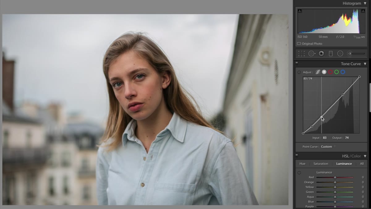 Tone curve with a light S-curve applied, no extreme lifts or pulls
Rather than applying an aggressive S-curve, she places just a light adjustment. Her warning here is direct: she’s seen a lot of edits that rely on muddy, overdone tone curves, and it destroys image detail, especially in the hair and shadow areas. A slight lift in the shadows and a gentle pull on the highlights is all you need at this stage. She also notes that she’ll return to the tone curve at the end, once all the colors are in place. That two-pass approach is something I’ve started doing in my own work. Your curve decisions should respond to the color that’s already there.
Tone curve with a light S-curve applied, no extreme lifts or pulls
Rather than applying an aggressive S-curve, she places just a light adjustment. Her warning here is direct: she’s seen a lot of edits that rely on muddy, overdone tone curves, and it destroys image detail, especially in the hair and shadow areas. A slight lift in the shadows and a gentle pull on the highlights is all you need at this stage. She also notes that she’ll return to the tone curve at the end, once all the colors are in place. That two-pass approach is something I’ve started doing in my own work. Your curve decisions should respond to the color that’s already there.
Step 6: Build the Peach with Split Toning
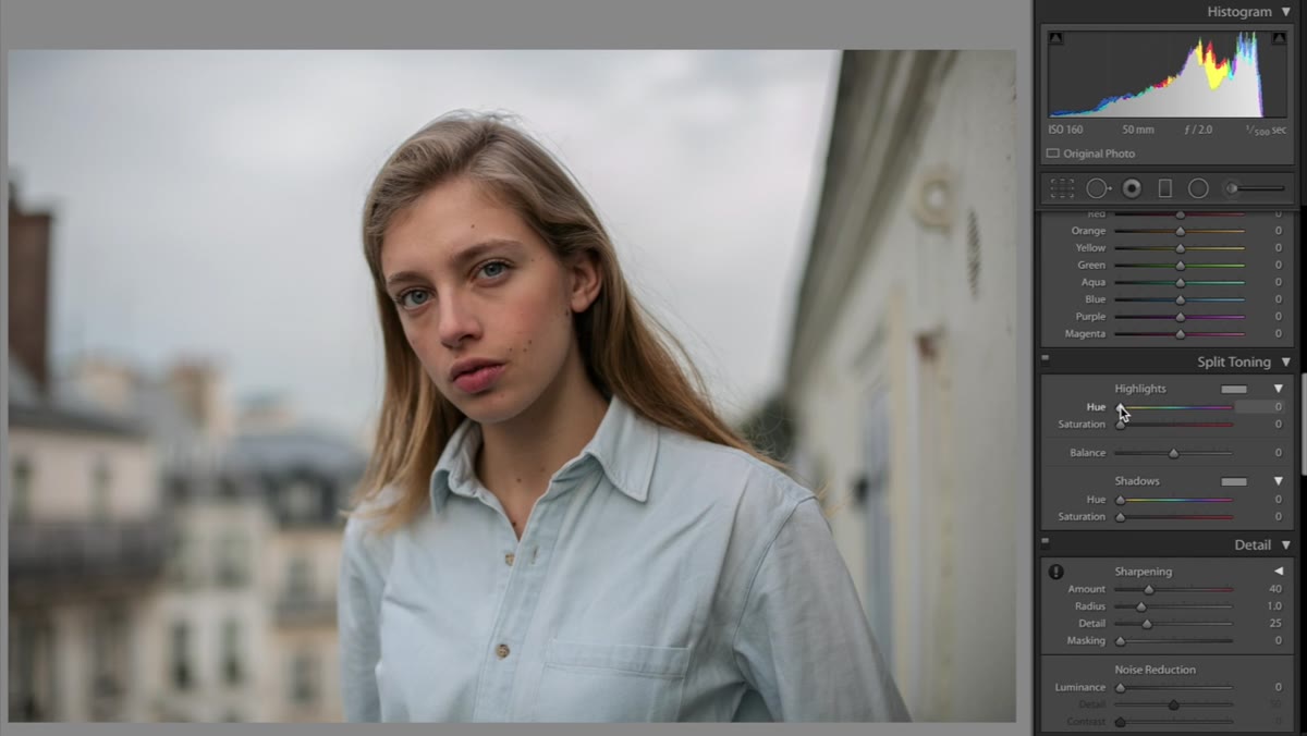 Split toning panel open, highlights hue near yellow, shadows near orange
This is where the signature look actually happens. In the Split Toning panel, the highlights get a warm yellow-orange hue, somewhere around 51, with saturation kept low, between one and five. The shadows get a similar orange-yellow treatment with saturation around four. Both values are minimal on purpose. The effect at this level is warm and flattering without reading as a color grade. Toggle split toning on and off after making these adjustments and you’ll see what she means: it’s subtle, but the image without it looks comparatively cold and flat. That’s the difference between a color grade and a color statement.
Split toning panel open, highlights hue near yellow, shadows near orange
This is where the signature look actually happens. In the Split Toning panel, the highlights get a warm yellow-orange hue, somewhere around 51, with saturation kept low, between one and five. The shadows get a similar orange-yellow treatment with saturation around four. Both values are minimal on purpose. The effect at this level is warm and flattering without reading as a color grade. Toggle split toning on and off after making these adjustments and you’ll see what she means: it’s subtle, but the image without it looks comparatively cold and flat. That’s the difference between a color grade and a color statement.
What I’d Add: HSL Skin Tone Tuning
Once the split toning is set, I always spend a few extra minutes in the HSL panel targeting the orange channel specifically. In portrait work, skin tones live almost entirely in orange and red. Nudging the orange Hue slider slightly warmer will push the peach tone into the skin itself, not just the highlights and shadows. Bringing up the orange Luminance by five to eight points can also make skin look more luminous without touching exposure globally. It’s a small addition to what Kobeissi demonstrates, but it ties the split toning color into the actual subject rather than just the light.
One caveat: if you lift orange Luminance too aggressively, you’ll lose definition in the face. Watch what happens to the nose and forehead before committing to the value. This is especially worth monitoring on high-contrast skin tones where the highlights are already sitting near clipping.
The biggest takeaway from this tutorial isn’t a specific slider value. It’s the idea that great color grading is mostly about creating space for color, not just applying it. Desaturating the base, recovering the highlights, lifting the shadows gently, keeping the tone curve conservative. Each of those steps clears the road before the split toning even starts. That’s the workflow thinking that separates edits that feel polished from edits that feel forced.
Watch the full tutorial on YouTube and watch how Kobeissi moves through these decisions in real time. Seeing the before-and-after toggles as she works is genuinely instructive in a way that screenshots can’t fully capture.
Comments
Leave a Comment