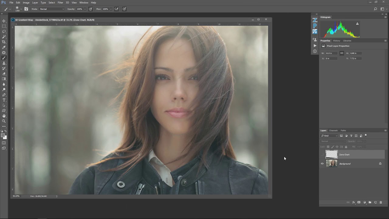
There is a version of photo editing where you nail the exposure, balance the whites, clean up the shadows, and call it done. Technically perfect. Emotionally inert. I spent an embarrassing amount of time in that version before I started paying attention to what color grading actually does to a viewer. It is not about making an image look “correct.” It is about making someone feel something before they even read your caption.
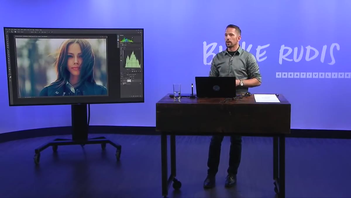
That shift in thinking is exactly what this CreativeLive tutorial puts into words better than most. Watch the full tutorial on YouTube before or after reading this breakdown. The instructor walks through the relationship between color, mood, and artistic identity in a way that reframes color grading from a finishing step into a core creative decision. The Photoshop techniques he covers, specifically solid color fills, gradient maps, and blend modes, translate directly into how I think about color decisions in Lightroom too, because the underlying logic is identical.
What follows is a step-by-step breakdown of the core technique from the video, written so you can follow along without pausing every thirty seconds.
Step 1: Understand What Color Grading Actually Is
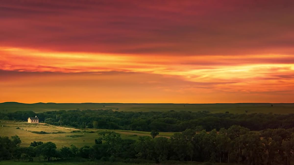 Color theory and mood title card on screen
Before touching a slider, get clear on the distinction the instructor makes early on. Color grading is not color correction. Correction gets your image to a neutral, accurate baseline. Grading takes those colors and pushes them somewhere intentional, even if that somewhere contradicts reality. He uses movies as the clearest example: a daytime scene in a film can be drenched in blue during a sad moment, and your brain accepts it completely because the emotion reads true even when the physics do not.
Color theory and mood title card on screen
Before touching a slider, get clear on the distinction the instructor makes early on. Color grading is not color correction. Correction gets your image to a neutral, accurate baseline. Grading takes those colors and pushes them somewhere intentional, even if that somewhere contradicts reality. He uses movies as the clearest example: a daytime scene in a film can be drenched in blue during a sad moment, and your brain accepts it completely because the emotion reads true even when the physics do not.
As photographers, we often stop at correction and treat grading like an optional flourish. The tutorial reframes it as the third essential pillar of image-making, alongside tonal accuracy and color accuracy. Your artistic expression, the specific emotional register you want the image to live in, belongs in that same category. It is not decoration. It is content.
Step 2: Recognize Your Own Color Identity
 Multiple processed versions of the same image displayed together
The instructor describes a project he ran where he gave the same HDR bracket set to photographers around the world and collected the results. Thirteen to twenty people, all working from identical source material, produced completely different images. Same file, different emotional worlds.
Multiple processed versions of the same image displayed together
The instructor describes a project he ran where he gave the same HDR bracket set to photographers around the world and collected the results. Thirteen to twenty people, all working from identical source material, produced completely different images. Same file, different emotional worlds.
The takeaway is not that everyone is right or that anything goes. It is that you are going to gravitate toward certain colors naturally, and becoming conscious of that pull is how you develop a consistent style. He mentions his own preference for blues and greens. Mine runs toward warm shadows with slightly desaturated highlights, which is why half my presets end up named after Tom Waits songs. Pay attention to what you keep reaching for. That pattern is your starting point, not a limitation.
Step 3: Open a Solid Color Fill Adjustment Layer
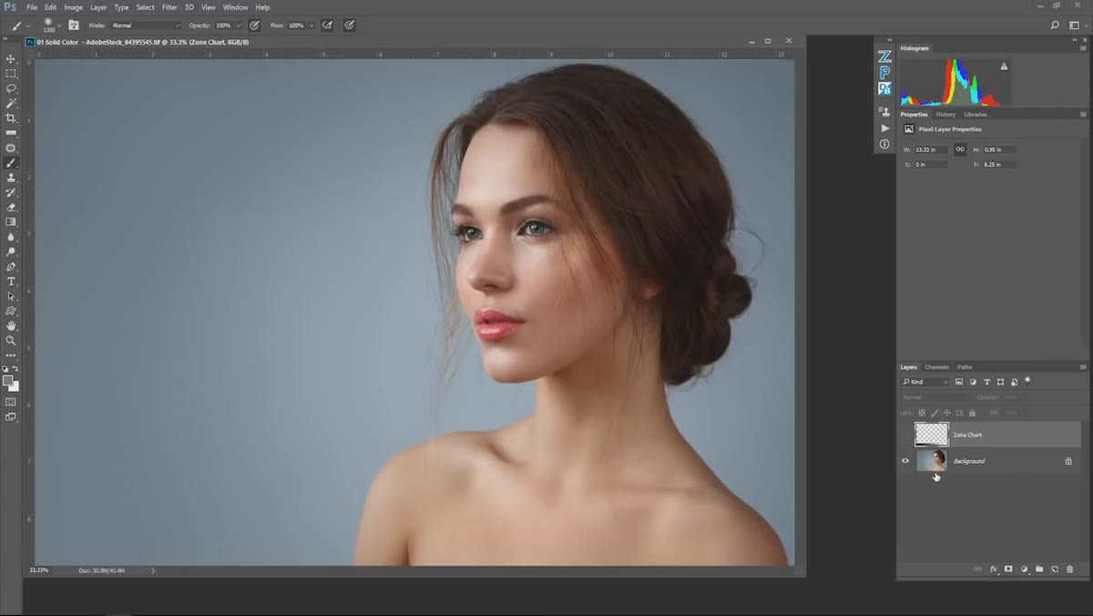 Adjustment layer menu open with Solid Color Fill highlighted
In Photoshop, navigate to the adjustment layers panel and select Solid Color Fill. Choose a color, and yes, your image will immediately look like a disaster. A flat wash of red or blue covering everything you just spent an hour editing. This is expected. The solid color fill on its own is not the technique. It is the ingredient.
Adjustment layer menu open with Solid Color Fill highlighted
In Photoshop, navigate to the adjustment layers panel and select Solid Color Fill. Choose a color, and yes, your image will immediately look like a disaster. A flat wash of red or blue covering everything you just spent an hour editing. This is expected. The solid color fill on its own is not the technique. It is the ingredient.
Pick a color that corresponds to the mood you want to reinforce. Cooler blues and teals push toward melancholy or tension. Warmer oranges and ambers lean into nostalgia or intimacy. Do not overthink the specific hex value at this stage. You will have room to adjust.
Step 4: Change the Blend Mode to Color
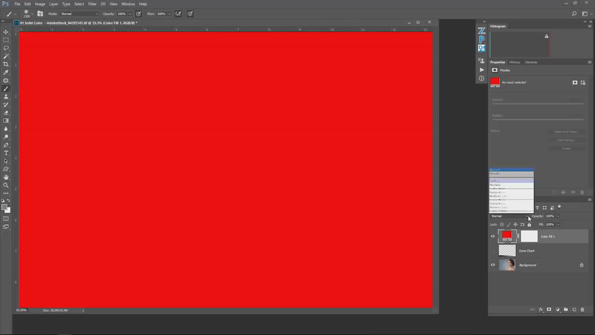 Blend mode dropdown set to Color in the layers panel
This is where the math kicks in. With your solid color fill layer selected, open the blend mode dropdown and choose Color. The Color blend mode is specific in what it does: it applies the hue and saturation of the fill layer to the image beneath it, while leaving the luminosity, meaning the actual light and dark values, completely intact.
Blend mode dropdown set to Color in the layers panel
This is where the math kicks in. With your solid color fill layer selected, open the blend mode dropdown and choose Color. The Color blend mode is specific in what it does: it applies the hue and saturation of the fill layer to the image beneath it, while leaving the luminosity, meaning the actual light and dark values, completely intact.
The practical result is that your shadows and highlights are protected. The tonal structure you built stays readable. What changes is the color temperature and emotional register of the midtones and general image, without flattening everything into a single hue. The image now has a color cast that feels intentional rather than like a white balance mistake.
Step 5: Adjust Opacity to Control Intensity
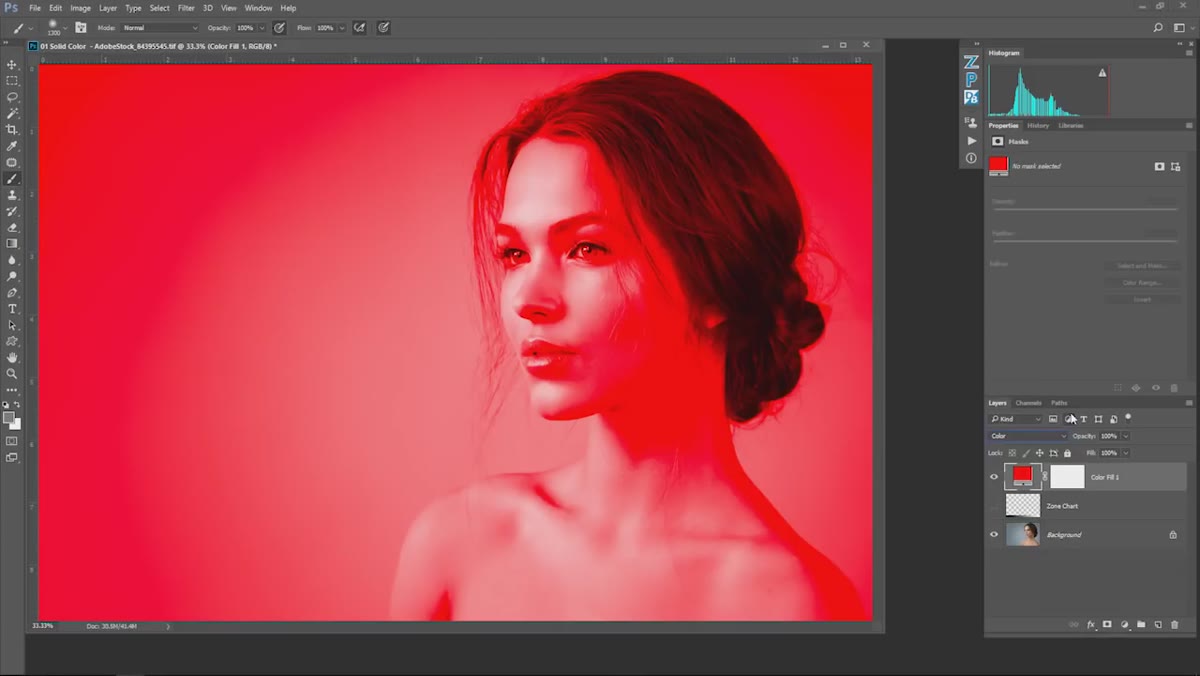 Red solid color fill applied with Color blend mode active
A full-strength Color blend mode layer will usually be too aggressive. Drop the opacity of the fill layer down and watch how the effect integrates with the image underneath. Somewhere between 15% and 45% is where most images find their footing, though that range shifts depending on how saturated your original file is.
Red solid color fill applied with Color blend mode active
A full-strength Color blend mode layer will usually be too aggressive. Drop the opacity of the fill layer down and watch how the effect integrates with the image underneath. Somewhere between 15% and 45% is where most images find their footing, though that range shifts depending on how saturated your original file is.
Think of this like seasoning. The goal is not to taste the salt. The goal is to make everything else taste more like itself, but in the direction you chose. A slight blue cast over a portrait shot in golden hour does not turn the image cold. It creates tension between warmth and cool that reads as cinematic rather than confused.
What I Do Differently in Lightroom
Photoshop’s adjustment layers give you explicit control through blend modes, but you can approximate the same logic entirely inside Lightroom using the Color Grading panel (the three-wheel HSL interface that replaced Split Toning). I use the midtone wheel the way the tutorial uses a Color blend mode fill: as the primary mood driver. Shadows I push subtly warm. Highlights I let stay relatively neutral or pull slightly cool. That combination mimics the tonal protection the Color blend mode provides because I am not slamming a single hue across the whole luminosity range.
The luminance sliders in the HSL panel work alongside this well. If you push blue into your midtones but the sky reads too heavy, pulling the luminance of blue up slightly lifts the sky without removing the cast from the rest of the image. It is a manual version of what blend modes do automatically, and the precision actually gives you more control once you understand the underlying logic the tutorial explains.
The single most important idea in this video is that technical correctness and emotional resonance are separate goals, and you need both. Getting the tones right is the floor, not the ceiling. Color grading is how you tell the viewer what to feel, and a solid color fill with the right blend mode is one of the fastest ways to test an emotional direction before committing to a full grade.
Watch the full tutorial on YouTube to see the gradient map and gradient techniques the instructor covers beyond what is broken down here. Both are worth the time, especially the gradient map approach, which opens up some genuinely surprising possibilities for split toning at the extremes of your tonal range.
Comments
Leave a Comment