
Most of my color grading happens in Lightroom. That’s just reality when you’re moving through a shoot fast and need consistency across 400 frames. But every now and then I hit an image that deserves more surgical attention, and that’s when I open Photoshop and remember why the Levels adjustment layer is genuinely underrated as a color tool.
I came across this technique through Watch the full tutorial on YouTube from Aaron Nace over at PHLEARN, part of his 30 Days of Photoshop series. What caught me was how he frames Levels not as a contrast tool (which is how most of us were taught) but as a color channel mixer. Once that framing clicks, the whole panel starts to make sense in a new way.
The core idea is this: when you isolate a single color channel inside Levels, you can push specific hues into your shadows or highlights independently. That means warm shadows, cool highlights, or any split-toning combination you want, without buying a plugin or wrestling with Curves. If you’ve ever named a preset after a song and wondered whether there was a more intentional way to build that look from scratch, this method is it.
Step 1: Open a Levels Adjustment Layer
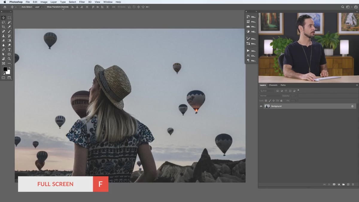 Navigating to Layer menu to open Levels adjustment
Start by opening your image in Photoshop. Go to Layer, then New Adjustment Layer, then Levels. Click OK on the dialog box and pull the Properties panel somewhere you can see it comfortably. You’ll be switching between channels a lot, so give yourself room to work.
Don’t just open this from the Adjustments panel out of habit. Creating it as a proper adjustment layer keeps everything non-destructive, meaning you can come back and revise the grade after you’ve slept on it. And you will want to sleep on it.
Step 2: Understand What the Sliders Actually Do
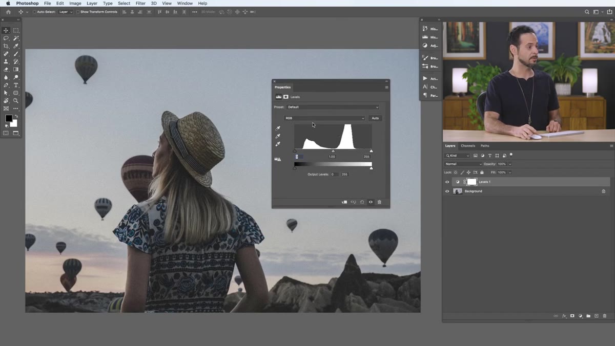 Levels panel with RGB composite channel selected, sliders visible
Before touching a single slider, spend a minute understanding the layout. The panel has five sliders: three on top (input) and two on the bottom (output). The top-left input slider darkens your shadows, the top-right brightens your highlights, and the middle one controls midtones. The bottom sliders invert this logic, compressing the tonal range from either end.
Aaron walks through this clearly, and it’s worth internalizing because the same logic applies inside each individual color channel. You’re not learning six different tools here. You’re learning one tool that scales across four channels.
Step 3: Switch to the Red Channel and Learn the Color Logic
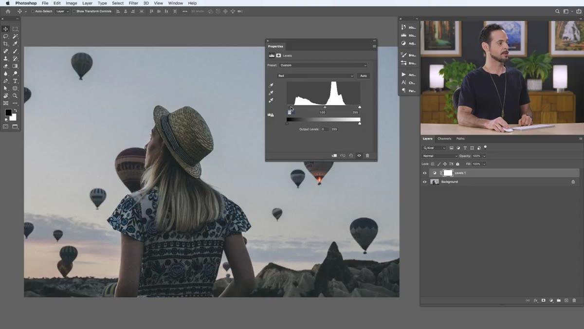 Red channel selected in Levels, left input slider being moved
Click the channel dropdown in the Properties panel and select Red. Now the sliders control red and its opposite, cyan. Drag the top-left input slider to the right and you pull red out of the shadows, which shifts them toward cyan. Drag the top-right slider to the left and you’re adding red to the highlights, which also brightens them slightly.
The bottom output sliders work in reverse: left-bottom adds red to shadows and lifts them, right-bottom pulls red from highlights and darkens them. It sounds like a lot to track, but after one pass through the image it becomes intuitive. The key rule is that every color has an opposite living on the other side of that slider.
Step 4: Check the Green and Blue Channels
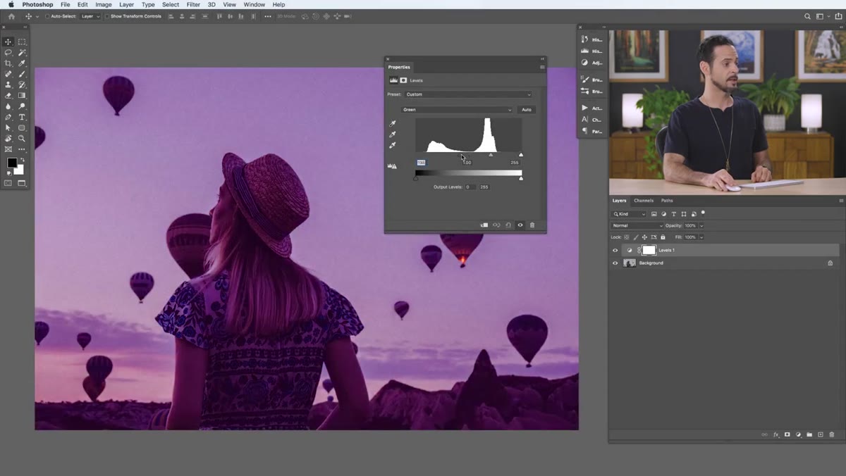 Green channel selected, demonstrating magenta/green relationship
Switch to the Green channel and you’re now working with green versus magenta. Same slider logic, different color axis. Then move to Blue, and now you’re controlling blue versus yellow. These three axes, red/cyan, green/magenta, and blue/yellow, are the building blocks of every color grade you’ve ever admired in a film or a portrait session.
Aaron points out that blue and yellow are opposites in the Blue channel, which is exactly why the classic “teal and orange” look lives here. Getting comfortable with all three channels means you’re no longer guessing what slider creates what color. You’re navigating a color space.
Step 5: Decide on a Direction and Start Grading
 Blue channel selected, shadow slider being adjusted to add blue
Now that you understand the system, it’s time to make a creative call. In the tutorial, Aaron decides to push blue into the shadows and shift the highlights toward yellow, creating a split-tone with cool shadows and warm highlights. He goes to the Blue channel, pulls the top-left input slider to add blue to the shadows, then moves the top-right slider to introduce yellow into the highlights.
This is where I’d encourage you to trust your instincts rather than just copying the same grade. Try a different channel first. See what happens when you push the Green channel instead. The worst case is you hit reset and try again. The Levels adjustment layer costs you nothing to experiment with.
Step 6: Toggle the Adjustment Layer and Evaluate
 Layer visibility toggled off and on to compare before and after
Hit the eye icon on your adjustment layer to toggle it off and on. This before-and-after comparison is the most honest evaluation tool in Photoshop. It’s easy to push too far when you’re staring at a changed image for ten minutes straight. Toggling forces your eyes to recalibrate.
If the effect feels too strong, drop the layer opacity. Something between 60 and 80 percent often hits the sweet spot where the grade reads as intentional rather than processed.
My Take: Pairing This with Lightroom’s Color Grading Panel
If you’re a Lightroom-first editor like me, you’re probably wondering how this fits into an existing workflow. The honest answer is that it doesn’t replace Lightroom’s Color Grading panel for batch work. But for a hero image, using Levels channels in Photoshop gives you a level of tonal specificity that Lightroom’s three-wheel system doesn’t quite match.
What I’ve started doing is building the base exposure and white balance in Lightroom, exporting to Photoshop as a smart object, applying the Levels channel grade, and then saving back. The smart object roundtrip keeps everything editable, and the Lightroom adjustments stay intact underneath. If a client asks for a warmer version three weeks later, nothing is baked in.
The other thing worth saying: this method makes you think about color in terms of relationships rather than individual hues. You’re always working with an axis, not a single color. That mental model transfers to every other color tool you’ll ever use.
The single most important thing Aaron Nace demonstrates here is that Levels isn’t just a contrast tool. It’s a channel-based color grading engine that’s been sitting in Photoshop all along, waiting for you to look at it differently. That reframe alone is worth the fifteen minutes.
Watch the full tutorial on YouTube and see the technique in action on the sample image. The visual of watching him toggle that layer on and off at the end is worth seeing with your own eyes.
Comments
Leave a Comment