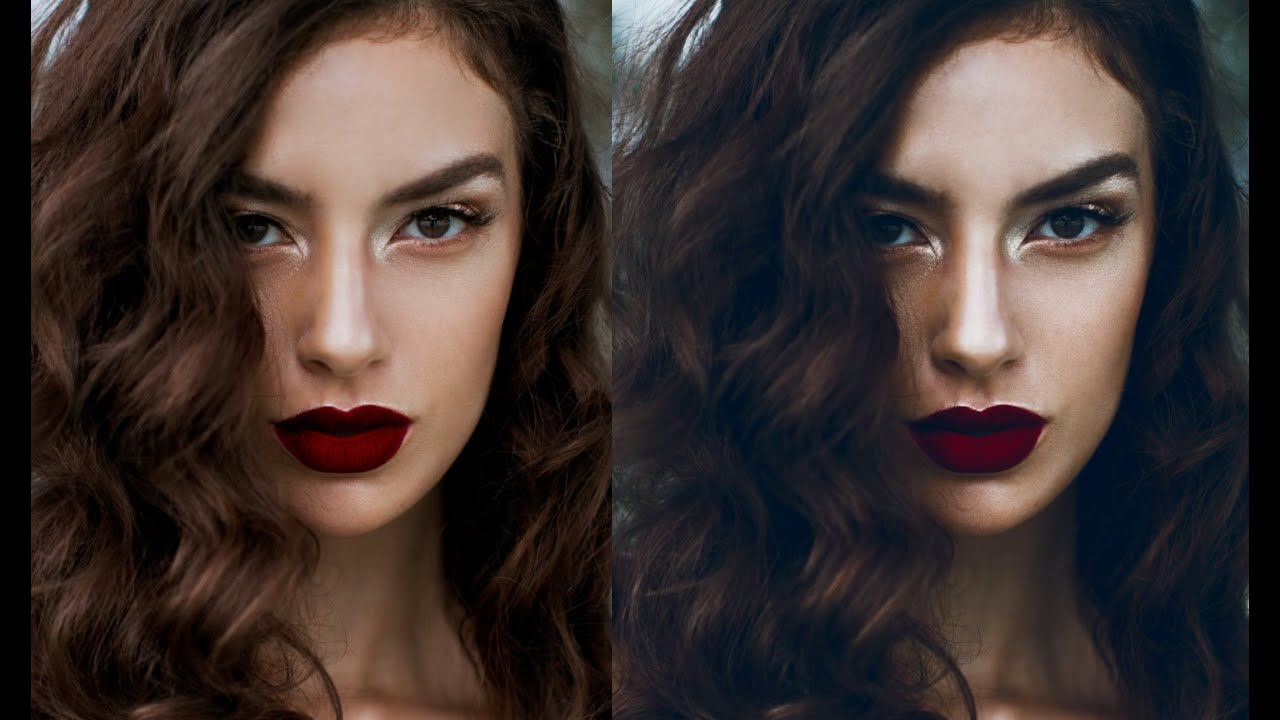
Most of my work lives in warm territory. Golden hour skin tones, amber shadows, that Nashville-afternoon-through-blinds quality I’ve spent years chasing. Which is exactly why I keep returning to tutorials that push in the opposite direction. When your default is warmth, you get lazy about cool tones. You forget they require their own logic.
Watch the full tutorial on YouTube
In this Jessica Kobeissi tutorial, she walks through a Photoshop adjustment layer workflow that pulls a portrait into cool, dark, slightly desaturated territory without nuking the skin. It’s the kind of edit where the individual steps look wrong until suddenly the whole thing clicks. What I appreciate about her approach is that it’s adjustment-layer-based, which means every decision is nondestructive and you can dial any layer back at any point. That flexibility is something I preach constantly, and it was satisfying to see it modeled here.
Step 1: Knock Back the Saturation First
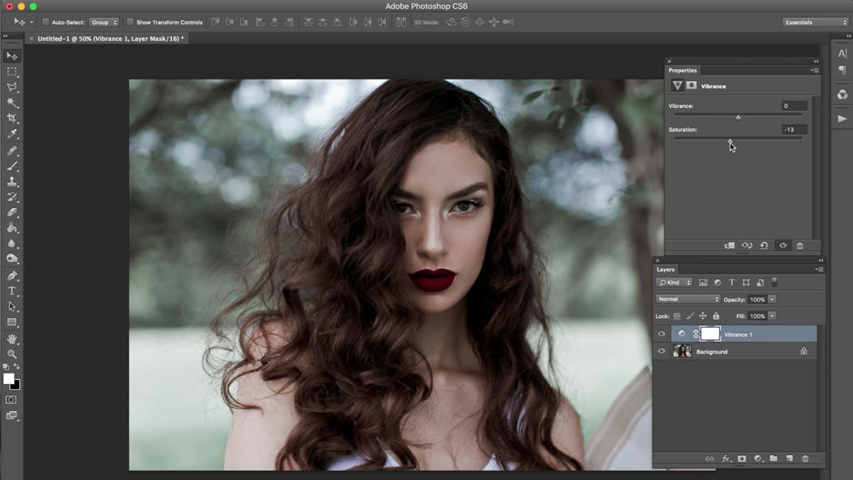 Hue/Saturation adjustment layer with saturation lowered
Before touching contrast or color, Jessica brings a Hue/Saturation adjustment layer in and lowers the overall Saturation to around -13. The layer’s opacity then gets pulled back to 73%. This is a move I’ve seen skipped constantly by beginners, and it’s a mistake every time. Dropping saturation slightly at the start creates a neutral base that gives subsequent color adjustments more control. If you start with fully saturated skin tones and then try to push blue into the image, you’re fighting the original colors the whole time. A modest desaturation step lets you steer.
Hue/Saturation adjustment layer with saturation lowered
Before touching contrast or color, Jessica brings a Hue/Saturation adjustment layer in and lowers the overall Saturation to around -13. The layer’s opacity then gets pulled back to 73%. This is a move I’ve seen skipped constantly by beginners, and it’s a mistake every time. Dropping saturation slightly at the start creates a neutral base that gives subsequent color adjustments more control. If you start with fully saturated skin tones and then try to push blue into the image, you’re fighting the original colors the whole time. A modest desaturation step lets you steer.
The opacity reduction is the part worth paying attention to. Bringing a layer to 100% and then cranking the setting is a different result than bringing the setting to a moderate value at reduced opacity. The latter gives you finer control and keeps the adjustment from feeling painted on. That face-area sensitivity Jessica mentions is real. Faces read oversaturation immediately, but they also read overcorrection just as fast.
Step 2: Shape the Light with a Curves Layer in Luminosity Mode
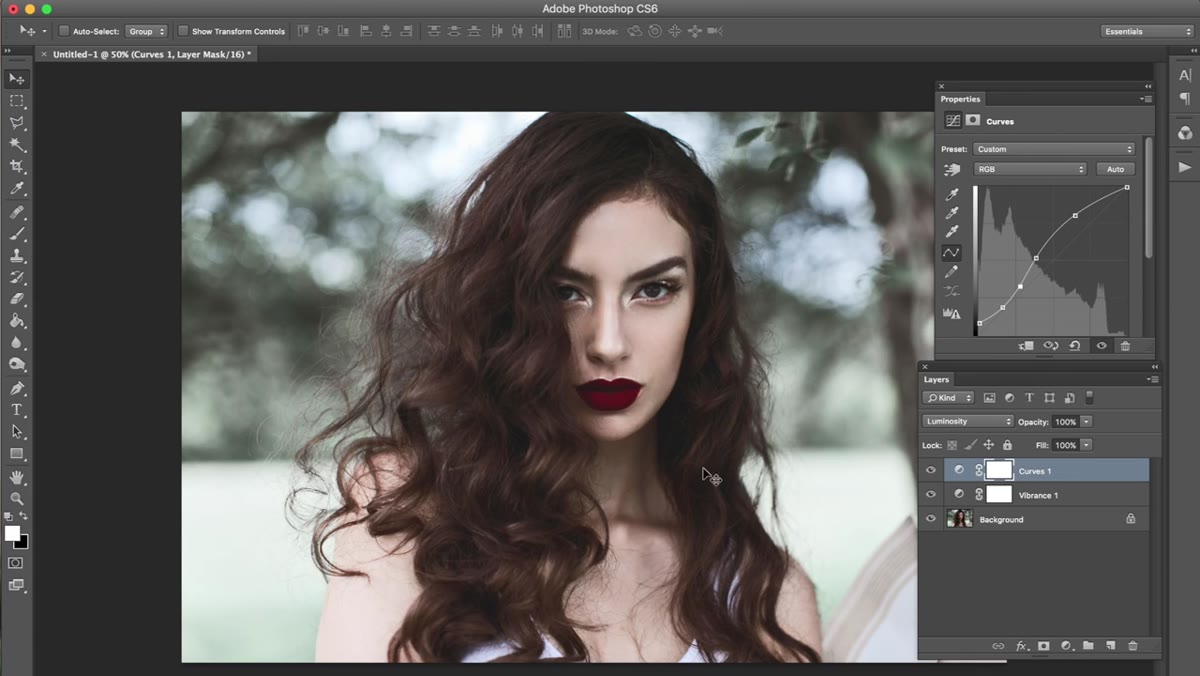 Curves adjustment layer with blend mode set to Luminosity
Here Jessica adds a Curves adjustment layer and sculpts the tone curve, then changes the layer’s blend mode from Normal to Luminosity. This is one of those blend mode choices that feels like a small thing and turns out to matter a lot. Luminosity mode means the curve affects brightness only, without shifting the underlying colors. The result is that highlights get brighter without going green or magenta, which is exactly what a curve applied in Normal mode would risk on complex skin tones.
Curves adjustment layer with blend mode set to Luminosity
Here Jessica adds a Curves adjustment layer and sculpts the tone curve, then changes the layer’s blend mode from Normal to Luminosity. This is one of those blend mode choices that feels like a small thing and turns out to matter a lot. Luminosity mode means the curve affects brightness only, without shifting the underlying colors. The result is that highlights get brighter without going green or magenta, which is exactly what a curve applied in Normal mode would risk on complex skin tones.
She sets this layer’s opacity to around 73% as well. The key takeaway here is that Curves in Luminosity mode is almost always safer for portraits than Curves in Normal mode when you’re brightening or lifting highlights. If you’ve ever had a curves adjustment make your whites look weirdly warm or cool, switching to Luminosity is likely to fix it immediately.
Step 3: Use Selective Color to Shift the Underlying Tones
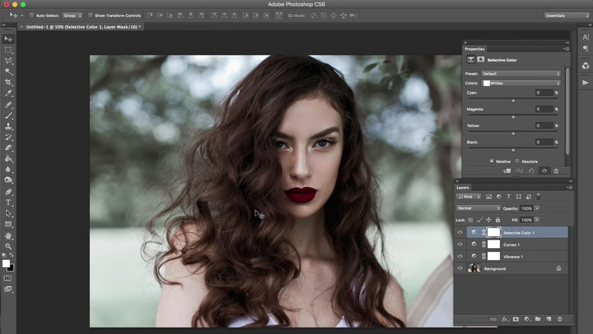 Selective Color panel open showing Reds and Neutrals tabs
Selective Color is where the cool tone really starts to take shape. Jessica hits the Reds channel first and pushes Blacks up by around +38. Then she moves into the Neutrals channel and makes adjustments there as well. Her most frequently used tabs, by her own account, are Reds, Yellows, Whites, Neutrals, and Blacks. She rarely touches Greens unless there’s foliage in the frame.
Selective Color panel open showing Reds and Neutrals tabs
Selective Color is where the cool tone really starts to take shape. Jessica hits the Reds channel first and pushes Blacks up by around +38. Then she moves into the Neutrals channel and makes adjustments there as well. Her most frequently used tabs, by her own account, are Reds, Yellows, Whites, Neutrals, and Blacks. She rarely touches Greens unless there’s foliage in the frame.
The Neutrals and Blacks tabs are worth serious experimentation. Neutrals affect the midtone range, which on a portrait is a huge chunk of the image including most of the face. Pulling the Cyan slider up in Neutrals, for instance, will cool the skin without touching the brightest highlights or deepest shadows. You can make enormous tonal shifts here with small numerical moves. Jessica drops the Selective Color layer’s opacity to 75% and keeps the mode on Normal. That opacity reduction is the same principle as before, softening the adjustment so it reads as a grade rather than a filter.
Step 4: Add a Second Curves Layer, Again in Luminosity Mode
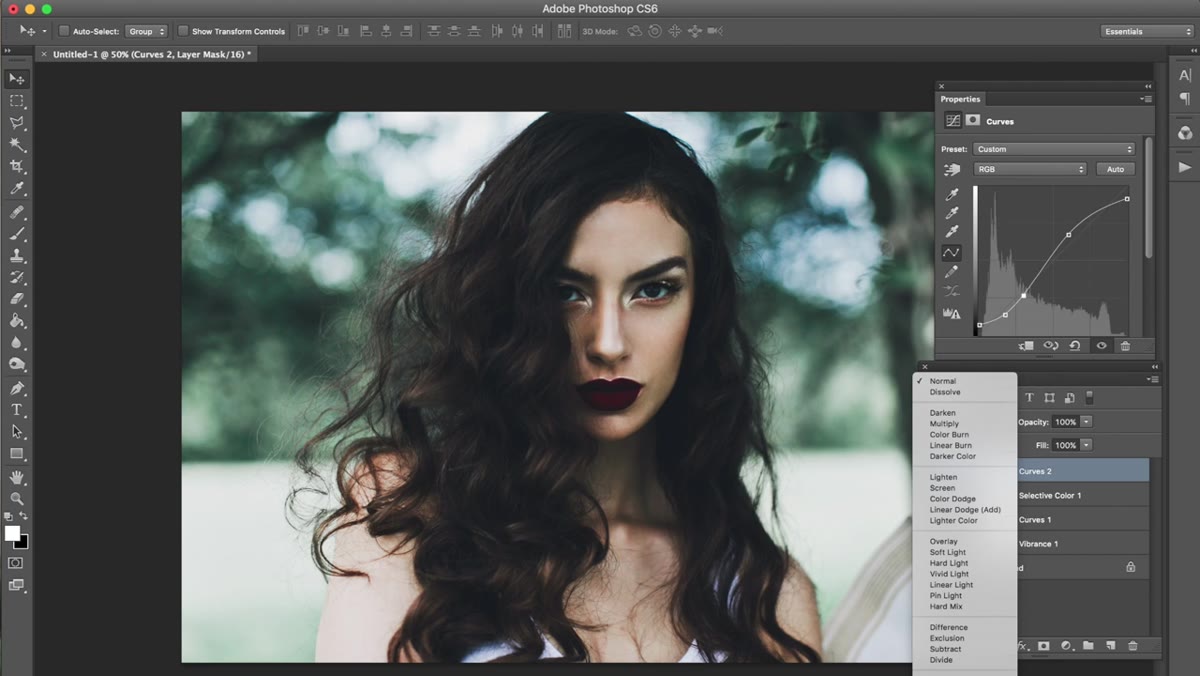 Second Curves layer applied with Luminosity blend mode at 50% opacity
A second Curves adjustment layer comes in here, shaped similarly to the first but set to Luminosity mode and dropped to 50% opacity. The lower opacity means this layer is doing half as much work as it might otherwise, which after the first Curves pass is exactly right. Stacking two lighter Curves adjustments in Luminosity gives you more graduated control than one heavier one. You can turn either layer off independently to see its contribution, and you can adjust their opacities relative to each other to shift the balance.
Second Curves layer applied with Luminosity blend mode at 50% opacity
A second Curves adjustment layer comes in here, shaped similarly to the first but set to Luminosity mode and dropped to 50% opacity. The lower opacity means this layer is doing half as much work as it might otherwise, which after the first Curves pass is exactly right. Stacking two lighter Curves adjustments in Luminosity gives you more graduated control than one heavier one. You can turn either layer off independently to see its contribution, and you can adjust their opacities relative to each other to shift the balance.
The result Jessica is after at this stage is reduced harshness in the contrast. The image should feel dark but not crunched, with detail still visible in the shadows. If you get to this point and the shadows feel blocked up, try pulling the black point of the lower Curves layer up slightly rather than reducing opacity.
Step 5: Introduce Subtle Yellow with the Blue Curve
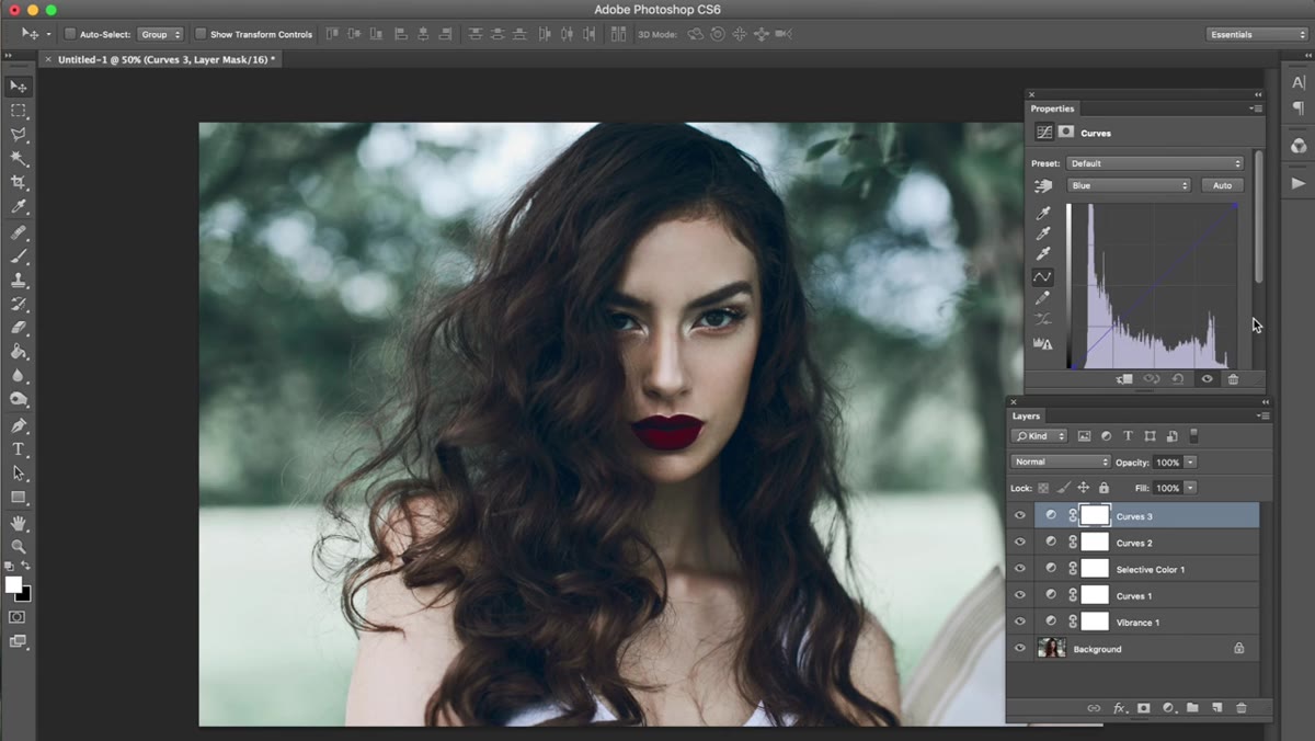 Curves panel showing Blue channel selected with slight downward pull
This step is easy to miss and it’s one of the more interesting choices in the edit. Jessica opens a third Curves layer and navigates to the Blue channel specifically. She pulls the curve down very slightly. Pulling Blue down in a Curves layer adds yellow, because blue and yellow are opposing values in the RGB model. The amount here is genuinely small, almost imperceptible at full zoom.
Curves panel showing Blue channel selected with slight downward pull
This step is easy to miss and it’s one of the more interesting choices in the edit. Jessica opens a third Curves layer and navigates to the Blue channel specifically. She pulls the curve down very slightly. Pulling Blue down in a Curves layer adds yellow, because blue and yellow are opposing values in the RGB model. The amount here is genuinely small, almost imperceptible at full zoom.
The reason this works is that a tiny warmth signal in the shadows keeps the image from reading as clinical. Pure cool tones without any counterbalance can look like a camera white balance error rather than an intentional grade. A trace of yellow in the right place tells the viewer’s eye that the coolness is deliberate. It’s the same reason colorists in film often leave a touch of complementary color in the shadows even on a heavily color-graded look.
What I’d Add From My Own Workflow
Photoshop’s adjustment layer approach here is sound, and I run similar stacks when I’m doing heavy compositing work. But for single-image portrait grades, I tend to do a lot of this same logic in Lightroom using the HSL panel and the Tone Curve, then bring the file into Photoshop only if I need Selective Color’s granularity. Selective Color in Photoshop genuinely has finer per-channel control than anything in Lightroom’s color panel, and for portraits where you need to separate the reds in skin from the reds in a background element, there’s no substitute.
One thing worth adding to Jessica’s workflow: if you’re doing this kind of cool grade and you have warm catchlights in the eyes, they can become a distraction. A small masked Hue/Saturation layer targeting just the yellow-orange range, applied only to the eyes, can bring those catchlights into alignment with the rest of the image without affecting skin anywhere else. It’s a two-minute addition that makes the finished image feel considered all the way through.
The biggest thing I took from this tutorial is the confidence to stack multiple Curves layers in Luminosity mode at reduced opacity rather than trying to do everything in one curve. Precision beats efficiency every time when you’re working on a face. Watch the full tutorial on YouTube to see Jessica’s exact curve shapes and the before/after that ties it all together.
Comments
Leave a Comment