There’s a reason film photography has seen a massive revival: film looks beautiful. The colors, grain, and tonal characteristics of classic film stocks have a quality that digital images straight out of camera don’t naturally have.
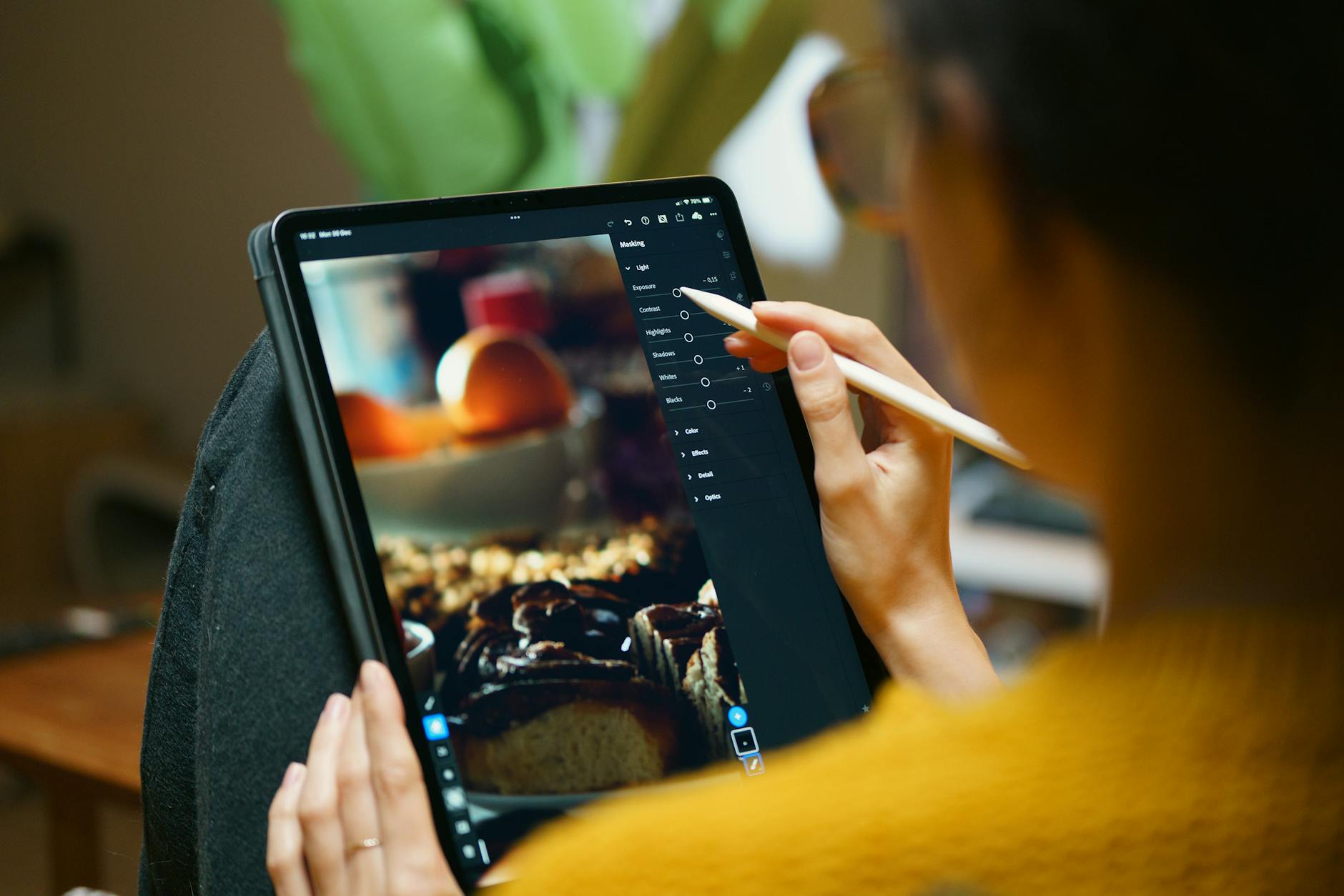
But you don’t need to shoot film to get the look. Lightroom can convincingly emulate the characteristics of popular film stocks if you understand what makes each one distinctive.
What Makes Film Look Like Film
Several characteristics separate film rendering from digital:
Lifted blacks. Film rarely produces pure black. Even in deep shadows, there’s a slight density that prevents true black. This creates a “faded” or “matte” quality that feels softer than digital’s hard blacks.
Non-linear color response. Film doesn’t capture colors linearly the way digital sensors do. Different film stocks have different color biases — some shift blues toward cyan, some warm up skin tones, some desaturate greens. These characteristic shifts give each film stock its personality.
Grain. Film grain is organic and varies with exposure — shadows have more visible grain than highlights. Digital noise, by contrast, is uniform and electronic-looking.
Highlight rolloff. Film transitions from bright to blown-out gradually, preserving a pleasing gradation. Digital sensors clip abruptly. This smooth highlight rolloff is one of film’s most loved characteristics.
Portra 400: The Portrait Standard
Kodak Portra 400 is beloved for its warm skin tones, fine grain, and forgiving latitude. Here’s how to approximate it:
- Tone Curve: Lift the shadow end point to about 15-20%. This creates the matte black look. Gently compress the highlights by pulling the top point down slightly.
- White Balance: Shift +300-500K warm, +5 tint toward magenta.
- HSL: Shift orange hue toward yellow by -5. Increase orange and yellow saturation by +10. Desaturate blues by -15.
- Color Grading: Shadows toward warm amber (hue 40, saturation 10). Highlights toward warm cream (hue 45, saturation 5).
- Grain: Amount 25, Size 30, Roughness 50.
Ektar 100: Vivid Landscapes
Kodak Ektar is known for extremely vivid, saturated colors and fine grain. It’s the opposite of Portra’s subtlety.
- Tone Curve: Classic S-curve with moderate contrast. Don’t lift the blacks — Ektar has deep, rich shadows.
- Vibrance: +25 to +35. Ektar is saturated but not garish.
- HSL: Boost blue saturation +20, shift blue hue toward cyan -10. Boost green saturation +15. Boost red saturation +10.
- Clarity: +10 to +15 for the crisp, detailed look Ektar is known for.
- Grain: Amount 10, Size 20, Roughness 40. Ektar is a fine-grain film.
Tri-X 400: Classic Black and White
Kodak Tri-X is the most iconic black and white film, known for punchy contrast and distinctive grain.
- Convert to black and white using the B&W panel. Set Red to 50, Orange to 60, Yellow to 40, Green to 30, Aqua to 20, Blue to 10.
- Tone Curve: Strong S-curve. Pull shadows down, push highlights up. Tri-X is contrasty.
- Lift the black point slightly — just 5-10%. Tri-X has depth but not crushed blacks.
- Clarity: +20 to +30. Tri-X renders with visible grit and edge contrast.
- Grain: Amount 40, Size 35, Roughness 60. Tri-X grain is distinctive and visible — it’s part of the aesthetic.
Fuji 400H: Soft Pastels
Fuji 400H was known for its soft, pastel rendering and slightly cool tone. Widely used in wedding photography.
- Tone Curve: Lift blacks to 15-20%. Gentle, flat midtones — reduce midtone contrast.
- White Balance: Shift slightly cool, -100 to -200K.
- HSL: Desaturate everything by -10 to -15 across the board. Shift greens toward teal. Shift orange toward peach (more yellow).
- Color Grading: Shadows toward cool blue (hue 220, saturation 8). Highlights toward pale green (hue 150, saturation 5).
- Grain: Amount 20, Size 25, Roughness 45.
Tips for Convincing Emulation
Match the grain to the ISO. Film grain varies with speed. ISO 100 films have very fine grain. ISO 400 is moderate. ISO 3200 is heavy. Adjust your Lightroom grain accordingly.
Don’t over-process. Film has a natural, unstressed quality. Heavy clarity, extreme saturation, or over-sharpening breaks the illusion. Film looks effortless.
Study real film scans. Find actual scans of the film stock you’re emulating and compare side by side. The comparison will reveal where your emulation needs tweaking.
Comments (5)
Mostly agree, though I've had better results doing step 2 before step 1.
Short, practical, and to the point. More of this please.
Tried the first three steps and already saw improvement. Can't wait to nail the rest.
Subscribed after reading this. Looking forward to more content like this.
Thanks for reading, Paul Henderson!
Leave a Comment