There’s a specific kind of RAW file that shows up in my Lightroom catalog way too often. The exposure is fine, the focus is sharp, the composition is solid. And yet the image sits there looking like a stock photo of nowhere in particular. No weight. No atmosphere. Just a technically correct photograph that nobody would ever stop scrolling for. If you shoot landscapes, you know exactly what I’m talking about.
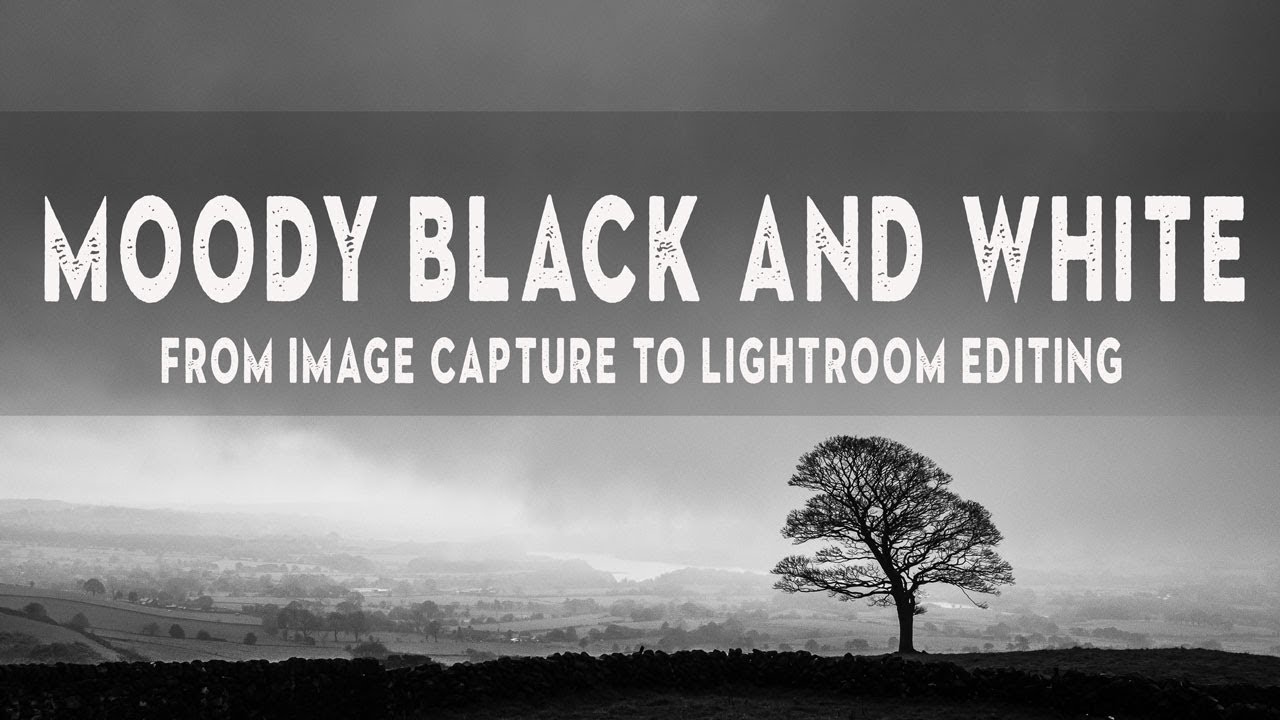
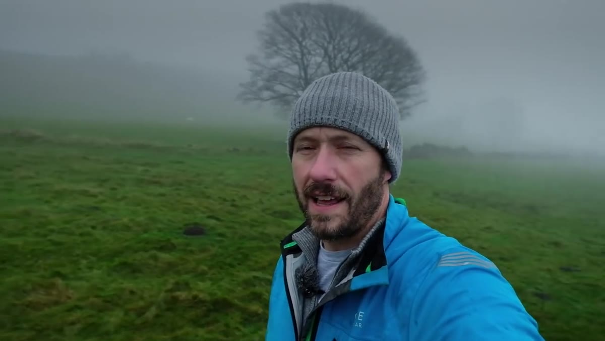
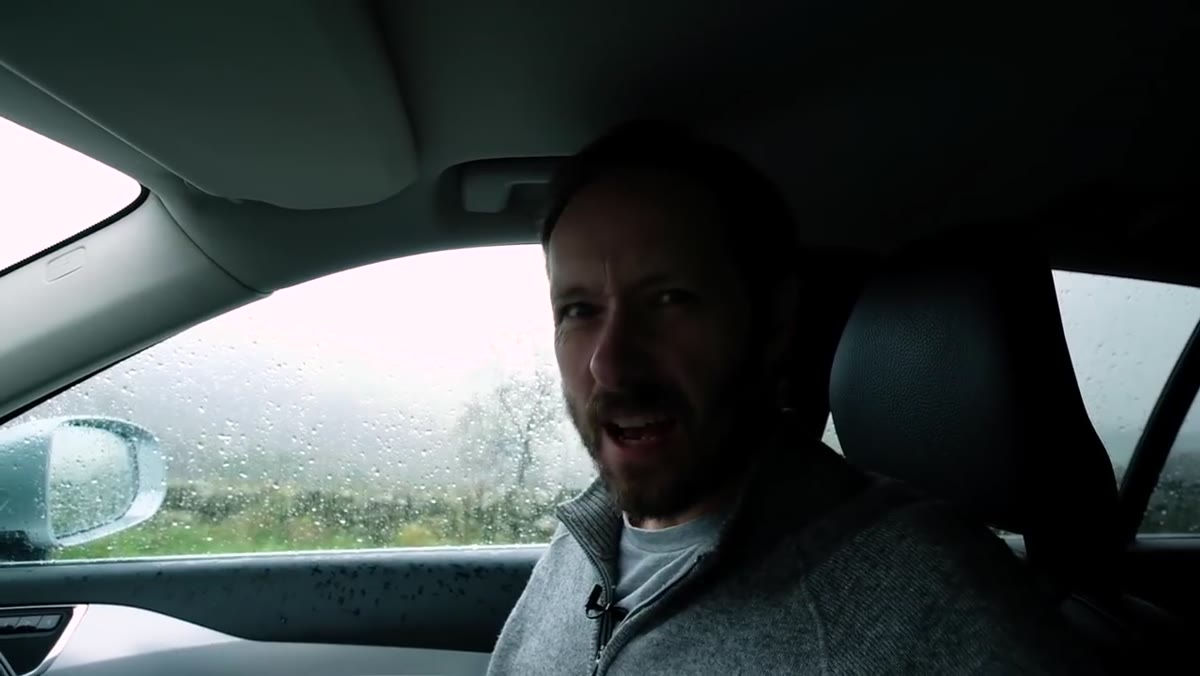
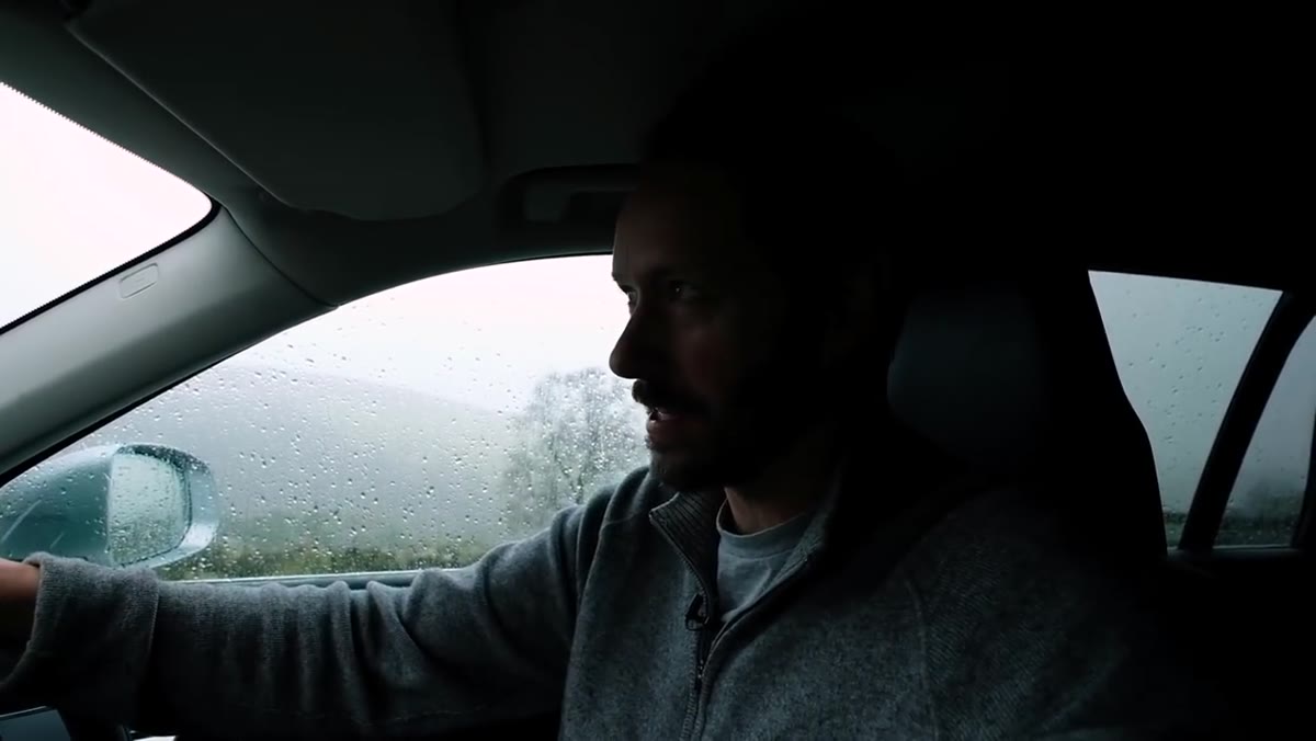
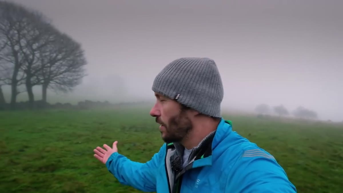
The fix usually isn’t a better camera or a more dramatic location. It’s knowing what emotional story you’re trying to tell before you touch a slider. That realization is at the core of Watch the full tutorial on YouTube — a tutorial by landscape photographer Nigel Danson where he shoots in genuinely miserable British weather, rain hammering his lens, fog rolling across the Peak District, and then turns that chaos into a stunning black and white image inside Lightroom. The whole thing is equal parts field documentary and editing masterclass, and it pushed me to rethink how I approach moody conversions.
What makes Danson’s approach worth studying isn’t just the settings he lands on. It’s the through line from the feeling he chased on location to every decision he makes in post. The edit serves the moment he was standing in. That’s rarer than it sounds.
Step 1: Nail Your Exposure Foundation in Basic Panel
 Lightroom Basic panel with RAW file loaded
Before anything else, Danson sets a clean exposure baseline. The goal here isn’t to make the image look good yet. It’s to give yourself honest raw material to work with. Bring highlights down enough to recover any blown sky detail. Lift shadows just enough to see what’s actually in the darker areas of the frame. Don’t crush blacks yet and don’t boost whites. You’re mapping the tonal range, not making creative decisions.
Lightroom Basic panel with RAW file loaded
Before anything else, Danson sets a clean exposure baseline. The goal here isn’t to make the image look good yet. It’s to give yourself honest raw material to work with. Bring highlights down enough to recover any blown sky detail. Lift shadows just enough to see what’s actually in the darker areas of the frame. Don’t crush blacks yet and don’t boost whites. You’re mapping the tonal range, not making creative decisions.
A mistake I see constantly in reader submissions is people doing their creative grading on top of a poorly balanced exposure. Then when they share the file, the histogram is stacked against one wall like furniture in a storage unit. Start flat and even, and the rest of the process gets dramatically easier.
Step 2: Convert to Black and White Using the HSL Panel, Not a Preset
 HSL/Color panel showing B&W mix sliders
Danson converts to black and white by going into the HSL panel and switching to the B&W mix, rather than just clicking “Black and White” in the Basic panel and calling it done. This gives you per-channel luminance control, which is the actual power move. Dropping the blue channel darkens a grey sky into something threatening. Lifting the green channel separates foliage from mid-tones so your trees don’t disappear into a muddy grey mass.
HSL/Color panel showing B&W mix sliders
Danson converts to black and white by going into the HSL panel and switching to the B&W mix, rather than just clicking “Black and White” in the Basic panel and calling it done. This gives you per-channel luminance control, which is the actual power move. Dropping the blue channel darkens a grey sky into something threatening. Lifting the green channel separates foliage from mid-tones so your trees don’t disappear into a muddy grey mass.
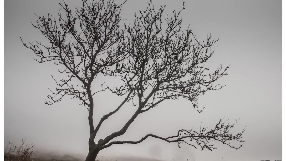
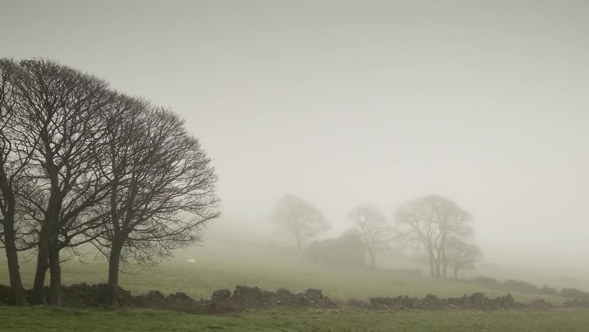
For a moody landscape like Danson’s foggy Peak District scene, pulling the blue and aqua channels down while keeping greens relatively elevated creates that classic dramatic tension where the sky feels heavy but the land still has structure. Experiment with the orange and red channels if there’s any warm tonal information in your image because those affect skin tones in portraits but rock and earth tones in landscapes.
Step 3: Shape the Light With the Tone Curve
 Tone Curve panel with an S-curve applied
Once your B&W conversion is in a good place, the tone curve is where the mood really gets locked in. Danson uses an S-curve with emphasis on deepening the lower midtones rather than just crushing the blacks. There’s a meaningful difference. Crushing blacks makes everything dark look the same. Deepening lower midtones preserves separation in the shadows while still giving the image weight and drama.
Tone Curve panel with an S-curve applied
Once your B&W conversion is in a good place, the tone curve is where the mood really gets locked in. Danson uses an S-curve with emphasis on deepening the lower midtones rather than just crushing the blacks. There’s a meaningful difference. Crushing blacks makes everything dark look the same. Deepening lower midtones preserves separation in the shadows while still giving the image weight and drama.
Pull the bottom anchor point up slightly off the absolute floor to lift the shadow floor and prevent pure black clipping. Then add a subtle pull-down point in the lower quarter of the curve. This is what creates that rich, filmic darkness without looking like you ran an Ansel Adams preset from 2011. The upper midtones and highlights can stay relatively untouched or receive a slight lift to keep luminosity in the fog and mist.
Step 4: Use Local Adjustments to Direct the Eye
 Radial or Graduated Filter applied to sky area
Global adjustments only get you so far. Danson uses graduated filters and radial filters to push specific areas of the frame toward his intended mood without affecting the whole image. In a scene with fog and mist, this matters a lot because the atmospheric depth is doing a lot of compositional work, and you don’t want to flatten it by applying uniform adjustments everywhere.
Radial or Graduated Filter applied to sky area
Global adjustments only get you so far. Danson uses graduated filters and radial filters to push specific areas of the frame toward his intended mood without affecting the whole image. In a scene with fog and mist, this matters a lot because the atmospheric depth is doing a lot of compositional work, and you don’t want to flatten it by applying uniform adjustments everywhere.
A graduated filter pulling down exposure and adding contrast across the upper sky area makes the heaviness of the storm clouds feel real without touching the mid-ground trees. A subtle radial filter can then lift exposure slightly on a focal point like a lone tree to keep the viewer’s eye anchored. These are small moves but they’re the difference between an image that reads clearly and one that just looks dark.
Step 5: Add Texture and Clarity Selectively
 Texture and Clarity sliders in local adjustment panel
Clarity and Texture in Lightroom are powerful and easy to overdo globally. Danson’s approach uses them locally, applying texture boosts to specific structural elements like tree bark or dry stone walls rather than pumping them across the entire frame. This keeps the misty atmospheric areas soft and ethereal while giving the subject tactile detail that grounds the image.
Texture and Clarity sliders in local adjustment panel
Clarity and Texture in Lightroom are powerful and easy to overdo globally. Danson’s approach uses them locally, applying texture boosts to specific structural elements like tree bark or dry stone walls rather than pumping them across the entire frame. This keeps the misty atmospheric areas soft and ethereal while giving the subject tactile detail that grounds the image.
Set Clarity around +15 to +25 on the foreground subject using a local brush. Keep the sky and fog areas at or near zero for Clarity. For Texture, you can go slightly higher on rough surfaces. The result is an image with a clear hierarchy: soft where the mood lives, detailed where the eye should land.
Step 6: Finish With Vignette and Grain
 Effects panel showing Vignette and Grain settings
Danson finishes by adding a subtle post-crop vignette and a touch of grain. The vignette doesn’t need to be heavy. Midpoint around 50, Feather around 80, and Amount somewhere between -10 and -25 depending on the image. This gently compresses the edges and keeps attention centered without looking like you dropped a black circle on your photo.
Effects panel showing Vignette and Grain settings
Danson finishes by adding a subtle post-crop vignette and a touch of grain. The vignette doesn’t need to be heavy. Midpoint around 50, Feather around 80, and Amount somewhere between -10 and -25 depending on the image. This gently compresses the edges and keeps attention centered without looking like you dropped a black circle on your photo.
Grain is the thing most people skip, but for black and white work it genuinely matters. A fine grain structure with Size around 20 and Roughness around 50 gives the image a tactile quality that reads as intentional rather than digitally sterile. It also unifies the tones across the frame so smooth areas don’t look artificially clean compared to detailed areas.
One Thing I’d Add: Start With the Emotion, Not the Sliders
Danson does something in the field portion of this video that most editing tutorials skip entirely. He talks about wanting to capture the mood of the day before he ever shows a Lightroom panel. He went out in genuinely brutal weather because the weather matched the feeling he wanted the image to carry. That’s not a technique you can add in post.
I’ve been guilty of approaching editing the other way around. Opening a file and going straight for the tools, hoping a dramatic preset will inject feeling into something that was shot on a flat, forgettable afternoon. It rarely works. The edits Danson makes are only convincing because the raw material already had the atmosphere baked into it. The Lightroom work is just revealing what was already there. Next time you’re planning a shoot, ask what mood you’re after before you ask what location. The edit gets a lot easier when you know the answer.
The single most important thing this tutorial taught me is that black and white conversion is a tonal sculpting process, not a desaturation step. Every channel in the B&W mix panel is a creative decision. Every curve adjustment is an emotional statement. When you treat it that way, the images stop looking like technically correct photographs and start looking like something someone felt.
Watch the full tutorial on YouTube and pay attention to how Danson talks about the scene while he’s still outside in the rain. That context makes the editing decisions make complete sense.
Comments
Leave a Comment