
There’s a specific kind of photo that shows up in my editing queue more than any other: technically fine, emotionally flat. Good composition, bad light, shot at the wrong time of day. The kind of image where you know something is there but the raw file just doesn’t show it yet. For years I’d muscle through these with heavy-handed contrast moves that never quite worked. Then I started paying closer attention to how editors like Matt Kloskowski approach the problem, and it shifted the way I think about the entire process.
In this Matt Kloskowski tutorial, he takes three viewer-submitted photos through a full Lightroom and Photoshop treatment. The first image is a cluttered outdoor scene with blown highlights, no golden-hour warmth, and a lot competing for your eye. It’s exactly the kind of shot most people would either over-edit into oblivion or abandon entirely. What he does instead is methodical, honest, and genuinely useful. Here’s how the whole thing breaks down.
Step 1: Establish Warmth Before Anything Else
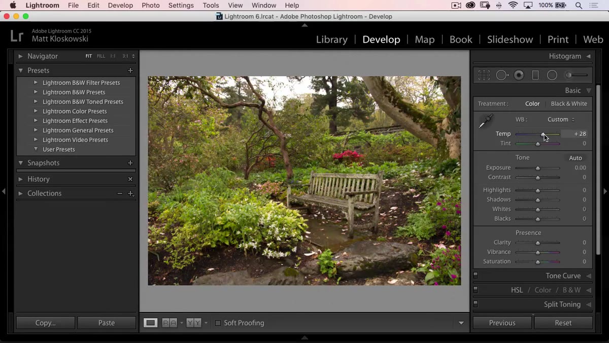 Temperature slider being pushed warmer in the Basic panel
The first move Matt makes isn’t exposure, it isn’t contrast. It’s temperature. He pushes the temperature slider warm immediately, and the logic is worth internalizing: when a scene is visually cluttered, warmth acts as a unifying element. It gives the eye something to latch onto emotionally before it starts sorting through the chaos of detail. Cold, neutral light in a busy frame just reads as noise. A warmer cast starts to suggest a story, even if the light wasn’t actually there when the shutter clicked.
Temperature slider being pushed warmer in the Basic panel
The first move Matt makes isn’t exposure, it isn’t contrast. It’s temperature. He pushes the temperature slider warm immediately, and the logic is worth internalizing: when a scene is visually cluttered, warmth acts as a unifying element. It gives the eye something to latch onto emotionally before it starts sorting through the chaos of detail. Cold, neutral light in a busy frame just reads as noise. A warmer cast starts to suggest a story, even if the light wasn’t actually there when the shutter clicked.
This is the kind of decision that separates editing from processing. Processing would be correcting the white balance to neutral. Editing is asking what the photo needs to feel right, and then using the tools to get there.
Step 2: Set Whites and Blacks with Alt/Option Click
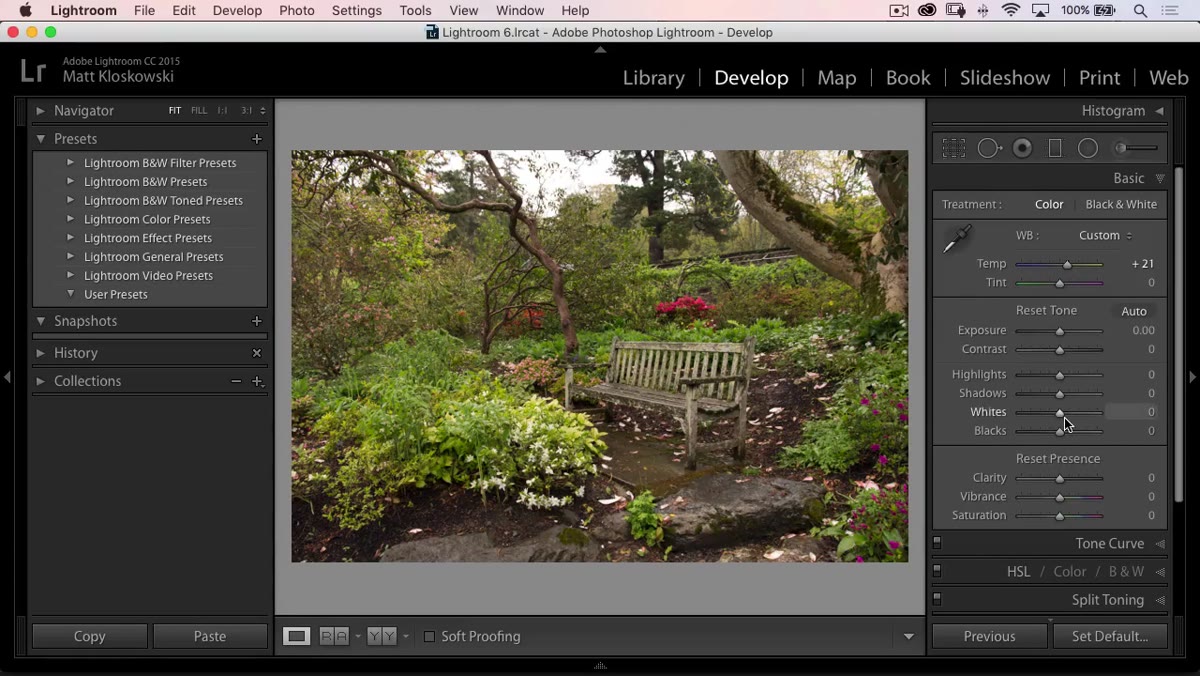 Whites and Blacks sliders with Alt-click clipping overlay visible
Matt’s whites and blacks technique is one I use on almost every single image, and if you’re not doing it this way, you’re guessing. Hold Alt on Windows or Option on Mac while dragging the Whites slider and the canvas goes black. Any area that shows up as white is clipping. You push until you see clipping, then back off just enough. Repeat for Blacks, but drag left instead, watching for areas to appear in the black canvas that indicate crushed shadow detail.
Whites and Blacks sliders with Alt-click clipping overlay visible
Matt’s whites and blacks technique is one I use on almost every single image, and if you’re not doing it this way, you’re guessing. Hold Alt on Windows or Option on Mac while dragging the Whites slider and the canvas goes black. Any area that shows up as white is clipping. You push until you see clipping, then back off just enough. Repeat for Blacks, but drag left instead, watching for areas to appear in the black canvas that indicate crushed shadow detail.
In this particular shot, the sky is already blown out and there’s nothing recoverable there. Matt acknowledges this directly and doesn’t waste time trying to pull back highlights that don’t exist. That kind of editorial restraint is something worth practicing. Not every problem has a Lightroom solution, and trying to force one usually makes the image look worse.
Step 3: Crop Strategically, but Leave Room for Photoshop
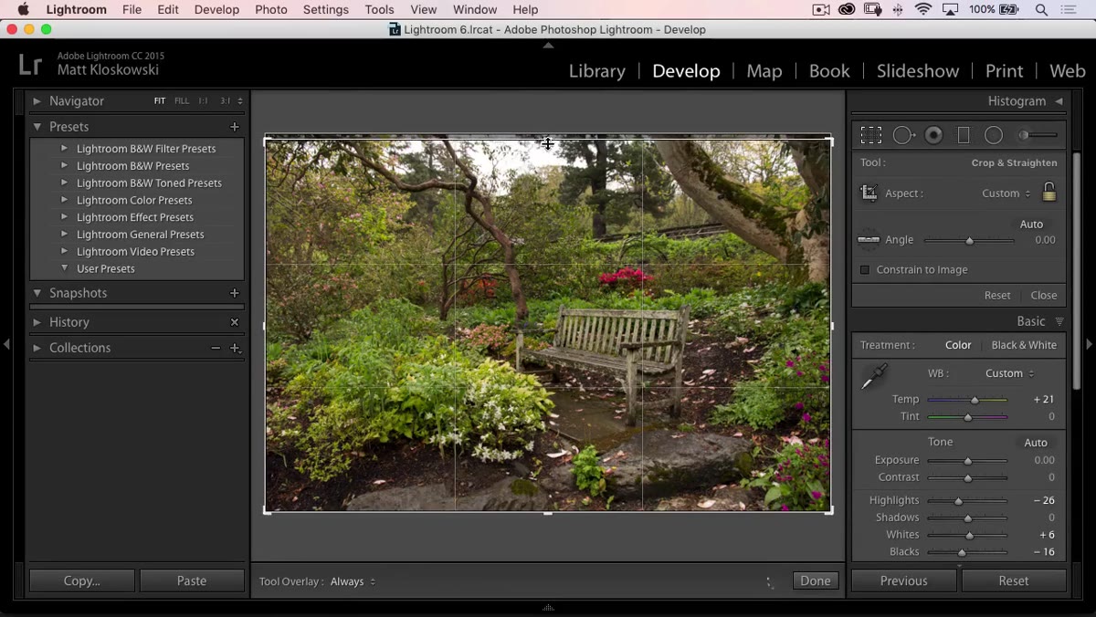 Crop tool active with top of frame being pulled down
The blown-out sky needs to go, mostly. Matt pulls the crop down from the top to eliminate the worst of it, but he deliberately leaves a sliver of that overexposed area in the frame. This seems counterintuitive until he explains why: he’s planning to use a lens flare overlay in Photoshop, and that overlay will need a bright anchor point at the top of the frame to look convincing. Cropping it completely would remove the very thing that makes the effect believable.
Crop tool active with top of frame being pulled down
The blown-out sky needs to go, mostly. Matt pulls the crop down from the top to eliminate the worst of it, but he deliberately leaves a sliver of that overexposed area in the frame. This seems counterintuitive until he explains why: he’s planning to use a lens flare overlay in Photoshop, and that overlay will need a bright anchor point at the top of the frame to look convincing. Cropping it completely would remove the very thing that makes the effect believable.
He also brings the crop in slightly from the right side to tighten the composition. Both moves are quick, purposeful, and tied to a plan that extends beyond Lightroom. That kind of forward-thinking is what makes the difference between an edit that holds together and one that looks like a series of disconnected adjustments.
Step 4: Sharpen to the Edge of Crunchy, Then Pull Back
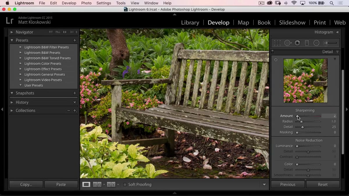 Detail panel open with Sharpening slider being adjusted at 100% zoom
Matt’s sharpening approach is refreshingly simple: zoom to 100%, increase the Amount slider until the image starts to look crunchy or artificial, then back off. That threshold varies by image, but the process of finding it visually rather than hitting a preset number is genuinely more reliable. For a scene with lots of fine detail, he keeps the Radius low. A high radius with complex textures creates halos around edges and that processed look that ages badly.
Detail panel open with Sharpening slider being adjusted at 100% zoom
Matt’s sharpening approach is refreshingly simple: zoom to 100%, increase the Amount slider until the image starts to look crunchy or artificial, then back off. That threshold varies by image, but the process of finding it visually rather than hitting a preset number is genuinely more reliable. For a scene with lots of fine detail, he keeps the Radius low. A high radius with complex textures creates halos around edges and that processed look that ages badly.
He skips noise reduction on this image because the shot doesn’t need it. This is another underrated editing skill, knowing when to leave a panel alone. Every slider you touch has a cost. Unnecessary noise reduction softens micro-detail. Unnecessary sharpening creates artifacts. The default position should always be “do I actually need this,” not “what’s my standard setting.”
Step 5: Use a Radial Filter Instead of the Vignette Slider
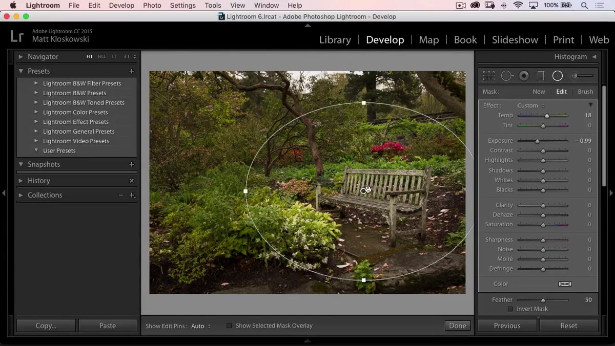
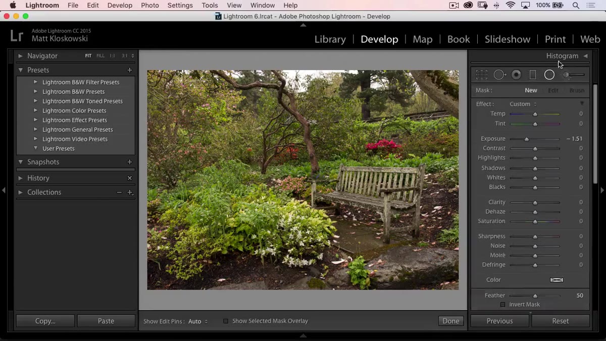 Radial filter being dragged over the center of the image
The built-in vignette in Lightroom’s Effects panel is convenient but blunt. It darkens from the edges toward the center geometrically, and on a wide or asymmetrical composition it can look obvious and stiff. Matt reaches for the Radial Filter instead, dropping exposure on the outside of an ellipse he places over the focal point of the scene. The result is a vignette that follows the actual subject rather than the mathematical center of the frame.
Radial filter being dragged over the center of the image
The built-in vignette in Lightroom’s Effects panel is convenient but blunt. It darkens from the edges toward the center geometrically, and on a wide or asymmetrical composition it can look obvious and stiff. Matt reaches for the Radial Filter instead, dropping exposure on the outside of an ellipse he places over the focal point of the scene. The result is a vignette that follows the actual subject rather than the mathematical center of the frame.
He also adds a slight warmth boost inside the radial filter while he’s there, which reinforces the temperature work from Step 1 at the exact point where the viewer’s eye should land. Small move, meaningful result.
Step 6: Add a Fake Lens Flare in Photoshop Using Overlays
 Photoshop open with a lens flare overlay being placed on the image
This is the step that most people don’t realize is happening in polished photography. Matt opens the image in Photoshop, duplicates the layer, and then brings in a lens flare or light leak overlay from a stock library. He mentions Adobe Stock and a site called Belleview Avenue as sources for these kinds of textures. The overlay gets blended into the image, anchored to that bright upper area of the frame he was careful to preserve during the crop step.
Photoshop open with a lens flare overlay being placed on the image
This is the step that most people don’t realize is happening in polished photography. Matt opens the image in Photoshop, duplicates the layer, and then brings in a lens flare or light leak overlay from a stock library. He mentions Adobe Stock and a site called Belleview Avenue as sources for these kinds of textures. The overlay gets blended into the image, anchored to that bright upper area of the frame he was careful to preserve during the crop step.
The effect, done right, looks like the image was taken with warm late-afternoon light filtering through the lens. It’s not deceptive, it’s a creative choice, the same category as dodging and burning or adding a gradient. It solves the original problem of the image: flat light in a cluttered scene. Warmth and lens character give it atmosphere that the original shooting conditions never provided.
What I’d Add From My Own Workflow
The radial filter move in Step 5 is solid, but I’ve started combining it with a slight saturation boost inside the ellipse rather than just an exposure and temperature adjustment. When you warm the center of a frame and bump saturation by even 5-10 points, the focal area starts to pop in a way that feels more organic than clarity or texture boosts. It reads as light, not sharpening. Try it on any image where the subject feels a little lifeless against a background competing for attention.
The lens flare overlay technique is one I resisted for a long time because it felt like cheating. Then I started noticing it everywhere in editorial and commercial work and realized I was the only one still holding that position. If the result serves the image and the intent, the method doesn’t need defending.
The core lesson from this entire workflow is that every decision points toward the same goal: give a flat, difficult image a sense of light and atmosphere it didn’t have at capture. Temperature, radial filters, strategic cropping, and the overlay work in Photoshop are all different tools solving the same problem. When you see the edit that way, the choices stop feeling arbitrary and start feeling inevitable.
Watch the full tutorial on YouTube to see Matt’s complete treatment of all three photos, including the Photoshop overlay work in real time.
Comments (3)
Printing this out and pinning it next to my monitor. That good.
Wow, I had no idea you could do this. Mind blown.
I've watched a dozen tutorials on this and yours is the clearest by far.
Leave a Comment