There’s a specific kind of photo I used to dread editing. Not a disaster shot, not a total throwaway, but the mediocre middle-ground image. Flat light, a blown highlight somewhere it shouldn’t be, colors that look like they were processed through a wet sock. The kind of file where you open it in Lightroom, stare at it for thirty seconds, and then go make coffee instead. I’ve got a whole folder of those from the early years, back when I was editing press photos for my band because nobody else was going to do it.
What changed things for me was watching experienced editors work through exactly those kinds of files out loud. No cherry-picked hero shots, no dramatic before-and-after magic tricks. Just a real, imperfect image and a systematic process. In this Scott Kelby tutorial, that’s precisely what you get. Kelby is upfront that the photo isn’t great and won’t become great, but he walks through his full intermediate-level workflow anyway, which is honestly more instructive than watching someone polish an already-beautiful raw file. Watch the full tutorial on YouTube if you want to follow along in real time. Otherwise, here’s the full breakdown.
Step 1: Set the Camera Profile First
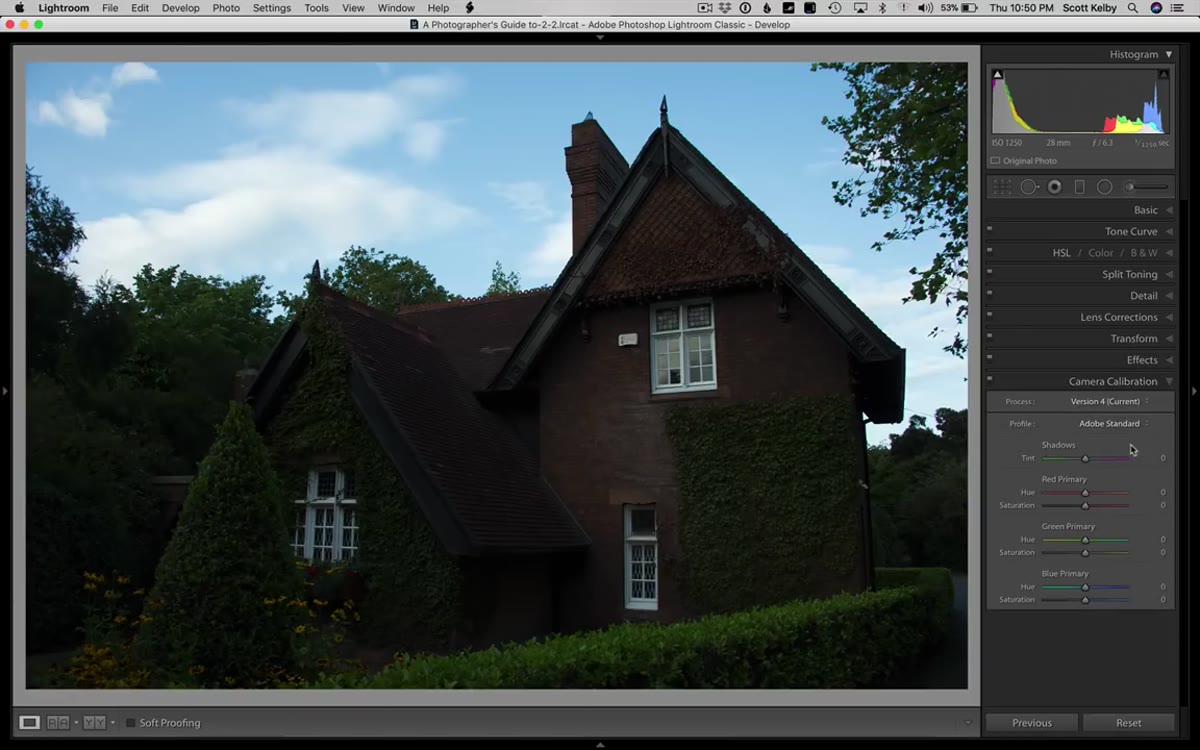 Camera Calibration panel open with profile options visible
Before touching a single slider, Kelby heads straight to the Camera Calibration panel and swaps out the default Adobe Standard profile for the Vivid profile. This is a foundational move that a lot of intermediate shooters skip because it feels like a minor cosmetic choice. It isn’t. The camera profile affects every tonal and color decision you make afterward. Adobe Standard is intentionally flat and neutral, which is fine if you’re building a complex grade from scratch. But for editorial and architectural work where you want punch and presence, starting on Vivid gives you a richer base and often means less work with the Vibrance and Saturation sliders later.
Camera Calibration panel open with profile options visible
Before touching a single slider, Kelby heads straight to the Camera Calibration panel and swaps out the default Adobe Standard profile for the Vivid profile. This is a foundational move that a lot of intermediate shooters skip because it feels like a minor cosmetic choice. It isn’t. The camera profile affects every tonal and color decision you make afterward. Adobe Standard is intentionally flat and neutral, which is fine if you’re building a complex grade from scratch. But for editorial and architectural work where you want punch and presence, starting on Vivid gives you a richer base and often means less work with the Vibrance and Saturation sliders later.
Step 2: Correct the Lens Before Anything Else
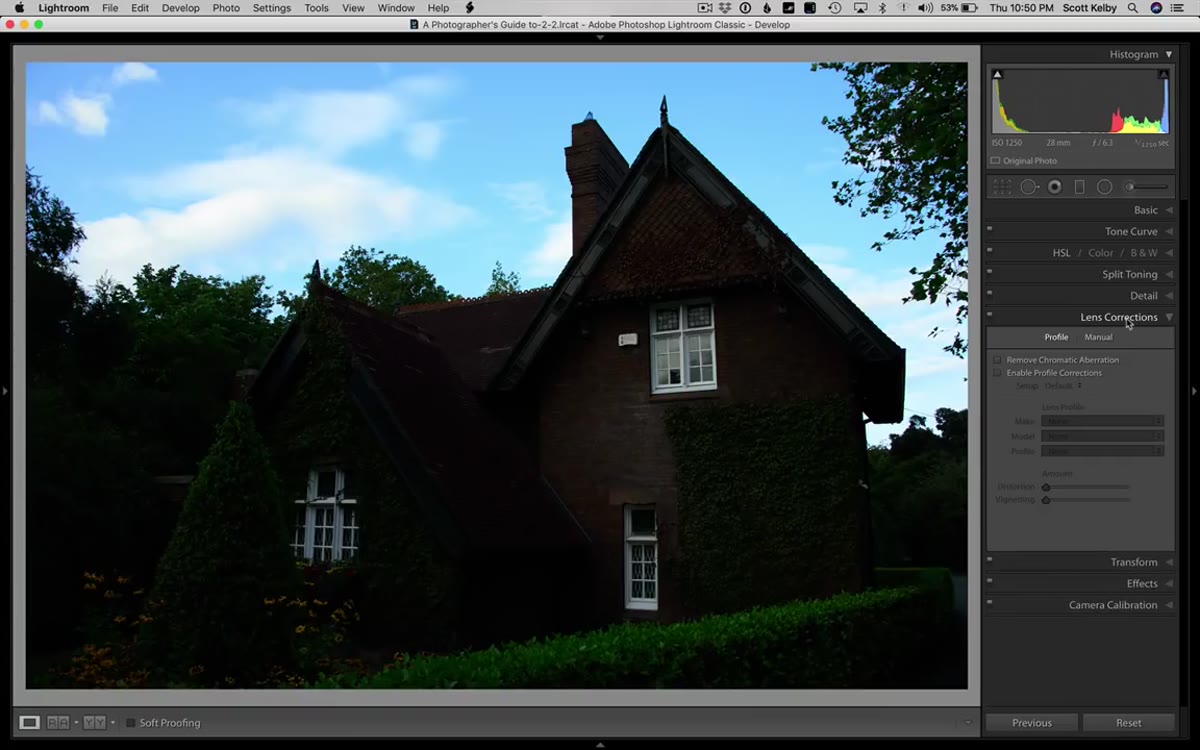 Lens Corrections panel with Enable Profile Corrections checked
With the color foundation set, the next move is lens corrections, and Kelby does this in two passes. First, he enables the lens profile for the camera, which removes the barrel distortion causing the image edges to bow outward. Then he jumps into the Transform panel and hits Auto, letting Lightroom geometrically straighten the perspective. The order matters here. You want the lens profile applied before you correct perspective, because the profile correction changes the actual shape of the image and can affect how Lightroom reads the geometry. Doing it in reverse can leave you chasing your own tail with the Transform sliders.
Lens Corrections panel with Enable Profile Corrections checked
With the color foundation set, the next move is lens corrections, and Kelby does this in two passes. First, he enables the lens profile for the camera, which removes the barrel distortion causing the image edges to bow outward. Then he jumps into the Transform panel and hits Auto, letting Lightroom geometrically straighten the perspective. The order matters here. You want the lens profile applied before you correct perspective, because the profile correction changes the actual shape of the image and can affect how Lightroom reads the geometry. Doing it in reverse can leave you chasing your own tail with the Transform sliders.
Step 3: Use Auto Tone as a Starting Point, Then Correct Its Mistakes
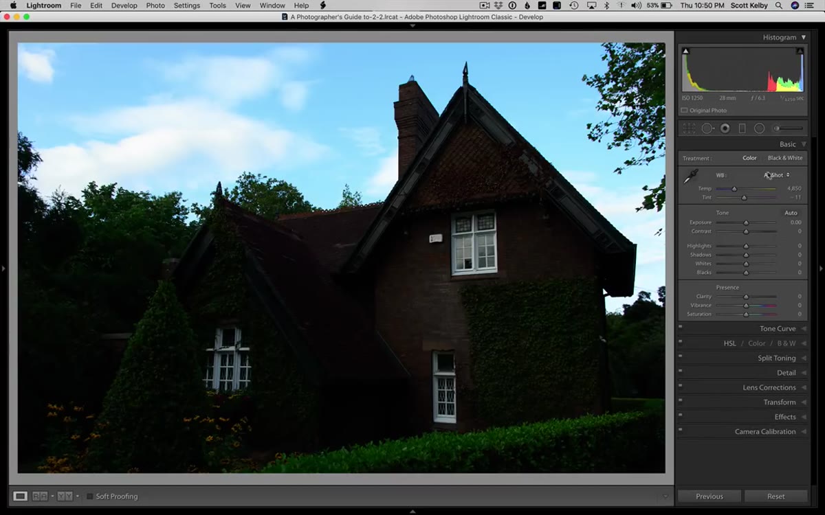 Basic panel after Auto button applied, shadows and contrast sliders visible
Kelby then does something that used to feel like cheating but doesn’t anymore: he hits the Auto button in the Basic panel. Lightroom’s AI-driven Auto has gotten genuinely useful over the last few versions. It’s not a finishing move, but it gets you to a reasonable ballpark faster than nudging sliders from scratch. The catch, and Kelby is specific about this, is that Auto tends to over-lift the Shadows and pull Contrast down too aggressively. His fix is simple: pull the Shadows back toward where they were and push a little Contrast back in. Think of Auto as a rough draft that you then edit, not a final answer.
Basic panel after Auto button applied, shadows and contrast sliders visible
Kelby then does something that used to feel like cheating but doesn’t anymore: he hits the Auto button in the Basic panel. Lightroom’s AI-driven Auto has gotten genuinely useful over the last few versions. It’s not a finishing move, but it gets you to a reasonable ballpark faster than nudging sliders from scratch. The catch, and Kelby is specific about this, is that Auto tends to over-lift the Shadows and pull Contrast down too aggressively. His fix is simple: pull the Shadows back toward where they were and push a little Contrast back in. Think of Auto as a rough draft that you then edit, not a final answer.
Step 4: Kill Chromatic Aberration in Lens Corrections
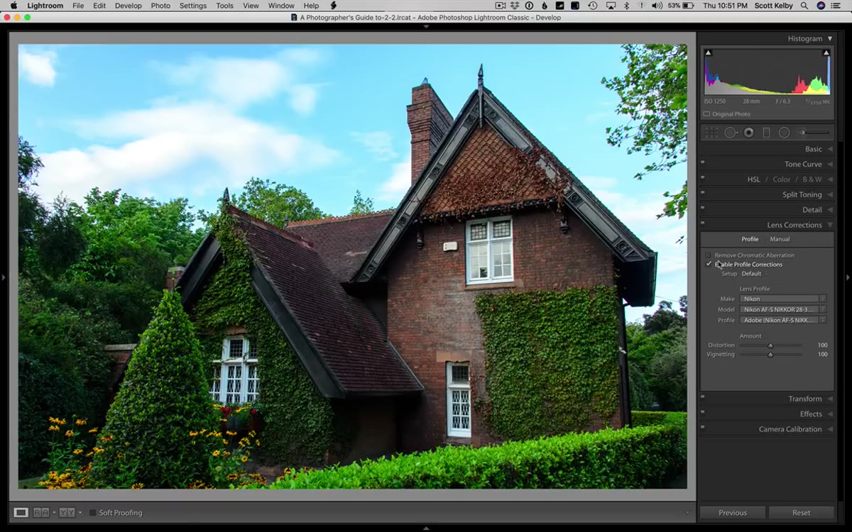 Lens Corrections panel with Remove Chromatic Aberration checkbox enabled
Back in Lens Corrections, Kelby checks Remove Chromatic Aberration and then manually addresses the color fringing still visible around the chimney. He nudges the Purple and Green fringe sliders to dial out the colored halos. This is worth doing even when you think the aberration is minor. It shows up in print, it shows up when you export for web at larger sizes, and it’s one of those details that separates a file that looks professionally processed from one that looks like it came straight out of camera. Automated correction handles most of it, but giving those manual sliders a small push finishes the job.
Lens Corrections panel with Remove Chromatic Aberration checkbox enabled
Back in Lens Corrections, Kelby checks Remove Chromatic Aberration and then manually addresses the color fringing still visible around the chimney. He nudges the Purple and Green fringe sliders to dial out the colored halos. This is worth doing even when you think the aberration is minor. It shows up in print, it shows up when you export for web at larger sizes, and it’s one of those details that separates a file that looks professionally processed from one that looks like it came straight out of camera. Automated correction handles most of it, but giving those manual sliders a small push finishes the job.
Step 5: Add Contrast and Clarity in the Basic Panel
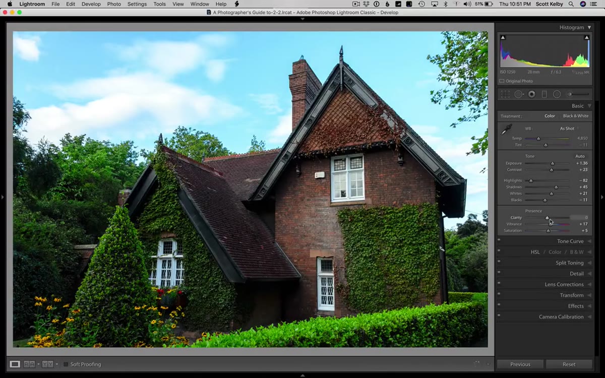 Basic panel with Contrast and Clarity sliders being adjusted
Now the actual tonal work begins. In the Basic panel, Kelby pushes both Contrast and Clarity up with some intention. Clarity in particular does a lot of heavy lifting on architectural and environmental shots because it adds midtone contrast that makes textures read more clearly. Brick, stone, wood grain, foliage, these all respond well to Clarity. The risk is going too far and creating a crunchy, over-processed look. Kelby’s approach is to push until it looks punchy, then use your gut to decide if it crossed the line. If you have to ask, it probably did.
Basic panel with Contrast and Clarity sliders being adjusted
Now the actual tonal work begins. In the Basic panel, Kelby pushes both Contrast and Clarity up with some intention. Clarity in particular does a lot of heavy lifting on architectural and environmental shots because it adds midtone contrast that makes textures read more clearly. Brick, stone, wood grain, foliage, these all respond well to Clarity. The risk is going too far and creating a crunchy, over-processed look. Kelby’s approach is to push until it looks punchy, then use your gut to decide if it crossed the line. If you have to ask, it probably did.
Step 6: Fix the Sky with HSL Luminance and Saturation
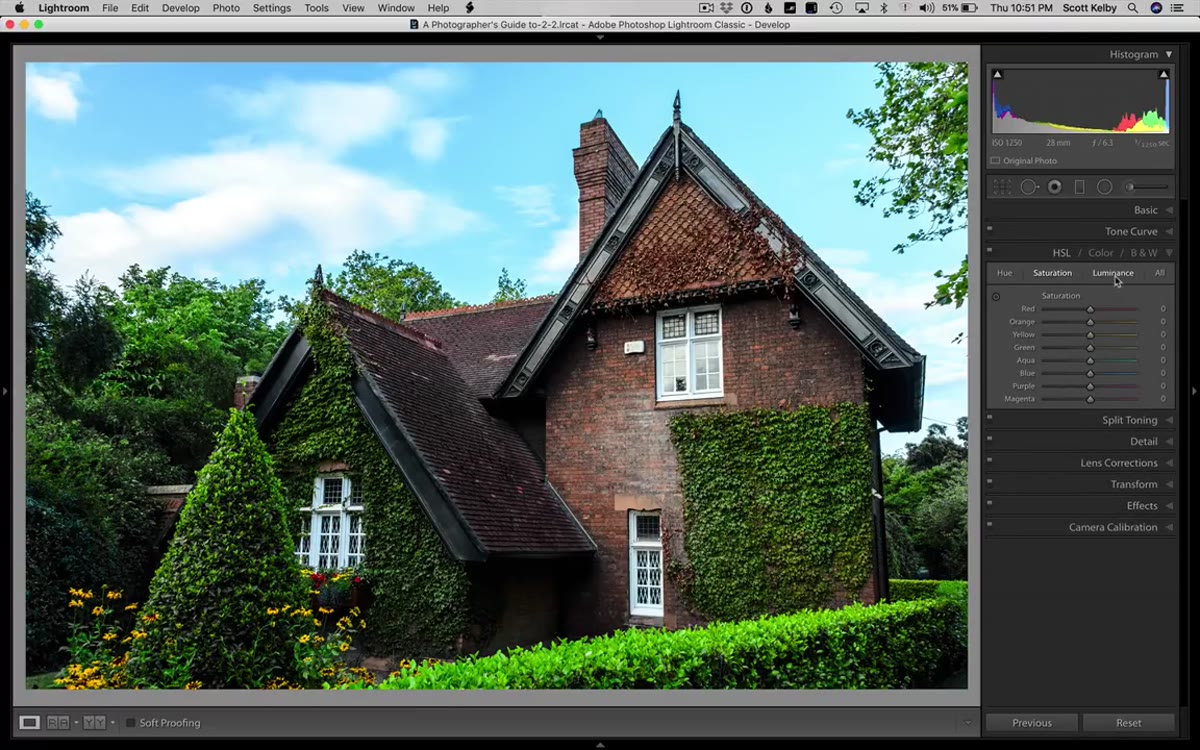 HSL panel open on Luminance tab with Blue channel being dragged left
The sky in the image looks washed out, and Kelby goes to the HSL panel to address it in two moves. First, in the Luminance tab, he pulls the Blue channel down to darken the sky and bring some depth back into it. Then he switches to the Saturation tab, grabs the Targeted Adjustment Tool, and drags downward on the sky to reduce the blue saturation, which had become oversaturated from the luminance pull. This two-step combination, darken the luminance channel, then ease back the saturation, is something I use constantly. It gives you a sky that reads as natural rather than as someone who discovered the Blue channel for the first time.
HSL panel open on Luminance tab with Blue channel being dragged left
The sky in the image looks washed out, and Kelby goes to the HSL panel to address it in two moves. First, in the Luminance tab, he pulls the Blue channel down to darken the sky and bring some depth back into it. Then he switches to the Saturation tab, grabs the Targeted Adjustment Tool, and drags downward on the sky to reduce the blue saturation, which had become oversaturated from the luminance pull. This two-step combination, darken the luminance channel, then ease back the saturation, is something I use constantly. It gives you a sky that reads as natural rather than as someone who discovered the Blue channel for the first time.
Step 7: Use the Adjustment Brush for Problem Areas and Light Dabs
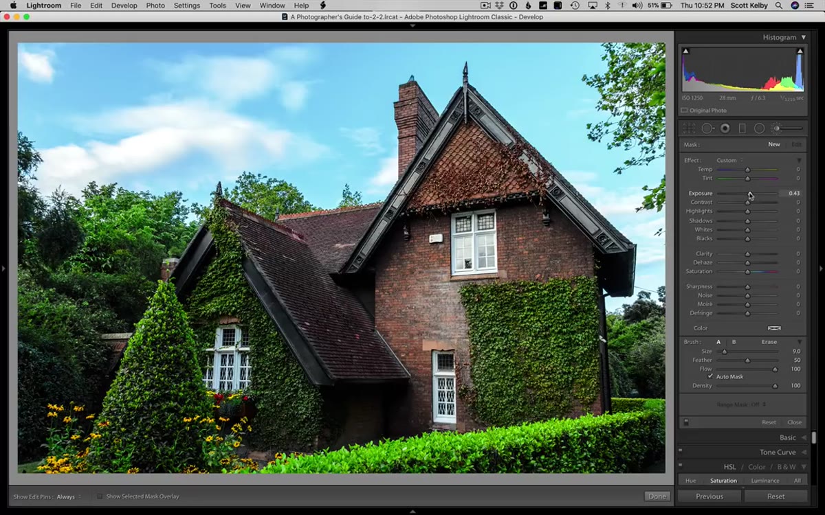 Adjustment Brush active with a mask painted over the washed-out brick area
The last major phase is local adjustments with the Adjustment Brush. Kelby uses it in two ways. First, he paints over a washed-out area of brick to bring the Highlights down and add localized Contrast, blending it back into the surrounding tone. Then he creates a second, separate brush set with a boosted Exposure and uses it to click in small highlights across the image, simulating the way light naturally falls across a scene in bright patches. Those small dabs of brighter exposure add dimensionality and keep the eye moving through the frame. It’s a subtle technique but it’s the kind of finishing touch that makes processed images feel observed rather than edited.
Adjustment Brush active with a mask painted over the washed-out brick area
The last major phase is local adjustments with the Adjustment Brush. Kelby uses it in two ways. First, he paints over a washed-out area of brick to bring the Highlights down and add localized Contrast, blending it back into the surrounding tone. Then he creates a second, separate brush set with a boosted Exposure and uses it to click in small highlights across the image, simulating the way light naturally falls across a scene in bright patches. Those small dabs of brighter exposure add dimensionality and keep the eye moving through the frame. It’s a subtle technique but it’s the kind of finishing touch that makes processed images feel observed rather than edited.
My Addition: Save Those Brush Settings as a Preset
Once Kelby showed me this pattern, I started saving my own local adjustment configurations as named brush presets. I’ve got one I call “Blue Monday” for sky corrections and one called “Golden Hour Dab” for those highlight touches. Lightroom lets you save Adjustment Brush settings as presets just like global develop presets, and it cuts my editing time on repeat image types significantly. If you find yourself making the same localized moves across a shoot, name it, save it, and stop reinventing it every time.
The single most important thing I took from this workflow is Kelby’s sequencing. Camera profile first, lens corrections before tone, Auto as a draft not a destination, and local adjustments last. That order exists for reasons, and following it means you’re solving the right problems in the right order instead of fighting yourself across the panel.
Watch the full tutorial on YouTube to see every move in real time, including the moments where Kelby overcorrects and backs off, which are just as instructive as the ones that work immediately.
Comments
Leave a Comment