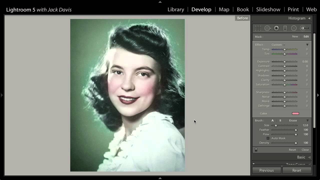
There’s a specific kind of client request that used to make me quietly groan: “Can you make it look hand-colored? Like an old portrait studio photograph?” The ask sounds simple. The old workflow was not. We’re talking multiple Photoshop layers, blend modes, luminosity masks, and about forty-five minutes of work for a single image. I’d finish it, bill for it, and immediately resent how long it took for something that looked deliberately imperfect anyway.
That changed when I watched this CreativeLive tutorial on colorizing images in Adobe Lightroom 5. Watch the full tutorial on YouTube — it’s short, dense, and immediately useful. The instructor demonstrates how to use Lightroom’s adjustment brush to apply individual color passes to different areas of a portrait, skin, lips, blush, hair, background, in a single non-destructive workflow. No layer stack. No blend modes. No switching applications.
What makes this technique click for me is the underlying philosophy: hand-tinted photographs were made by human beings with brushes and dyes, and they were slightly sloppy. That sloppiness is the aesthetic. Lightroom’s adjustment brush, with the right density and feathering settings, actually replicates that quality better than Photoshop’s precision tools do. Once I understood that, the technique stopped feeling like a workaround and started feeling like the right tool for the job.
Step 1: Create a New Brush Pin for Skin Tone
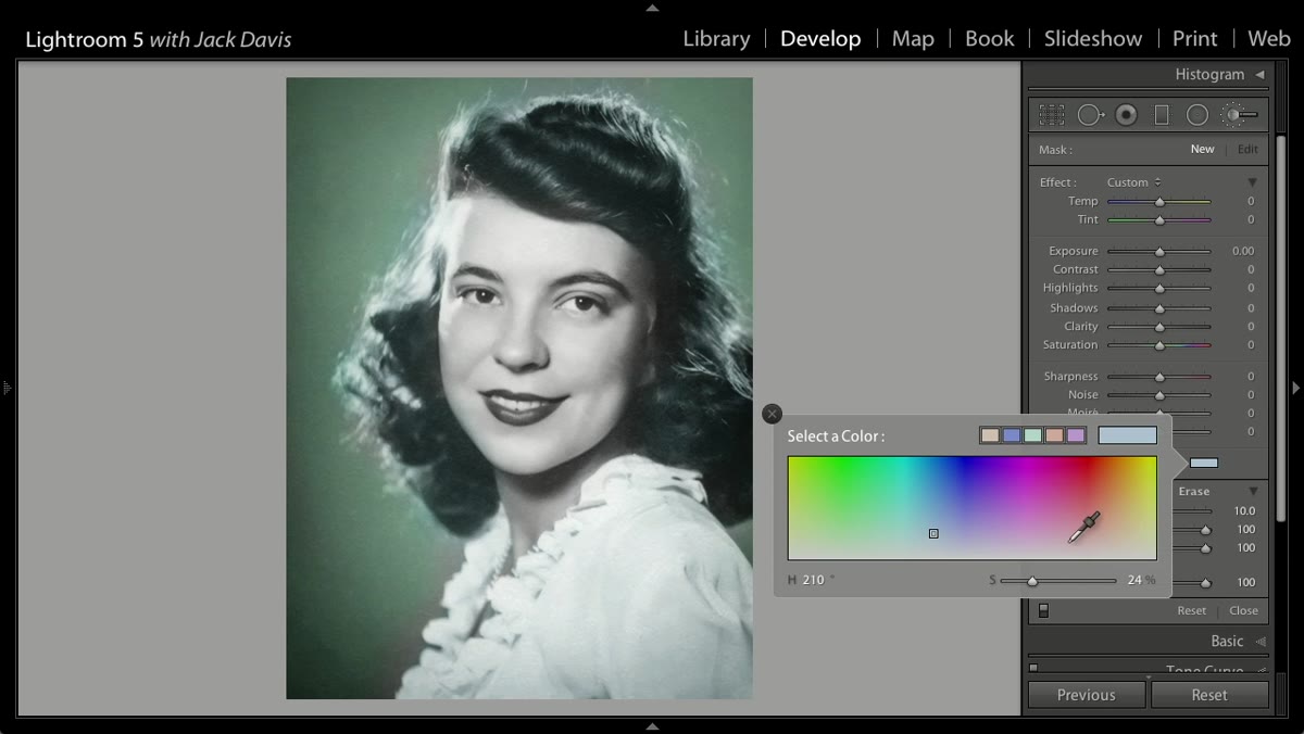 Instructor clicking New brush pin for skin tone
Start in the Develop module with your image desaturated or already in a black-and-white treatment. Open the Adjustment Brush panel and click “New” to create a fresh pin. Click the color swatch at the bottom of the brush panel and dial in a warm orange-red. Skin tones in hand-tinted photographs lean orange rather than peachy, so don’t be subtle here — you can pull it back with the Saturation slider after you’ve painted.
Before you start painting, press the O key to toggle the mask overlay. The red overlay lets you see exactly where your brush is hitting, which matters a lot when you’re working around eyes and teeth. Set your brush to a large, soft size for this first pass — you’re covering the full face in one or two strokes, not cutting around features yet.
Step 2: Paint the Skin Loosely — On Purpose
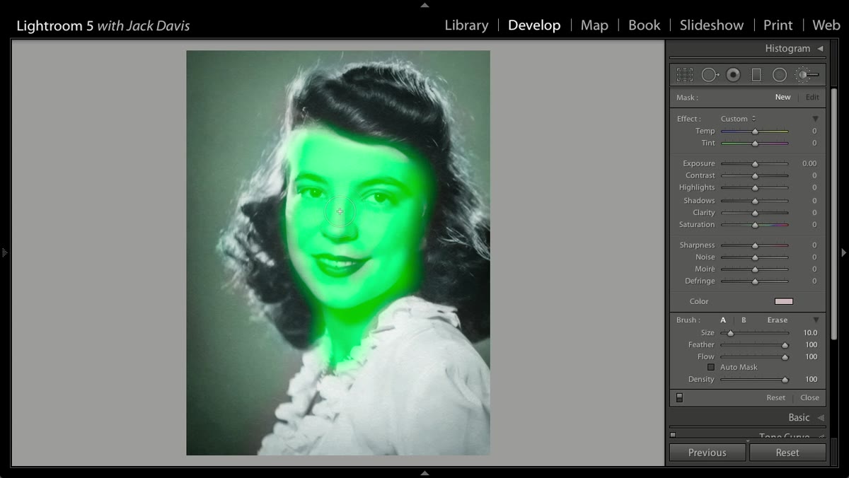 Broad brush strokes covering the face with skin tone mask
This is the step where most people’s instincts work against them. The tutorial makes the point clearly: if you can’t rough in a hand-tint in about thirty seconds, you’re overthinking it. Paint the entire face, neck, and any exposed skin in one broad sweep. Don’t worry about the teeth or the eyes at this stage. The loose edge is not a mistake — it’s the look.
After your initial pass, hold Alt (Windows) or Option (Mac) to temporarily switch to the Erase mode on the same brush, and reduce your brush size to clean up the eyes and teeth. You want those areas free of the skin-tone overlay. Keep the edges slightly soft even when erasing. A perfectly masked eye in a hand-tinted portrait looks wrong in a way that’s hard to describe but immediately visible.
Step 3: Add Lip Color on a Separate Brush Pin
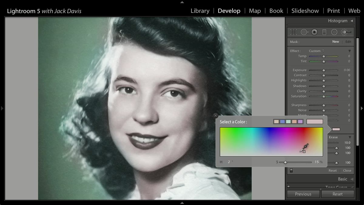 New brush pin selected, red color chosen for lips
Click “New” again to create a completely separate adjustment. Open the color swatch and push toward a true red, warmer than a pure crimson but clearly distinct from the orange you used on the skin. Zoom in to at least 100% before you start painting here — the lips are small enough that a few pixels of overspill will be obvious at full size.
Reduce your brush size and paint within the lip line. The transcript makes an interesting point about spill here: a small amount of color bleeding onto the skin around the mouth actually reinforces the vintage effect. Full containment looks digital. Controlled imprecision looks analog.
Step 4: Use Density to Add Blush Without a New Color
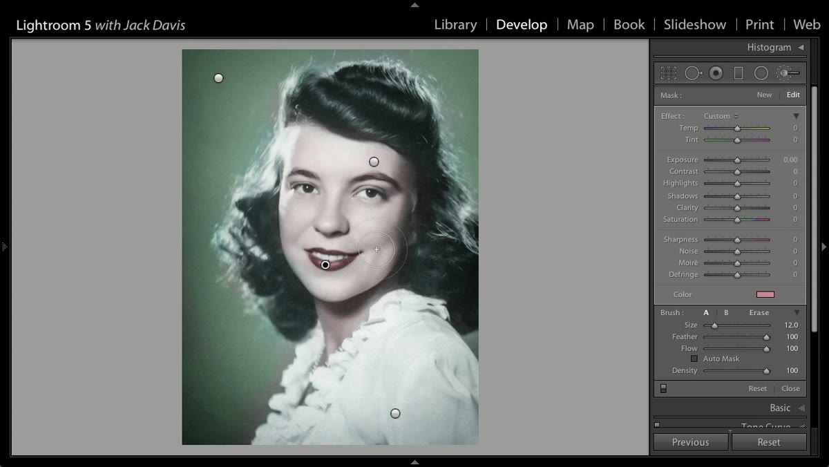 Density slider pulled down, soft brush applied to cheeks
This is one of the more practical tricks in the tutorial. Rather than creating a new brush pin with a different color for the cheeks, you stay on the same red adjustment you used for the lips and reduce the Density slider. Density controls how opaque the effect is — lower density means the same hue applied at a fraction of the intensity.
Switch to a large, soft brush and click once or twice on each cheekbone. Because you’re using the same red, the blush tone automatically matches the lips, which is exactly what you want. If the effect feels too light after one click, tap again rather than cranking the density back up. Building it in passes gives you more control over where the effect lands.
Step 5: Fine-Tune Each Mask After the Fact
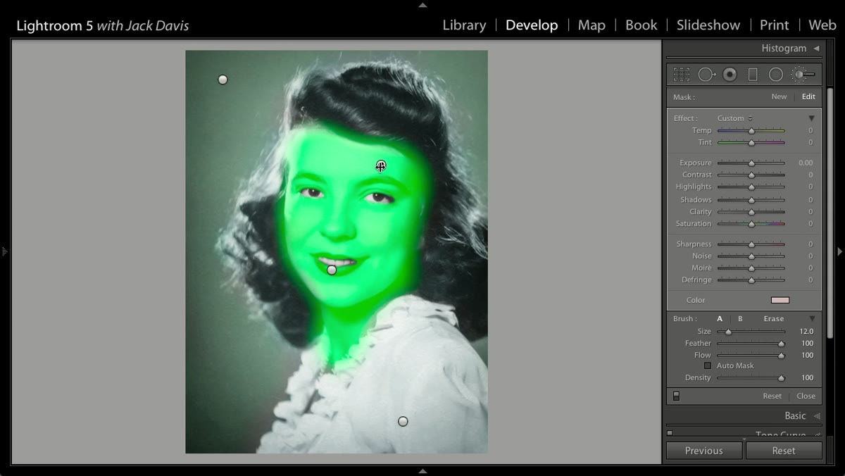 Clicking individual pins to adjust saturation and exposure separately
One of Lightroom’s real advantages over a Photoshop layer approach becomes clear here: you can go back to any individual brush pin and adjust its settings independently after you’ve painted everything. Click the skin tone pin and push the Saturation to the right if the orange reads as too flat on your specific image. Click the background pin and drop the Exposure slider to darken it without touching the subject.
The tutorial also mentions pulling Clarity into negative territory on the background pin, which creates a subtle glow or halo around the subject’s hair. In Photoshop you’d do this with a gaussian blur applied through a mask set to Soft Light or Screen. In Lightroom it’s one slider on one pin. If you’ve ever had to explain to a client why a “simple” glow effect took forty minutes, this moment in the tutorial will feel personally validating.
Step 6: Use Snapshots for Before/After Comparison
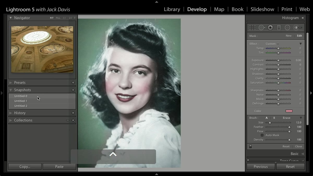 Right-clicking a snapshot to set it as the Before state
Before you start the colorizing process, take a snapshot of the base edit. The tutorial shows how to right-click any snapshot in the Snapshots panel and designate it as the “Before” state. Once that’s set, the backslash key toggles between that snapshot and your current state — a true before/after for the colorization work specifically, not just the global import state.
This matters for client presentation and for your own calibration as you work. Colorization adjustments can creep. What looks like a soft blush after step three sometimes reveals itself as clown makeup when you toggle back to the original. Checking early and often saves you from overcorrecting at the end.
What I Do Differently After Watching This
The technique as demonstrated works well on portraits. Where I’ve extended it is on product photography and architectural shots — adding a split-toned, hand-colored treatment to old buildings or vintage objects using the same multi-pin brush workflow. The key adjustment I add that the tutorial doesn’t cover: I bring the Highlights slider down on my skin tone pin to prevent the warm orange from blowing out in areas where the light already hits hard. It’s a subtle change, but on high-key portraits it keeps the skin tone from reading as overexposed rather than colorized.
I’ve also started naming these saved presets after songs, which is a habit I picked up from my own cataloging system. “Kodachrome ‘72” is a loose, warm skin tone pass that works on almost any portrait from a golden-hour session. It saves time on the first pin when I’m working quickly.
The single most important thing this tutorial reframes is what “good” looks like for this style of edit. Precision is not the goal. Intentional looseness is the goal. Once you stop trying to mask perfectly and start painting like someone who actually used dye and cotton swabs on a print, the results start looking right almost immediately.
Watch the full tutorial on YouTube and pay close attention to the pacing — the instructor moves fast, and that speed is part of the lesson.
Comments (1)
Tried this technique this morning. Game changer for real.
Leave a Comment