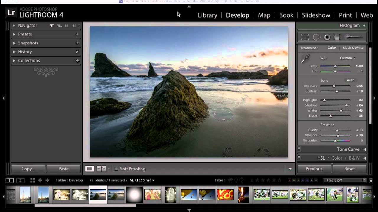
There’s a version of me from a few years back who treated the Lightroom Basic Panel like a slot machine. Pull a slider, see what happens, pull another one, hope for the best. The photo usually ended up looking like it was edited by someone who just discovered the word “vibrance.” What I was missing wasn’t access to better tools. It was a logical order of operations, a reason for each move instead of a reaction to each one.
That’s what makes this tutorial from KelbyOne so worth your time. Instructor Matt Kloskowski walks through a real sunset landscape edit, using it as a vehicle to explain not just what each Basic Panel slider does, but when to reach for it and why the sequence matters. Watch the full tutorial on YouTube - it’s short, practical, and genuinely reframes how you think about these controls.
Here’s the walkthrough, with the logic filled in.
Step 1: Set White Balance First, Creatively
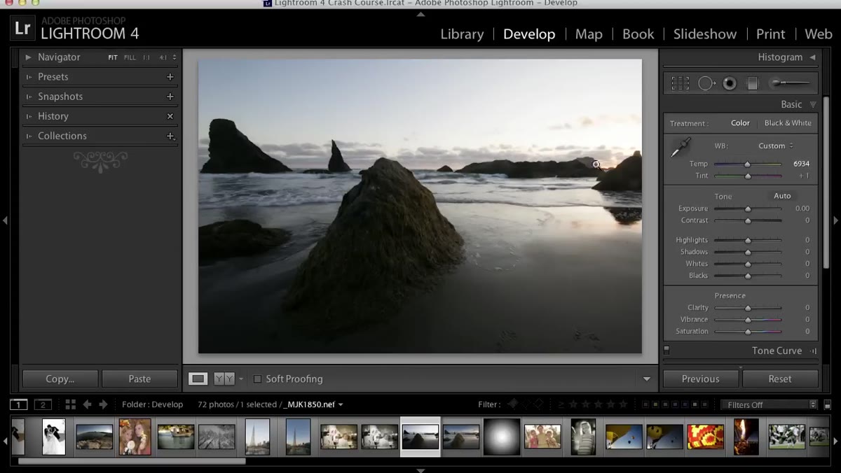 White balance slider being adjusted on sunset landscape
Before anything else, Kloskowski sets white balance. The important distinction he makes here: when there’s no neutral gray point in the frame, white balance stops being a correction and becomes a creative choice. With a sunset image, you’re not trying to make it accurate. You’re deciding how warm or cool the mood should feel. Drag the temperature slider right to push into golden territory, left to cool things down into blue tones. Make this call early so every subsequent adjustment builds on the right emotional foundation.
Step 2: Skip Exposure for Now - Start With Highlights and Shadows
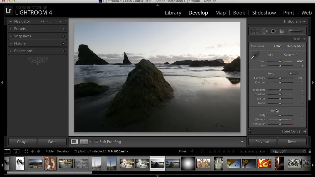 Highlights slider dragged hard left, sky detail recovered
This is the step that changed how I work. Most people grab the Exposure slider first because it feels like the main volume knob. Kloskowski calls it a sledgehammer, and that’s exactly right. It moves everything at once. Instead, go straight to Highlights and Shadows. Pull Highlights left to recover blown-out areas, like an overexposed sky. Push Shadows right to open up dark foreground detail. These two sliders let you work the tonal range from both ends simultaneously, which gives you far more control than exposure ever could on its own. In the tutorial, Highlights gets cranked hard to the left to bring back sky detail that would otherwise be gone.
Step 3: Come Back to Exposure After You’ve Shaped the Tones
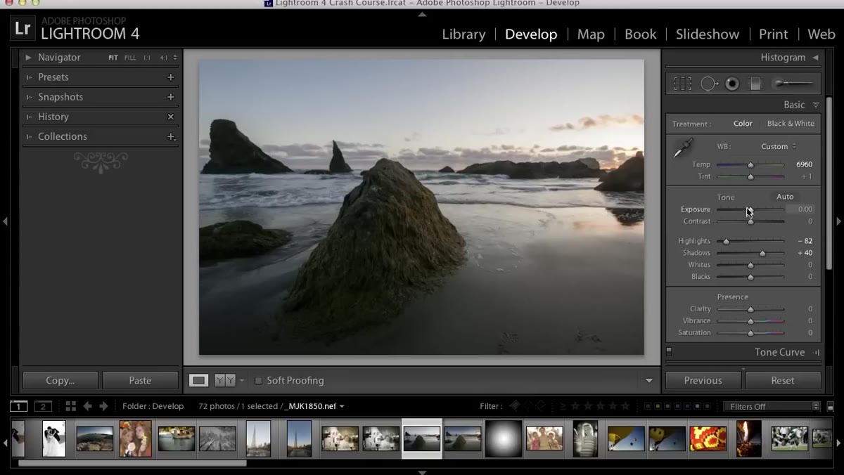 Exposure slider pulled down slightly after highlights and shadows set
Once Highlights and Shadows have done their work, you’ll have a much better read on the overall brightness of the image. That’s when Exposure becomes useful. At this point in the edit, Kloskowski notices the image is still reading a little bright, so he brings exposure down by roughly a stop. The key insight is that by waiting, you’re making a more informed decision. You’re adjusting the remaining midtones rather than blindly brightening or darkening an image you haven’t shaped yet. If pulling exposure down darkens the foreground too much, the Shadows slider is right there to compensate.
Step 4: Use Whites and Blacks With the Option/Alt Clip Warning
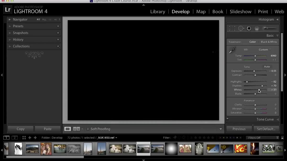 Alt key held while dragging Whites slider, clipping overlay visible
Whites and Blacks aren’t required for every edit, but they’re powerful when used correctly. The technique here is to hold down the Option key on Mac or Alt on Windows while dragging. For the Whites slider, the canvas goes black and you drag right until you start seeing color or white appear. That first hint of brightness is your white point. For Blacks, the canvas goes white and you drag left until you see dark areas appear. That’s your black point. Kloskowski is honest about when this doesn’t apply. Some images simply don’t have a true white or black point, and forcing one will make the photo look worse. The goal is contrast and depth, not hitting arbitrary targets.
Step 5: Use Clarity for Texture and Midtone Contrast
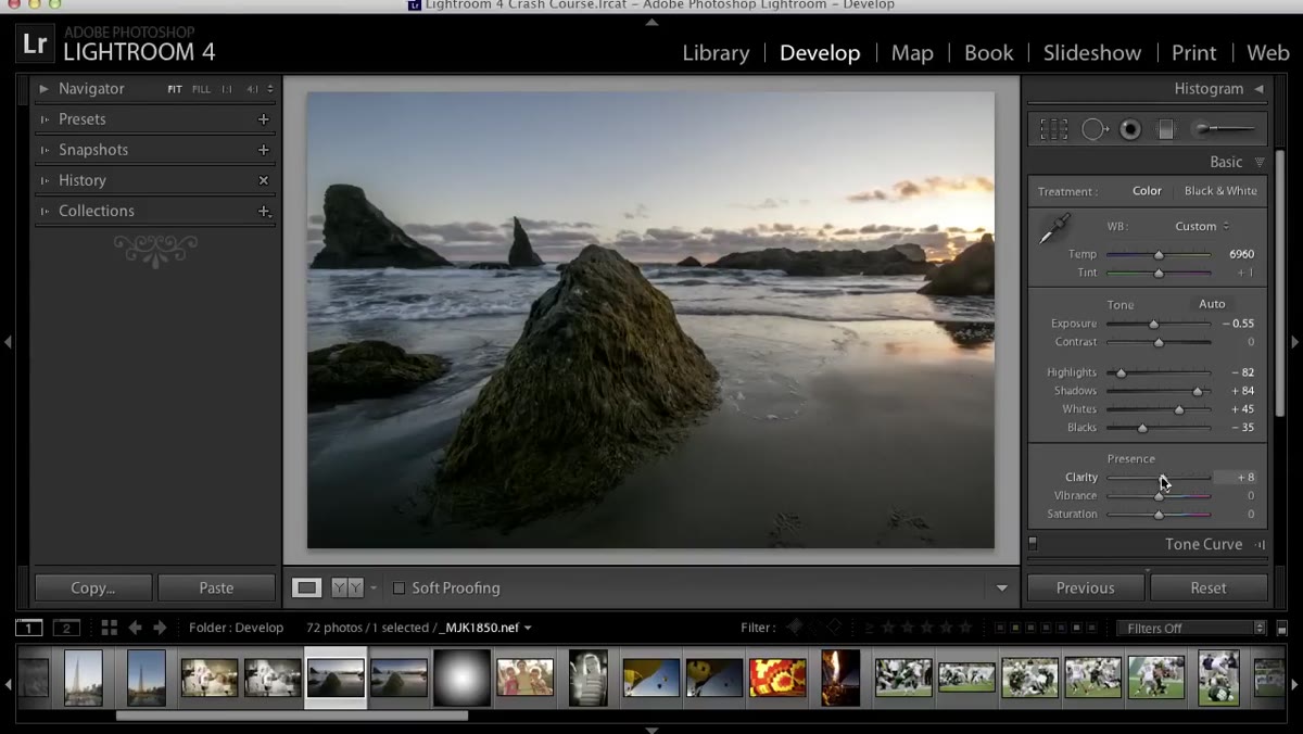 Clarity slider increased, rock texture sharpened
Clarity adds midtone contrast, which translates visually as texture and edge definition. It makes rocks look rockier, skin look more detailed, and landscapes feel grounded. In Lightroom 4 and beyond, the algorithm is smooth enough that you can push it reasonably hard without the ugly halo effect that plagued older versions. Kloskowski uses it here as a final punch to make the image feel sharper and more present. It’s not a substitute for actual sharpening in the Detail panel, but as a broad stroke it adds a lot without much risk.
Step 6: Vibrance Over Saturation, Every Time
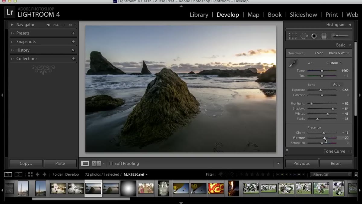 Vibrance slider increased slightly at end of Basic Panel workflow
Vibrance closes out the Basic Panel edit. The difference between Vibrance and Saturation is worth internalizing: Saturation boosts all colors equally and can quickly make skin tones look like a sunburn. Vibrance is smarter. It targets muted, undersaturated colors first and protects colors that are already strong, including skin. For landscape work it adds richness without making the image look like it was processed by someone who confused “punchy” with “neon.” A small increase goes further than you’d expect.
What I’d Add From My Own Workflow
The tutorial covers the slider order beautifully, but there’s one habit I’ve built on top of it. After finishing the Basic Panel, I hit the backslash key to toggle the before/after view. Kloskowski mentions this in the video and it’s worth making it a reflex. When you’ve been staring at an image for ten minutes, your eyes adjust and you lose the reference point. The before/after snap is like resetting your palette. If the after doesn’t feel like an obvious improvement in that first half second, something is usually off. The edit might be technically correct but emotionally wrong. Trust that gut reaction and go back to whatever slider created the problem.
The other thing I’d push: resist the urge to treat these sliders as a checklist. The sequence Kloskowski demonstrates isn’t a recipe, it’s a framework. He adjusts Shadows, revisits Exposure, then goes back to Shadows again. That iteration is the actual skill. Knowing why you’re returning to a slider matters more than getting it right the first time.
The single most important thing I took from this tutorial is that order changes outcomes. Highlights and Shadows before Exposure isn’t a quirk of one person’s style. It’s a logical approach to shaping tonal range before making global brightness decisions. Try it on your next image and see how much less fighting you do with the sliders.
Watch the full tutorial on YouTube to see Kloskowski work through the full edit, including the Photoshop portion that follows the Lightroom pass.
Comments (2)
Tried this technique this morning. Game changer for real.
Well explained. I think my audience would really benefit from this — mind if I link to it?
Leave a Comment