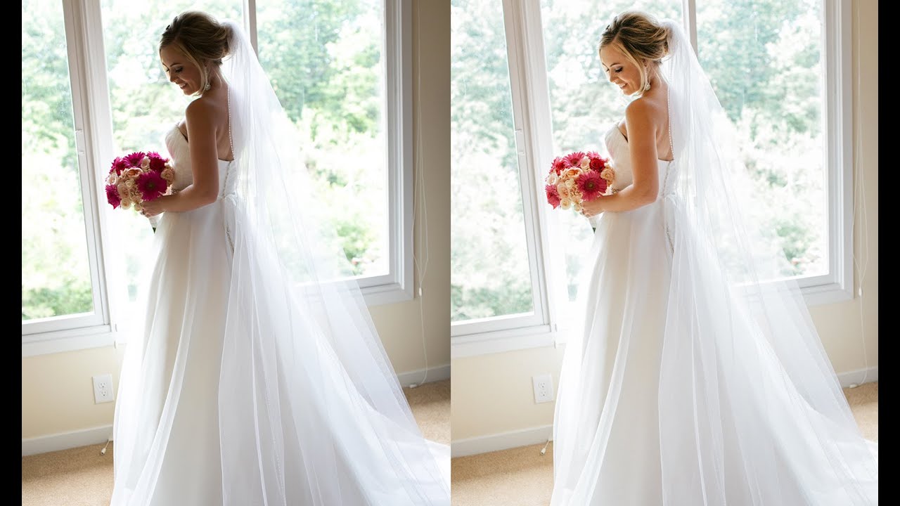
Wedding photographers live and die by their turnaround speed. You come home from a ten-hour shoot with 800 raw files, your feet hurt, and the couple is already texting to ask when the gallery will be ready. The last thing you want is to treat every single image as a from-scratch editing project. What you actually need is a repeatable system that handles the hard stuff first, specifically those tricky backlit shots where the subject is half-swallowed in shadow, and then scales across the rest of the gallery without you losing your mind.
That’s exactly the problem this Jessica Kobeissi tutorial takes on. Watch the full tutorial on YouTube before or after reading this, depending on how you learn. What she demonstrates is a compact but genuinely clever Lightroom workflow that starts with tone curve color work, moves through targeted color adjustments, and ends with a paste-settings trick that collapses a full gallery edit into something manageable. I’ve watched a lot of editing tutorials, and what separates this one from the noise is that she’s not performing for the camera. She’s showing you what she actually does.
I picked it apart step by step below so you can follow along in Lightroom without needing to pause and rewind every thirty seconds.
Step 1: Reset the Image and Go Straight to Tone Curve
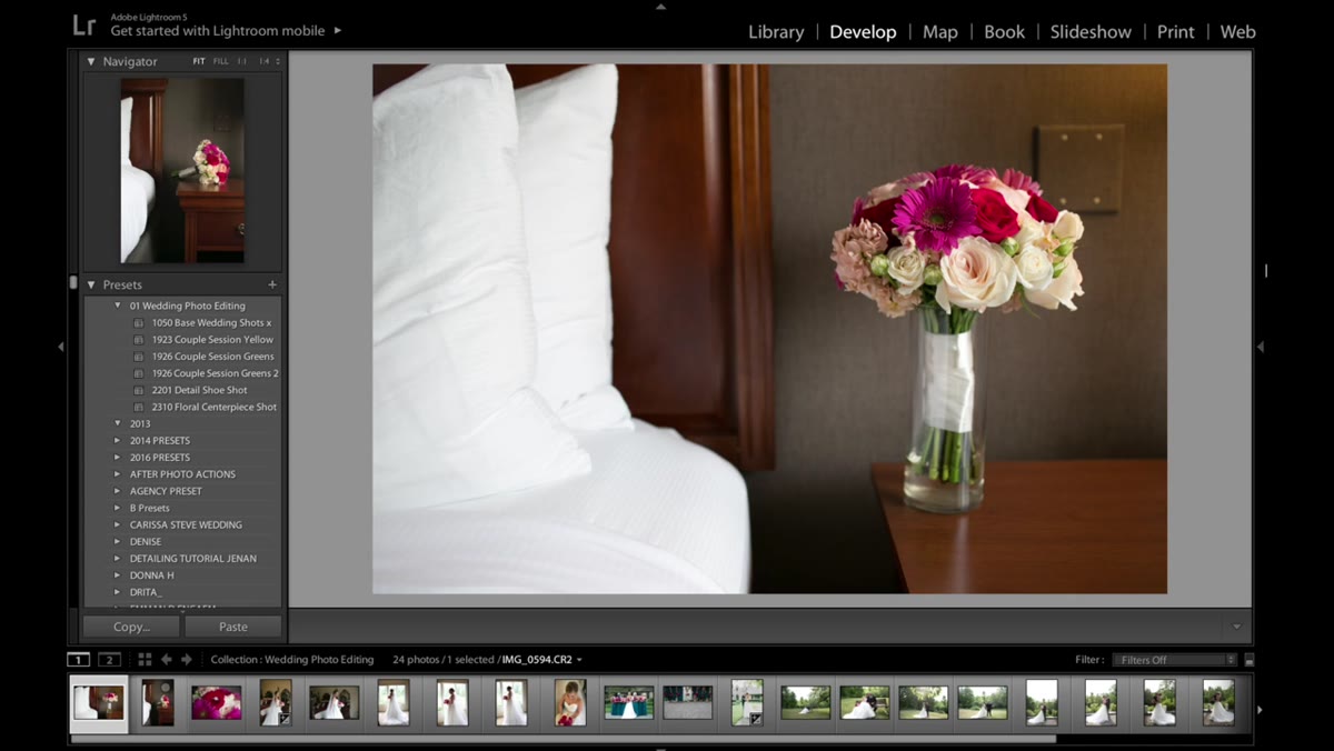 Resetting image settings before beginning the edit
Before touching exposure or white balance, reset the image completely so you’re working from a clean baseline. Then head directly to the Tone Curve panel. Most tutorials send you to Basic first. Jessica doesn’t, and that’s deliberate. She wants the color contrast locked in before she starts pushing light around.
Inside Tone Curve, switch from the RGB composite view to the individual channel view. You’ll see separate curves for Red, Green, and Blue.
Step 2: Build a Five-Point S-Curve in Each Color Channel
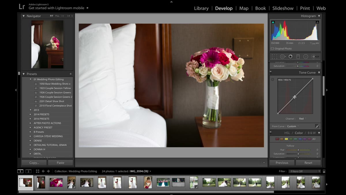 Adding a five-point S-curve to the Red channel in Tone Curve
For each of the three channels, Red, Green, and Blue, create a gentle five-point S-curve. The technique is straightforward: place anchor points to pin the midtones, then nudge the highlights upward and the shadows slightly downward. You’re not making dramatic moves here. The goal is subtle per-channel contrast that adds color depth and prevents the image from looking flat when you raise the exposure later.
Repeat this same curve shape in the Green and Blue channels. By the time you’re done with all three, the image should already look richer and more dimensional, even before you’ve touched the Basic panel. This is the kind of foundational work that separates edits that feel alive from edits that just look brightened.
Step 3: Raise Exposure in the Basic Panel
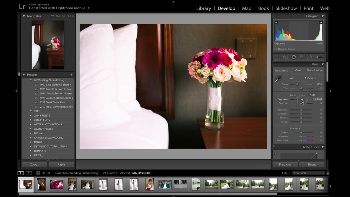 Raising the exposure slider in the Basic panel
After the tone curve work is done, go back to the Basic panel and increase the exposure. Because you’ve already built contrast into the individual color channels, the image can handle a more aggressive exposure push without immediately washing out. The colors hold their structure better.
For a heavily backlit image, you might be pushing exposure by a full stop or more. Use your histogram as a guide and stop before the highlights start clipping. You’ll address any blown areas in a later step.
Step 4: Pull Back Saturation and Refine Reds and Yellows in HSL
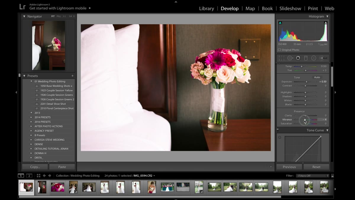 Desaturating the image slightly using the Saturation slider
A slight global saturation reduction keeps the colors from looking oversaturated after the exposure increase. Think of it as taking the edge off. From there, move into the HSL panel, which stands for Hue, Saturation, and Luminance, and focus on the reds and yellows specifically.
Wedding images almost always carry warm skin tones, pinkish shadows, and golden-hour yellows that need individual attention. In the Luminance tab, use the red and pink sliders to control how bright or dark those tones appear without changing their color. In the Hue tab, you can shift those same reds slightly toward orange or pink depending on what flatters the skin. Lower the saturation on yellows to keep them from going muddy. These are small adjustments, but they make the difference between a photo that looks professionally edited and one that just looks processed.
Step 5: Lower Highlights to Recover Blown Detail
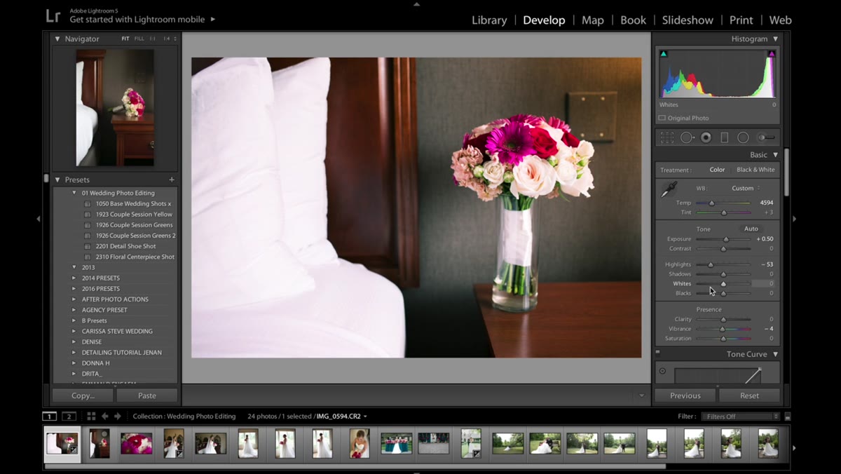 Lowering the Highlights slider to recover bright areas
After brightening the exposure, any areas that were already close to clipping, like bright window light behind the subject or a white dress in direct sun, need to come back down. Return to the Basic panel and pull the Highlights slider to the left.
How far you go depends on the image. Watch the highlight clipping warning, the blinking red overlay you can toggle with the J key, and bring the slider down until those areas show texture again. This is a targeted recovery, not a global tone shift, so it won’t undo the exposure work you’ve already done on the shadows and midtones.
Step 6: Adjust White Balance for the Mood of Each Shot
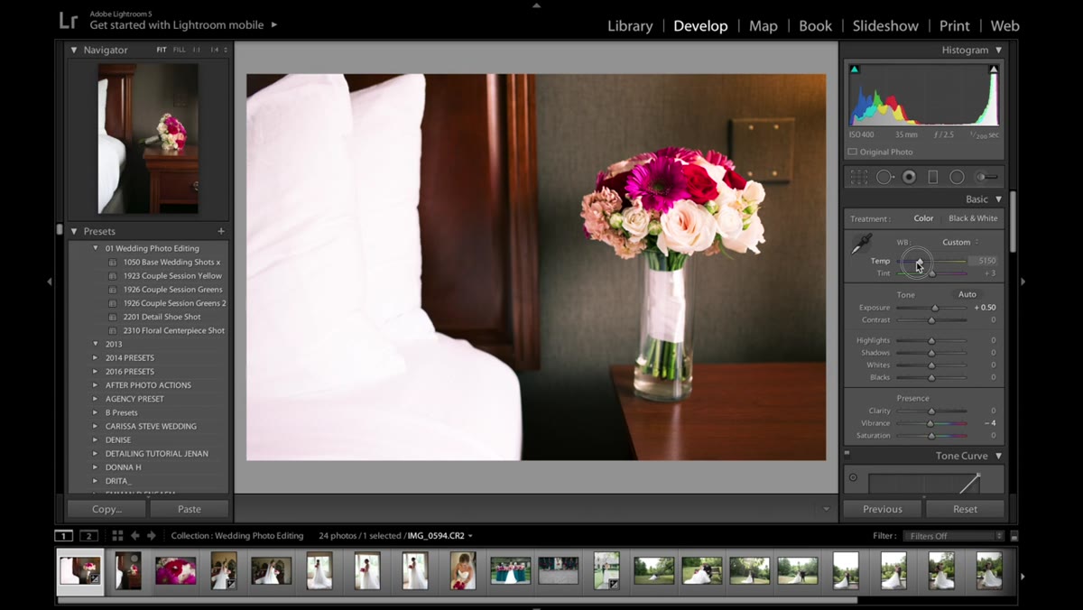 Adjusting the white balance temperature slider
Color temperature is one of those settings that’s easy to set once and forget, which is a mistake in wedding photography where the light changes constantly. Jessica checks white balance after the other corrections are in place, which makes sense because a warm or cool cast reads differently once the exposure and colors are balanced.
For outdoor backlit shots, a slightly warm temperature tends to feel more romantic and natural. Indoor shots near windows might need a cooler correction. Drag the Temperature slider slowly and watch the skin tones, not the sky or background. Skin is your most reliable reference point for getting white balance right.
Step 7: Paste Settings Across the Gallery
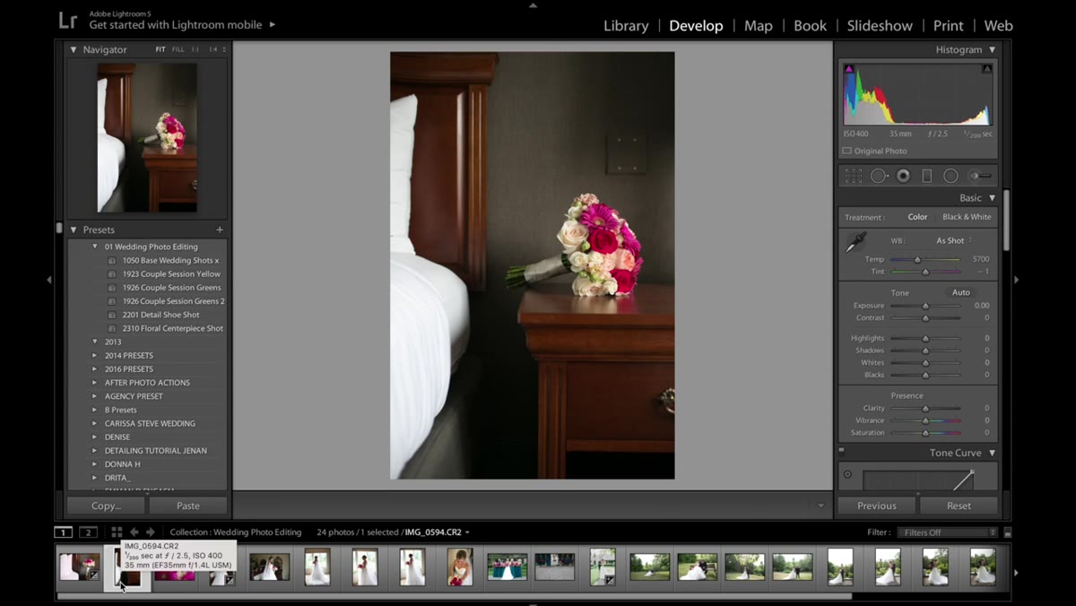 Using Command+Alt+V to paste settings to the next image
Here’s where the workflow pays off at scale. Once you’ve edited one image completely, select the next photo in the filmstrip and use Command+Alt+V on Mac (Ctrl+Alt+V on Windows) to paste all the settings from the previous image. Lightroom applies every adjustment you just made in a single keystroke.
The resulting image won’t be perfect yet. That’s expected. What you’ve done is eliminated 80 percent of the work. From there, you’re only making small tweaks: adjusting temperature if the light changed, lifting shadows if the exposure runs a bit dark, or shifting a hue slider if the skin tone reads differently. This paste-and-tweak approach is how professionals move through large galleries without burning out or sacrificing quality.
A Note on Starting With Tone Curves Instead of Basic
I’ll be honest, the first time I tried a workflow that bypassed the Basic panel at the start, it felt backward. I’m so conditioned to reach for Exposure and White Balance immediately. But after working with Jessica’s approach on a batch of my own images, I understand why it works. The per-channel S-curves act like a skeleton. Everything you do afterward, the exposure push, the HSL work, the highlight recovery, sits on top of a structure that already has color contrast built in. Without it, you’re often chasing warmth and depth in the final steps that you should have established at the beginning.
One extension I’d suggest: after you paste settings to a new image, check the tone curve channels again before touching anything else. Sometimes a significant lighting shift between frames means the channel curves need a slight remap, not just the basic sliders.
The single most important thing this tutorial teaches is that editing speed and editing quality are not opposites. A strong foundational process, built in the right order, gives you both. Build the color contrast first, correct the light second, refine the specifics third, then duplicate your work intelligently. That’s the whole system.
Watch the full tutorial on YouTube to see Jessica walk through the actual before-and-after results on her wedding images. Seeing the visual payoff of each step in real time is worth the watch, even after you’ve read the breakdown here.
Comments (2)
Quality content like this is rare. Keep it up.
Applied this to my portfolio shots and the improvement is noticeable.
Leave a Comment