Color is the part of editing where most people either overdo it or give up and call it “done” too early. I’ve been on both sides of that. When I first started editing seriously, I treated the color sliders like a dare instead of a tool, and the results looked like a fever dream. It took years of working through other people’s workflows to develop a framework that actually holds up across different images and lighting conditions.
That’s why I keep coming back to Nigel Danson’s work. In this Nigel Danson tutorial on editing color in Lightroom, he walks through his landscape color workflow with real images from Iceland and the Faroe Islands. It’s a tight, practical breakdown, and it covers four tools that, when used in order, create a coherent and repeatable color approach. What follows is my step-by-step expansion of what he demonstrates, with enough context that you can apply it to your own shoots without needing to pause and rewind.
Step 1: Set White Balance Before Anything Else
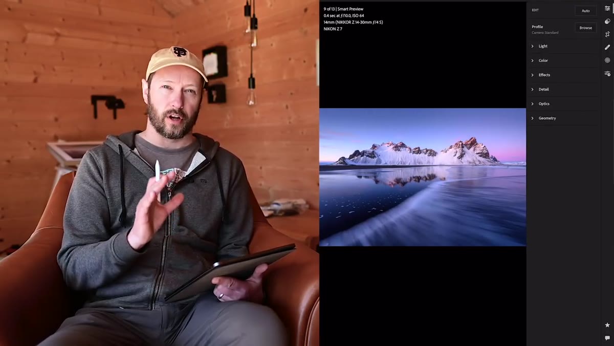 Lightroom white balance sliders applied to Iceland sunrise photo
White balance is the foundation the rest of your edit sits on. Nigel treats it as the first adjustment, not an afterthought, and that sequencing matters. If you push saturation or tweak your tone curve before locking in white balance, you’re building on a shaky base and you’ll spend time correcting things twice.
Lightroom white balance sliders applied to Iceland sunrise photo
White balance is the foundation the rest of your edit sits on. Nigel treats it as the first adjustment, not an afterthought, and that sequencing matters. If you push saturation or tweak your tone curve before locking in white balance, you’re building on a shaky base and you’ll spend time correcting things twice.
His approach is to match the white balance to what the light actually felt like at the time of shooting, not necessarily what looks “pretty” in the moment. A blue hour shot should probably feel cold. A golden hour shot should feel warm. Spend time here before touching anything else. On the Temperature slider in Lightroom’s Develop module, small moves make a big perceptual difference. Shift it 200-300K in either direction and compare before committing.
Step 2: Use Graduated Filters to Adjust White Balance Locally
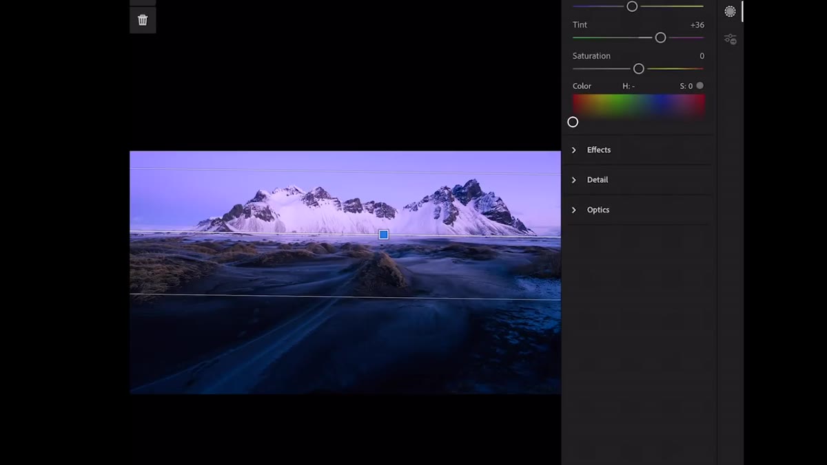 Graduated filter panel showing tint adjustment on sky
One of the more underused techniques Nigel demonstrates is applying white balance adjustments locally, not globally. He uses a graduated filter on part of a frame to shift the tint independently from the rest of the image. In the Faroe Islands image he shows, he adds a slight purple tint to the sky using a gradient, which subtly changes the character of the blue without affecting the foreground.
Graduated filter panel showing tint adjustment on sky
One of the more underused techniques Nigel demonstrates is applying white balance adjustments locally, not globally. He uses a graduated filter on part of a frame to shift the tint independently from the rest of the image. In the Faroe Islands image he shows, he adds a slight purple tint to the sky using a gradient, which subtly changes the character of the blue without affecting the foreground.
To do this yourself, add a Graduated Filter from the toolbar below the histogram, draw it over the area you want to adjust, then use the Temp and Tint sliders inside that filter’s settings. This is separate from your global white balance and only affects the masked region. It’s an elegant way to handle scenes where the sky and ground have different color temperatures, which is basically every landscape shot taken near sunrise or sunset.
Step 3: Use HSL to Reshape Individual Colors
 HSL panel open with hue sliders visible on Faroe Islands image
HSL stands for Hue, Saturation, and Luminance. Each section lets you target a specific color range in your image and push it independently. Nigel focuses on how this tool handles grass, which sounds unglamorous but is genuinely one of the trickier things to get right in landscape work. The issue is that grass in photographs tends to register as yellow more than green, so if you want the field to look greener, you adjust the Yellow Hue slider, not the Green one.
HSL panel open with hue sliders visible on Faroe Islands image
HSL stands for Hue, Saturation, and Luminance. Each section lets you target a specific color range in your image and push it independently. Nigel focuses on how this tool handles grass, which sounds unglamorous but is genuinely one of the trickier things to get right in landscape work. The issue is that grass in photographs tends to register as yellow more than green, so if you want the field to look greener, you adjust the Yellow Hue slider, not the Green one.
Pull the Yellow Hue slider toward green to give grass a more vivid, saturated appearance without it looking artificially boosted. You can also work in the Saturation tab to increase the intensity of specific tones like the blue of water or sky without blowing out the rest of the image. The key is restraint, and checking what each slider actually does to the image before stacking changes.
Step 4: Use the Target Tool to Sample Colors Directly
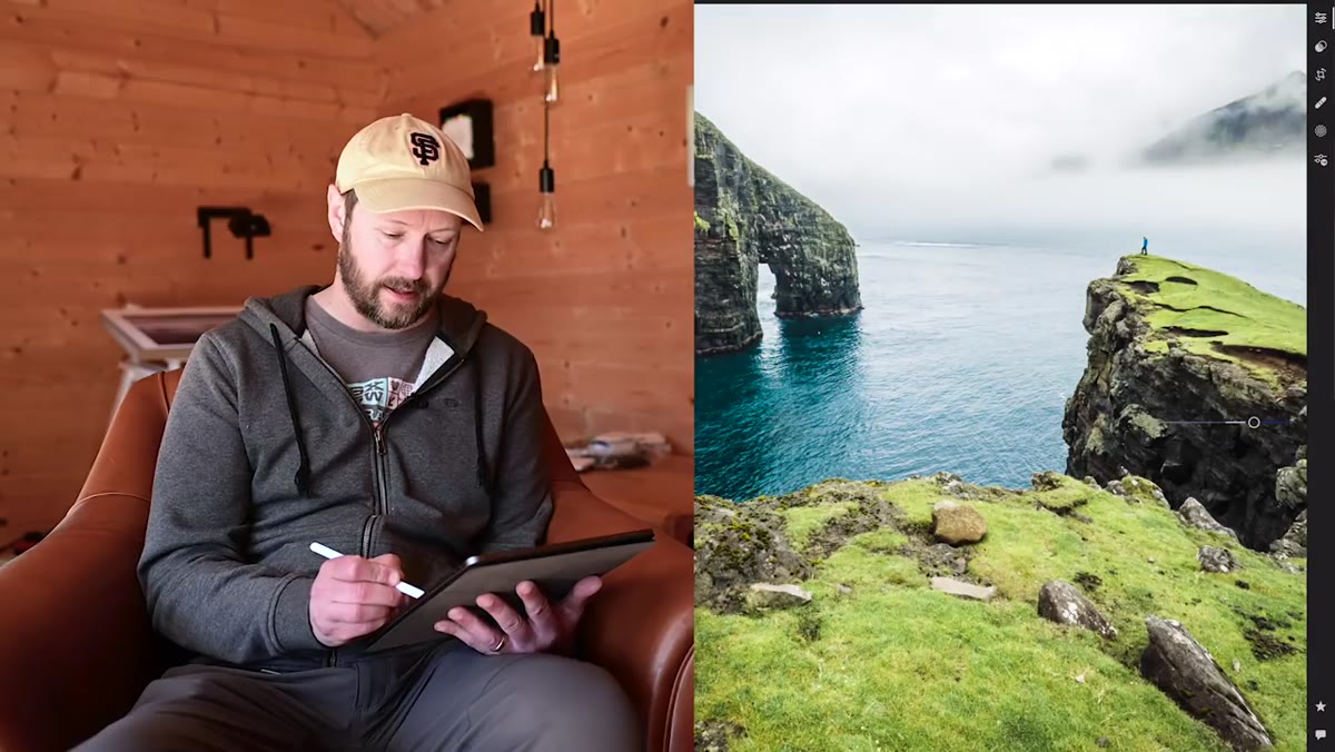 Target/picker tool being dragged over blue water in image
Lightroom’s HSL panel includes a small circle icon, the Target tool, that lets you click directly on a color in your image and drag up or down to shift it. Nigel uses this when working on the blue tones in water. Rather than guessing which slider controls the exact shade of blue in your shot, you click on the water itself and drag upward to increase saturation, or sideways to shift the hue.
Target/picker tool being dragged over blue water in image
Lightroom’s HSL panel includes a small circle icon, the Target tool, that lets you click directly on a color in your image and drag up or down to shift it. Nigel uses this when working on the blue tones in water. Rather than guessing which slider controls the exact shade of blue in your shot, you click on the water itself and drag upward to increase saturation, or sideways to shift the hue.
This is significantly faster than hunting through eight sliders and it’s more precise. The target tool will often move multiple sliders at once because real-world colors overlap between Lightroom’s defined color ranges. That’s fine. The end result matters more than keeping individual sliders tidy.
Step 5: Add Dimension with Split Toning
 Split toning panel showing separate highlight and shadow color controls
Split toning, which has been renamed Color Grading in more recent versions of Lightroom, lets you push different colors into the highlights and shadows of an image independently. This is where a lot of the “mood” in landscape photography comes from. Cool shadows and warm highlights, for example, is a combination that mimics the natural color separation you get during golden hour.
Split toning panel showing separate highlight and shadow color controls
Split toning, which has been renamed Color Grading in more recent versions of Lightroom, lets you push different colors into the highlights and shadows of an image independently. This is where a lot of the “mood” in landscape photography comes from. Cool shadows and warm highlights, for example, is a combination that mimics the natural color separation you get during golden hour.
Nigel uses this tool to give images depth that pure exposure editing can’t achieve. A subtle warm push in the highlights and a slightly blue-tinted shadow can make a flat image feel cinematic. In the Color Grading panel, use the color wheels rather than the sliders if you’re in a recent version of Lightroom. Drag the center point slightly toward your chosen color. Small moves, under 10 on the Hue and Saturation values, usually do more than people expect.
One Thing I’d Add From My Own Workflow
The order Nigel uses, white balance first, local adjustments second, HSL third, split toning last, is exactly the sequence I follow, but I’d add one checkpoint between HSL and split toning. Before you hit the Color Grading panel, export a quick JPEG and look at it in a different app or on your phone. Display variation between monitors is real, and if your HSL adjustments were already pushing saturation hard, the split toning can push it over into territory that looks great on your editing monitor and garish everywhere else.
I learned this the awkward way after sending a client a set of Faroe Islands edits that looked perfect in Lightroom and extremely purple on their MacBook. A quick sanity check before the final color grade step saves that kind of conversation.
The single most important idea from this tutorial is that color editing is sequential, and the sequence matters. White balance sets the emotional tone. Local adjustments handle problem areas. HSL shapes individual colors. Split toning adds the final layer of depth. Skip or scramble those steps and the edits fight each other instead of stacking cleanly.
Watch the full tutorial on YouTube to see Nigel work through each adjustment on real images. His demonstration with the Iceland shots especially is worth watching if you shoot in cold, low-contrast light and want to understand how to handle blue hour color without losing the mood.
Comments
Leave a Comment