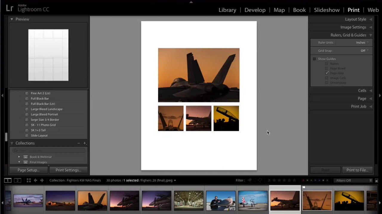
Every photographer I know has a folder somewhere called “for print” that contains exactly zero finished layouts. We shoot, we edit, we export JPEGs, and then the idea of printing somehow becomes a project we’ll get to later. The Print module in Lightroom is genuinely powerful, but it feels intimidating if you’ve never built a custom layout from scratch. Most people click in there once, feel overwhelmed, and retreat back to Develop.
That changed for me when I went through this tutorial by Scott Kelby over at KelbyOne. Watch the full tutorial on YouTube before or after reading this – the walkthrough is short and tight. What he builds is a 1+3 layout: one large hero image across the top of the page, and three smaller images lined up below it. It’s clean, it’s versatile, and once you save it as a template, you’ll actually use it more than once. That last part is the one everyone skips. Let me walk you through the whole thing.
Step 1: Open the Print Module and Choose Custom Package
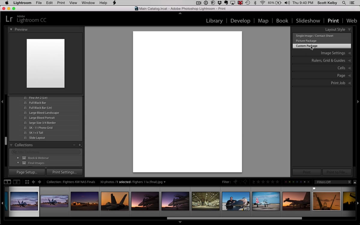 Lightroom Print module with Custom Package selected in layout panel
Head to the Print module – it’s the second-to-last option in the top module strip. Once you’re there, look at the upper-left panel labeled “Layout Style.” Do not choose “Single Image / Contact Sheet” or “Picture Package.” You want “Custom Package.” This is the option that gives you total freedom to drag, resize, and position cells anywhere on the page. Without selecting Custom Package first, the rest of this workflow won’t make sense.
Lightroom Print module with Custom Package selected in layout panel
Head to the Print module – it’s the second-to-last option in the top module strip. Once you’re there, look at the upper-left panel labeled “Layout Style.” Do not choose “Single Image / Contact Sheet” or “Picture Package.” You want “Custom Package.” This is the option that gives you total freedom to drag, resize, and position cells anywhere on the page. Without selecting Custom Package first, the rest of this workflow won’t make sense.
Step 2: Set Up Your Page Size
 Print module showing 8.5x11 page canvas
Before adding any cells, confirm your page size in the Print Job panel or through the Page Setup button at the bottom of the left panel. Kelby works on a standard 8.5 x 11 inch page, which is the most common setup for home and pro lab printing. If you’re printing square or A4, adjust accordingly. The proportions of your cells will shift depending on your canvas, so lock this in before you start placing anything.
Print module showing 8.5x11 page canvas
Before adding any cells, confirm your page size in the Print Job panel or through the Page Setup button at the bottom of the left panel. Kelby works on a standard 8.5 x 11 inch page, which is the most common setup for home and pro lab printing. If you’re printing square or A4, adjust accordingly. The proportions of your cells will shift depending on your canvas, so lock this in before you start placing anything.
Step 3: Add the Large Hero Cell
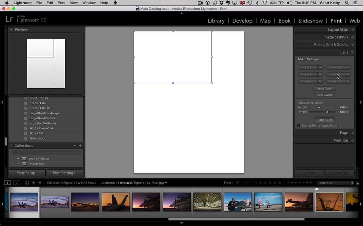 A 4x6 cell appearing on the print canvas
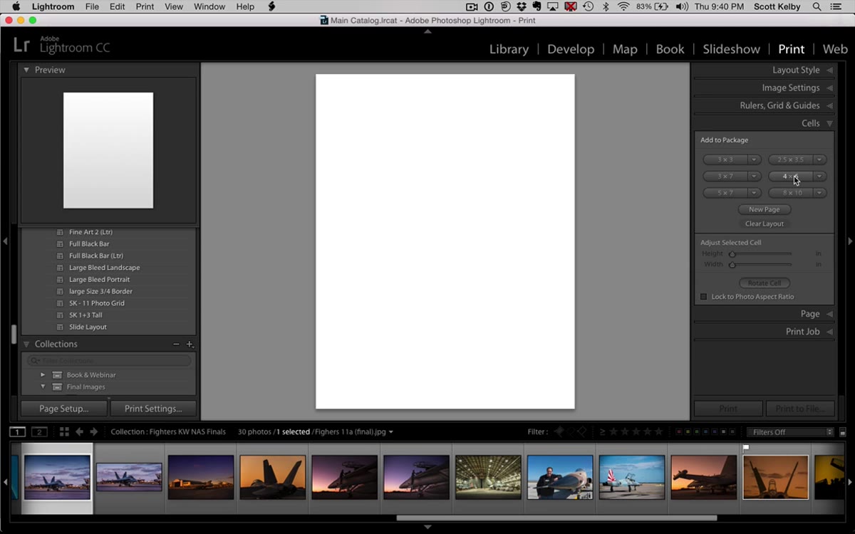
Open the Cells panel on the right side. You’ll see preset cell size buttons. Kelby clicks the 4x6 option to drop a cell onto the canvas, which gives him a solid rectangle to work with as his main hero image slot. Click and drag the cell toward the upper portion of the page. Here’s the thing you need to know immediately: Lightroom has snap-to-grid behavior enabled by default, and your cell will feel magnetic as you move it around. That’s not a bug. That’s the “Snap” feature working. If you want to see the grid underneath it all, go to the toolbar, turn on “Show Guides,” and enable “Page Grid.” Kelby keeps the grid hidden but keeps snapping on – that’s a reasonable default until it works against you, which happens in Step 5.
A 4x6 cell appearing on the print canvas
Open the Cells panel on the right side. You’ll see preset cell size buttons. Kelby clicks the 4x6 option to drop a cell onto the canvas, which gives him a solid rectangle to work with as his main hero image slot. Click and drag the cell toward the upper portion of the page. Here’s the thing you need to know immediately: Lightroom has snap-to-grid behavior enabled by default, and your cell will feel magnetic as you move it around. That’s not a bug. That’s the “Snap” feature working. If you want to see the grid underneath it all, go to the toolbar, turn on “Show Guides,” and enable “Page Grid.” Kelby keeps the grid hidden but keeps snapping on – that’s a reasonable default until it works against you, which happens in Step 5.
Step 4: Add the Three Smaller Cells
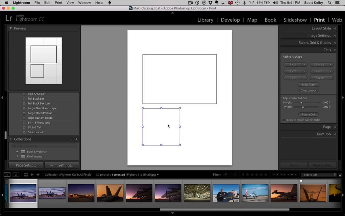 Three smaller square cells being positioned below the hero image
Go back to the Cells panel and click the 3x3 preset to drop a smaller square onto the canvas. Shift-drag a corner handle to resize it proportionally. You’re eyeballing the size here to fit three of these cells side by side beneath the hero – Kelby is upfront that some guessing is involved on the first pass. Once you have your first small cell sized the way you want it, hold Option on Mac or Alt on Windows and drag a copy. Do this twice to get three total. Line them up below the hero image, spacing them as evenly as you can.
Three smaller square cells being positioned below the hero image
Go back to the Cells panel and click the 3x3 preset to drop a smaller square onto the canvas. Shift-drag a corner handle to resize it proportionally. You’re eyeballing the size here to fit three of these cells side by side beneath the hero – Kelby is upfront that some guessing is involved on the first pass. Once you have your first small cell sized the way you want it, hold Option on Mac or Alt on Windows and drag a copy. Do this twice to get three total. Line them up below the hero image, spacing them as evenly as you can.
Step 5: Handle the Grid Snapping Problem
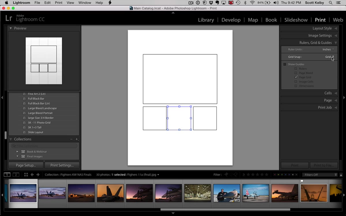 Grid snapping disabled to allow finer cell positioning
This is where most people get frustrated and give up. When you try to space three cells evenly across the bottom of the page, the snap-to-grid feature will fight you. The invisible grid increments won’t always divide the available space into three equal parts. The fix is simple: temporarily turn off grid snapping. In Lightroom, you do this through the View menu or the Guides options. With snapping off, you can nudge cells by hand into the exact positions you want. Once everything looks visually balanced, you’re good. You don’t need pixel-perfect math here. Your eye is sufficient.
Grid snapping disabled to allow finer cell positioning
This is where most people get frustrated and give up. When you try to space three cells evenly across the bottom of the page, the snap-to-grid feature will fight you. The invisible grid increments won’t always divide the available space into three equal parts. The fix is simple: temporarily turn off grid snapping. In Lightroom, you do this through the View menu or the Guides options. With snapping off, you can nudge cells by hand into the exact positions you want. Once everything looks visually balanced, you’re good. You don’t need pixel-perfect math here. Your eye is sufficient.
Step 6: Drag Photos Into the Cells
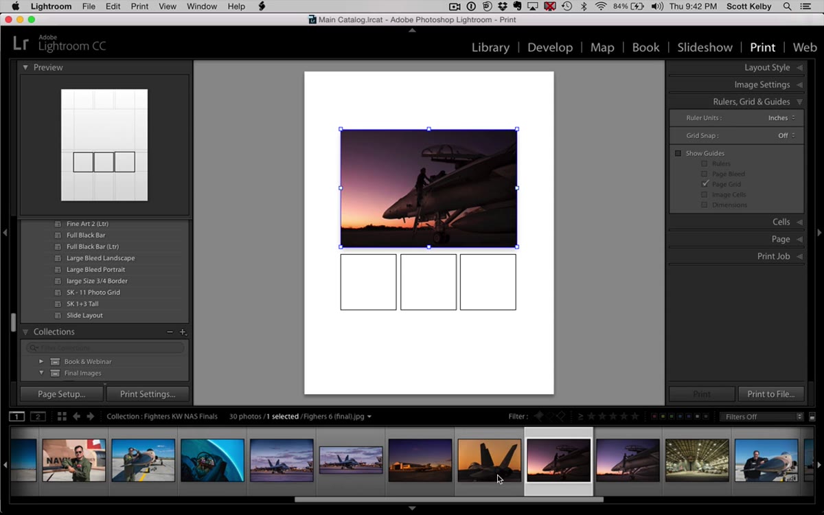 Aerial photos being dragged from filmstrip into print layout cells
With your layout structure locked in, go to the filmstrip at the bottom of the screen and drag photos directly into each cell. Click a photo in the filmstrip and drag it up onto one of the cells on the canvas. Lightroom will fill the cell with that image. Do this for all four cells. You can drag and swap images between cells after placing them. Kelby uses aerial photos for his demo, but this layout works for anything – weddings, portraits, sports, product photography. The structure doesn’t care about subject matter.
Aerial photos being dragged from filmstrip into print layout cells
With your layout structure locked in, go to the filmstrip at the bottom of the screen and drag photos directly into each cell. Click a photo in the filmstrip and drag it up onto one of the cells on the canvas. Lightroom will fill the cell with that image. Do this for all four cells. You can drag and swap images between cells after placing them. Kelby uses aerial photos for his demo, but this layout works for anything – weddings, portraits, sports, product photography. The structure doesn’t care about subject matter.
Step 7: Save It as a Template
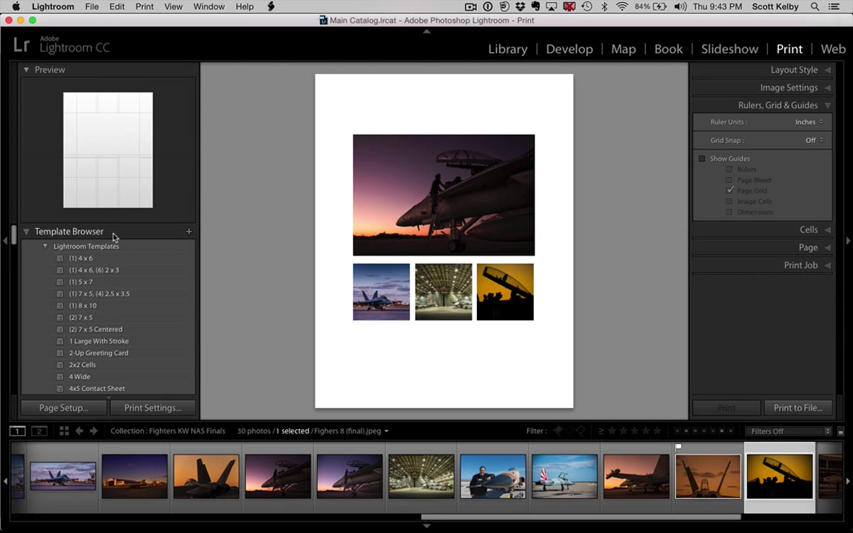 Template Browser with plus button highlighted for saving new template
This is the step most people skip, and it’s the whole reason the layout pays off long-term. At the top of the Template Browser on the left side, click the small plus icon. A dialog box will appear asking you to name your template and choose a folder. Be specific with your name. Kelby’s naming convention is practical – he uses initials plus a descriptor like “1+3 tall” so he knows exactly what he’s looking at six months later. Save your template to the User Templates folder. It will now appear in your Template Browser every time you open the Print module.
Template Browser with plus button highlighted for saving new template
This is the step most people skip, and it’s the whole reason the layout pays off long-term. At the top of the Template Browser on the left side, click the small plus icon. A dialog box will appear asking you to name your template and choose a folder. Be specific with your name. Kelby’s naming convention is practical – he uses initials plus a descriptor like “1+3 tall” so he knows exactly what he’s looking at six months later. Save your template to the User Templates folder. It will now appear in your Template Browser every time you open the Print module.
What I’d Add: Use This Layout for Client Proof Sheets
I’ve started using this exact layout as a lightweight proof delivery format for smaller shoots. Instead of sending a client a link to a gallery of 40 images, I’ll pull the four strongest shots, drop them into this 1+3 template, export as a PDF, and send that. It’s fast to produce and easy for a client to read – the hero image signals the best shot, and the three smaller ones give context. If you’re naming your templates and building a small library of layouts in Lightroom, you can turn a proof sheet like this around in under five minutes once the editing is done.
Building a print template from scratch teaches you things about Lightroom’s Print module that clicking around randomly never would. The snap-to-grid behavior, the cell duplication shortcut, the template save workflow – these are tools that show up across other print projects once you’ve learned them here. The 1+3 layout is simple enough to build in one sitting and useful enough to reach for again and again.
Watch the full tutorial on YouTube to see Scott Kelby walk through the entire process in real time – it runs just a few minutes and fills in anything you want to see in motion.
Comments (2)
Quality content like this is rare. Keep it up.
Just subscribed. If the rest of your content is this good, I'm in.
Leave a Comment