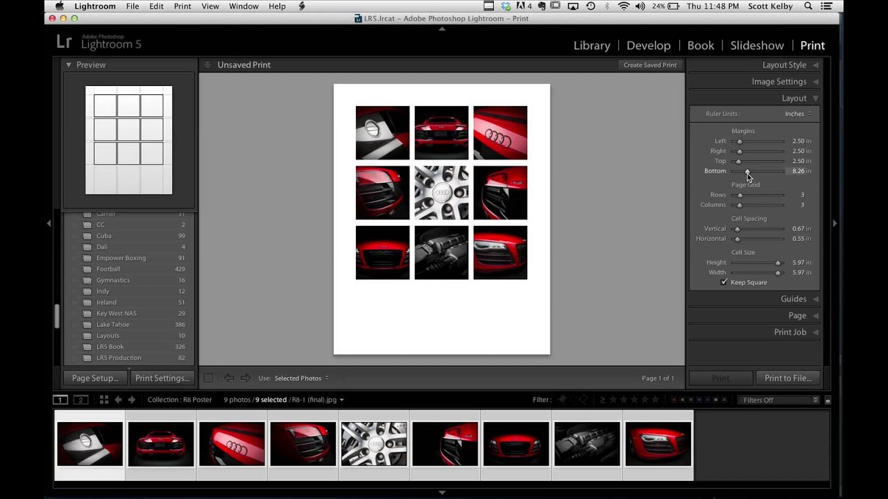
Every few months I’ll see someone post a finished image and my first reaction is “okay, that had to be a full Illustrator project.” Then I find out it was mostly Lightroom and I feel both humbled and relieved. That’s exactly what happened when Scott Kelby shared an Audi R8 poster he made for a client. Nine photos, grid layout, clean margins, big empty space for text at the bottom. It looked like a print ad. People in the comments were convinced he’d used some combination of InDesign and magic. He used Lightroom’s Print module.
Watch the full tutorial on YouTube
In this Scott Kelby tutorial, the whole grid layout is built inside Lightroom’s Print module using the contact sheet feature, exported as a high-resolution JPEG, and then brought into Photoshop only at the very end to drop in text. That’s it. The reason this matters to me practically is that I’ve been routing work like this through three apps when one would have handled 90 percent of it. If you shoot cars, products, events, or anything a client wants turned into a framed poster, this workflow will save you a serious amount of time.
Step 1: Select Your Images in the Library Module
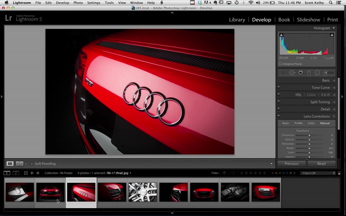 Nine R8 images selected in Lightroom’s Library grid view
Start by gathering the images you want to use. Kelby uses nine shots of the R8. Select all of them in the Library module before you do anything else, because the Print module will pull from your current selection. The order matters less right now than having the right nine (or however many you’re working with) highlighted and ready.
Nine R8 images selected in Lightroom’s Library grid view
Start by gathering the images you want to use. Kelby uses nine shots of the R8. Select all of them in the Library module before you do anything else, because the Print module will pull from your current selection. The order matters less right now than having the right nine (or however many you’re working with) highlighted and ready.
Step 2: Set Your Custom Paper Size
 Paper size dialog open showing custom 24x30 inch dimensions
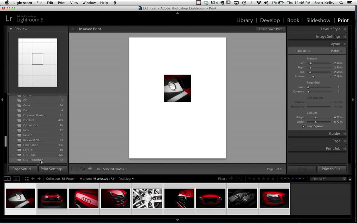
Jump to the Print module. The first thing you need to configure is the page size, because everything else gets built around it. Go to the Page Setup area, click on paper size, then choose “Manage Custom Sizes.” Kelby’s poster was 24 by 30 inches, which is a substantial print. Type in whatever dimensions your client or project requires and save the custom size. Doing this first means your grid cells and margins will scale properly instead of you having to recalculate everything after the fact.
Paper size dialog open showing custom 24x30 inch dimensions
Jump to the Print module. The first thing you need to configure is the page size, because everything else gets built around it. Go to the Page Setup area, click on paper size, then choose “Manage Custom Sizes.” Kelby’s poster was 24 by 30 inches, which is a substantial print. Type in whatever dimensions your client or project requires and save the custom size. Doing this first means your grid cells and margins will scale properly instead of you having to recalculate everything after the fact.
Step 3: Choose the Right Layout Style
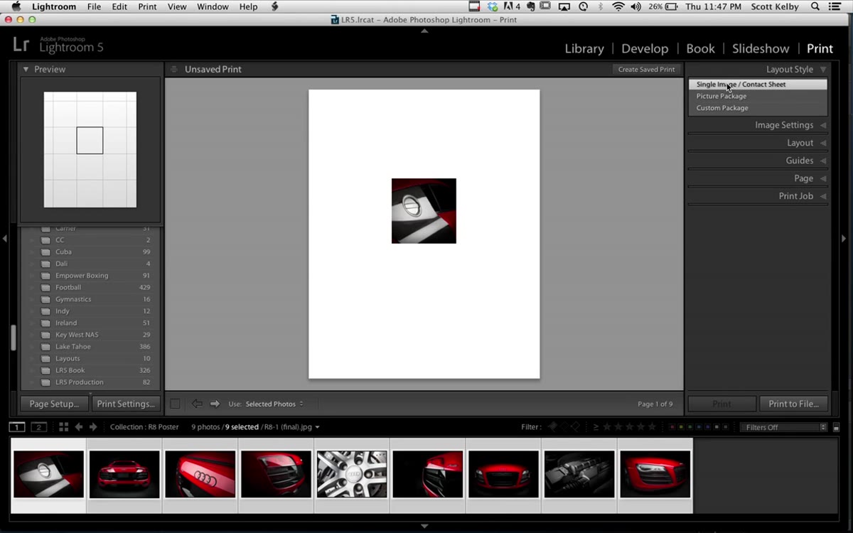 Layout Style panel with Single Image/Contact Sheet selected
In the Layout Style panel on the right side of the Print module, select “Single Image / Contact Sheet.” This is the part most people skip right past, and it’s the whole key to the technique. What you’re actually doing is repurposing Lightroom’s contact sheet tool as a precision layout engine. It sounds like a workaround, but it’s genuinely the most efficient path to a clean multi-image grid.
Layout Style panel with Single Image/Contact Sheet selected
In the Layout Style panel on the right side of the Print module, select “Single Image / Contact Sheet.” This is the part most people skip right past, and it’s the whole key to the technique. What you’re actually doing is repurposing Lightroom’s contact sheet tool as a precision layout engine. It sounds like a workaround, but it’s genuinely the most efficient path to a clean multi-image grid.
Step 4: Configure Your Margins
 Layout panel showing margin sliders with large bottom margin value
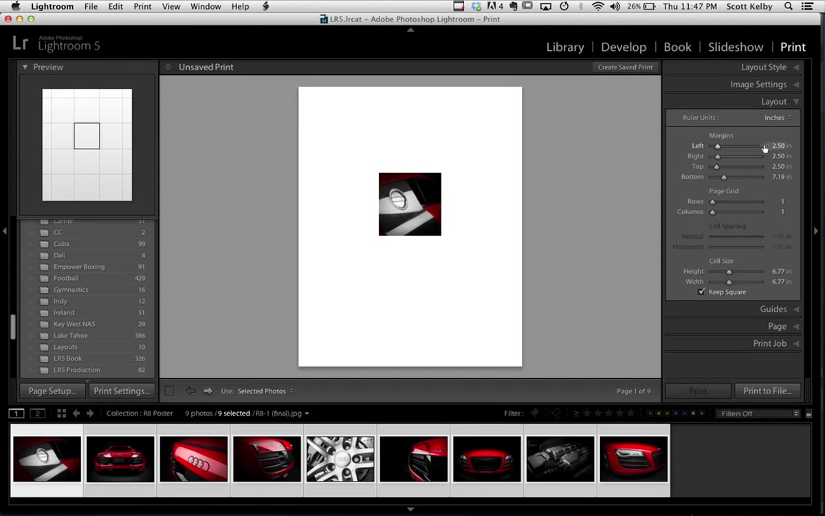
Open the Layout panel and set your margins. Kelby uses 2.5 inches on the left, right, and top. The bottom margin is the interesting one: he pushes it to just over 7 inches. That sounds excessive until you remember he’s reserving that space for the owner’s name, the car model text, and his own logo. If you’re building a poster that needs a title block or branding at the bottom, define that space here at the layout stage rather than trying to squeeze it in later. Planning the negative space first is the whole move.
Layout panel showing margin sliders with large bottom margin value
Open the Layout panel and set your margins. Kelby uses 2.5 inches on the left, right, and top. The bottom margin is the interesting one: he pushes it to just over 7 inches. That sounds excessive until you remember he’s reserving that space for the owner’s name, the car model text, and his own logo. If you’re building a poster that needs a title block or branding at the bottom, define that space here at the layout stage rather than trying to squeeze it in later. Planning the negative space first is the whole move.
Step 5: Build the Grid with Rows and Columns
 Page Grid section showing 3 rows and 3 columns set with spacing sliders
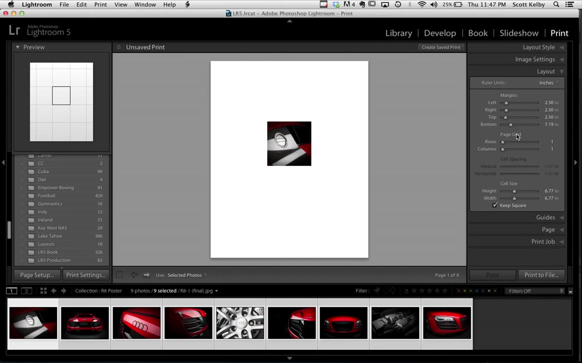
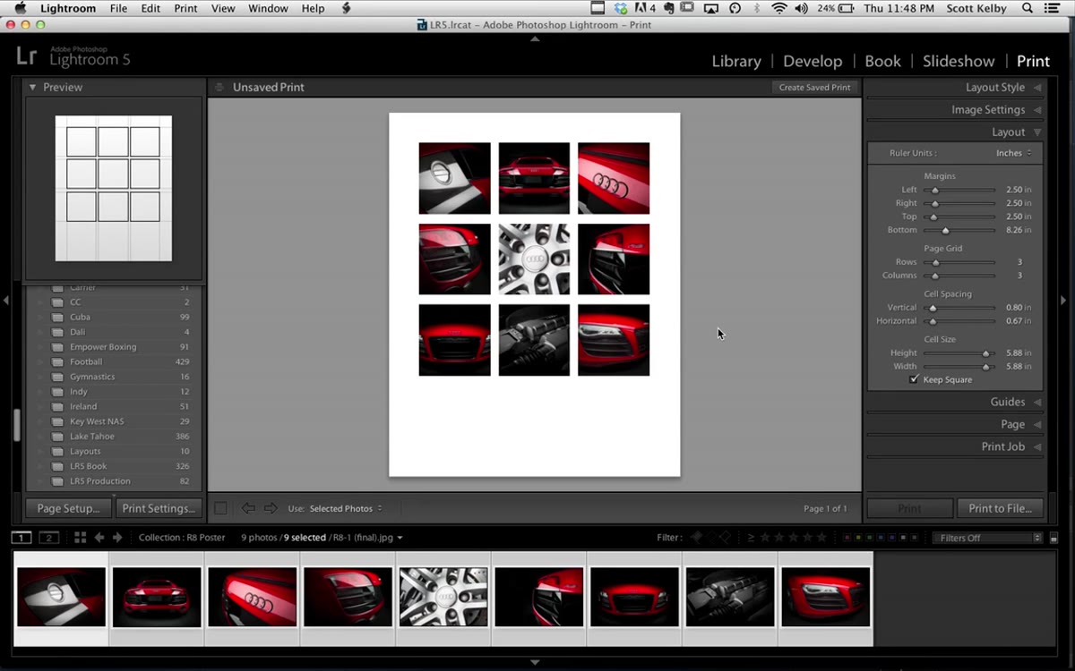
Still in the Layout panel, find the Page Grid section with the Rows and Columns sliders. Kelby sets both to 3, which creates a 3x3 grid for his nine images. The spacing between cells will look off at first. Use the Cell Spacing sliders to dial in the vertical and horizontal gaps. He has “Keep Square” enabled, which links the spacing controls together. A small amount of nudging on the bottom margin from here can help you fine-tune how the grid sits on the page. Take your time with this. The spacing is what separates something that looks designed from something that looks assembled.
Page Grid section showing 3 rows and 3 columns set with spacing sliders
Still in the Layout panel, find the Page Grid section with the Rows and Columns sliders. Kelby sets both to 3, which creates a 3x3 grid for his nine images. The spacing between cells will look off at first. Use the Cell Spacing sliders to dial in the vertical and horizontal gaps. He has “Keep Square” enabled, which links the spacing controls together. A small amount of nudging on the bottom margin from here can help you fine-tune how the grid sits on the page. Take your time with this. The spacing is what separates something that looks designed from something that looks assembled.
Step 6: Rearrange the Images to Your Liking
 Drag-and-drop rearranging of photos within the contact sheet grid
Once the grid is set, you can drag images between cells directly on the canvas to change which photo appears in which position. Kelby does this briefly to show the option, then undoes it because he liked the original arrangement. Composition logic applies here the same way it would to any layout: anchor images, flow between shots, how your eye moves across the grid. A hero shot in the center or corner tends to read better than burying it in the middle of a row.
Drag-and-drop rearranging of photos within the contact sheet grid
Once the grid is set, you can drag images between cells directly on the canvas to change which photo appears in which position. Kelby does this briefly to show the option, then undoes it because he liked the original arrangement. Composition logic applies here the same way it would to any layout: anchor images, flow between shots, how your eye moves across the grid. A hero shot in the center or corner tends to read better than burying it in the middle of a row.
Step 7: Print to File as a High-Resolution JPEG
 Print to File dialog with filename field and JPEG format selected
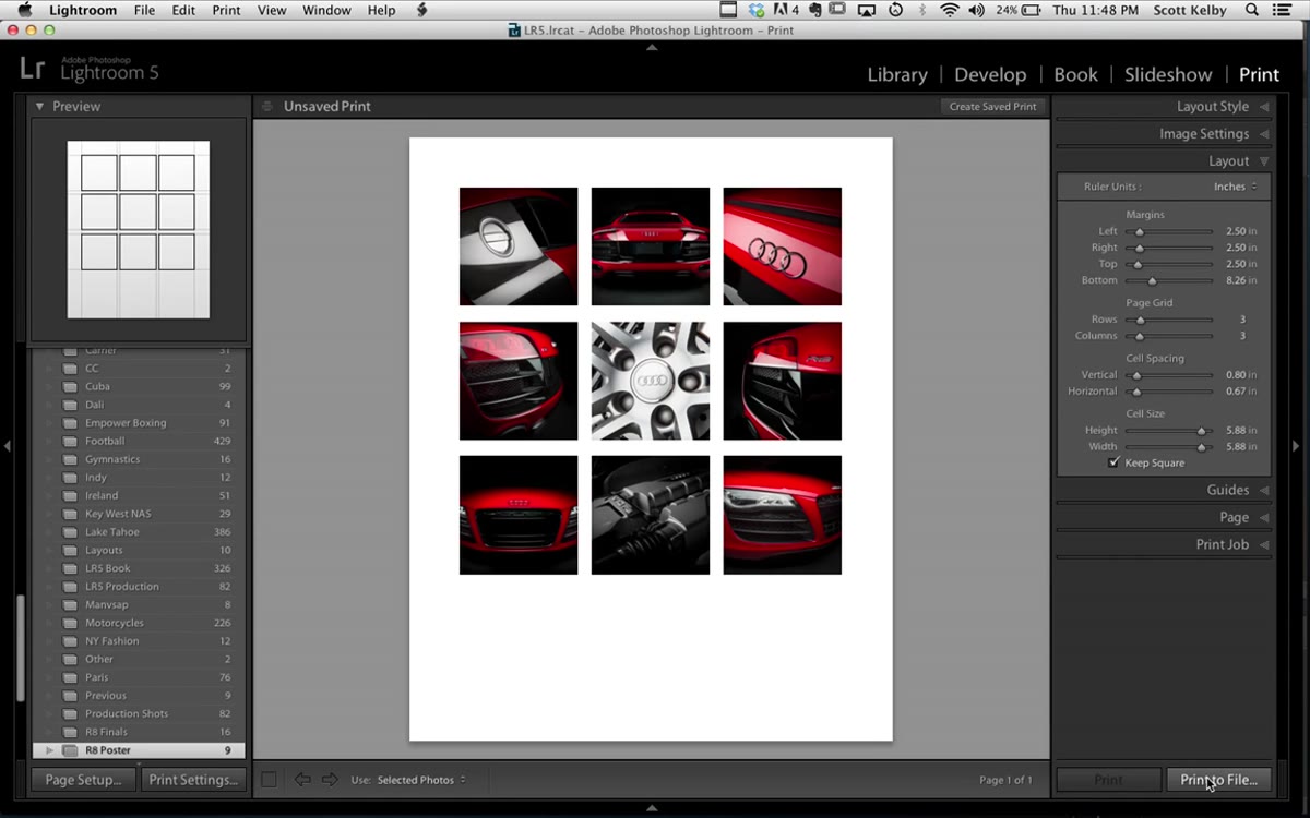
When the layout is where you want it, do not hit the regular Print button. Use “Print to File” instead. This exports the entire layout as a high-resolution JPEG. Name the file, save it, and you’re done with Lightroom. The file comes out at full resolution and is ready to open in Photoshop. The export is fast. A poster this size takes almost no time to render compared to what you’d expect from a 24x30 inch file.
Print to File dialog with filename field and JPEG format selected
When the layout is where you want it, do not hit the regular Print button. Use “Print to File” instead. This exports the entire layout as a high-resolution JPEG. Name the file, save it, and you’re done with Lightroom. The file comes out at full resolution and is ready to open in Photoshop. The export is fast. A poster this size takes almost no time to render compared to what you’d expect from a 24x30 inch file.
Step 8: Add Text in Photoshop
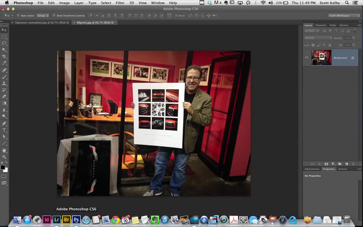 Photoshop with Type tool active, text being placed on exported poster
Open the exported JPEG in Photoshop. Grab the Type tool and add whatever text your poster needs. Kelby adds the car model name, a pipe character as a visual separator (Shift + backslash), and the owner’s name. He adjusts letter spacing using Option + Right Arrow to spread the characters out for a more editorial feel. Option + Left Arrow tightens the spacing. Getting tracking right on a single line of large type is the difference between a poster that looks premium and one that looks like a Word document header.
Photoshop with Type tool active, text being placed on exported poster
Open the exported JPEG in Photoshop. Grab the Type tool and add whatever text your poster needs. Kelby adds the car model name, a pipe character as a visual separator (Shift + backslash), and the owner’s name. He adjusts letter spacing using Option + Right Arrow to spread the characters out for a more editorial feel. Option + Left Arrow tightens the spacing. Getting tracking right on a single line of large type is the difference between a poster that looks premium and one that looks like a Word document header.
One Thing I’d Add: Edit Your Grid Images as a Batch First
Here’s where I’d push this workflow one step further. Before you build the grid in the Print module, sync your Lightroom edits across all nine images so they have a consistent look. Select your hero shot, dial in your color grade, then sync those settings to the remaining images. If you’re working with car photography specifically, I’d pay attention to matching the white balance and highlight recovery across frames shot at different angles. The poster will only look cohesive if the images were treated as a set. Kelby’s images already had that consistency because they were from one session, but it’s easy to overlook when you’re pulling selects from different parts of a shoot.
The real lesson here is that the Print module in Lightroom is not just for sending files to a lab. It’s a layout tool, and a genuinely capable one for this kind of project. You don’t need to open InDesign for a nine-image poster. You don’t need to manually build a canvas in Photoshop and drag layers around. Lightroom handles the grid, the spacing, and the export, and Photoshop gets involved only for the thirty seconds it takes to set type.
Watch the full tutorial on YouTube to see Kelby walk through the whole thing. It runs under five minutes and will permanently change how you think about what the Print module is actually for.
Comments
Leave a Comment