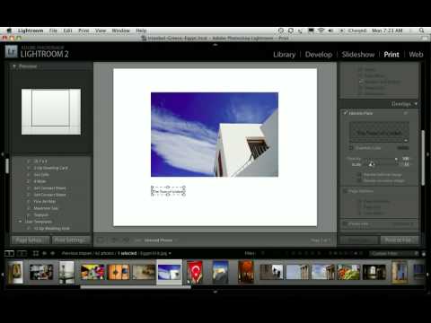
Every time a client asks me about photo books, my first instinct is still to recommend some dedicated software with a subscription fee and a learning curve shaped like a cliff. Then I remember that Lightroom has been quietly capable of this the whole time, sitting right there in the Print module while everyone ignores it in favor of flashier tools.
Watch the full tutorial on YouTube
In this Scott Kelby tutorial, part two of his three-part photo book series, he walks through building photo book layouts entirely inside Lightroom’s Print module, using photos from a trip to Egypt, Istanbul, and Greece as the working example. The goal is to replicate the clean, minimal aesthetic of Apple photo book layouts without leaving Lightroom or paying for anything extra. What makes this approach genuinely useful for working photographers is that you end up with individual JPEG files for each page, which means you can send them anywhere, print them yourself, or hand them off to a lab. No proprietary format locking you into one service.
The technique is more flexible than it looks on the surface. Once you understand the margin logic and the identity plate trick for adding text, you can build both single-image and multi-image layouts in minutes. Here is how to do it.
Step 1: Choose Your Collection and Open the Print Module
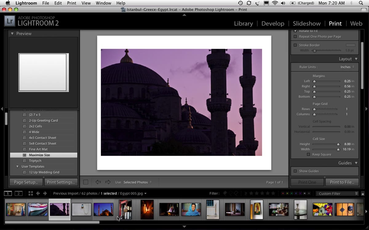 Lightroom Print module open with Egypt and Greece travel photos
Start by gathering the photos you want to use into a collection so they are easy to select and sequence. Kelby works from a trip collection, which keeps things organized and avoids the chaos of hunting through your entire catalog mid-layout. Once your photos are ready, head straight to the Print module. This is where the whole build happens, and it is underused by most Lightroom users who think of it only as a shortcut to their desktop printer.
Lightroom Print module open with Egypt and Greece travel photos
Start by gathering the photos you want to use into a collection so they are easy to select and sequence. Kelby works from a trip collection, which keeps things organized and avoids the chaos of hunting through your entire catalog mid-layout. Once your photos are ready, head straight to the Print module. This is where the whole build happens, and it is underused by most Lightroom users who think of it only as a shortcut to their desktop printer.
Step 2: Set Up Your Page Size and Orientation
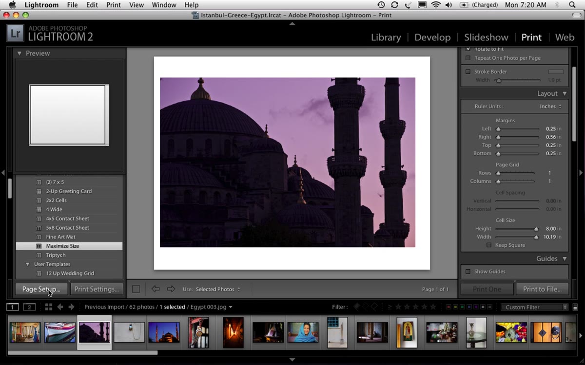 Page Setup dialog with 8.5x11 paper selected and landscape orientation
Click “Page Setup” in the lower left of the Print module. Choose 8.5 by 11 as your paper size, which is the standard US letter size and also happens to match what most print-on-demand services accept without any resizing headaches. Then set the orientation to landscape (horizontal). This gives you the wide, cinematic proportions that work well for travel and documentary-style photo books. Click OK and you are set.
Page Setup dialog with 8.5x11 paper selected and landscape orientation
Click “Page Setup” in the lower left of the Print module. Choose 8.5 by 11 as your paper size, which is the standard US letter size and also happens to match what most print-on-demand services accept without any resizing headaches. Then set the orientation to landscape (horizontal). This gives you the wide, cinematic proportions that work well for travel and documentary-style photo books. Click OK and you are set.
Step 3: Turn Off “Rotate to Fit” and Set Your Margins
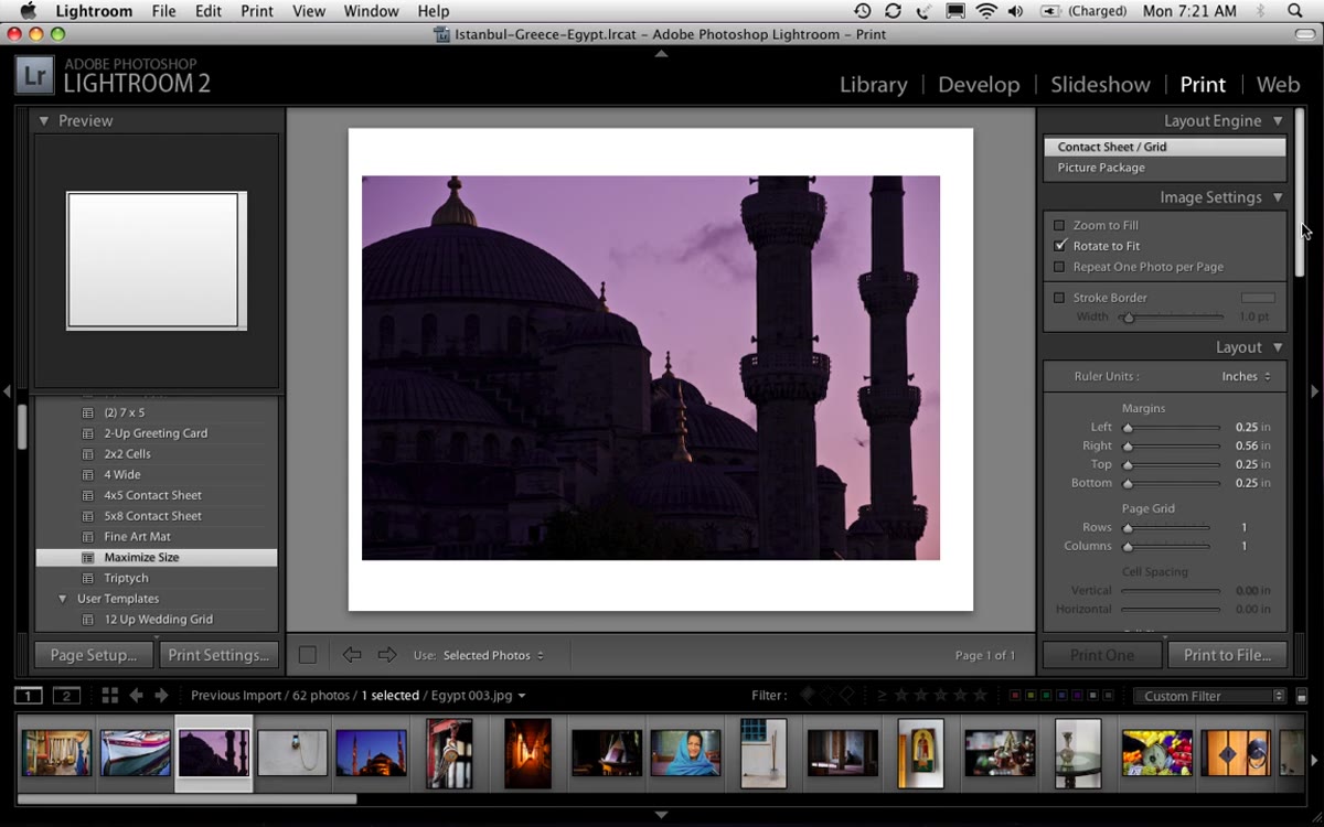 Layout panel showing Rotate to Fit checkbox and margin sliders
This step is where most people get tripped up if they are figuring this out on their own. First, locate the “Rotate to Fit” checkbox in the Layout panel and turn it off. Leaving it on will cause Lightroom to auto-rotate your images in ways that break the layout you are trying to build.
Layout panel showing Rotate to Fit checkbox and margin sliders
This step is where most people get tripped up if they are figuring this out on their own. First, locate the “Rotate to Fit” checkbox in the Layout panel and turn it off. Leaving it on will cause Lightroom to auto-rotate your images in ways that break the layout you are trying to build.
Next, dial in your margins. Kelby uses approximately 2 inches on both the left and the right, which creates the centered, bordered look that makes Apple-style photo book layouts feel polished rather than cramped. The bottom margin gets nudged up slightly to push the photo a little higher on the page, which improves the visual balance. If the sliders are too imprecise for your taste, just type the value directly into the margin field. 2.00 or 2.05 both work fine.
Step 4: Select Your Photo and Match Your Reference Layout
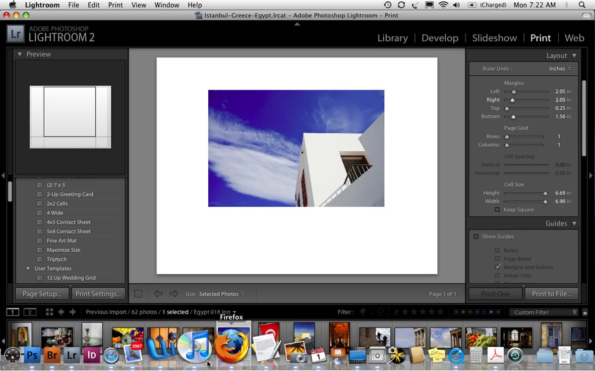 Lightroom layout compared side-by-side with iPhoto layout reference
One practical trick Kelby uses here: keep your reference application open alongside Lightroom so you can compare layouts in real time. If you have a previous photo book built in another program, or even a PDF of a layout you liked, use it as a visual target. Adjust your margins until the proportions match. This is faster than trying to guess your way to a good layout from scratch, and it keeps your book visually consistent if you are building multiple pages with the same style.
Lightroom layout compared side-by-side with iPhoto layout reference
One practical trick Kelby uses here: keep your reference application open alongside Lightroom so you can compare layouts in real time. If you have a previous photo book built in another program, or even a PDF of a layout you liked, use it as a visual target. Adjust your margins until the proportions match. This is faster than trying to guess your way to a good layout from scratch, and it keeps your book visually consistent if you are building multiple pages with the same style.
Step 5: Add Text Using the Identity Plate
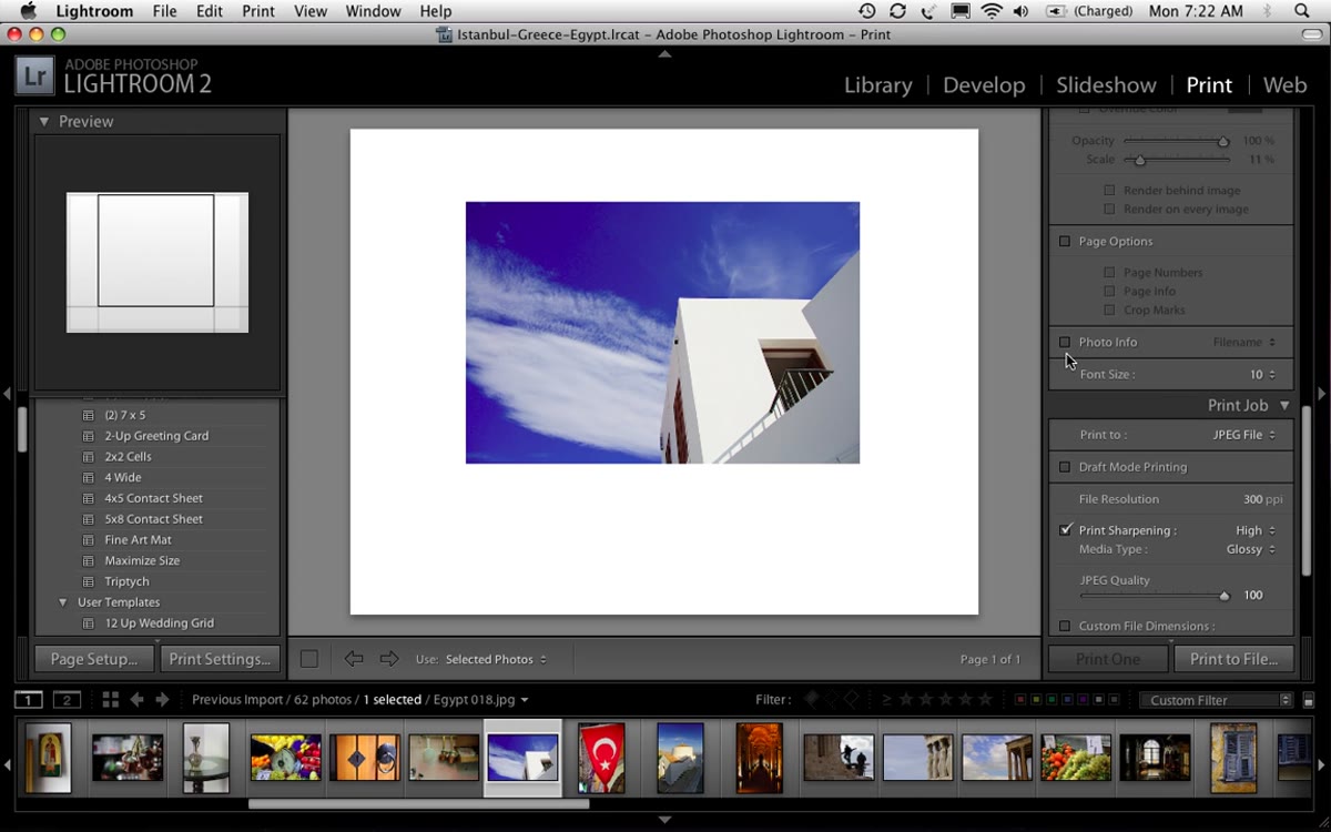 Identity Plate editor open with custom text typed in and black color selected
Lightroom has a basic photo info overlay, but it is rigid and limited in placement. The better option is the Identity Plate, which gives you actual typographic control. Check the “Identity Plate” box in the Page panel, then click the identity plate preview area and choose “Edit.” Type in your caption text, pick your font, and set the color. Kelby uses black for a clean look against lighter backgrounds. Click OK.
Identity Plate editor open with custom text typed in and black color selected
Lightroom has a basic photo info overlay, but it is rigid and limited in placement. The better option is the Identity Plate, which gives you actual typographic control. Check the “Identity Plate” box in the Page panel, then click the identity plate preview area and choose “Edit.” Type in your caption text, pick your font, and set the color. Kelby uses black for a clean look against lighter backgrounds. Click OK.
The identity plate will appear on the layout, and here is the key part: the point size you set inside the editor is not your final size. You can scale the text up or down after placing it using the scale slider in the Page panel. This means you do not need to go back and re-edit the text just to resize it, which saves several annoying round trips. You can also add multiple lines of text directly inside the identity plate editor, so captions with a location name and a subtitle are totally doable.
Step 6: Build a Multi-Photo Layout
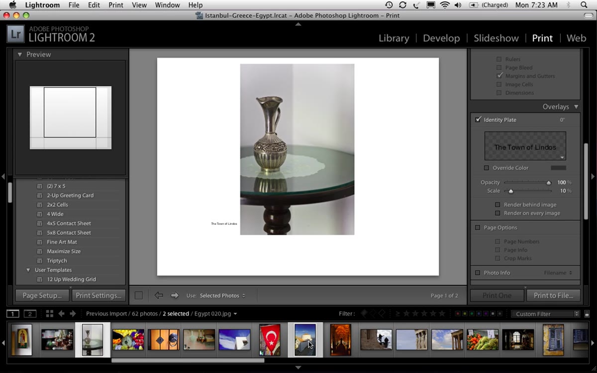 Print module showing two-column layout with two photos side by side
For spreads with more than one image, select multiple photos from the filmstrip at the bottom, then increase the column count in the Layout panel. Kelby goes to two columns for a two-photo layout. The photos will populate automatically, but they will be touching by default, which looks crowded. Go to the Cell Spacing controls and increase the gap between the cells until the layout breathes. The exact amount depends on your margin settings, but a small increase usually does most of the work. You can swap photos in and out by changing your filmstrip selection, and the layout updates instantly.
Print module showing two-column layout with two photos side by side
For spreads with more than one image, select multiple photos from the filmstrip at the bottom, then increase the column count in the Layout panel. Kelby goes to two columns for a two-photo layout. The photos will populate automatically, but they will be touching by default, which looks crowded. Go to the Cell Spacing controls and increase the gap between the cells until the layout breathes. The exact amount depends on your margin settings, but a small increase usually does most of the work. You can swap photos in and out by changing your filmstrip selection, and the layout updates instantly.
Step 7: Export Each Page as a JPEG
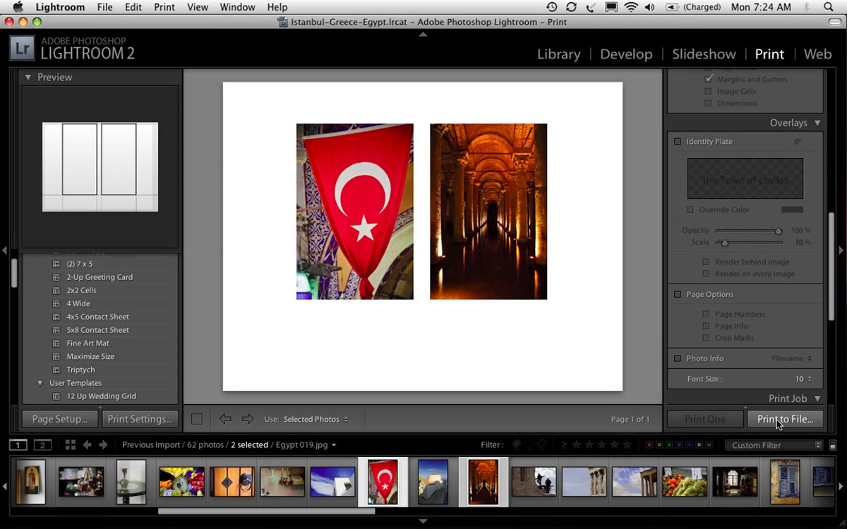 Print to File dialog with JPEG selected and resolution settings visible
Lightroom’s Print module does not have a native black background option, which is a real limitation if you want dramatic dark layouts. Kelby’s workaround is simple and actually more flexible: export each page as a JPEG file using “Print to File,” then assemble the pages however you want, including adding a black background in Photoshop before sending to a print service. This gives you more control over the final output than any single-click book-building tool. Turn off the identity plate before exporting if you plan to composite text in Photoshop instead.
Print to File dialog with JPEG selected and resolution settings visible
Lightroom’s Print module does not have a native black background option, which is a real limitation if you want dramatic dark layouts. Kelby’s workaround is simple and actually more flexible: export each page as a JPEG file using “Print to File,” then assemble the pages however you want, including adding a black background in Photoshop before sending to a print service. This gives you more control over the final output than any single-click book-building tool. Turn off the identity plate before exporting if you plan to composite text in Photoshop instead.
One Thing I Would Add: Save Your Margin Settings as a Template
After spending time dialing in a layout I like, I save it as a Print template immediately using the “+” button in the Template Browser on the left panel. I name mine after the project, same way I name my presets after songs. That way, if I am building a 20-page book, I am not re-entering margin values for every single page. It also means the layout is reusable across future projects without any setup time. Kelby does not cover this in the tutorial, but it is the difference between a technique you use once and a workflow you actually build on.
The single most important thing this tutorial teaches is that Lightroom’s Print module is a legitimate page layout tool, not just a gateway to your inkjet printer. Treating it that way opens up a whole category of deliverables you can produce without adding software to your stack.
Watch the full tutorial on YouTube and pay close attention to how Kelby toggles between Lightroom and his reference layout. That comparison habit is worth stealing on its own.
Comments (2)
I've been looking for exactly this kind of tutorial. Perfect timing.
Couldn't agree more. I've seen this make a huge difference in photoshop work specifically.
Leave a Comment