Client headshots have a way of exposing every gap in your retouching workflow. I found this out the hard way editing press shots for my old band, squinting at a laptop screen, trying to figure out why the skin tones looked like a wax museum exhibit. Good portrait editing is not just about fixing problems. It is about building something that feels intentional, like the light was always supposed to fall that way. That is exactly what this technique delivers.
In this Aaron Nace (PHLEARN) tutorial, Watch the full tutorial on YouTube, Aaron walks through a complete headshot retouch with a cinematic, golden-tone finish. The subject had reference images from Denzel Washington’s portraits, and the goal was to match that quality. Rich highlights, stylized shadows, smooth but realistic skin, and a warm color grade that feels like a movie still. I have watched a lot of retouching tutorials, and this one earns its runtime.
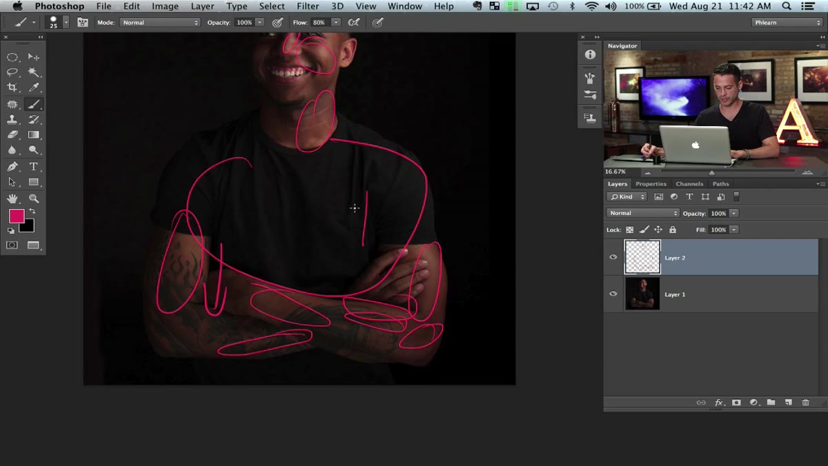
Before Aaron touches a single tool, he does something most people skip: he makes a plan. He annotates the image directly, notes where he wants to push highlights, where the shirt is losing detail, and where the skin needs smoothing. It sounds basic, but this habit alone separates photographers who get consistent results from those who wander around in Photoshop hoping something clicks. I started doing this with sticky notes next to my monitor. Same idea, slightly less professional looking.
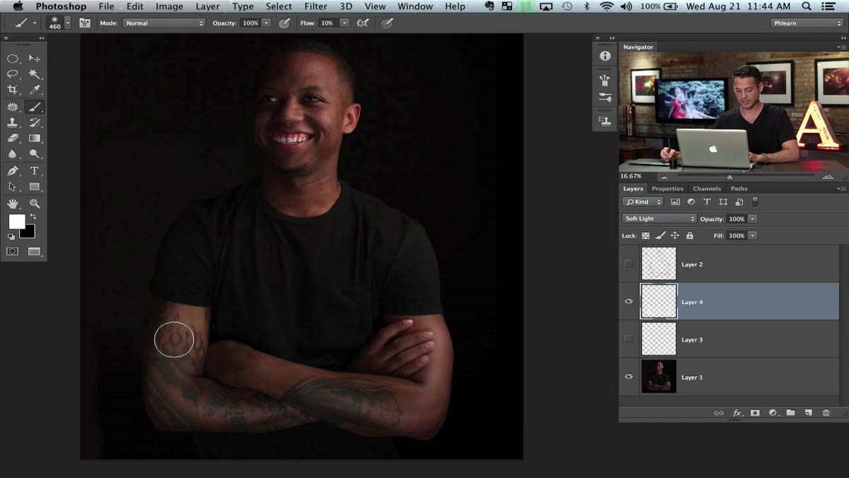
Step 1: Set Up Your Dodge and Burn Layer
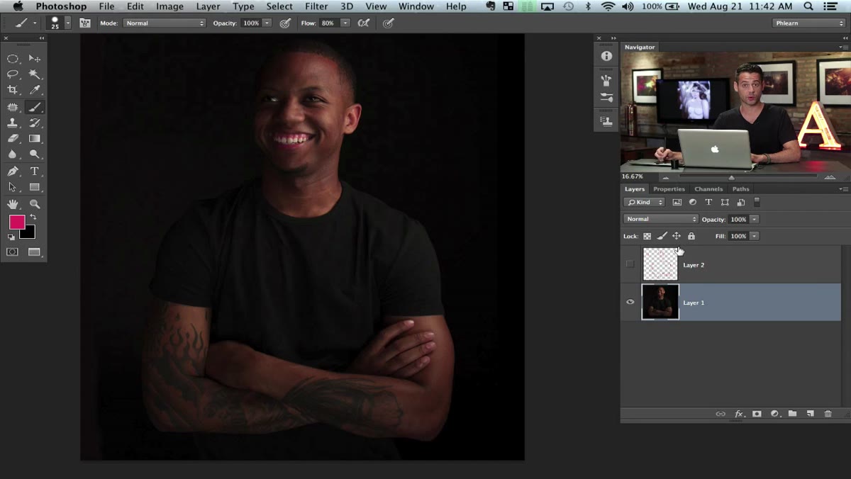 New layer set to Soft Light blending mode
Create a new blank layer above your image, then change the blending mode to Soft Light. This is the foundation of the non-destructive dodge and burn method. When you paint white on a Soft Light layer, it brightens. When you paint black, it darkens. Nothing touches your original pixels.
Hit D to reset your foreground and background colors to white and black. You will switch between them constantly using X. This setup keeps things simple and reversible, which matters when you are deep into a retouch and your client calls to ask if you can “just tweak the shadows a little.”
Step 2: Adjust Your Brush Settings for Control
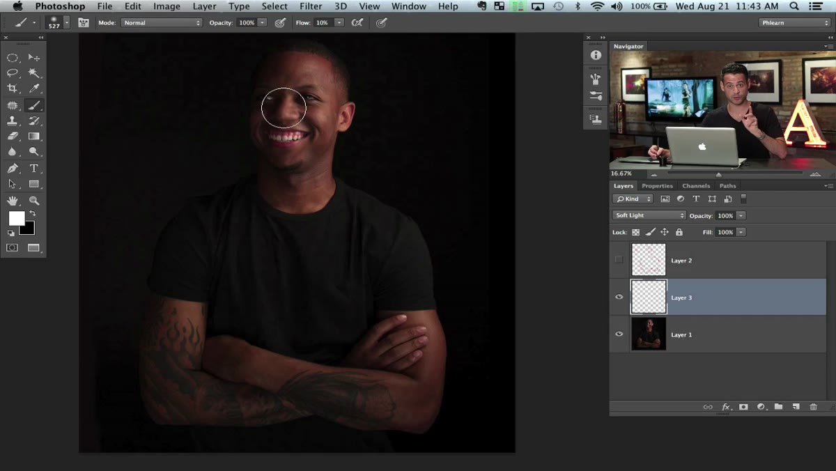 Soft round brush with flow set to 10 percent
Switch to a soft round brush and dial your flow down to around 10 percent. Flow controls how much paint is applied with each stroke, so at 10 percent you are barely whispering pigment onto the canvas. You can build up gradually by painting over the same area multiple times, which gives you far more control than a single heavy-handed pass.
Size your brush to roughly match the highlight area you are working on. Larger highlights get a larger brush, smaller details get a smaller one. On a Mac, hold Control and Option, then drag left and right to resize, or up and down to change hardness. On PC, it is Control plus Alt plus right-click drag. Learning this shortcut will cut your retouching time noticeably.
Step 3: Dodge the Highlights
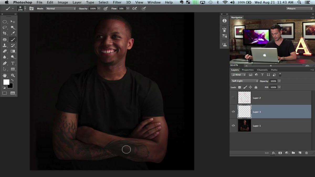 White paint being applied over existing highlights on skin
With white as your foreground color, paint over the areas where highlights already exist. The arm, the shoulder, the cheekbones, any place where the light is naturally landing. You are not inventing new light. You are amplifying what is already there, which is why the result reads as believable rather than artificial.
The key phrase Aaron uses is “paint where you already see the highlights.” This is the difference between dodge and burn that looks photographic and dodge and burn that looks like a painting app tutorial from 2009. Follow the existing light logic of the image.
Step 4: Burn the Shadows
 Black paint deepening shadow areas on the subject
Switch to black by pressing X, and use the same low-flow approach in the shadow regions. The goal is to deepen the contrast between the light and dark areas without crushing the detail entirely. Work especially in the transitions between highlight and shadow, where you can sculpt shape and dimension.
On a portrait, this means under the jaw, around the temples, along the edge of the neck. These are places where you can push the contrast and make the image feel more three-dimensional. Keep your brush large and your flow low. Subtlety is the whole game here.
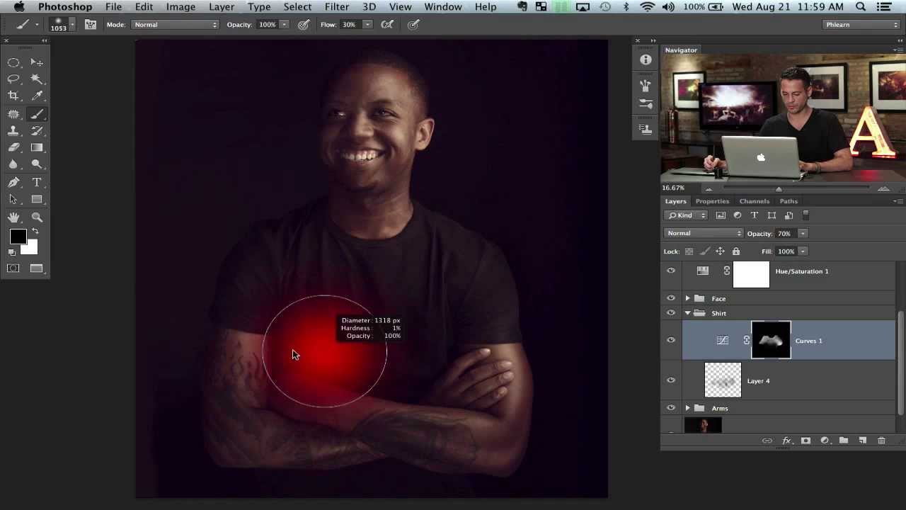
Step 5: Recover Detail in the Shirt
 Dark shirt area with almost no visible detail
A dark shirt with blown-out or crushed shadow detail is one of the most common portrait problems. Aaron addresses it by using the dodge and burn layer to lift the shadow detail in the fabric. With a large soft brush and white at low flow, he gently paints over the shirt area to recover texture that was hiding in the dark tones.
This is a technique I use constantly on band and performer shots where leather jackets or dark blazers go completely flat. Even a subtle lift makes the fabric read as fabric rather than a silhouette cutout.
Step 6: Smooth the Skin Selectively
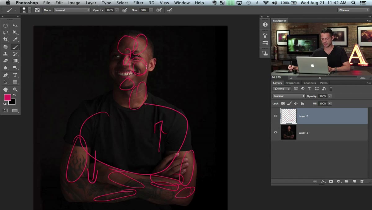 Annotation marks on forehead and cheek areas for smoothing
Aaron mentions targeting the forehead and cheek areas for a small amount of smoothing to round out shapes. The goal is not to eliminate texture but to soften the transition between planes of the face. Applied with restraint on a soft light layer, or through a frequency separation approach, this keeps the skin looking like skin.
The word “selectively” matters. Full-face smoothing is how you end up with portraits that look like they were processed through a beauty filter. Working in small, specific zones preserves the character of the face while cleaning up distractions.
Step 7: Apply the Golden Color Grade
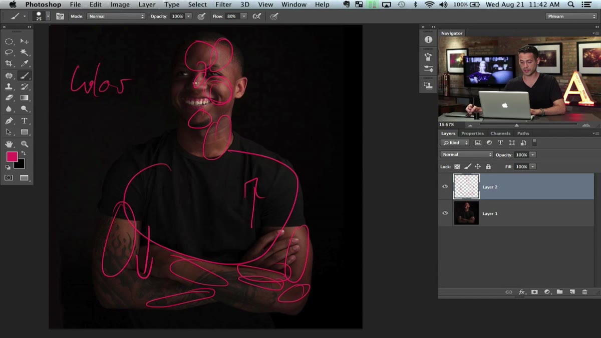 Final plan including color work noted for the end
Aaron saves the color work for last, which is the right call. You cannot accurately judge a color grade until the tones are where you want them. The golden tone look involves warming the highlights and midtones while keeping some coolness in the shadows. This creates a split-tone effect that reads as cinematic and cohesive.
Whether you use a Curves adjustment layer, Color Balance, or Selective Color, the target is the same: golden warmth in the skin, controlled saturation so the image does not look oversaturated, and a slight desaturation pass to give it that near-monochrome quality in the shadows.
What I Do Differently in Lightroom
Most of the dodge and burn structure Aaron builds in Photoshop can be approximated in Lightroom using the Masking panel with AI-powered subject selection. I often rough in the tonal work there before sending to Photoshop for detailed retouching. The color grade portion translates almost perfectly through Lightroom’s Point Curve and Color Mixer. I have a preset I call “Marvin” (yes, after the Gaye album) that handles most of the golden split-tone foundation in one click, then I fine-tune from there.
The planning step is the one thing I cannot replicate with a preset. That habit of annotating the image and committing to a direction before you start, that belongs in every editing session regardless of which software you use.
The single most important thing this tutorial teaches is that great retouching follows the light that already exists rather than inventing new light from scratch. Work with the image, not against it, and your results will look like photography instead of post-production. Watch the full tutorial on YouTube and see Aaron walk through the whole process in real time.
Comments
Leave a Comment