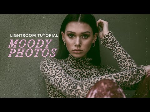
There’s a specific kind of photo that stops your scroll. Dark, atmospheric, a little desaturated, like it was found in a shoebox in someone’s attic. It doesn’t look over-processed. It looks like it has a past. Getting there in Lightroom is less about applying one magic slider and more about understanding a chain of decisions that each build on the last. I’ve been chasing that look for years, and Watch the full tutorial on YouTube from photographer Jessica Kobeissi is one of the cleaner, more honest breakdowns I’ve seen of the process.
What I appreciate most about her approach is that she doesn’t hide the troubleshooting. She adjusts curves live, second-guesses a channel, and keeps going. That’s what actually editing looks like. I’ve named a preset “Harvest Moon” that I rebuilt three times before it was right. The messiness is part of it. What follows is my step-by-step breakdown of her technique, expanded with the context she doesn’t always stop to explain.
Step 1: Set Your Tonal Foundation in the Basic Panel
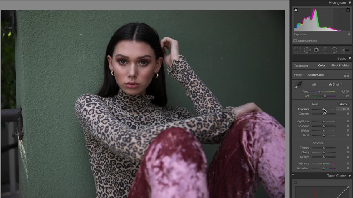 Exposure and contrast sliders being adjusted in Basic panel
Start in the Basic panel and bring up your exposure to compensate for the darkening you’re about to do. Jessica lands around +0.65 for her image, but treat that as a directional nudge rather than a fixed value. Your starting image will be different. Then add a small contrast boost, around +10, just enough to give the tones something to grip.
Exposure and contrast sliders being adjusted in Basic panel
Start in the Basic panel and bring up your exposure to compensate for the darkening you’re about to do. Jessica lands around +0.65 for her image, but treat that as a directional nudge rather than a fixed value. Your starting image will be different. Then add a small contrast boost, around +10, just enough to give the tones something to grip.
From there, pull the highlights down hard, to roughly -66. This is where the “attic photo” quality starts to emerge. The bright areas of your image begin to feel weighted down, less digital, more tired in the best possible way. Then bring the whites down to around -35. Leave shadows and blacks alone for now. You’ll revisit the overall tonal balance once the color work is in place.
Step 2: Add Clarity, Then Drain the Color
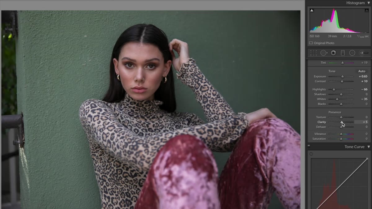 Clarity slider being increased in the Basic panel
Bump clarity up slightly. This adds midtone contrast and edge definition without blowing out highlights the way sharpening can. How much depends on your subject. Portraits get a lighter touch. Environmental or textural shots can handle more.
Clarity slider being increased in the Basic panel
Bump clarity up slightly. This adds midtone contrast and edge definition without blowing out highlights the way sharpening can. How much depends on your subject. Portraits get a lighter touch. Environmental or textural shots can handle more.
Then do something that feels wrong at first: pull both vibrance and saturation into the negatives. Jessica brings vibrance to around -25 and saturation to around -11. The goal is to remove color confidence from the image. You’re not going grayscale, you’re going gray-ish, which is a harder thing to calibrate. Fully desaturated is easy. Partially drained, where color still exists but feels quieter and further away, that’s the effect worth chasing here.
Step 3: Shape the Tone Curve on the RGB Channel
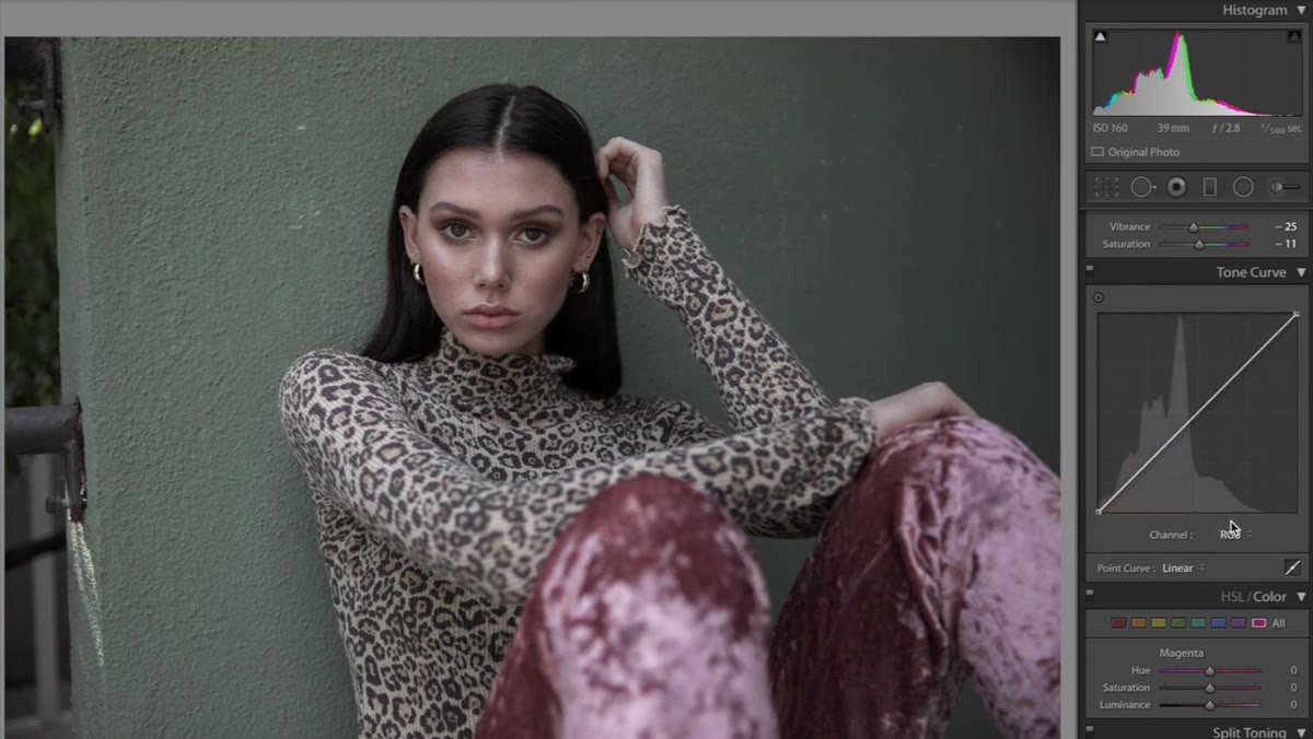 RGB tone curve being adjusted in the Tone Curve panel
Move to the Tone Curve panel and make sure you’re working in the RGB composite channel first. The adjustment here is about compressing the tonal range so your image never fully reaches true black or true white. Lift the bottom-left anchor point of the curve up slightly, and pull the top-right anchor point down slightly. This flattens the contrast at the extremes and gives the photo that faded, film-like quality. Nothing in the image will feel too punchy or too deep after this.
RGB tone curve being adjusted in the Tone Curve panel
Move to the Tone Curve panel and make sure you’re working in the RGB composite channel first. The adjustment here is about compressing the tonal range so your image never fully reaches true black or true white. Lift the bottom-left anchor point of the curve up slightly, and pull the top-right anchor point down slightly. This flattens the contrast at the extremes and gives the photo that faded, film-like quality. Nothing in the image will feel too punchy or too deep after this.
This is one of those moves that looks subtle in the histogram and dramatic in the image. If your photo still feels too digital or clean after the Basic panel work, this curve is usually why.
Step 4: Adjust the Red and Blue Channels Separately
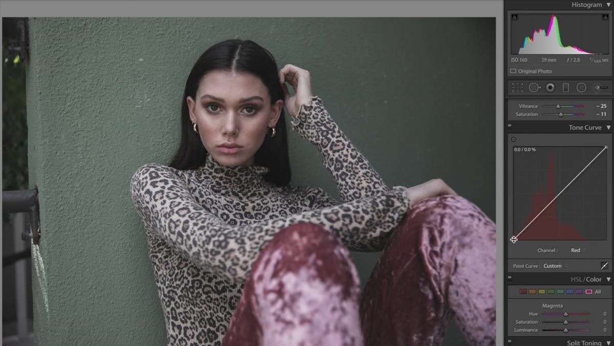 Red channel selected in the Tone Curve panel
Stay in the Tone Curve panel but switch to the Red channel. Jessica keeps these changes subtle. A very slight S-curve or minor repositioning of the midpoints. The goal isn’t to make the image obviously red or obviously lacking in red. It’s to introduce a slight warmth bias in certain tonal ranges that you’ll balance against the blue channel.
Red channel selected in the Tone Curve panel
Stay in the Tone Curve panel but switch to the Red channel. Jessica keeps these changes subtle. A very slight S-curve or minor repositioning of the midpoints. The goal isn’t to make the image obviously red or obviously lacking in red. It’s to introduce a slight warmth bias in certain tonal ranges that you’ll balance against the blue channel.
Then switch to the Blue channel, which is where the mood really locks in. Bringing blues up in the shadows and midtones introduces that cool, cinematic quality associated with dark and moody photography. It’s the channel doing most of the emotional heavy lifting in this look. Even small movements here will visibly shift the image’s feeling. Go slowly.
Step 5: Use Split Toning to Define the Color Story
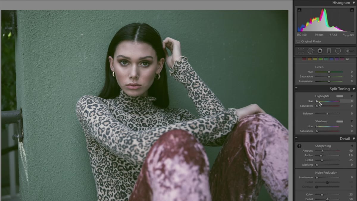 Split Toning panel open with Highlights hue selected
The Split Toning panel (or Color Grading in more recent versions of Lightroom) lets you assign distinct colors to your highlights and shadows independently. Jessica uses a very soft green in the highlights, and a blue-leaning color around the 208 hue mark for shadows. Both are applied at low saturation values, which is important.
Split Toning panel open with Highlights hue selected
The Split Toning panel (or Color Grading in more recent versions of Lightroom) lets you assign distinct colors to your highlights and shadows independently. Jessica uses a very soft green in the highlights, and a blue-leaning color around the 208 hue mark for shadows. Both are applied at low saturation values, which is important.
If you’ve ever wondered why your split toning isn’t doing anything, it’s almost always because the saturation for that section is sitting at zero. The hue setting is meaningless without saturation to carry it. Bring saturation up gradually until you see the effect, then back off until it feels natural rather than applied. The balance slider lets you weight the effect toward shadows or highlights. For this look, shadows usually deserve more attention.
Step 6: Dial In the Camera Calibration Panel
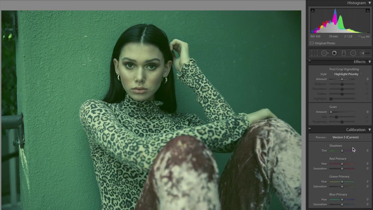 Camera Calibration panel open, Shadow Tint slider at -100
The Camera Calibration panel sits at the very bottom of the Develop module and is one of the most underused tools in Lightroom. Jessica starts by pulling the Shadow Tint slider to -100, pushing the shadows toward green. Combined with the blue work you’ve done in the curves and split toning, this green-shadow calibration creates a more complex, layered color beneath the surface.
Camera Calibration panel open, Shadow Tint slider at -100
The Camera Calibration panel sits at the very bottom of the Develop module and is one of the most underused tools in Lightroom. Jessica starts by pulling the Shadow Tint slider to -100, pushing the shadows toward green. Combined with the blue work you’ve done in the curves and split toning, this green-shadow calibration creates a more complex, layered color beneath the surface.
From there she makes targeted hue and saturation adjustments to the Red and Green primaries. She brings the Red Primary hue to around -16. These are fine-tuning moves, not dramatic ones. The Calibration panel is affecting how Lightroom interprets your camera’s raw data, so changes here are structural rather than cosmetic.
Going Further: What I’d Add to This Workflow
One thing Jessica doesn’t spend much time on is the starting image selection. This technique rewards photos that already have a directional color or a clear light source. Flat, evenly lit images can look muddy rather than moody when you strip saturation and flatten tonal range. I’ve learned, sometimes painfully, to start with an image that has something to say before I try to say it louder with edits.
I’d also suggest saving a snapshot before you hit the Calibration panel. That panel changes the image in ways that are harder to reverse incrementally. A snapshot gives you a clean rollback point if the calibration moves push things too far.
The biggest thing this tutorial reinforces for me is that dark and moody is a color grade, not just a brightness adjustment. Pulling exposure down does not make a photo moody. Working through curves, split toning, and calibration in a deliberate sequence, each layer influencing the next, that’s what creates the effect. Get the sequence right and the mood follows.
Watch the full tutorial on YouTube and follow along with your own image. The technique will land differently depending on your photo, which is exactly the point.
Comments
Leave a Comment