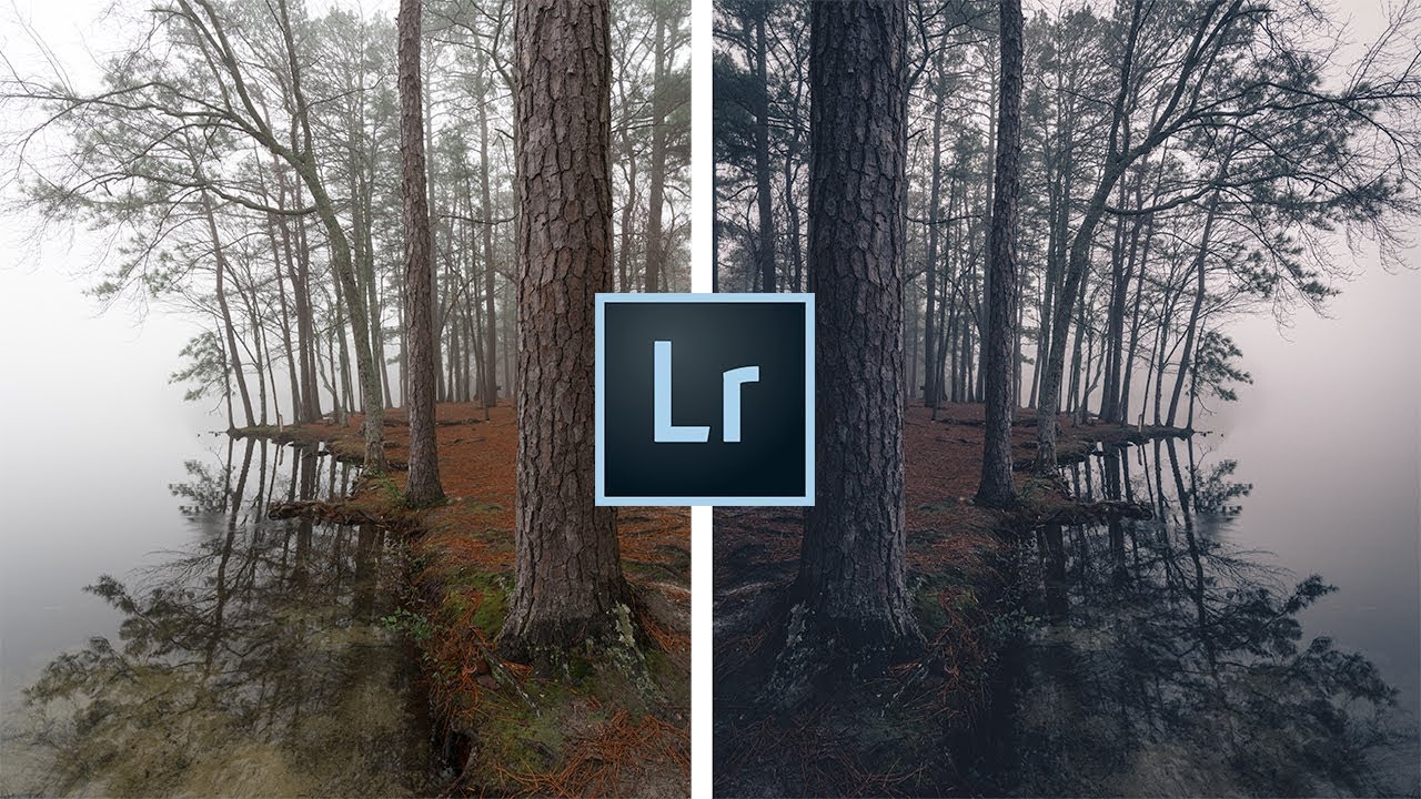
There’s a specific kind of landscape photo that stops you mid-scroll. Dark, atmospheric, a little unsettling. The kind of image where the fog does half the storytelling and the edit does the other half. I’ve been chasing that look for years, and I’ll admit I used to think it was mostly about being in the right place at the right time. It’s not. It’s mostly about knowing what to do with the raw file once you’re back home.
I came across this Mark Denney tutorial recently and it clicked in a way that a lot of “moody editing” videos don’t. Most of them hand you a preset and call it a day. This one actually breaks down the logic behind the look, which is the part that transfers to every image in your library. Watch the full tutorial on YouTube if you want to follow along with his source image. What follows is my own walkthrough of the technique, written so you can execute it without having the video open.
Before you dive in: this approach works best on images that already carry some atmospheric weight. Overcast days, fog, mist, dramatic cloud cover. You can push a sunny golden-hour shot in this direction, but you’ll be fighting the image the whole way. Pick a file that wants to go dark.
Step 1: Pull Down the Exposure
 Exposure slider being lowered in the Basic panel
The first move is straightforward but sets the tone for everything that follows. Drop your Exposure slider in the Basic panel. You’re not going for a dramatic underexposure here, just a couple of stops lower than where you’d normally land for a clean edit. Think of it as shifting the overall emotional register of the image downward. Bright and airy communicates one thing. Darker and quieter communicates something else entirely.
Exposure slider being lowered in the Basic panel
The first move is straightforward but sets the tone for everything that follows. Drop your Exposure slider in the Basic panel. You’re not going for a dramatic underexposure here, just a couple of stops lower than where you’d normally land for a clean edit. Think of it as shifting the overall emotional register of the image downward. Bright and airy communicates one thing. Darker and quieter communicates something else entirely.
Don’t overthink the exact number at this stage. You’ll revisit overall brightness once the other adjustments are in place. For most files, something in the -0.5 to -1.5 range is a reasonable starting point.
Step 2: Cool the White Balance
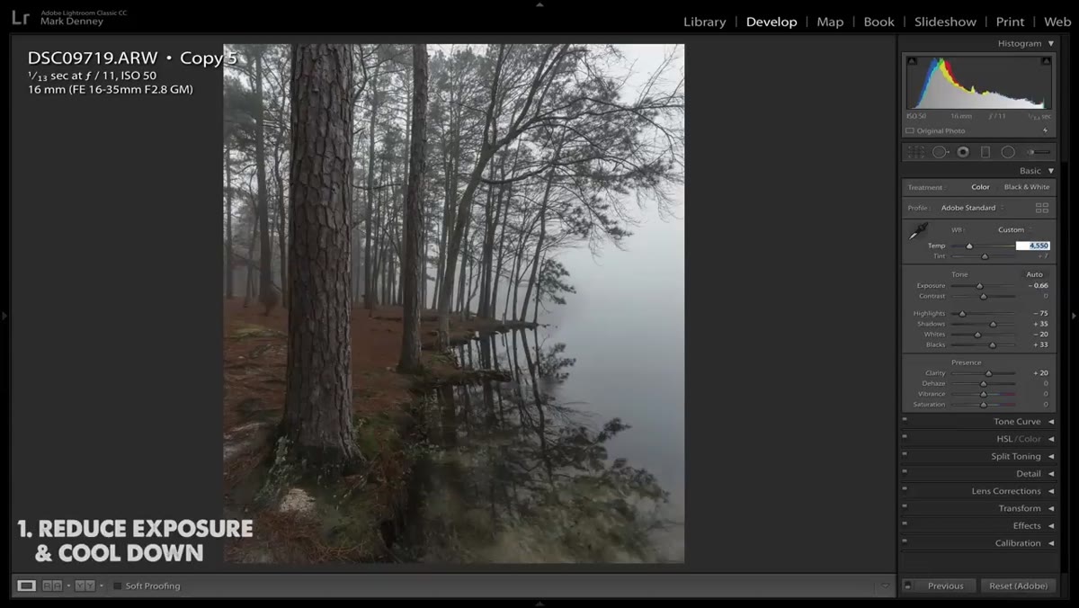 Temperature slider being shifted toward blue in Basic panel
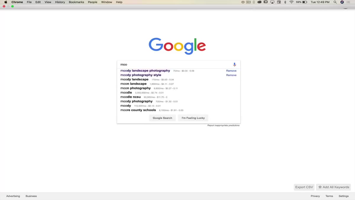
One of the most consistent traits across moody landscape photography is a cool color temperature. Warm images read as inviting and comfortable. Cool images read as isolated and tense. If you’re going for mood, you want the viewer slightly on edge, and a cooler white balance does that work quietly in the background.
Temperature slider being shifted toward blue in Basic panel
One of the most consistent traits across moody landscape photography is a cool color temperature. Warm images read as inviting and comfortable. Cool images read as isolated and tense. If you’re going for mood, you want the viewer slightly on edge, and a cooler white balance does that work quietly in the background.
Bring your Temperature slider left toward blue. The adjustment doesn’t need to be extreme. A subtle shift of 200 to 500 Kelvin below your original capture temperature is often enough to change the entire emotional quality of the scene. Combine this with a very slight nudge of the Tint slider toward green and you’ll start building that desaturated, slightly clinical atmosphere that defines the look.
Step 3: Push Greens and Blues Into the Shadows via Calibration
 Camera Calibration panel with Shadows tint slider highlighted
This is the step most tutorials skip, and it’s the one that separates a flat dark edit from something that actually reads as cinematic. Head all the way down to the Camera Calibration panel at the bottom of your Develop module. Find the Shadows tint slider and push it toward green.
Camera Calibration panel with Shadows tint slider highlighted
This is the step most tutorials skip, and it’s the one that separates a flat dark edit from something that actually reads as cinematic. Head all the way down to the Camera Calibration panel at the bottom of your Develop module. Find the Shadows tint slider and push it toward green.
Mark lands around -40, which sounds aggressive until you toggle the adjustment on and off and see how much it shifts the image. What you’re doing is injecting a green-blue tint specifically into the darker regions of the photo. It’s the same quality you see in a lot of film stock and in modern cinematic color grading. The highlights and midtones stay relatively neutral while the shadows take on that cool, slightly otherworldly character. This single slider does more heavy lifting for the moody look than almost anything else in the panel.
Step 4: Use Vibrance and Saturation Together
 Vibrance being raised while Saturation is lowered in Basic panel
Here’s a move I’ve used for years and still think is underrated: push Vibrance up while pulling Saturation down. These two sliders are not the same thing, and using them in opposition creates a result neither one can achieve alone.
Vibrance being raised while Saturation is lowered in Basic panel
Here’s a move I’ve used for years and still think is underrated: push Vibrance up while pulling Saturation down. These two sliders are not the same thing, and using them in opposition creates a result neither one can achieve alone.
Saturation affects every color channel uniformly. Pull it down and everything goes gray together. Vibrance is smarter. It targets the less-saturated colors in your image more aggressively and leaves already-vivid colors closer to where they are. So when you raise Vibrance and lower Saturation simultaneously, you get a desaturated overall palette that still has some color depth and variation. The image looks intentionally muted rather than just washed out. For a moody landscape, that’s exactly the distinction that matters.
Step 5: Target Individual Colors in the HSL Panel
 HSL panel open with Saturation tab selected
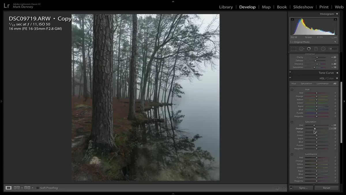
Once the overall color temperature and saturation are in the right neighborhood, drop into the HSL panel and work the individual channels. Mark’s approach here is to start with the Saturation tab before touching Hue or Luminance. The reasoning is practical: saturation changes are easier to see, which helps you identify which specific colors are actually in your image before you start moving hue values around blindly.
HSL panel open with Saturation tab selected
Once the overall color temperature and saturation are in the right neighborhood, drop into the HSL panel and work the individual channels. Mark’s approach here is to start with the Saturation tab before touching Hue or Luminance. The reasoning is practical: saturation changes are easier to see, which helps you identify which specific colors are actually in your image before you start moving hue values around blindly.
For a moody landscape, the greens and blues are usually your most important channels. Pulling the Saturation down on greens and aquas keeps foliage from looking artificially vivid against your cooler overall palette. If your image has any orange or red warmth left in it from the original capture, pulling those channels down will bring the whole image into tonal consistency. Small moves here, maybe 10 to 20 points per channel. You’re tuning, not rebuilding.
Step 6: Refine Contrast with Tone Curve
 Tone curve being shaped in Develop module
The final structural step is a tone curve adjustment to lock in your contrast and protect the shadow detail you’ve been building. A gentle S-curve adds punch without blowing out highlights. For a moody edit specifically, consider lifting the bottom anchor point of your curve slightly off the bottom-left corner. This crushes the absolute blacks just enough to add a faint lifted shadow quality, which reads as filmic and slightly hazy rather than deep and pure black.
Tone curve being shaped in Develop module
The final structural step is a tone curve adjustment to lock in your contrast and protect the shadow detail you’ve been building. A gentle S-curve adds punch without blowing out highlights. For a moody edit specifically, consider lifting the bottom anchor point of your curve slightly off the bottom-left corner. This crushes the absolute blacks just enough to add a faint lifted shadow quality, which reads as filmic and slightly hazy rather than deep and pure black.
This is also where you can do a final check on whether the image still has enough visible detail in the dark regions. Moody doesn’t mean muddy. If you’ve lost texture in the shadows you care about, use the Shadows slider back in the Basic panel to recover it before you call the edit done.
One Thing I’d Add: A Radial Filter to Anchor the Atmosphere
Mark’s six steps will get you to a strong moody baseline, and I’d add one more move that I reach for constantly on foggy or overcast shots. Drop a Radial Filter over the main subject or the area you want the viewer’s eye to land. Invert it so the adjustments affect the outside of the ellipse rather than the inside. Bring the Exposure down slightly and add a touch more coolness to the outer region.
This creates a very subtle vignette effect that doesn’t look like a vignette. It looks like the atmosphere is naturally heavier at the edges of the frame, which on a foggy day, it often is. It reinforces the mood without the artificial ring that traditional vignettes can leave behind.
The single most transferable thing in this tutorial is the logic Mark lays out at the start: moody landscape photos share specific visual DNA. They’re underexposed, cool-toned, desaturated, and they carry green-blue color in the shadows. Once you understand those four traits as design decisions rather than happy accidents, you stop chasing the look and start building it deliberately.
Watch the full tutorial on YouTube to see Mark apply this to his source image in real time. Watching the before and after toggles on each step is worth the full runtime.
Comments
Leave a Comment