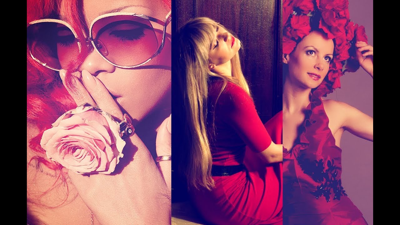
There are certain images that stop you mid-scroll and make you think: how did they do that? For me, it was Rihanna’s Loud album photography. That warm, golden, almost otherworldly tone where the shadows fill in with deep purples and the highlights glow yellow. I had it pinned to a mood board for months before I actually sat down and tried to reverse-engineer it. I got close, eventually, but it took longer than I’d like to admit.
That’s why this tutorial from photographer and educator Jessica Kobeissi hit differently when I found it. In this Watch the full tutorial on YouTube, she breaks down how she spent days obsessing over the same reference images, eventually cracking the look using just two adjustment layers in Photoshop. No third-party plugins. No seventeen-step workaround. Just Levels and Curves, used in a way most people haven’t thought to try.
One thing she flags early that I think is genuinely important: this technique depends on having red in the image. Red hair, red clothing, red in the skin tones. Without it, the yellow cast reads as a color cast problem rather than an intentional grade. Keep that in mind before you apply it to a blue-hour landscape and wonder why it looks strange. With the right source image, though, the results are stunning.
Step 1: Add a Levels Adjustment Layer to Deepen the Blacks
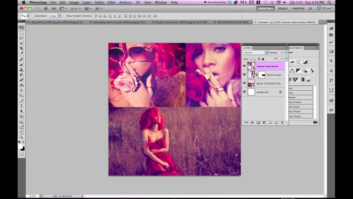 Adding a new Levels adjustment layer in Photoshop
Before any color work, Jessica adds a Levels adjustment layer to push the blacks slightly deeper. The goal here isn’t a dramatic contrast boost. It’s subtle - just enough to give the shadows something to hold onto when the color grading hits. Think of it as preparing the canvas.
Pull the black input slider slightly to the right. You’re not crushing the shadows entirely, just making sure the darkest areas in the frame are genuinely dark. The difference will make more sense in a few steps, but she shows a comparison with and without this layer, and the grades that skip it look noticeably washed out.
Step 2: Add a Curves Adjustment Layer
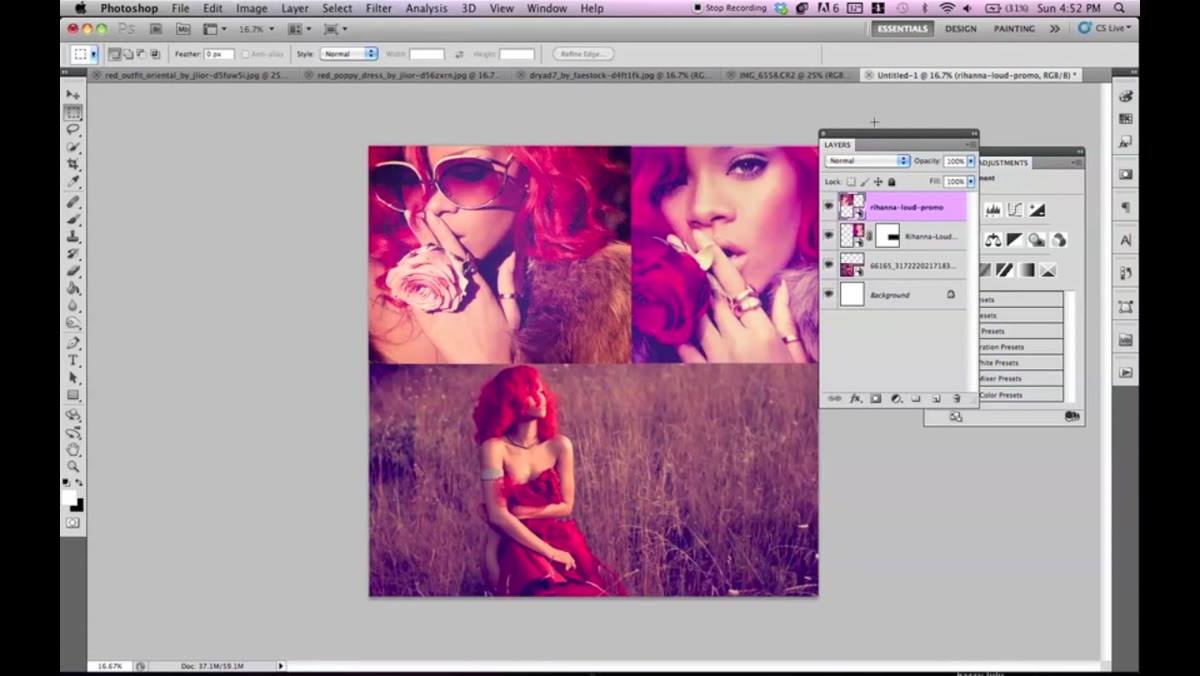 Curves adjustment layer panel open in Photoshop
The Curves adjustment layer is where everything actually happens. Jessica calls it the magic layer, and I’d agree. Add it on top of your Levels layer. You’ll be making two separate curve adjustments inside this single layer - one on the RGB composite channel for overall tone, and one on the Blue channel for the color effect.
Start by staying on the RGB channel and gently lifting the midtones. A subtle S-curve or a mild lift to the midpoint is enough. You’re just nudging the overall exposure and contrast slightly before the color work. Don’t go heavy here - this is a supporting move, not the main event.
Step 3: Switch to the Blue Channel and Lift the Shadows
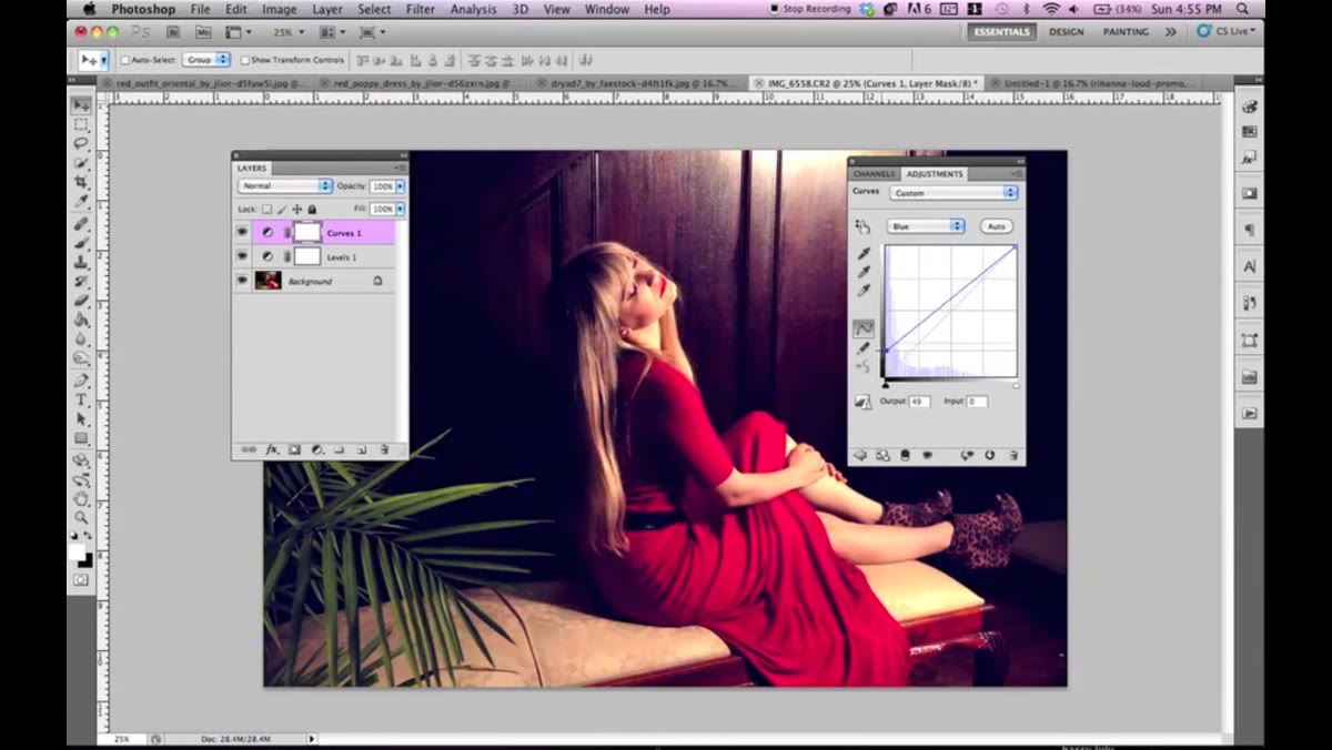 Blue channel selected in Curves, shadow point being lifted
Here’s where the technique gets interesting. Inside the same Curves adjustment layer, switch from the RGB channel to the Blue channel. Find the bottom-left anchor point on the curve - the point that represents pure black in the shadows - and drag it upward along the left edge.
What happens visually is immediately striking. The blacks and deep shadows stop being neutral and start pulling toward blue. The darkest areas of the image fill in with a cool, slightly blue-purple tone. This is exactly the shadow behavior you see in the Loud reference photos. You’re not adding blue everywhere - just into the parts of the image that would otherwise sit in pure black.
Step 4: Pull the Top of the Blue Curve Down to Introduce Yellow
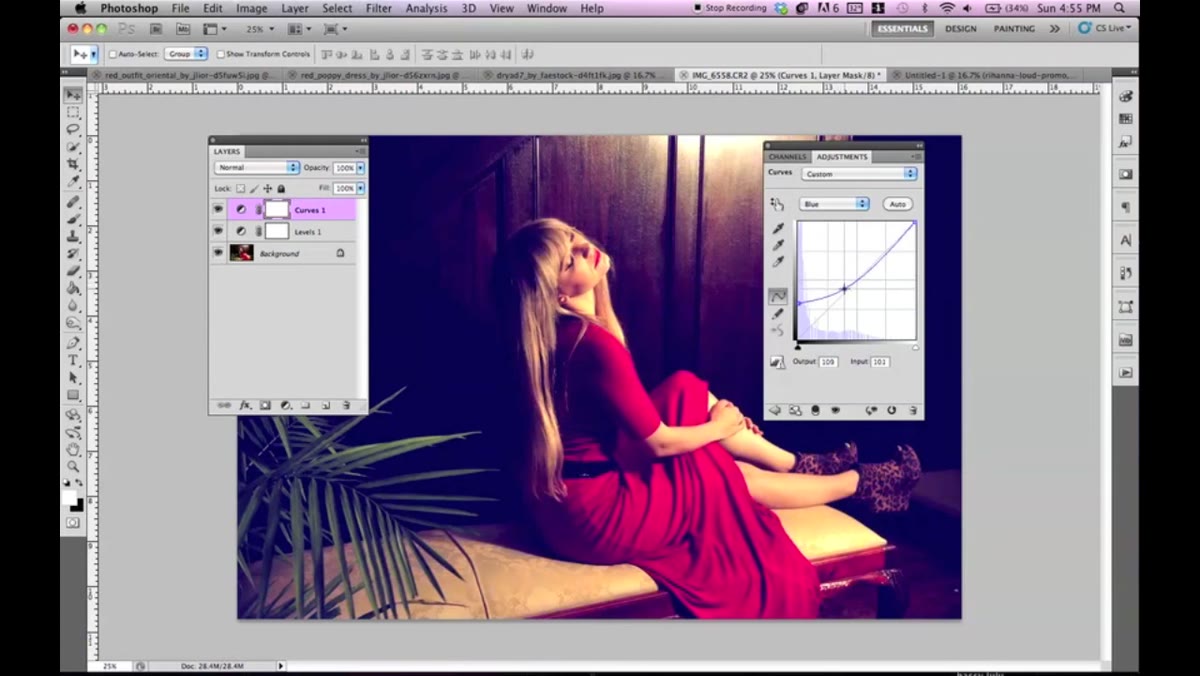 Top anchor point of Blue curve pulled downward creating yellow cast
Now, while still on the Blue channel, grab the top-right anchor point - the highlight end of the curve - and pull it downward. Dragging down on the Blue channel subtracts blue from the highlights and midtones, which in color terms pushes those areas toward yellow and orange.
This is the move that creates the warm, golden tone across the skin and bright areas of the image. Combined with the lifted shadow point from Step 3, you get a split-tone effect: cool purple-blue in the shadows, warm yellow-gold in the highlights and midtones. Jessica spends time playing with how far to pull this down, and it’s worth experimenting based on your specific image. Too far and the highlights start looking green. Around a quarter to a third of the way down tends to be the sweet spot.
Step 5: Return to RGB and Fine-Tune the Overall Tone
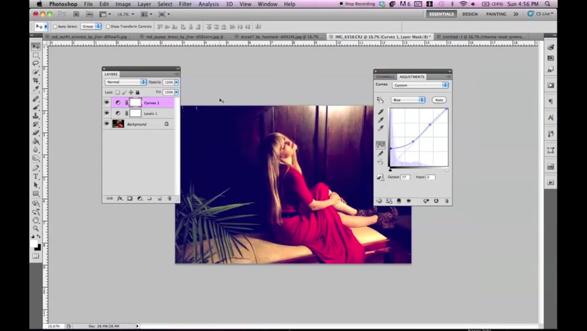 RGB channel selected in Curves, midtone adjustment being made
Once the Blue channel is set, switch back to the RGB composite channel and revisit your overall brightness and contrast. The color shifts you just made will have changed how the tonal balance reads, so it’s worth a second look. Jessica does this revisit after getting the color in place, and it’s a good habit - color and luminosity interact with each other, and what looked right before the grade might need a small correction after.
Small moves only here. A slight downward nudge to the highlights or a minor lift to the midtones is usually all it takes to bring the image back into balance without disturbing the color you’ve worked for.
Step 6: Compare Before and After, Then Evaluate Against Your Reference
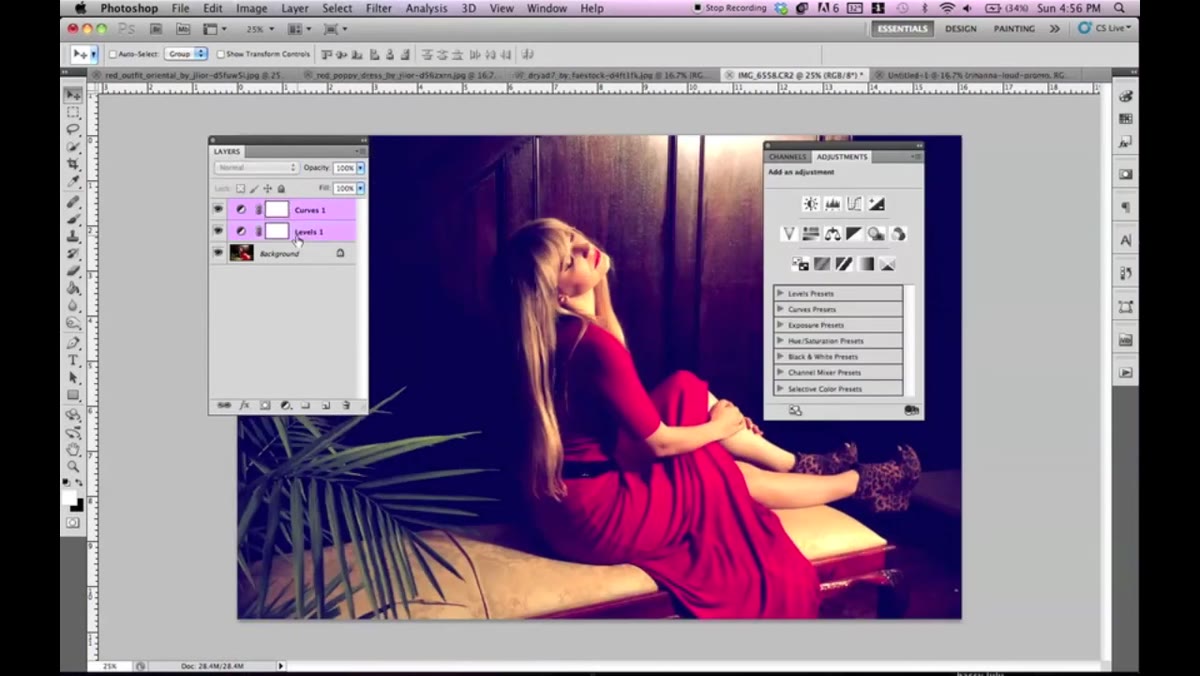 Before and after comparison showing the yellow-toned grade effect
Toggle your adjustment layers on and off to do a true before-and-after comparison. This is where you can judge whether the Levels layer is actually earning its place in the stack. Jessica shows this comparison in the tutorial, and the version without the initial Levels step does look softer and less intentional.
If you have a reference image - and I’d strongly recommend having one - put it side by side with your edit now. You won’t match it exactly, and that’s fine. The goal is to understand the structure of a look, not to clone someone else’s image. Use the reference to calibrate your eye, then make the grade your own.
A Note From My Own Workflow: This Translates Directly into Lightroom
I work primarily in Lightroom, not Photoshop, and the first thing I did after going through this tutorial was map the technique onto the Tone Curve panel. The Blue channel manipulation in Photoshop’s Curves is essentially identical to what you’d do in Lightroom’s Point Curve with the Blue channel selected. Lift the shadow anchor, pull the highlight anchor down. Same logic, same result.
If you’re a Lightroom user watching this and feeling like it doesn’t apply to you - it does. The underlying color theory is the same regardless of which tool you’re in. I’ve since built a rough version of this grade into a preset I’m calling “Loud” (yes, obviously). It’s not a one-click solution because the red-in-the-image requirement is real, but as a starting point it saves significant time.
The single most important thing this tutorial teaches isn’t a specific curve position - it’s that split-toning through the Blue channel alone, using just the shadow and highlight anchor points, can produce a sophisticated dual-tone look without any color overlay layers or blend modes. That’s the insight worth saving.
Watch the full tutorial on YouTube to see Jessica work through the technique on two different images and get a feel for how the curve adjustments move in real time - watching the sliders is genuinely helpful for calibrating your own version of this grade.
Comments
Leave a Comment